In 1991, Mitch Payton launched one of the most influential independent teams in motocross history. Backed by Peak antifreeze and partnered with American Honda, Mitch Payton’s new squad burst onto the scene with a stable of young talent that quickly took the new team to the top.
Outfitted in team-issue AXO Sport gear and on board identical blue Honda CR125Rs, Jeremy McGrath, Brian Swink, Steve Lamson and Jeromy Buehl dominated both coasts, capturing the ‘91 125 East and 125 West Coast Supercross titles. Along the way, the look and professionalism of the team set new standards for presentation and performance for a non-factory effort. While there had certainly been other private team efforts prior to Pro Circuit in 1991, none had ever been able to capture its combination of mindshare in the pits and success on the track.
In 1991, Pro Circuit set the standard for how good a satellite team could be, and has continued to do so over the last 27 years. They have withstood manufacturer swaps, multiple sponsor changes and the endless turnover of talent that is the lifeblood of motocross. Through it all, they have continued to rack up wins and titles for their fans and sponsors.
As the OG of satellite teams, Matthes and I thought it might be fun to take a look back at the many forms the Pro Circuit team has taken through the years. In order to do this, we are going to cover examples of each year’s machines and offer our thoughts on each. To break things up a bit, I thought it might be fun to also get the opinion someone not so inside baseball, so I asked my wife Christine to look at the bikes and add her thoughts as well. Because she knows absolutely nothing about Pro Circuit or any of these bikes, it should make for an interesting point of view for everyone. Here are Pro Circuit’s race team bikes from 1991 through 2018.
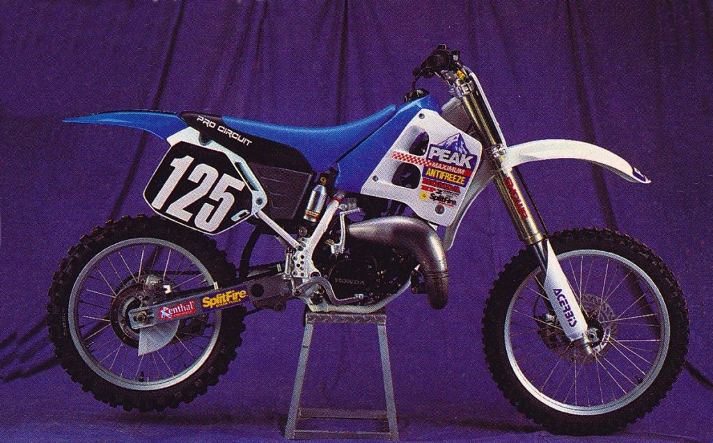
1991 Peak Pro Circuit Honda CR125R of Jeremy McGrath Photo Credit: Dirt Rider
Blaze: The first of Pro Circuit’s race team bikes is probably still my favorite of all their machines. In ’91, I so wanted to do this look for my CR; that is until I found out they actually had to paint these tanks before every race. The availability of aftermarket plastic was not as widespread back then and building a replica was a major undertaking at times. One-off parts aside, this bike still looks badass and really holds up in the looks department. Clean-looking and far more understated than later PC machines, Jeremy’s ‘91 Peak CR125R is classy and a real classic.
Matthes: As Blaze said this is a classic look and you know how I know that? Because, in the world of vintage bikes, people are still trying to get this look for their Hondas. I know in ’91, I thought about doing it to my bike! This blew everyone away when Payton debuted this look at Orlando SX 1991 and then well, the team blew everyone away all SX season. Replicating the tank was an issue for sure. I think by outdoors the team was just running stickers over stock tanks.
Mrs B: Clean, modern colors. Nice shade of blue. I really like how the Pro Circuit logo on black breaks up the blue. I like the font they used on the number plate. It is large and easy to read. Not so fond of the graphics on the radiator shroud though.
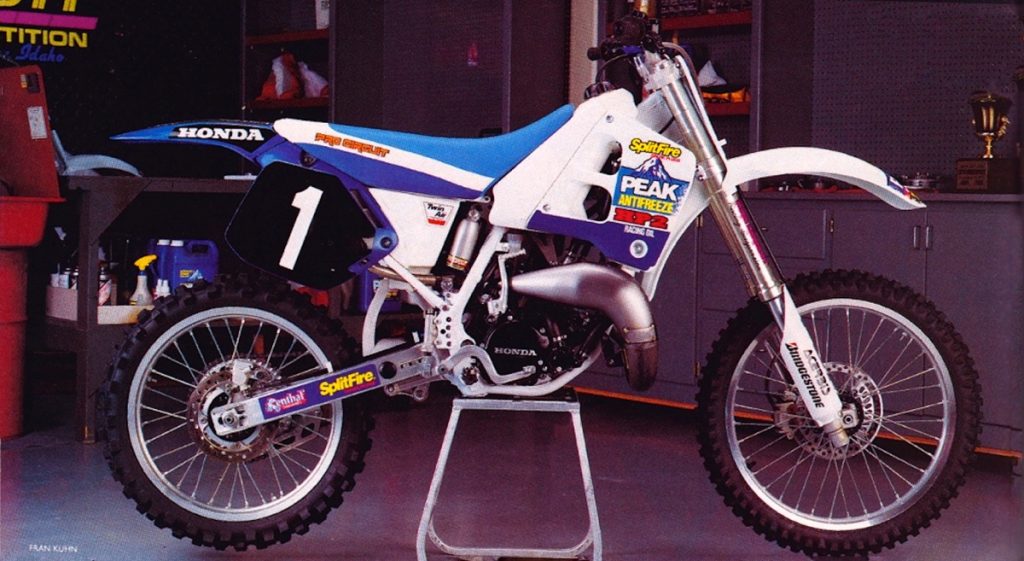
1992 Peak Pro Circuit Honda CR125R of Jeremy McGrath Photo Credit: Motocross Action
Blaze: I imagine I am going to be in the minority on this, but I never really cared for the look of the ’92 Peak Hondas. The white tank is less interesting to me and the new seat and graphics combo just don’t hold a candle to the lovely ’91. Still it was a great year for MC and the team, but the bikes were not as much to my liking as the year before.
Matthes: You’re drunk and/or high Blaze. This was a sweet look. There are CR250 (much different look than the 125) kits floating around that are from when MC did 250s at some rounds this year. I think this is better than the ’91 look, or at least the same, right? I was staying in SoCal for a couple of months in the winter of ’92 and somehow I went riding with Gary Semics and with a guy that borrowed one of MC’s practice bikes and it looked just like this. I remember drooling over it somewhere in the hills of Railroad Canyon.
Mrs B: Yuk. That seat. Reminds me of an airplane. Don’t like this one at all.
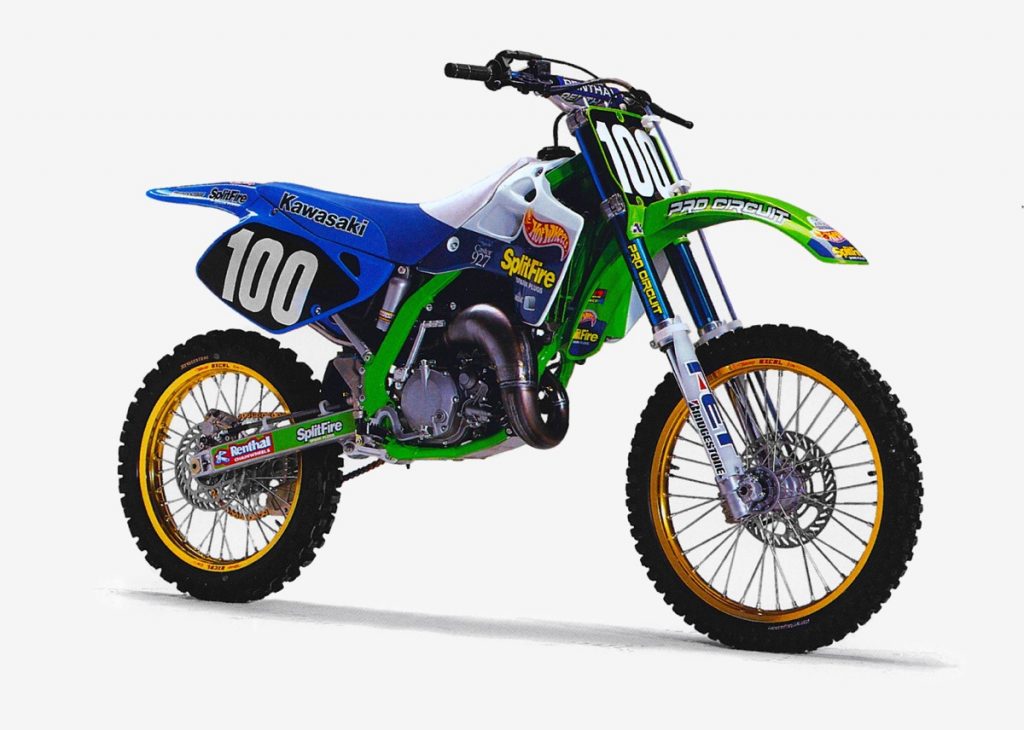
1993 Hot Wheels Splitfire Pro Circuit Kawasaki KX125 of James Dobb Photo Credit: Fran Kuhn
Blaze: At the end of ’92, Honda made the decision to move its 125 race team back in house and that left Pro Circuit looking for new manufacturer backing for 1993. Thankfully for Mitch and his team, Kawasaki was more than willing to snap up the team that had delivered three 125 Supercross titles in two years.
The switch to Kawasakis meant a new look and a new title sponsor for the team – Hot Wheels. Designed by Kenny Safford of AXO Sport, the revised graphics were a major departure from the Peak Hondas they replaced. At the time, the green, baby blue and gold combo struck me as slightly odd, but it really has grown on me over the years.
This switch was a tough one for Mitch and the whole team, as these KX125s were notoriously slower than the Hondas they had been using. As I remember, it took quite a while for the team to extract the same level of performance out of the Kawasakis that they had enjoyed on the CRs. Still, it was good enough to get Jimmy Gaddis the ’93 West Coast Supercross title and take Jamie Dobb to the win at Unadilla that year. Overall, a good-looking bike and a great example of early-nineties style.
Matthes: Ugly bikes for sure and Stafford does his best here to make them a tad better. They should’ve made the frames white or blue, there is too much going on here. Gold, green, blue, white with some orange and yellow? No thanks. Don’t forget the blue forks. Ugh. The Oral History story of Gaddis winning this title was interesting though, in that the bikes were bad…like, really bad. Also, how Payton pulled the Hot Wheels sponsorship is epic. Check out the moto history tab up top on the site to read it.
Mrs B: I like this color scheme. The colors are bright and primary. I would like to see the number plate in a reverse, black number on white.
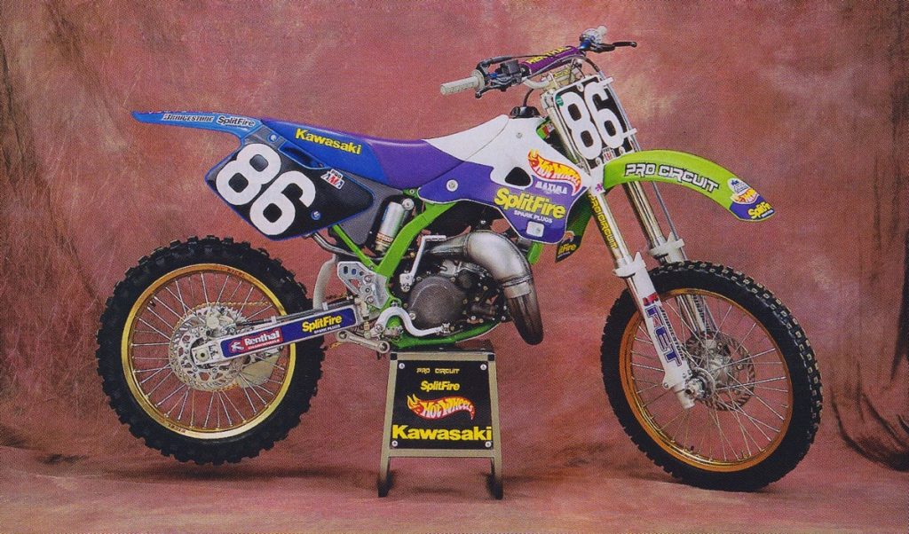
1994 Hot Wheels Splitfire Pro Circuit Kawasaki KX125 of Pedro Gonzalez
Blaze: In 1994, Pro Circuit got a much-improved new KX125 to work with and an influx of new talent from the Factory team. After a couple of injury-plagued years under the Kawasaki tent, Ryan Hughes was moved over to Pro Circuit and brought with him several wins indoors and out, but no titles. Pedro Gonzalez also took the team to victory at San Jose, a victory that still stands as Mexico’s only AMA win.
On the looks front, I really like the ’94 Splitfire bikes and prefer the new bodywork to the ’93 design. I was not a huge fan of all the purple, but this was the mid-nineties and purple was literally everywhere. Overall, I would rate this one above the ’92 and ‘93 look, but below the ’91 design.
Matthes: It’s better than ’93, but still has too much going on in my opinion. To rank this above the ’92 makes me want to call the cops on you Blaze. At least the ’94 Kawi’s did look better than ‘93s,
Mrs B: Is that purple I see? I like it. Did they change the number plate and tail? I don’t really like it. The tail seems long and there doesn’t seem to be enough room for the numbers.
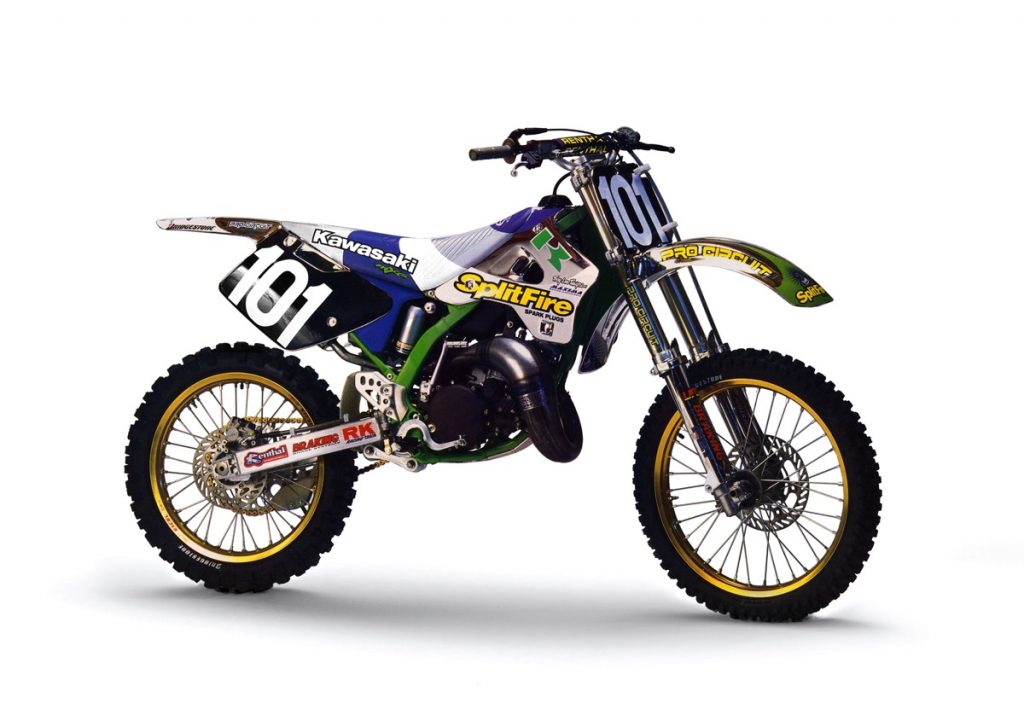 1995 Splitfire Pro Circuit Kawasaki KX125 of Mickaël Pichon Photo Credit: Motocross Action
Blaze: When Mitch came out with this chrome look in 1995, it really blew people’s wigs back. At the time, this was literally unlike anything else ever seen on the track (unless of course, you counted bikes from the fifties and sixties when they had REAL chromed metal fenders). Unfortunately, like the ’91 painted tanks, these special chromed plastics were costly to produce and not very durable, so the majority of the time the team ran their traditional white and blue in its place.
Matthes: PC incorporated the airbox into the colorway and that was an improvement for this year and of course, the chrome was bitching, but not feasible to do week-to-week. Pichon killed it this year in SX tho. RIP Hot Wheels sponsorship.
Mrs B: This bike looks confused, like the parts are from different bikes. Not my cup of tea, although I do like the SplitFire sticker.
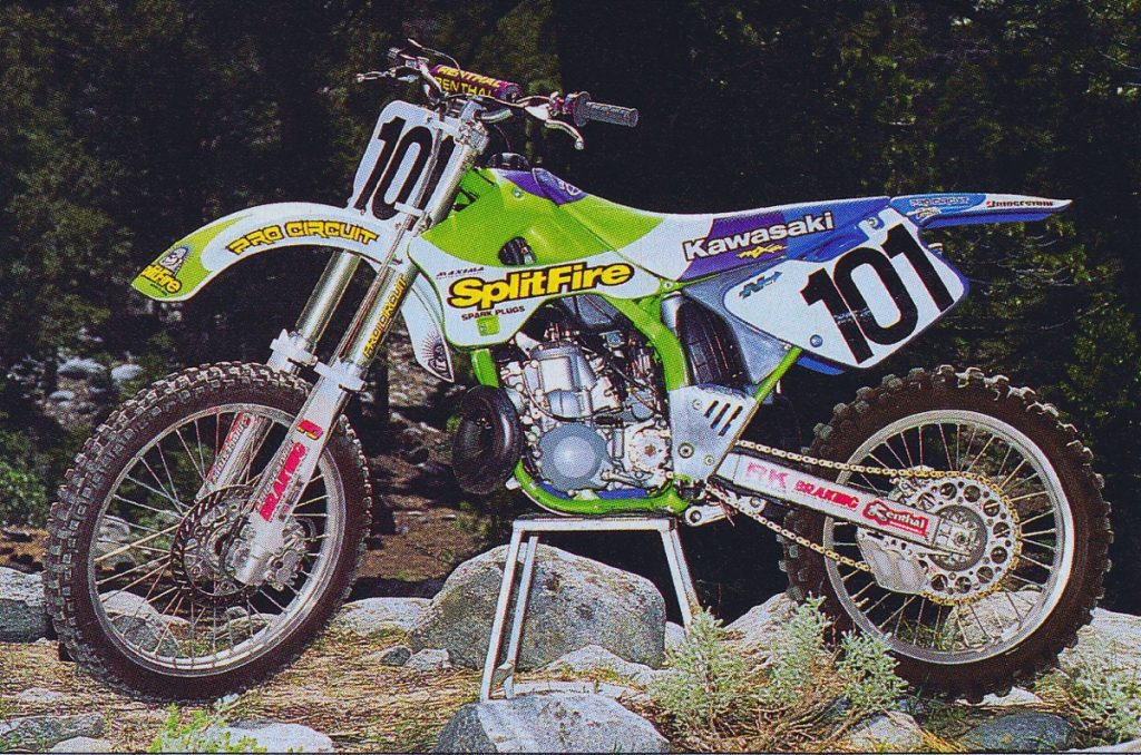
1995 Splitfire Pro Circuit Kawasaki KX250 of Mickaël Pichon Photo Credit: Motocross Action
Blaze: Here is the more mundane version of the 1995 PC bike. For me, the chrome version rates a ten on the coolness scale, but the standard bike is still a damn fine-looking motorcycle.
Matthes: The OEMs always like the teams to run the proper color of front fender so that has screwed up looks for teams since the beginning of time, but here they slap on a white front fender and it makes a whole lot of difference. We were still a year away from the day-glo green that shocked the pits.
Mrs B: Finally, something exciting! I love these colors. They are bright and vibrant. Definitely a “look at me” color combination. I do have to point out that the number font is boring.
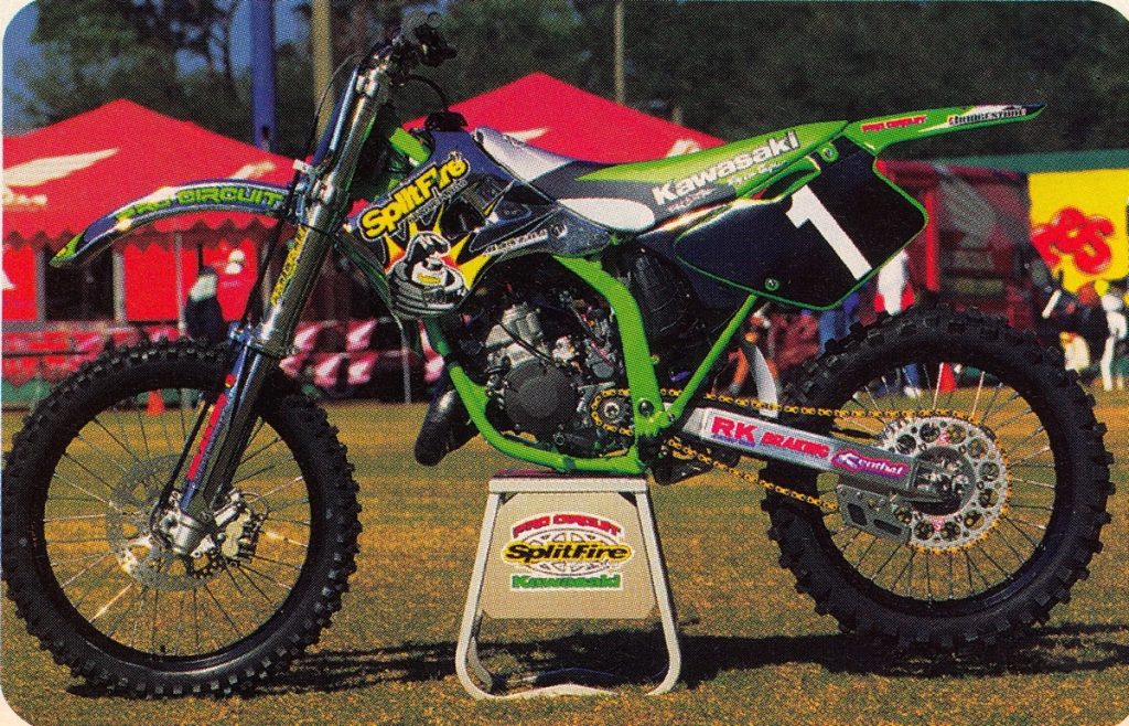
1996 Splitfire Pro Circuit Kawasaki KX125 of Mickaël Pichon Photo Credit: N-Style
Blaze: In 1996, the PC team once again ran some cool chrome plastic at select Supercross events. In the outdoors, it was back to plain green for the front fender and shrouds. Personally, I really liked the looks of the ’96 Splitfire graphics, but I have never been a fan of black rims and I preferred the blue seat and plastic of 1995.
Matthes: Good looking bike, I don’t know what Blaze is talking about, but then again, he wore orange AXO stuff on a red Honda back in the day. They moved the “Splitfire” to the top of the shrouds for better visibility and I get that, but it would still look good on the bottom of the shroud like last years bike. The giant bottom of the spark plug graphic first appeared this year and we’ve never been the same since.
Mrs B: Hmmm, big color shift. Darker, more substantial. Tires are very grrrrrr. Kinda monstrous. I really like the design on the seat.
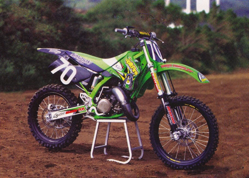
1997 Splitfire Pro Circuit Kawasaki KX125 of Ricky Carmichael Photo Credit: Motocross Action
Blaze: I know I going to be out on an island on this one, but I have never really liked the looks of the 1997 Splitfire bikes. Personally, I hate black on dirt bikes and this was the first year they really went all-in on the black look. The whole back of the bike is plain looking and seems like an afterthought. The seat cover too is not really one of my favorites. I know Ricky hauled ass on this thing, but this was by far my least favorite PC bike up to this point.
Matthes: Good look, maybe because RC just killed everyone on it, but I thought it was one of the better ones they’ve had. Clearly Blaze and I wouldn’t get along if we were married and trying to decorate a house. I was back east at Chad Watts’ house during the nationals this summer and he had so much used plastic there off RC’s bike and would not have cared if I took a number plate or three. Why didn’t I? Maybe, because I lived in a box van. Regrets…
Mrs B: Still on the darkside, but I don’t think as well done as the previous year. Looks like it got a dark dip for the fun of it.
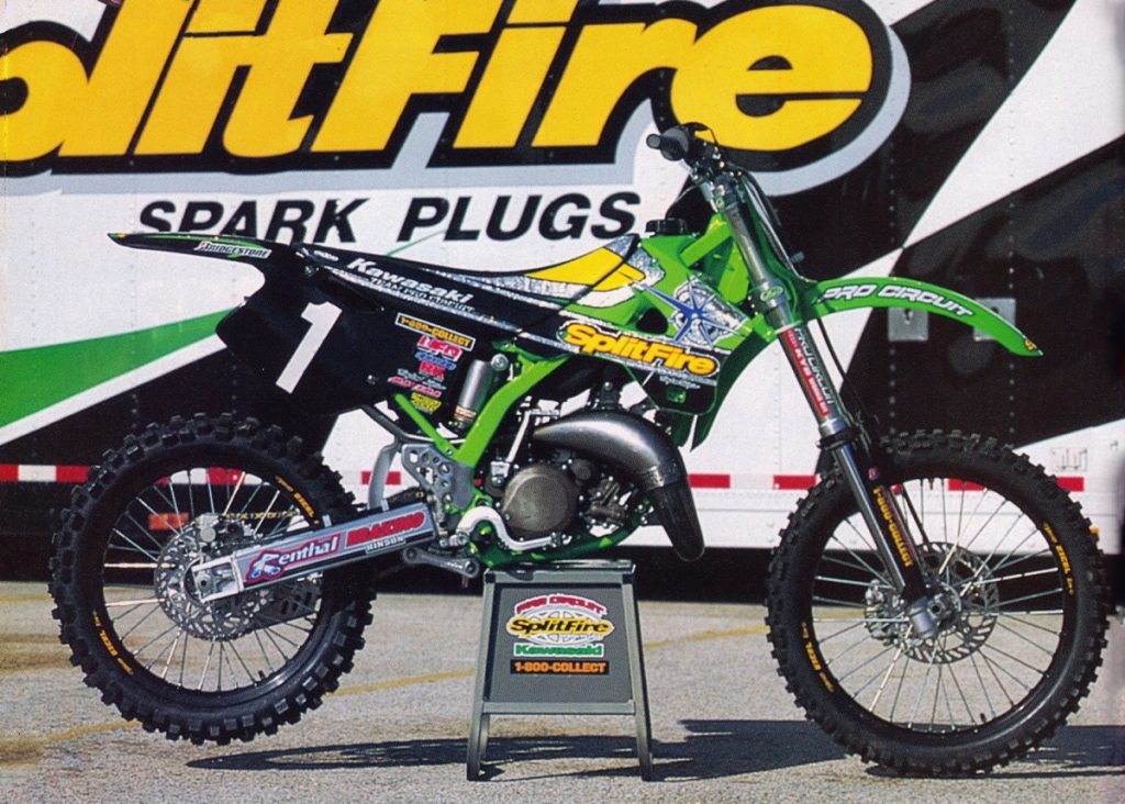
1998 Splitfire Pro Circuit Kawasaki KX125 of Ricky Carmichael Photo Credit: N-Style
Blaze: For 1998 they kept the black theme going, but added a splash of metal-flake to brighten things up. Still not my favorite design, but better than the ultra-plain ’97.
Matthes: Moto XXX paints its bikes with metal-flake in ’97 for a race and the next year Payton adds some to his graphics? Hmmmmmm… Splitfire is back down on the shrouds and it looks good right? Also, when bikes have the #1 on them, they are way cooler.
Mrs B: I’m torn. It looks a bit insect-like to me.
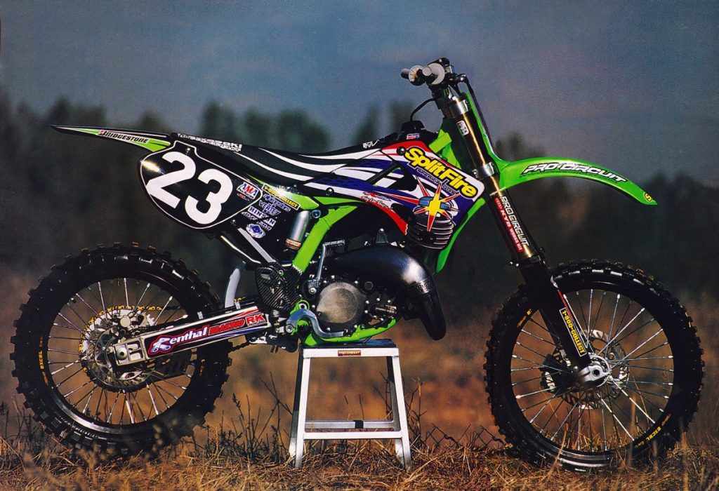
1999 Splitfire Pro Circuit Kawasaki KX125 of Nick Wey Photo Credit: Motocross Journal
Blaze: In 1999, the Pro Circuit team got an all-new KX125 to play with and came out with one of my all-time favorite PC looks. Unlike previous designs, this one did a good job breaking up all the black with splashes of white, blue and green. I love all the color in the Splitfire design and this bike feels like the utter antithesis of the dystopian Monster Energy future we find ourselves in now. #BringBackTheColorPC
Matthes: NO NO NO NO NO Blaze. I like the symmetry with the stripes on the seat and shrouds (god bless the PC mechanics for having to make this line up every week with the staple gun by the way), but no thanks on the red and blue with green.
Mrs B: Oh my. What happened? I like the idea of the stripes, but really not a fan of the added red.
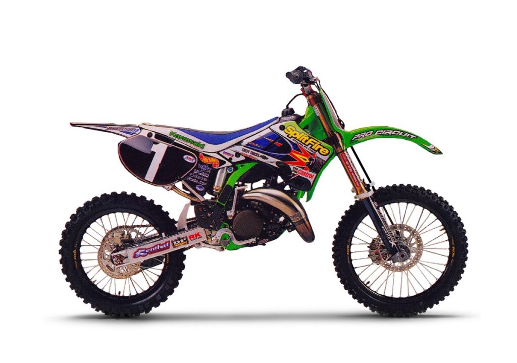
2000 Splitfire Pro Circuit Kawasaki KX125 of Nathan Ramsey Photo Credit: Motocross Action
Blaze: Another classic design, the 2000 PC bikes are the last one to use Splitfire as a title sponsor for the team. Personally, I always thought that Splitfire plugs were a gimmick anyway, so the only real loss was the cool logo. Looks-wise, this ranks below the ’99 for me based on its slightly busier feel. The blue in the seat and overall layout just never appealed to me as much as the year before. Still great, but not in my top three.
Matthes: The spark plug graphic there is shooting off the shroud, maybe a bit of foreshadowing to them pulling out of the team. I like this better than the previous years for sure.
Mrs B: Looks to me like they threw the crayon box at this one. No, not a fan.
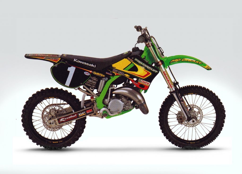
2001 Pro Circuit Kawasaki KX125 of Shae Bentley Photo Credit: Motocross Action
Blaze: I am not sure what happened in 2001, but Pro Circuit seemed to lose a bunch of their title sponsors. Hot Wheels was nowhere to be seen and Splitfire was depreciated to a tiny sticker on the airbox (that you would never see if a rider was actually on the bike). The overall bike was once again black heavy, but all the red and yellow did a great job of brightening things up. Overall, a good-looking bike.
Matthes: This was Mike Brown’s 2001 title year and because I was at KTM that year, I have to hate this look. But seriously, yellow? Where did that come from?
Mrs B: And it got worse. Yikes.
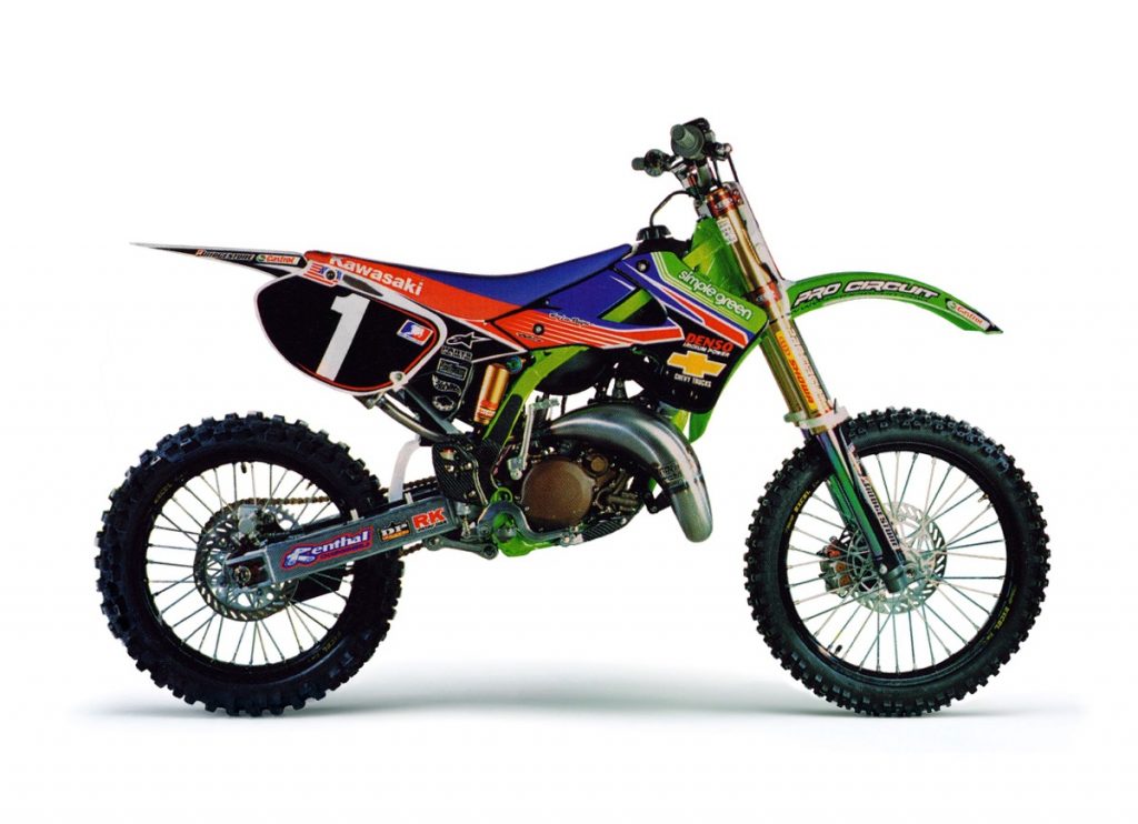
2002 Simple Green Pro Circuit Kawasaki KX125 of Mike Brown Photo Credit: Motocross Action
Blaze: Now this really was a major departure after five years of going black hat. The bright colors and white plastic certainly give the 2002 PC bikes a unique look that feels very different than the previous few years. I don’t know if I actually liked it better, but at least it was a fresh look for the team.
Matthes: No thanks; red and green on a bike just don’t go together. But to be honest, I also hated the look of all the Kawi’s this year, with that frame bar showing through the shroud. Looked goofy to me.
Mrs B: Wow. Did they smoosh it? It looks really squatty. And definitely not a fan of this color scheme. I think the red/orange and blue or the red/orange and green would be a better combo.
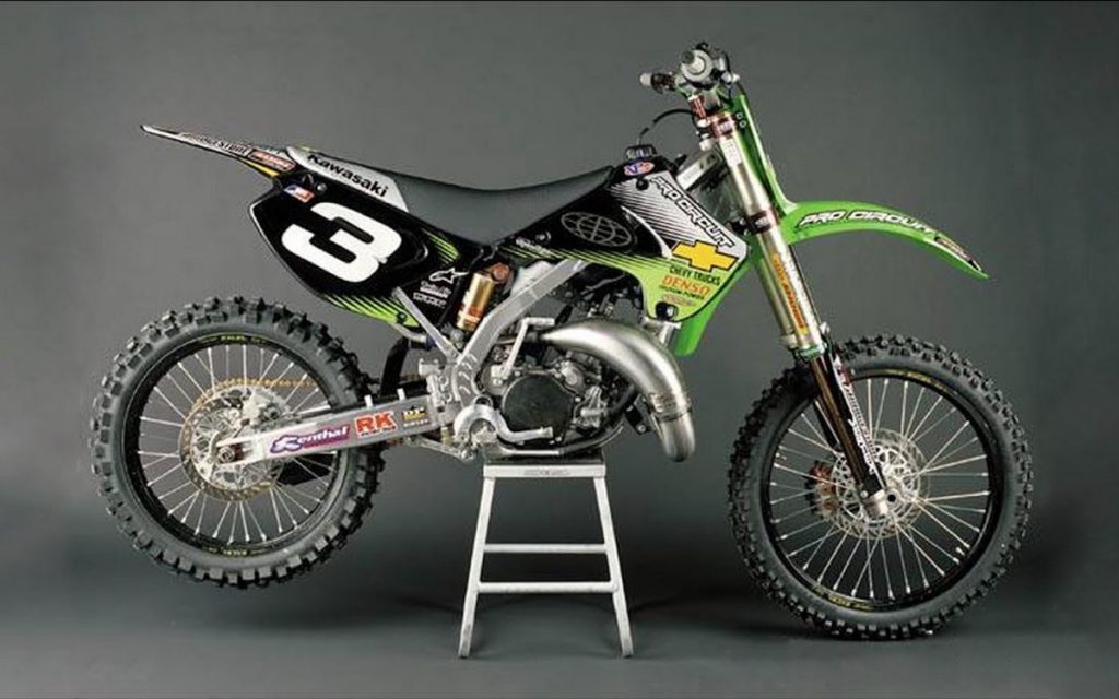
2003 Pro Circuit Kawasaki KX125 of Mike Brown Photo Credit: Pro Circuit
Blaze: Here is another one that I know I am way in the minority on. These 2003/2004 PC bikes are by far my least favorite of all their designs. As I said earlier, I pretty much hate black bodywork and this year’s bike seemed to double-down on the Oakland/Los Angeles/Las Vegas Raiders look. That silver and black is just dour and depressing to me and not even my beloved Chevy Trucks logo is enough to bring it up in my eyes.
Matthes: This was the look all year? I don’t remember this at all. Yeah, basic for sure.
Mrs B: I like this color scheme. Clean, sharp, not bad at all.
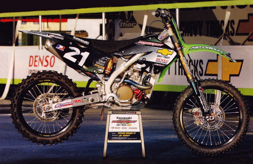
2004 Pro Circuit Kawasaki KX250F of Stephane Roncada Photo Credit: Dirt Rider
Blaze: Basically, a warmed-over version of the 2003 look, the 2004 PC bikes were only a tiny bit better due to the added bling of the PC accessories required on the new 250F four-stroke. Without that, the ’04 bikes were just another year of silver and blah…
Matthes: Boy, Payton sure loved himself some black rims huh? Gotta run that green front fender though! The bike would be way better looking without it.
Mrs B: Don’t like this one as much. And what is that bronze thing sticking out behind the number plate?
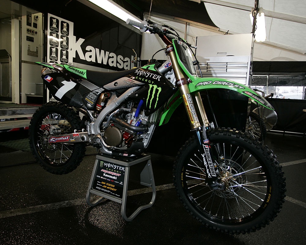
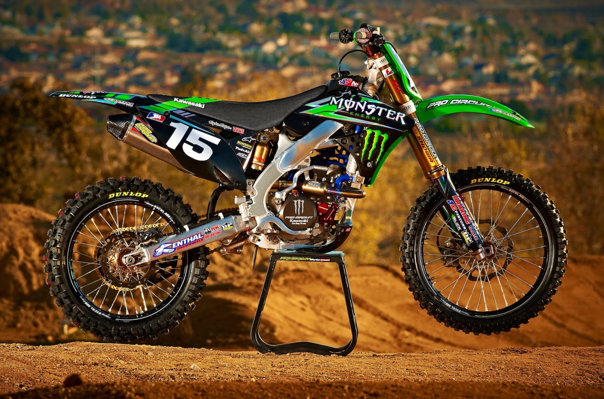
2005 Monster Pro Circuit Kawasaki KX250F of Ivan Tedesco Photo Credit: Transworld Motocross
Blaze: Here we have the start of the Monster Energy era. In hindsight, this seems like it was destined to be with Mitch’s apparent infatuation with green and black. Still, the claw on the shroud and the little bit of green on the seat and fender perk up the looks over ’04.
Mrs B: I love this design but hate that shade of green. Reminds me of John Deere tractors.
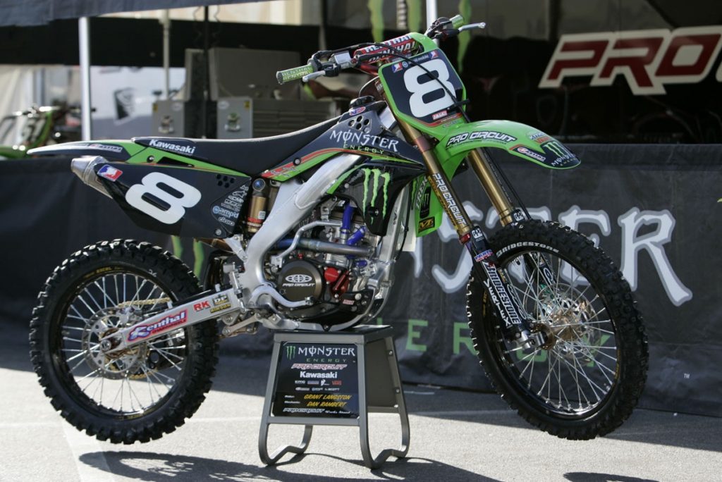
2006 Pro Circuit Kawasaki KX250F of Grant Langston Photo Credit: Transworld Motocross
Blaze: In 2006, Kawasaki retired the lackluster first-gen Kawazuki thumpers and introduced an all-new and much-improved KX250F. Personally, I really liked the looks of the stock bikes this year and the PC bikes were pretty good-looking as well. The small red accents in the graphics really helped set off the anodized parts and the new bodywork was way better looking than the slightly fugly ’04-’05 machine.
Matthes: Ok Blaze, I’m checking out here. I can’t tell the difference from year-to-year. First year with the aluminum frame and Angus Young would love this and many other years of PC bikes #BackinBlack
Mrs B: Hmmm, I like this. Not much plastic, makes the bike look lean, slim. Kinda nice to see all of the inner workings.
Blaze: Matthes, Matthes, Matthes, I know these damn Monster bikes all look alike, but sometimes you have to put your balls on the crossbar (sorry Mrs. B, metaphorically speaking) and power through. Oh well, the Bassets probably needed walking, so I guess I will let you slide. Mrs. B, it looks like it is just you and I from here on out.
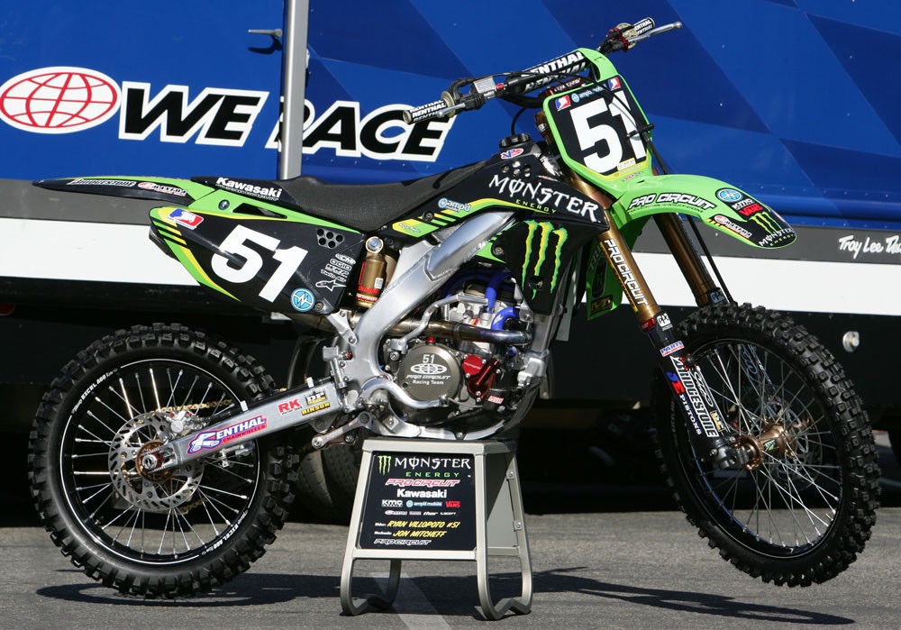
2007 Monster Pro Circuit Kawasaki KX250F of Ryan Villopoto Photo Credit: GuyB
Blaze: Remember that red I liked in 2006? Well, forget about that for 2007. Pro Circuit has RV and that is enough red for any team! Overall, this KX250F was decent looking, but not particularly interesting in any way. The graphics are basically a Monster can wrapped around a motorcycle and pretty much an energy drink snooze fest.
Mrs B: This is ok. I like last years better.
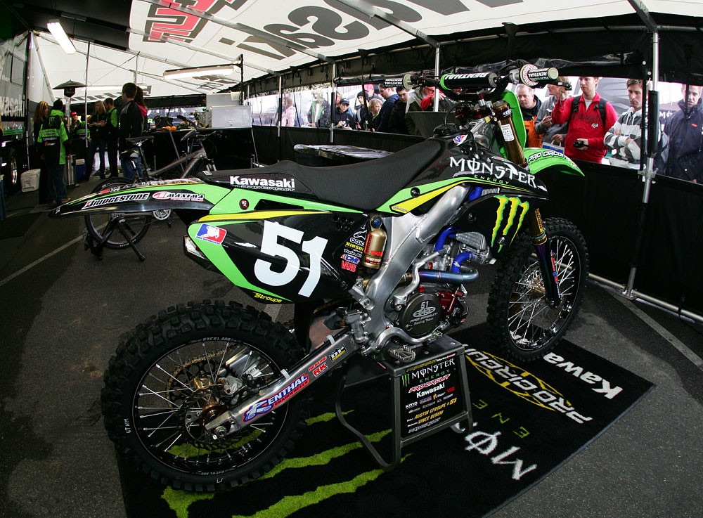
2008 Monster Pro Circuit Kawasaki of Austin Stroupe Photo Credit: GuyB
Blaze: Look, a new shade of green stripes for 2008! All these early Monster PC bikes are so similar that they run together in my mind. One year they add a stripe, the next they add a few hash marks. Zzzzzzzz…
Mrs B: Nice, day-glow green. I like the graphics, a bit animalistic.
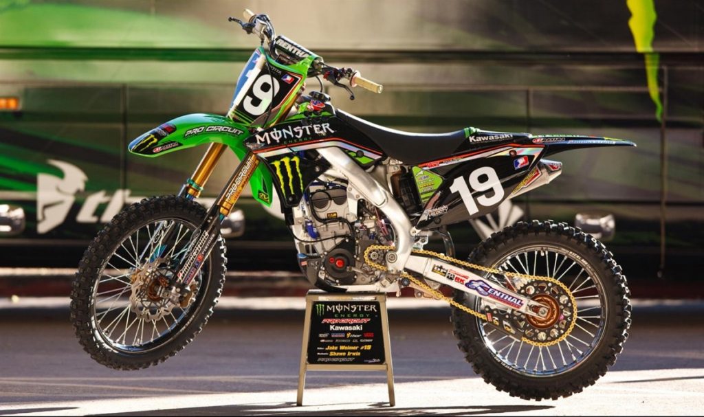
2009 Monster Pro Circuit Kawasaki KX250F of Jake Weimer Photo Credit: Simon Cudby
Blaze: Finally, a little pizazz! The 2009 bikes were still that damn green and black, but at least N-Style saw fit to perk things up with a little color. The red stripe and reflective strip running down the shrouds and side plates made these the best-looking of the claw bikes so far IMO.
Mrs B: Now this is different. I like the design a lot, just not sure about the red.
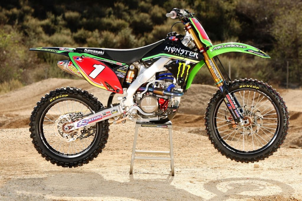 2010 Monster Pro Circuit Kawasaki KX250F of Christophe Pourcel Photo Credit: Transworld Motocross
Blaze: First off, that red plate always sets off any bike and that big number one sure doesn’t hurt. That said, however, I still like the 2009 version a lot better. I never really liked the shape of the side plates on this generation KXF and the green stripe bordering them highlights their slightly odd teardrop shape. I also prefer the mirrored graphics of ’09 to the fading green-to-yellow treatment of 2010.
Mrs B: Ouch. These colors hurt my eyes. Feels a little like Christmas.
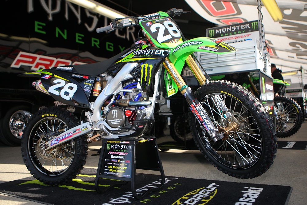
2011 Monster Pro Circuit Kawasaki KX250F of Tyla Rattray Photo Credit: GuyB
Blaze: Pretty much more of the same for 2011, but I do like the fact that they dropped the goofy plate border and added a zoomy sort of lightning bolt to the shroud graphics. More visually interesting than a plain pinstripe, these little slashes connote a sense of speed and power when standing still. Still too damn much black for my taste, but better than 2010.
Mrs B: Much better. Good color, clean design.
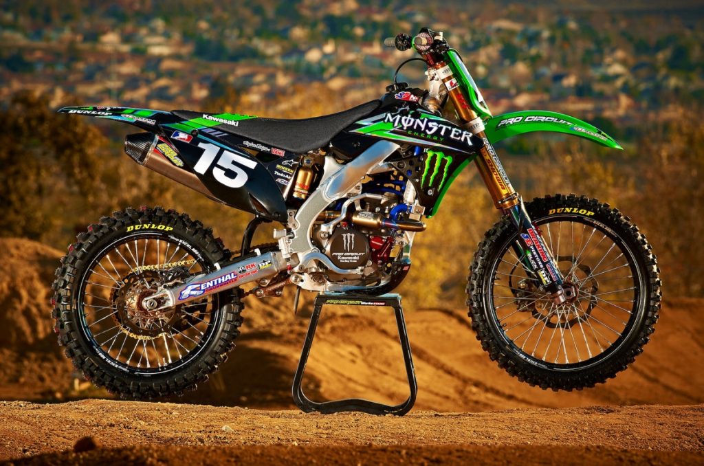
2012 Monster Energy Pro Circuit Kawasaki KX250F of Dean Wilson Photo Credit: Pro Circuit Kawasaki
Blaze: Basically, a re-tread of 2011 with a green stripe on the seat, it is pretty clear that N-Style was running out of ideas at this point. I do like this slightly better than the year before due to the increase of mirroring in the graphics, but it is a subtle improvement at best. Doesn’t Monster come in any other colors than green and black?
Mrs B: What is that big silver wrench running from the tire to the gas tank?
Blaze: Wrench? Huh…I think that is the frame you’re talking about?
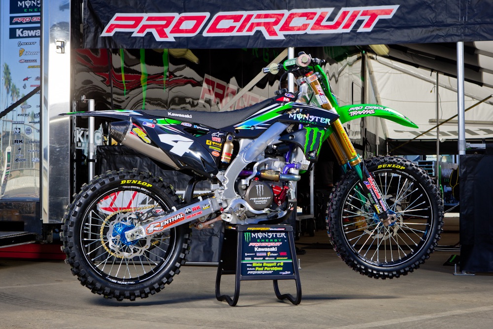
2013 Monster Pro Circuit Kawasaki KX250F of Blake Baggett Photo Credit: Transworld Motocross
Blaze: Not a major departure for 2013, but I did like the nice green-to-blue fade in the “new” graphics. The switch to blue anodizing for the hubs was also a welcome change that added a much-needed splash of color. That big number 4 doesn’t hurt either.
Mrs B: For the most part, I like this. I’m loving the blue, but I think I would like a different color for the forks.
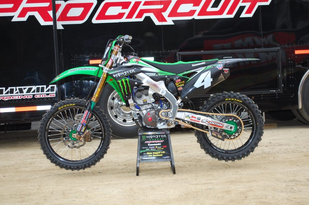
2014 Monster Pro Circuit Kawasaki KX250F of Blake Baggett Photo Credit: Transworld Motocross
Blaze: OK, now we finally starting to get somewhere. The plastic was still mostly that damn black, but at least they actually allowed a bit of green on the seat and a lot more green in the graphics. The hubs were also green for 2014, so things were finally moving the right direction.
Mrs B: This is a very balanced look. Not too much green, not too much black. Really nice.
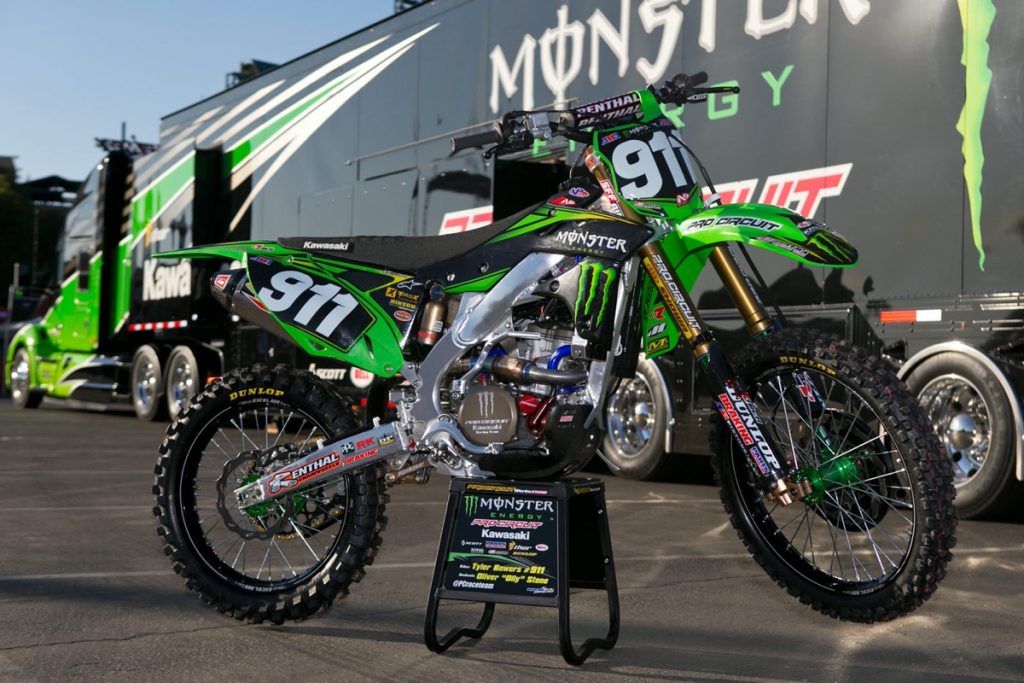
2015 Monster Pro Circuit Kawasaki KX250F of Tyler Bowers Photo Credit: GuyB
Blaze: Hallelujah! After 19 long years, a Pro Circuit bike finally had a green rear fender on it again. With the green plates and fenders, this thing looks soooo much brighter and more colorful. I LOVED this change and I give it a major thumbs-up.
Mrs B: I don’t know if this is a new green or just the photo, but I love it. My only question is what happened to the rear number plate? It looks like it caved in.
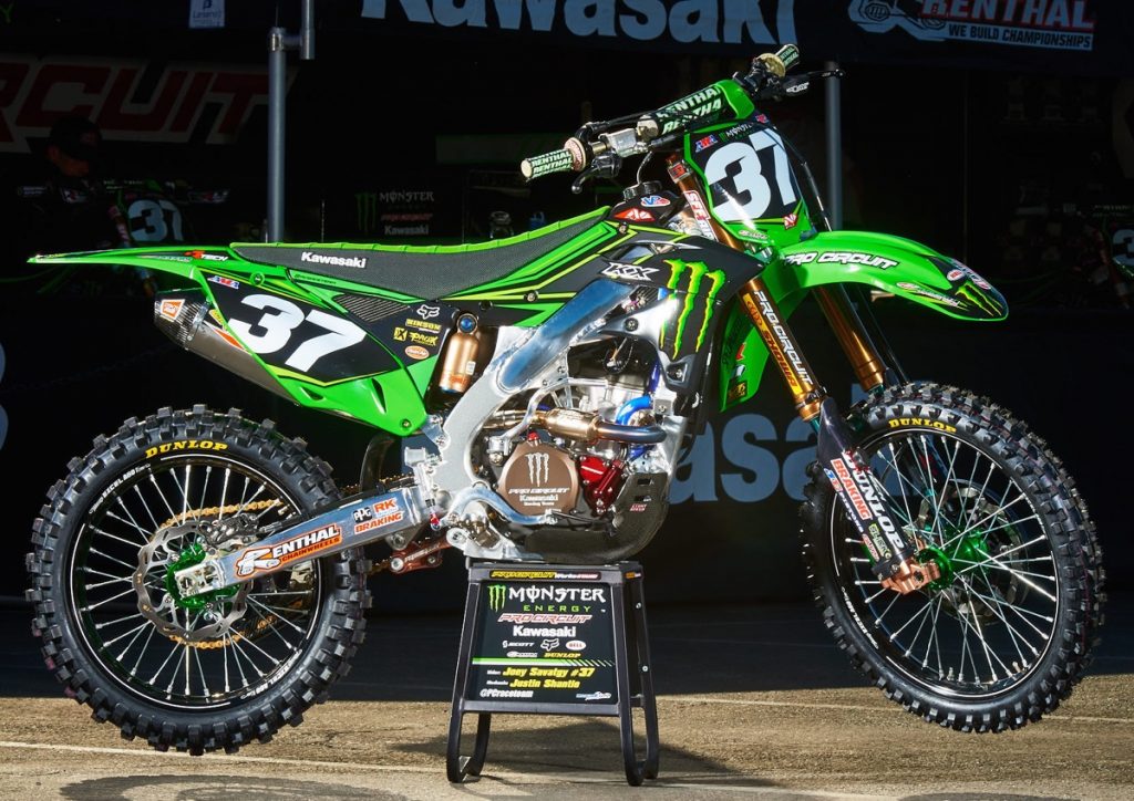
2016 Monster Pro Circuit Kawasaki KX250F of Joey Savatgy Photo Credit: mcnews.com.au
Blaze: Here is by far my favorite of the Monster Energy Kawasakis. Tons of green with black used only as an accent really make this thing pop.
Mrs B: My eyes are starting to glaze. This looks pretty similar to last years, and the year before, and the year before…
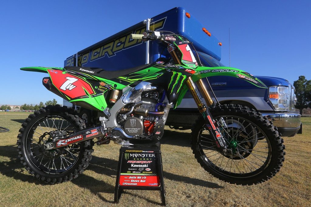
2017 Monster Pro Circuit Kawasaki KX250F of Justin Hill
Blaze: Similar to 2016, I love that they kept the green plastic, but I do prefer the previous year’s graphics. The switch back to an all-black saddle also feels a bit like a move back to the dark side.
Mrs B: And more green and black. Still not a fan of the red.
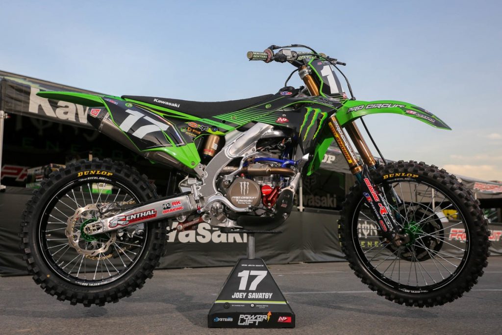
2018 Pro Circuit Kawasaki KX250F of Joey Savatgy Photo Credit: GuyB
Blaze: Again, I love the green plastic, but don’t like the graphics and black seat as much as 2016. Good looking, yes, but not the best of the N-Style machines IMO.
Mrs B: And again more green and black. I do like the stripes in the design.
For your daily dose of old-school moto goodness, make sure to follow me on Twitter and Instagram -@TonyBlazier
For questions or comments, feel free to drop me a line anytime at TheMotocrossVault@Gmail.com

