Myself and Blazier get together to put together this gruesome list.
Myself and Blazier get together to put together this gruesome list.
The Ugliest Bikes Ever
By Tony Blazier and Steve Matthes
Since Matthes and I took a look back at the best looking bikes in history, I thought it only fitting that we pull back the curtain on the dark underbelly of Moto – the truly hideous train wrecks that have been proffered on the buying public over the last forty years. These abominations are the bikes that live on in infamy, seared into the retinas of Moto fans everywhere. They range from the crude and cobby to the flamboyant and comical. Some of them were good bikes wrapped in ridiculous attire, while others were ugly to the bone.
Here are our picks for the 10 homeliest machines ever to soil a motocross track.
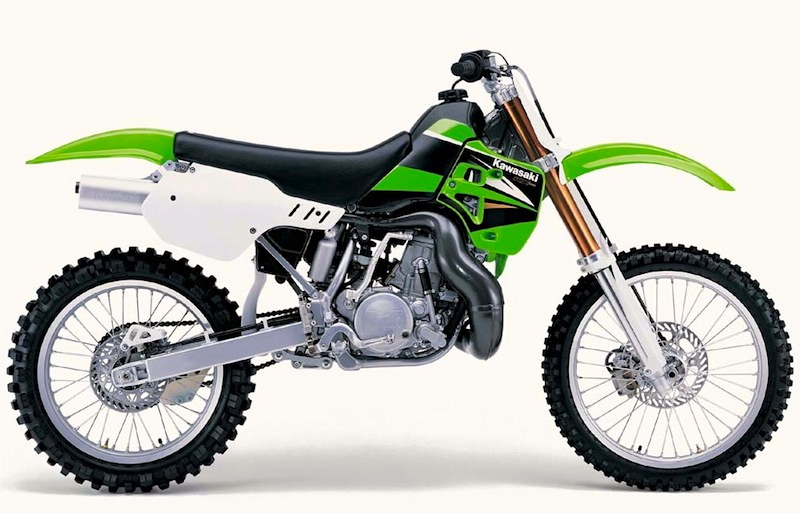
#10 The 2004 Kawasaki KX500
 |
|
The Jolly Green Giant of motocross, the KX500 started out as a slightly pudgy, but lovable pussycat of an Open bike. Sixteen years and ZERO development later, it went out as a homely desert sled. I’m sure the Metal Mulisha crowd appreciated the KX’s Darth Vader aesthetics, but to me it ruined its already marginal appearance. |
Blazier- Ok, I kind of feel bad putting this bike on the list. It is kind of like making fun of Emmit Smith after he went to the Cardinals. He was a once the greatest back in football, but eventually age caught up with him and the game passed him by. Similarly, the mighty KX500 was once the baddest machine in the land. In 1988 Kawasaki introduced an all-new KX500 and for the first time, put up a real challenge to the omnipotent CR500R for Open class supremacy. The new KX was a little porky (as were most 500’s at the time), but both smoother and faster than the CR. It was an awesome package that would take Kawasaki to four of the next six 500 National Motocross titles.
The only problem with this story is that Kawasaki would not see fit to update the KX500 (aside from suspension tweaks and BNG) for the next SIXTEEN years! In ’88 the KX was no great looker, with its bulbous tank and gigantic snow shovel for a rear fender. Unfortunately, those looks did not improve with age. Things really started getting weird in 1996 when Kawasaki got a wild hair and decided to make their KX line purple. While this did not look too horrible on the 125 and 250, on the 500 it looked totally ridiculous. Things only got worse from there. Every time Kawasaki would update their lineup, the little bikes would get new bodywork and flashy graphics, while the 500 would get the lipstick on a pig treatment. By the time 2004 rolled around, the once mighty KX500 looked like a refugee from a Metal Mulisha convention. I have never been a fan of a lot of black on a motorcycle and on this bike in particular it just looks horrible. The black seat looks like something the owner ordered from a J.C Whitney catalog, and the white side panels appear to be an afterthought that matches nothing else on the bike. The whole Black Bart motif really highlights the age and clunky look of the geriatric KX’s Regan era bodywork. Much like the once lovely Meg Ryan, I think this aging star may have had one to many facelifts toward the end.
Matthes- I couldn’t agree more with Blaze’s assessment of this bike, at one time they did look pretty decent but by the early 90’s, Honda’s were clearly the better looking machine. It’s funny because I really don’t even remember this bike ever being produced and I definitely never saw one anywhere. Strangely though, in talking to Honda racers like Stanton, Bayle and even Kawasaki’s own Jeff Ward, the factory Kawi’s were always though of as better bikes. They handled really good. I’m sure the sales didn’t justify making major changes to the 500 but c’mon Kawi, a new tank and shroud combo would have done this thing wonders. Why even bother insulting the consumers with trying to keep it looking like the new 125 and 250? I say just run the ’88 or ’89 graphics on it the whole time and just put “The KX 500- Yeah it’s the same bike as always but there’s still none better” and just embrace your frugality! Well, keep the factory-ish gold forks because those do look pretty sweet.
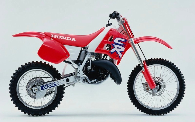
#9 The 1992 Honda CR125R
 |
|
This may be my most controversial pic. I know a lot of people like the looks of these CR’s, but I can stand them. The fruity pinkish red plastic, combined with the white airbox and awful graphics make this one ugly machine. If it had come with plate backgrounds to break up all that funky color, or a decent set of graphics, it might have dodged the list, but it didn’t, so here it is. |
Blazier- I’m sure this one will get me a lot of hate mail, but I’m sorry, this is one fugly motorcycle. Ironically, I loved this same basic bodywork on the 1990 CR250R, but on this pink and white monstrosity it just looks terrible. In truth, the basic shape of the motorcycle is not particularly objectionable. It is the horrendous graphics and garish color scheme that plants this baby on the list. I am on the record as being a huge fan of the “Honda Red” (read orange) color used on the ’90-’91 CR’s. I thought that particular shade always looked great. This weird, ’92 exclusive neon pinkish red, on the other hand, needs to buried in Davey Jones’ locker.
When I first saw pictures of Honda’s new ’92 CR’s, I literally could not believe my eyes. Honda had been the absolute trendsetter throughout the 80’s in terms of classy, cutting-edge design. To think the same company that had turned out the gorgeous ’87 CR250R could produce this tasteless pile was just hard to swallow. For starters you have that awful color. In truth, pictures just do not do this weird color justice. Looking at the picture above you might be misled into thinking the ’92 CR was actually a very bright red. That is just not the case. In person, the color was a funky pinkish red that looked completely out of place on a racing motorcycle. Even worse, the color would start fading ten minutes after you bought the bike. If you left the bike in the sun for any length of time it became this weird translucent salmon color. Accenting the pink was a white airbox,(whoever came up with this idea never had to scrub boot scuffs off a bike) white tank, and white frame (again, assuring the bike would look beat 5 minutes into the first ride).
Now, I know some of you probably like pink (hey, I’m not one to judge, I had plenty of pink crap myself in ‘92) but please, can someone explain to me how a five year old got to design the logo for Honda’s new motocross flagship? I mean, come on! Look at that giant kindergarten CR on the radiator shroud. It looks like something from a Geico cave man commercial. Where is my Honda wing, for god’s sake!?! In place of the most iconic logo in motocross, we got an absurd and amateur looking design that was so bad it should have been a joke.
The ’92 CR125R is a rather unique machine. The funky color only lasted one year, as Honda injected more red back into the mix for ’93 and updated their tiddler to the new 250 bodywork that pulled off the color scheme much better. Much like the number ten bike on my list, this bodywork was never designed to work with this color combo. The result was a machine that looked like a half assed, aftermarket styling exercise. That, and its willful disregard for good taste, earns it the #9 spot on my list.
Matthes- Blaze is right, this choice is controversial. As much as two dorks making a list of their ugliest bikes could be I suppose. I had a ’92 CR 250 which looked different from this but still had that awesome pink-hue that Honda somehow though was awesome. Honda had the sweet orange-red for four years, then switched to a dark blood red for another couple before bringing back their orange-red color. That was all fine but it was so weird to me that all the OEM’s, in the exact same year, all decided to drop acid and redesign their bikes. What are the odds of that? None of these companies know what the others final look is going to be but yet in 1991, Yamaha went magenta-pink with seat and graphics, Kawasaki added blue (?!?_ forks, Honda went with this disastrous color and Suzuki, well we’ll get to what they did. There had to have been some kind if giant weed and LSD smoke bomb that went off and covered Japan. That’s about the only reason to explain why four seemingly normal companies went off the reservation all at once. This bike isn’t pretty but it doesn’t belong on this list. But hey, Blaze is the one who did this column, he gets to pick.
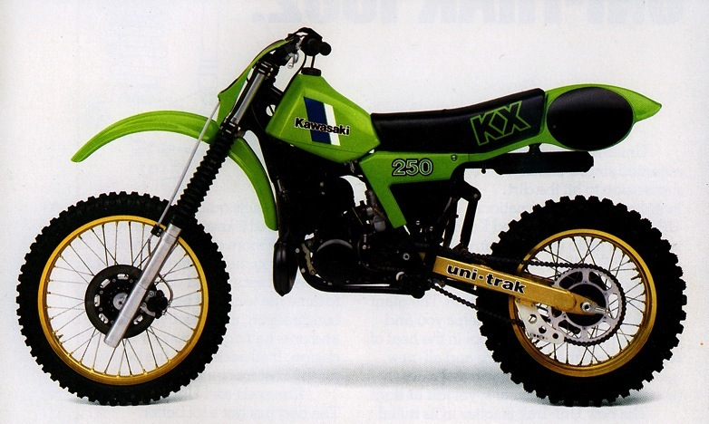
#8 1982 Kawasaki KX250
 |
|
For some odd reason, these early eighties Kawasaki’s make me think of Kermit the frog. Quite frankly, that stupid rear fender alone is enough earn it a spot on the list. As Kermit loved to say, it’s not easy being green. |
Blazier- To be perfectly honest, I hate all these early eighties KXs that used this rather unfortunate rear fender/number plate combo. I mean, who could ever have thought this was a good idea? It looks like you have a turtle strapped to the back of your bike for goodness sake. Not only does it look absolutely retarded, it also leaves some of the hottest parts of the motorcycle exposed so it can roast right through your cheesy early eighties nylon riding pants.
Personally, I’m not a huge fan of the shade of lime green used on these early eighties Kawasaki’s. In and of itself it does not look too bad, but when combined with a liberal dose of gold metal flake, it really looks awful. Normally I dig gold rims, but they just look terrible on these bikes. Even worse is the gold swingarm and Uni-Trak linkage that reminds me of a Smokey and the Bandit Fire-Chicken Trans Am. That big, long banana seat, funky bodywork and gag worthy color scheme makes the ’82 KX250 one of the ugliest motorcycles of its era and my pic for #8 on my walk of shame.
Matthes- Yep, this is one ugly machine. My buddy had one growing up, although I think his was an ’83, and I could never figure out the rear fender number plate thing either. Was there something wrong with the traditional spot? It certainly covered up you silencer and in this bikes case, it would also block that hideous Uni-Trak strut coming up from the swingarm. The guys at Kawasaki were clearly ahead of their time with the gold swingarm as that is now something that DMX would do to his quad if he wasn’t in jail. At least I think he’s in jail. And just to top this turd machine off, Kawi puts on a vented front number plate that, even though it’s from the side, you can just tell that it looks like poop. This bike also screams “Please rack your nuts on my tank.”
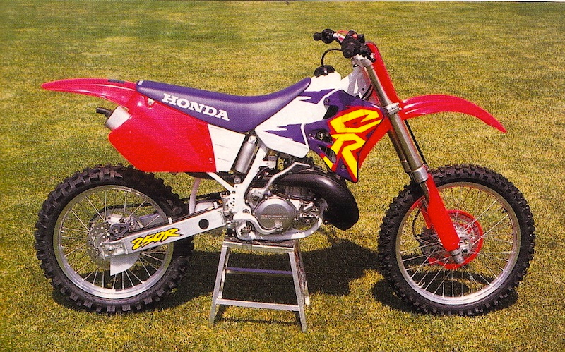
#7 1995 HONDA CR250R
 |
|
Attention, The Joker, your motorcycle has arrived. The two-wheeled equivalent of a clown car, the 1995 CR’s were so outlandish they almost seemed like a joke. At least the factory bikes looked good. |
Blazier- I would love to know how this incredible eye sore ever got green lit at conservative Honda Motor Corp. After the shock of the ’92 model, Honda toned things down a bit in ’93 and ’94. The CR retained its questionable white airbox and tank treatment, but the plastic was made less pink and the graphics were greatly improved. Things looked to be once again getting on the right track…then this acid trip was dropped on an unsuspecting public.
Compared to this thing, the ’92 model CR looks downright conservative. This bike looks like something dressed up for the Joker to ride in a Batman film. Its garish colors are a downright assault on the senses. Red, purple, yellow and white were never designed to live together on the same motorcycle. At least this was a really good motorcycle underneath all those Crayola colors. The Factory bike this year was one of Honda’s best looking ever, and all it took was a new coat of paint to affect the transformation.
My bet is someone in Japan ended up falling on a sword after this abomination.
Matthes- Just when we all thought it was safe to buy a new motorcycle and not throw up at the sight of it, Honda put this thing out in 1995 which was well past the time when we first saw our ugly wave of machines. The bike actually looked better without the tank stickers on it and that was good because they disappeared within two minutes of riding the bike. Perhaps nothing indicated the horror that this bike induced than the fact that the factory Honda bikes looked NOTHING like these. I suppose the race team knew what was up early on because the ’95 look of MC and Lamson was pretty strong. I’ve never liked it when the OEM’s didn’t put white backgrounds on the number plates and just let you fend for yourself. Yes, I know that not every one uses white but I have to think you have an 80% chance of getting it right if you went with some white backgrounds. If those were on this bike, it might actually have made it bearable. Also note to Honda, we were on to you back in this day. You were too cheap to give us a redesign from 1990 and so from ’90 to ’97 you just went with the same basic tank/shroud/seat/airbox combination but just put different colors on it to try and fool us.
#6 2010-2012 Yamaha YZ450F
 |
|
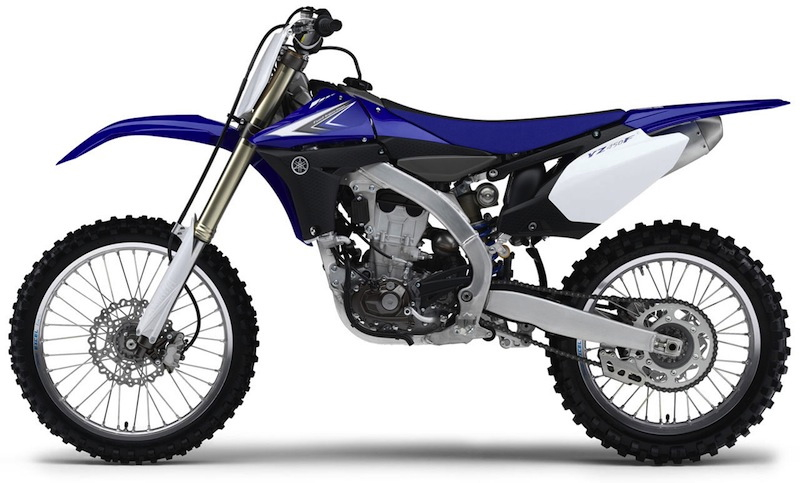
This bike is so goofy looking it almost looks like a Chinese knock off of a Japanese bike. I would love to know who thought copying a Cannondale was going to be a recipe for success. Maybe the most controversial bike in motocross history, the YZF is one of those love it or hate it designs. For the record, I fall in the latter category. |
Blazier- At this point, it almost feels like piling on to place this poor bike on my list, but place it I will. I’m not even going to debate the performance of this controversial machine. Instead, I’m going to limit my comments strictly to its aesthetic charms (or lack thereof). The real question is where to start? Do I start with the odd radiator shrouds that are the size of a barn door and make the bike look like a XR650R? Or do I start with the strangely shaped side plates that ruin the flow of the design? Yamaha’s decision to reverse the motor led to an odd gap where the airbox should be. As a result, the side panels look very strange and add to the overall disjointed look of the machine. How about the strange backwards-canted motor that makes the bike look like it was in some kind of tragic accident? Then there is the extremely busy fender design that looks overthought and contrived. There is so much to choose from, it boggles the mind.
I hate pretty much everything about this bike except the color. Unlike a majority of the bikes on my list, this machine’s problems run much deeper than an ugly color palate. The YZF is the kind of machine that looks ponderous and heavy just sitting still. That is not a great first impression for a racing machine to make. Put plainly, this is just one ugly pig of a motorcycle.
Oink!
Matthes- I remember when this bike first got introduced at the Montreal Supercross, the Friday before the race we got a little look at it from the folks at Yamaha. Although I’d seen pictures (and actually only saw the radically-shaped circle header in June at the Akrapovic factory but was sworn to secrecy) , this was my first time seeing it in person and my disgust mist have been written on my face as a Yamaha guy said to me “It’s not that bad” despite me not saying a word. They knew. The performance of the bike is controversial to be sure but the looks, yeah it’s not there either. I applaud Yamaha for thinking outside the box compared to the other cookie-cutter bikes but holy crap, they didn’t seem to think this one through. The motor is tilted like that for performance reasons but it looks very out of place. The rear half of the bike looks cool, I like the side panels but Yamaha, the only place you could find for the coil was on the side of the front motor mount? Really? All in all, this bike is going to be remembered as a stinker all around in every manner years from now.
#5 1980 Can AM MX-6
 |
|
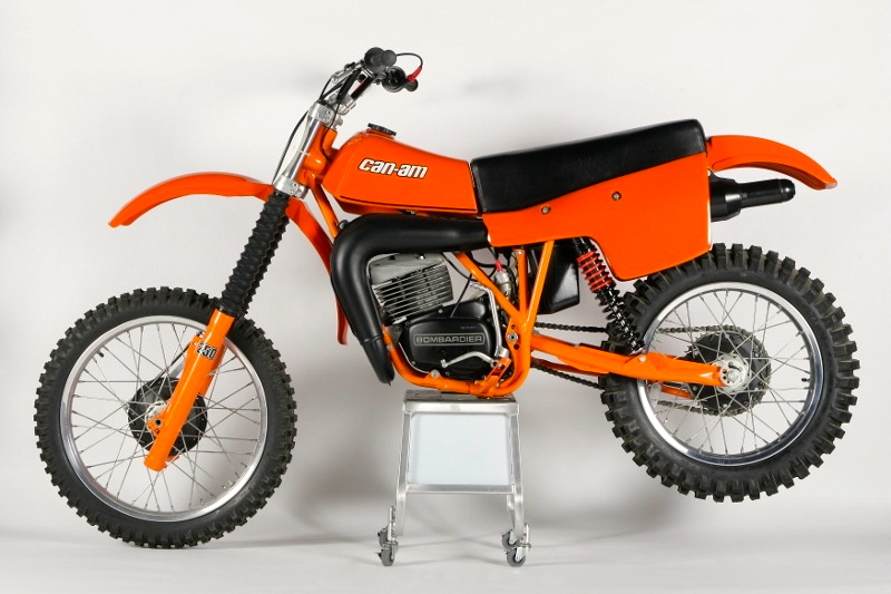
The Can-AM MX-6 looks like something my Dad threw together out of a bucket of spare parts and a tube of JB Weld. It is honestly hard to fathom how our brothers up North ever approved this fugly mess for production. Too much Labatts, eh? |
Blazier- This Can-Am MX-6 is so cobby looking it really is hard to believe this thing was ever sold as a legitimate racing machine. Even more incredibly, great riders like Tony DiStefano, Jimmy Wienert and Donny Hansen actually raced this bike at one point. Can-Am had been an actual motocross powerhouse only a few years before this, capturing the top three spots in the 1974 250 National Motocross Championship. Then things started to slip for the Canadian manufacturer. They introduced bikes like the infamous MX-3 Black Widow and started to loose the horsepower advantage that had made them famous. By the time the MX-6 made its debut in the late seventies, Can-Am was no longer considered a major motocross player. With bikes like this it is not hard to see why.
The MX-6 is so crude and crappy looking it appears to have been designed by an eighth grader doodling on the back of his Trapper Keeper. The back fender looks to be suffering from erectile dysfunction, and the side panels are about three sizes too big in relation to the rest of the motorcycle. Even though this is supposed to be a motocross bike, the ungainly rear silencer looks suspiciously like the one on my 1981 XR200. When you throw in the ugly orange color you have a bike that only a Canadian could love.
Matthes- Holy shit is this thing ugly. There’s nothing else to say. The seat and side panels look like something a 10-year old cut out, the orange swingarm just screams “I LOVE ORANGE WAY TOO MUCH” and yeah, there’s not much else to be said here.
#4 1991 Suzuki RM125
 |
|
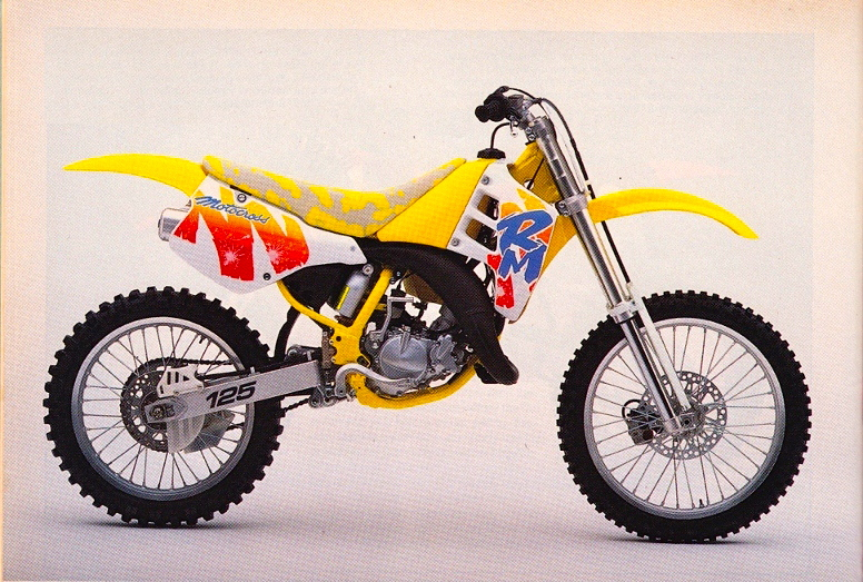
While the ’92 RM is almost charming in its bizarreness, this rolling disaster is without redemption. Everything about this bike, from its gaudy yellow frame, curious camo seat and the weird paintbrush graphics make it the poster child for bad taste. |
Blazier- It is amazing what a coat of paint can do. Just like the #9 CR, this bike started out as one of my all-time favorite looking bikes. The ’89-’90 RM’s were some of the best looking bikes ever, with clean lines and sweet graphics. Incredibly, that same beautiful machine is right here in front of you, hidden under a layer of barf-tastic paint and graphics.
The new yellow frame just looked passé compared to the sweet blue one it replaced. Then you had the absurdly ugly paintbrush graphics that adorned the radiator shrouds and side panels (don’t numbers go there?). Add in the mottled yellow and grey (grey?) seat and clashing white plastic and you have the wreck on wheels that was the ’91 RM125.
At the time, it appeared that Suzuki could not possibly go any lower down the taste scale than it had with this colossal train wreck. Oh, but as we know, the best (worst?) was yet to come…
Matthes- This is what I was talking about in the earlier paragraph. What were these companies thinking? The bodywork is fine but the colors, oh my! Nice job on the side panels Suzuki, I don’t know what those graphics ended up costing you in production but seeing as how 1% of your customers kept them on, I’m thinking you’d have been better off saving that sticker money up and stopped low-balling Guy Cooper year and after. Nice seat by the way. The less said about this the better. The only saving grace is up in Canada the shrouds and side plates were yellow and it reduced the ugliness by a bit. Just a bit.
#3 2005 Husaberg FC550
 |
|
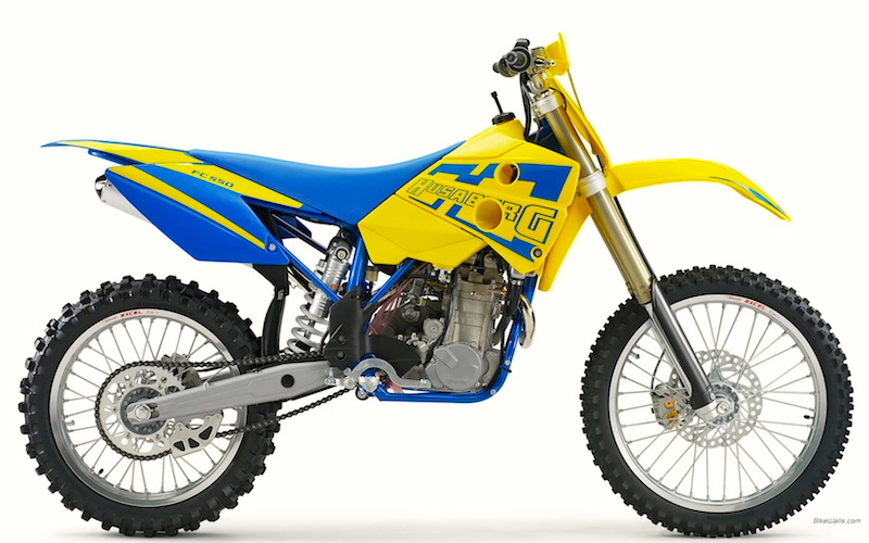
Husaberg started out in the late eighties building weird looking racing thumpers for guys with deep pockets. They were cobby looking and unreliable, but blazing fast. Eventually KTM gobbled them up, but they never lost their penchant for funky colors and bizarre styling. Even today, Husaberg’s are some of the strangest bikes you can buy. |
Blazier- If I wanted to, I could probably fill this entire list up with Husaberg motorcycles. Quite frankly, I have never seen one that I did not think was absolutely hideous. Even the 2012 versions are positively bizarre looking. Honestly, the hard part was just picking one to place on the list.
Former Husqvarna engineers who felt left behind by Cagiva’s acquisition of the Swedish motorcycle manufacturer originally founded Husaberg in 1988. The new Swedish manufacturer set about the task of building a competitive four-stroke race bike, and by 1994 was one of the new wave of ultra competitive four-stroke race machines. When riders like Joel Smets started beating the two-strokes on these big locomotives, it really made quite a stir. Either that, or people just could not believe how stinking ugly the dang things were. The Husaberg engineers put a premium on lightweight and performance, but seemed to care absolutely nothing about style or appearance. Their bikes were appliances made for winning races not beauty contests.
The result of this single-minded approach to motorcycle design, gave us some of both the ugliest and best four-strokes of the nineties. Husaberg’s choice of booger yellow and baby blue for their corporate colors has never resulted in a particularity attractive motorcycle, but this 2005 in particular is a real retina burner. The funky thing looks like it is supposed glow in the dark.
The bodywork is equally unattractive with a gigantic looking tank and strange radiator shroud design. Like the YZ450F, there is an odd hole where the airbox normally sits that looks like someone forgot to bolt something on. The rear fender looks too short, and the color of that blue seat against the radioactive yellow is truly gag-worthy. Husabergs have always been strange looking bikes, but this 2005 takes the cake.
Matthes- Seriously, where’s the airbox man? The tank looks ginormous, maybe it’s in there along with the fuel. I’m not sure but such a big motor and those frame tubes look like something out of a child’s play set. I’m not sure what they were thinking with those shrouds either, they look like something that I could shovel snow with. Well, except for the fact they have two holes in them. Left hand kickstart also, bet that was really fun trying to fire this beast up.
#2 1992 Suzuki RM250
 |
|
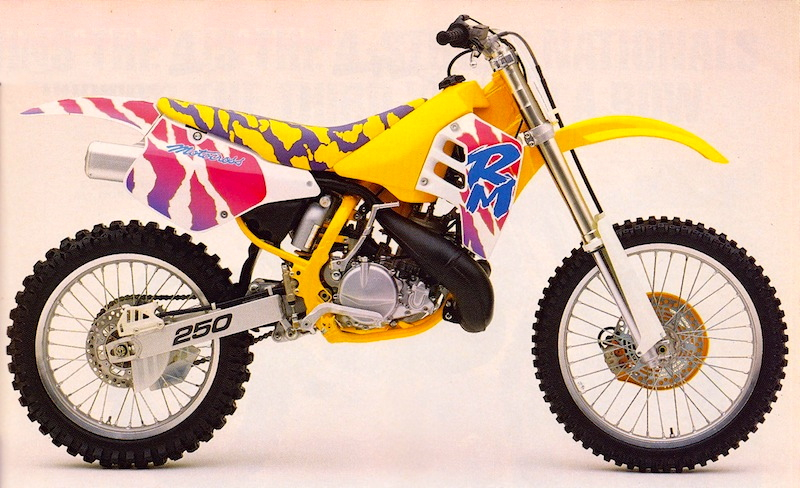
In Hamamatsu, this bike is probably treated like that wacky uncle that was always the life of the party, but nobody liked to talk about. Loud to an extreme and brazenly outlandish, the ’92 RM took the term “bold new graphics” to the ultimate extreme. |
Blazier- If you take a pole among Moto enthusiasts regarding the ugliest bike of all time, I bet this bike comes up more than any other. The ’92 RM has gone down in Moto history as the Edsel of motocross bikes-a bike so iconic in its styling futility that the mere mention of its name conjures up images of pink tigers and hair metal bands. Like its ’91 variation, the ’92 RM was a lovely lady, wrapped in a funky fat suit. The basic bike underneath was attractive, but Suzuki’s choice of colors ruined the package.
The nineties were a strange era where loud and garish replaced quiet and understated in motorcycle design. Crazy looking bikes like the ’95 CR and ’91-’92 RM’s were actually the norm for a few years in the early part of the decade. It was like all the manufacturers went off to college and decided to “experiment” for a few years. The result was a slew of absurd designs and outrageous motorcycles. There really is no other way to explain bikes like the ’92 RM. A little Ecstasy in the water cooler will do wonders for “opening” Ones mind, after all.
Whatever the reason, the resulting machine was so outlandish it would have made Liberace blush. Never has there been a machine that went so “all-in” in an effort to attract attention. This bike is so crazy even non-enthusiasts stop and gape at it. If the goal was to attract attention on the showroom floor, it certainly hit the bulls-eye there.
The yellow frame once again looks awful, just as it did on the ’91. I’m not exactly sure why, but it just looks cheesy somehow. The white fenders ruin the looks of the cleanly integrated bodywork and make the machine look like a bunch of different parts instead of a unified design. Then you have those God-awful graphics. Taken on their own they are actually not too bad. They are well drawn and certainly colorful, but when combined with the yellow plastic and purple camo seat they turn into a headache-inducing kaleidoscope of color.
Many people will still probably think this bike should be number one. It easily could have taken the top spot, but in the end, it lost out to a machine even more hideous. If you are brave enough, read on.
Matthes- I’m guessing that someone at Suzuki bet someone that it was indeed possible to come out with an uglier bike than the 1991 model. About the only thing worse than yellow and grey came on the seat would be, yep, purple and yellow. I’m such a dork I just spent a couple of minutes comparing the camo spots on the two models seats and yes, they’re different. So Suzuki had to make an all never cover design for the purple. That’s effort to be ugly and I guess I admire that in some sick way. That’s all I have to say about this.
#1 1994 TM 250 Cross
 |
|
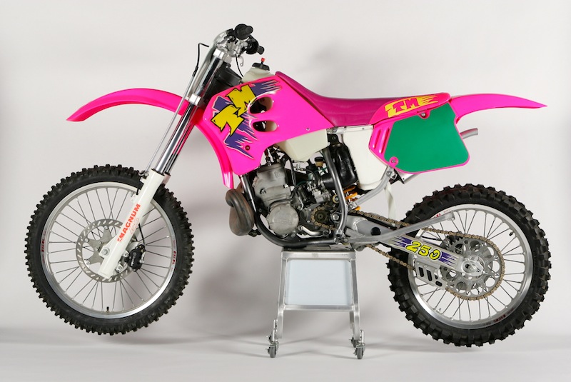
My eyes, oh God, my eyes! No list of ugly machines would possibly be complete without this jewel. This thing is so bad, it looks like a blown up version of one of those funky toy bikes you see at Wal-Mart. The Italians always pride themselves on style, but baby misses the mark by a mile. |
Blazier- TM is an Italian maker of boutique motorcycles. They have always specialized in building small numbers of bikes designed for customers looking for premium quality components and exclusivity. These days TM’s are actually pretty mainstream looking machines, but early on they were some of the wildest looking bikes on the track. This 1994 TM 250 is a perfect example of the quirky machines they were turning out in the early nineties.
Because of their low production numbers, TM has often used plastic components from other manufacturers. In this case, TM used a ’93 RM front fender and radiator shrouds mated to ‘93 CR rear fender and number plates, all molded in Barbie Corvette pink. To say this Frankenstein combination was not exactly attractive would be a bit of an understatement. Adding to this visual nightmare’s impact was its absurdly cartoonish graphics that looked to have been stolen from Fisher Price. Marzocchi Magnum forks with white sliders and ORANGE lettering top off all this visual goodness. So if you are counting, that is orange, white, purple, yellow and flo-pink all adorning this Italian Stallion.
This bike hits all the high notes that are key to a coveted top spot on my list. First, its bodywork is cobby, miss-matched and in general just plain ugly (plus it is stolen from two other bikes!). Second, its color scheme is an absolute abomination, completely devoid of taste or design sense. Third, its graphics are both amateurish, unattractive, and completely out of place on a serious racing machine. This is the Holy Trinity of awful that makes this the all-time worst looking bike in motocross history.
Matthes- Sweet Jesus. I guess if you’re TM and you want to be known for something, maybe flo-pink would get you on the top of ugliest bikes ever lists and that’s something. You know though, under that color (which I can’t get out of my mind) isn’t that bad looking of a bike. It’s not good looking mind you but I feel with a different color choice, this thing would just end up as forgettable and not just plain wacked like it is now. I like the off-white tank, that’s a nice touch guys. Green number plate backgrounds- that was definitely something this bike was missing. Some green. Good one.

