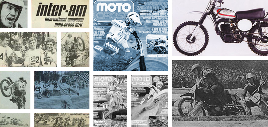
Within the motorcycle business, most advertising follows a few basic styles…
Within the motorcycle business, most advertising follows a few basic styles…
If your brand has a popular rider, you are likely to throw up a picture of said superstar on your bike, airing out a jump or blasting a berm. If you want to focus more on the bike, then you throw the all-new ACME 350SR up on a stand and take a few pictures of it front of some suitably picturesque locale. In either case, the message is usually the same:lighter, faster, better. When it comes to ads, the motorcycle industry usually plays it safe.
Every now and again, however, the manufacturers take a chance and delve off the beaten path. Sometimes, the results of those gambles are classic, others times…not so much. There is always a fine line between clever and calamity and some of these ads landed on the wrong side of that equation. In making my list of motorcycle misfires, I am including the ads I thought missed the mark in one way or another. Some of them erred through their own odd creative choices, while others failed due to events out of their control. Regardless of the reason, they all deserve their place in the hall of shame so let’s get counting. Some of these you people may like but I’m not sure why. Oh and I got Matthes to quit watching hockey and add in his two cents.
#10 The 1994 Yamaha YZ Line
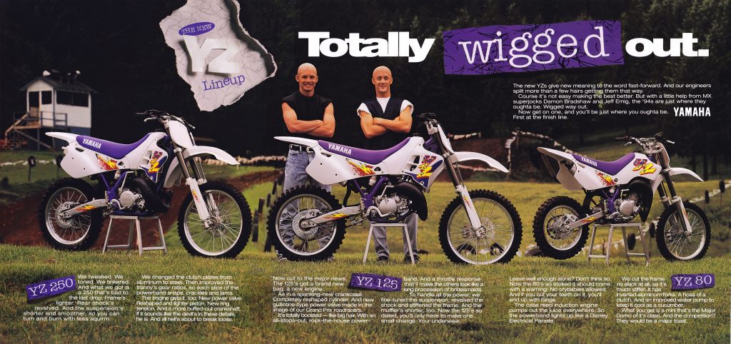
A few months after this picture was taken, it would be Yamaha who was wigged out.
Blaze- In tenth, I have an ad that I think was actually pretty interesting, but fell victim to events out of its control. When Yamaha shot this inventive ad for their 1994 YZ lineup, I doubt the big wigs at corporate had any idea that their star rider was about to go completely off the reservation and walk away from a multi-million dollar contract. Damon had struggled some after coming back from ACL surgery, but he had still won a few victories in ’93. It was certainly not the season he or Yamaha had wanted, but at least on the outside, it did not seem like a disaster. From Bradshaw’s perspective, however, the fun had gone out of racing. He was burned out and ready to call it quits at the ripe old age of 21.
This, of course, left Yamaha in a major lurch, with boxes full of promotion material highlighting a rider that they no longer had. Every time a Yamaha employee saw this ad in a magazine or hanging in a dealership, it had to be like pouring salt in a wound. Worst of all, it would happen again not five years later with the 11th hour departure of Kevin Windham to Honda. Both partings left Yamaha with egg on their face and turned what should have been excellent ad campaigns into embarrassing PR gaffes. Blaze- In tenth, I have an ad that I think was actually pretty interesting, but fell victim to events out of its control. When Yamaha shot this inventive ad for their 1994 YZ lineup, I doubt the big wigs at corporate had any idea that their star rider was about to go completely off the reservation and walk away from a multi-million dollar contract. Damon had struggled some after coming back from ACL surgery, but he had still won a few victories in ’93. It was certainly not the season he or Yamaha had wanted, but at least on the outside, it did not seem like a disaster. From Bradshaw’s perspective, however, the fun had gone out of racing. He was burned out and ready to call it quits at the ripe old age of 21.
Matthes- Yamaha hit and missed with their ad campaigns over the years but at least they tried some cool and different stuff. Remember the Austin Powers/McGrath stuff? For years they shot their stuff at Washougal which was a nice background and when prepped, it looked like a place anyone would want to go ride. The weird was that Yamaha did the whole “let’s photoshop our guys bald” a couple of years before this when they did the Yamaha engineers thing so why go back to that well? Well, I really don’t know. But I do know that these bikes were ugly.
#9 The 2012 Yamaha YZ lineup
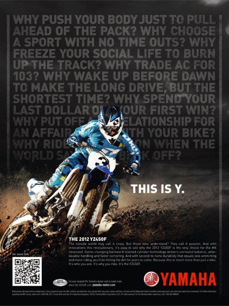
Zzzzzzzzzzzzzz
Blaze- This boring drivel is what passes for a motocross print ad these days. Considering Yamaha’s current PR nightmare with the backwards YZ450F, you would have thought they might put in a better effort. The overall design of the ad is visually uninspired and really makes no case why you should even stop to bother and read it. The “Y We Ride” slogan is at least an attempt at being clever, but in my opinion it comes off more like a home schooled kid’s poor grammar than a catchy tag line. This whole ad is flat, unremarkable and pretty much an embarrassment for a once proud brand.
Matthes- Blaze’s hate-on for Yamaha continues! Yeah, I agree though this doesn’t exactly get the blood flowing does it? I just always think you’re better off putting some of your racers in your ads to better have that brand awareness but then again, when this was shot there wasn’t a chance of getting James Stewart to appear in it was there?
#8 The 2000 Honda CR250R
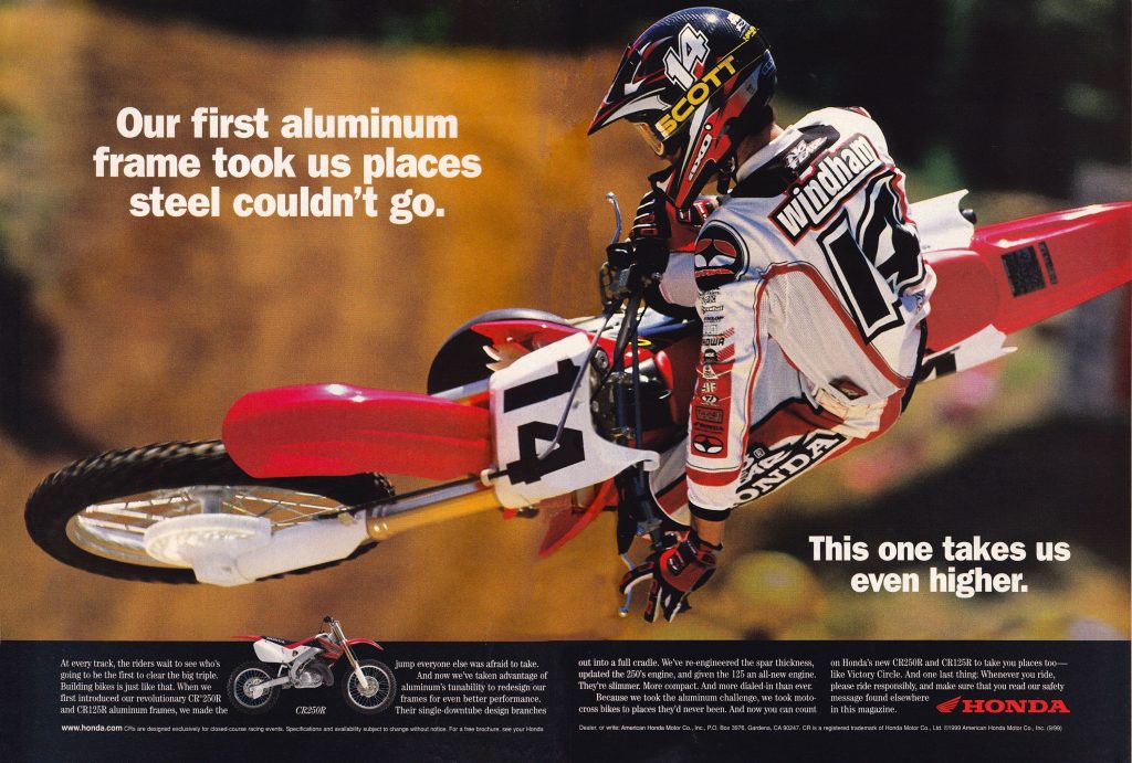
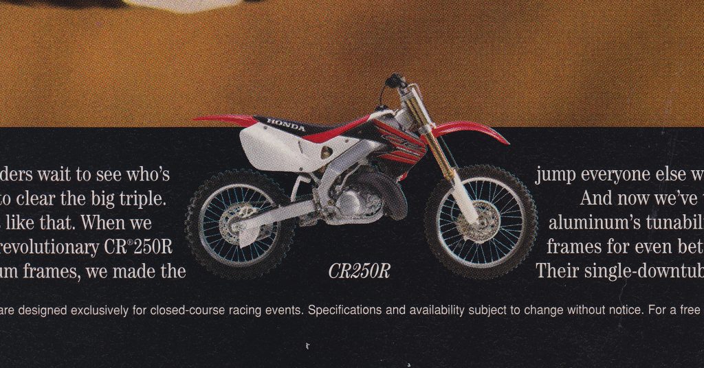
It’s always best to measure twice and cut once…
Blaze- This 2000 Honda CR250R ad is a case of a perfectly good concept sabotaged by poor execution. To the casual observer, in fact, there may not appear to be anything wrong. Look a little closer, however, and you will see that something is amiss. You surely can’t fault the flawless style and classic grace of a young Kevin Windham. He is doing his part and whipping the all-new CR into submission for the cameras. In this case, the fault appears to have been with the proofreaders, who apparently did not get the memo about this being an ad for the 2000 CR line.
If you either have not caught it by now, the Where’s Waldo in this ad is the small motorcycle at the bottom left. Somewhere along the way, someone mixed up the pictures of the all-new and much improved 2000 CR250R, with the outgoing and unloved ’99 model. This rather significant oversight made it all the way to the printers and into the hands of MXA readers everywhere. Considering the number of people that must have looked over this ad before it went to print, it is remarkable these ever made the light of day.Blaze- This 2000 Honda CR250R ad is a case of a perfectly good concept sabotaged by poor execution. To the casual observer, in fact, there may not appear to be anything wrong. Look a little closer, however, and you will see that something is amiss. You surely can’t fault the flawless style and classic grace of a young Kevin Windham. He is doing his part and whipping the all-new CR into submission for the cameras. In this case, the fault appears to have been with the proofreaders, who apparently did not get the memo about this being an ad for the 2000 CR line.
After the initial run of magazine spots, Honda rectified the oversight and replaced the ’99 with the ’00 model in later printings. It was an interesting example of a rare slip up by one of the most serious and successful brands in the sport.
Matthes- I’m that casual observer that Blaze spoke about in his top paragraph. I never noticed that it was the wrong year of bikes in the ads but that is classic. That’s a sweet shot of Windham also but I’m sure some heads really rolled over this. I had never heard of this story before and not sure how Blazier found out about it either.
#7 The 2001 Kawasaki KX line up
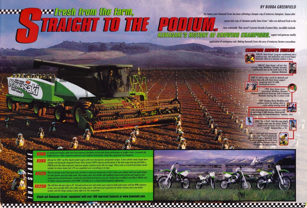
Time to harvest some hot prospects!
Blazier: If I’m going to bash Yamaha for being boring with their 2013 YZ ad, I probably should at least give Kawasaki some credit for attempting something different with this 2001 piece. In a sea of cookie-cutter ads, this baby certainly stands out. Unfortunately, it is more than just unique, it is downright odd. While I get the whole “harvesting young talent” metaphor they were going for, it just gives me the creeps. For some reason, the thought of chewing up young kids buried to their waist in dirt with a giant set of blades just does not make me want to buy a motorcycle (I know, call me crazy). In truth, this ad makes me think of some cheesy 50’s sci-fi B movie, Invasion of the Team Green Snatcher’s or something like that. Kawasaki is people…its PEOPLE…!!!
Matthes: Dear Kawasaki, thanks for creeping us all out. Thanks, SteveBlazier: If I’m going to bash Yamaha for being boring with their 2013 YZ ad, I probably should at least give Kawasaki some credit for attempting something different with this 2001 piece. In a sea of cookie-cutter ads, this baby certainly stands out. Unfortunately, it is more than just unique, it is downright odd. While I get the whole “harvesting young talent” metaphor they were going for, it just gives me the creeps. For some reason, the thought of chewing up young kids buried to their waist in dirt with a giant set of blades just does not make me want to buy a motorcycle (I know, call me crazy). In truth, this ad makes me think of some cheesy 50’s sci-fi B movie, Invasion of the Team Green Snatcher’s or something like that. Kawasaki is people…its PEOPLE…!!!
#6 1982 Can-Am Sonic 500
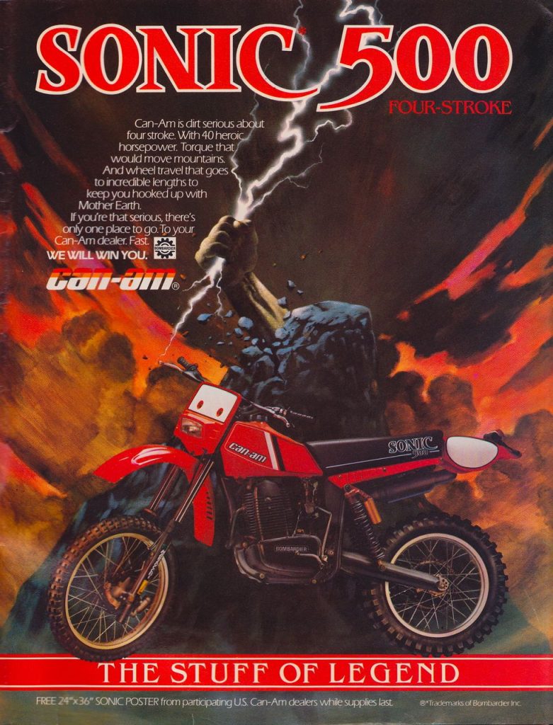 The Hammer of Thor could help this piece of crap
Blaze- By 1982, Can-Am was on the ropes and reeling. They had enjoyed a great deal of success in the early 70’s, but by the time this ad came out they were struggling for their survival. Unfortunately for Can-Am, this POS was not about to turn the tide.
For starters, this has to be one of the ugliest bikes I have ever seen. That rear fender is just abysmal looking and I’m not sure there is an attractive line on the machine. Then you have the whole fire and brimstone motif that is not doing the bike’s looks any favors. If you look up fugly in the dictionary, there is a picture of a Can-Am Sonic 500 front and center. Then you have that tag line, “The Stuff Of Legend”, really? Hyperbole much?Blaze- By 1982, Can-Am was on the ropes and reeling. They had enjoyed a great deal of success in the early 70’s, but by the time this ad came out they were struggling for their survival. Unfortunately for Can-Am, this POS was not about to turn the tide.
The only thing I can figure is that they were going for the huge J.R.R Tolkien fan base in the moto industry and trying to appeal to the Mordor set (if there is one thing that home schooling is good for, it is an appreciation for the classics). Apparently the Can-Am Sonic is all the rage on Mount Doom these days. Who knew?
Matthes- The best part of this is the tagline “We will win you”- that doesn’t even really make sense. Did they forget the word “over” after “you”? And serious, this came out in 1982 and if you lined this POS up against any other of its competition it would like a Model T to an F1 car nowaways. And this was 1982! C’mon Can-Am- you really should have known better.
#5 The 1978 DR370
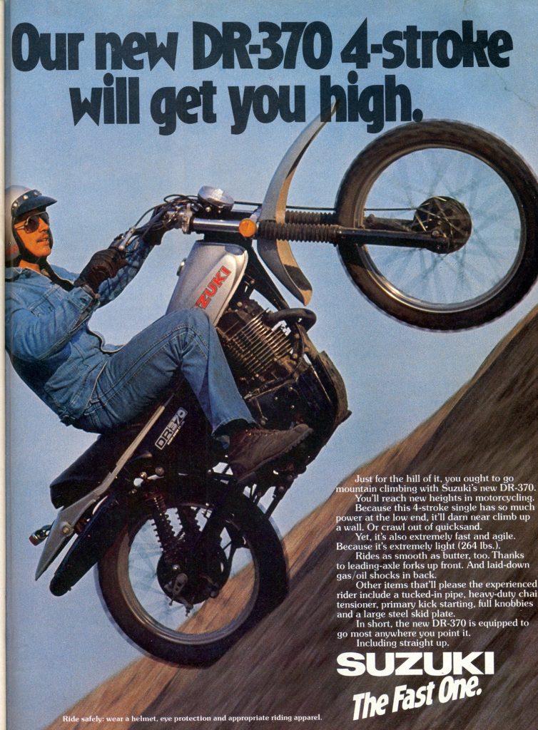 Cheech and Chong, your bike has arrived.
Blaze- I know it was the 70’s and all, but really Suzuki? God knows I love a reefer reference as much as the next guy, but this just seems a bit much. Can you imagine if they tried something like this today? It would cause such a stink, Suzuki would have soccer moms with pitchforks and torches camped out in front of the corporate office in a matter of minutes (on the bright side, J-Law and the “get a Dell” dude would have a job). Maybe that is just my Nancy Reagan “just say no” brainwashing coming out though, so don’t mind me.
As for the rest of the ad, it certainly does not help that this is one of the lamest looking dirt bikes ever built. That bodywork is just terrible and the dude riding the bike looks like an extra from the set of some cheesy 70’s porn flick (it just wouldn’t be the 70’s without a set of aviators and a sweet creeper stash). I’ve never rode one of these machines, but one look and you just know it was god-awful. Can you imagine hitting a whoop at speed on this 300-pound lead sled? Maybe that’s why you needed the weed. Honestly, it is a wonder we made it out of the 70’s alive.Blaze- I know it was the 70’s and all, but really Suzuki? God knows I love a reefer reference as much as the next guy, but this just seems a bit much. Can you imagine if they tried something like this today? It would cause such a stink, Suzuki would have soccer moms with pitchforks and torches camped out in front of the corporate office in a matter of minutes (on the bright side, J-Law and the “get a Dell” dude would have a job). Maybe that is just my Nancy Reagan “just say no” brainwashing coming out though, so don’t mind me.
Matthes- The 70’s were a strange time indeed. I think creativity was at its lowest point ever. Have you seen some of the cars from back then? Someone really should have passed this around the office a bit and asked around if this was cool. Besides, promoting a four-stroke? How dumb is that? As if those hunks of crap will EVER be commonplace in the dirt bike world.
#4 The 1994 Kawasaki KX250
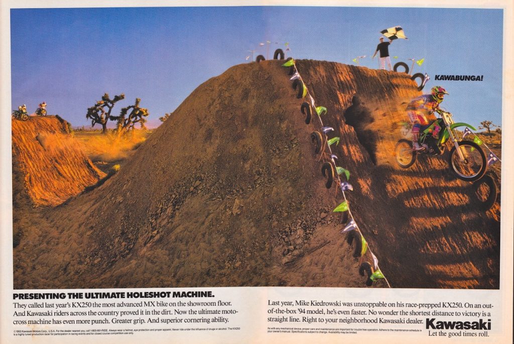
Kawasucka!!!!
Blaze- As I stated in my list of good motorcycle ads, there is a very fine line between cool and crap. To me, the ’93 Kawasaki KX250 ad nailed the former, while its ’94 successor pegged the latter. Chicken busting out a mega leap? Badass. Mike Kiedrowski punching holes in dirt mounds while yelling the moto of the Teenage Mutant Ninja Turtles? Mega lame. You have a guy would obliterated the competition all summer, on an all-new sweet looking machine (one of my all-time favorites) and this is the best you can come up with? Pathetic.
Matthes- Yeah, out of all the motocrossers back then that I could picture NOT yelling “Cowabunga”, Mike Keidrowski would be at the top of the list. On the list of mx’ers who I COULD imagine yelling “Cowabunga” would be Mike Craig.Blaze- As I stated in my list of good motorcycle ads, there is a very fine line between cool and crap. To me, the ’93 Kawasaki KX250 ad nailed the former, while its ’94 successor pegged the latter. Chicken busting out a mega leap? Badass. Mike Kiedrowski punching holes in dirt mounds while yelling the moto of the Teenage Mutant Ninja Turtles? Mega lame. You have a guy would obliterated the competition all summer, on an all-new sweet looking machine (one of my all-time favorites) and this is the best you can come up with? Pathetic.
#3 The 1987 Suzuki RM’s
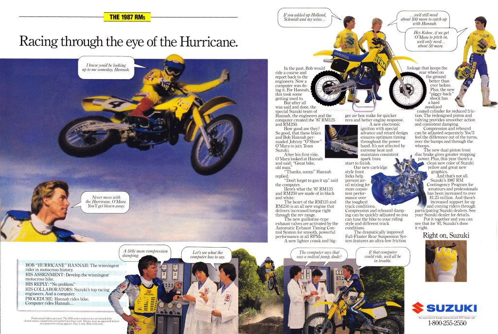 If that computer could ride, the ’87 RM’s would still suck.
Blaze- In the world of motocross, few ads have lived on in infamy like this one for the 1987 Suzuki RM’s. This was supposed to be the ad proclaiming the arrival of Suzuki’s new savior, ’84 Supercross champ Johnny “O’Show” O’Mara. Instead, it became known as the ridiculous “computer” ad. The idea was simple: show how advanced the new RM’s were by partnering the old man of motocross, Bob Hannah, with some computer that looked to have been stolen from the set of the original Star Trek. The problem was, they paired this reasonable concept with some of the most ridiculous dialog this side of Winners Take All.
The exchanges attributed to the riders and technicians in this ad are so lame as to be cringe inducing. Even if you give them credit for being tongue-in-cheek, it comes off as just plain stupid. I do give it some props for being memorable, (anyone who rode in the 80’s certainly remembers this thing) but that’s more a testament to its comedic value than its enduring greatness.
Matthes- The one thing I always wondered about this ad (and it’s not as lame as Tony makes it out to be by the way) is why is Donny Schmidt wearing some cheeseball Suzuki jersey? The other guys are in their proper gear and Donny was a Fox guy back then. I’m guessing that he showed up without his gear and they had to make something work. Honestly, it’s haunted me for years and if Schmidt were alive, this would be question number one on my podcast with him. And also, why not more Johnny O? He was the third best rider in ’86 and had just signed a three-year deal with Suzuki. He was the guy! The biggest free agent signing by far and instead they slap Hannah in there?
#2 1976 Kawasaki KD175
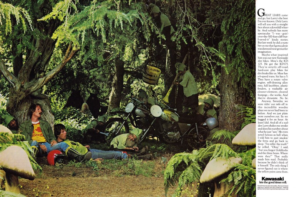 Wood gnomes, yeah those with sell us some bikes…
Blaze- In second, we have an ad that most of you reading this have probably never seen before. This ad for the 1976 Kawasaki KD125 and KD175 is a complete acid trip from start to finish. It tells the story of two guys out on a ride that find themselves set upon by a set of wood gnomes when they stop to take a break. Seriously, that’s the pitch. Apparently, the gnomes enjoy knocking out stray motorcycle riders and painting their bikes yellow (Any bets on the number of joints consumed coming up with this advertising gold?). This has to be the single oddest motorcycle ad ever produced. Call me crazy, but I doubt this thing sold Kawasaki many motorcycles in ‘76. Ah, the 70’s….
Matthes- So high on the creepy scale it’s not even funny. And why are two “buddies” laying there with ones head almost in his other “buddies” lap? There’s some weird shit going out in Kawasaki’s forests around its Irvine, CA headqurters man.Blaze- In second, we have an ad that most of you reading this have probably never seen before. This ad for the 1976 Kawasaki KD125 and KD175 is a complete acid trip from start to finish. It tells the story of two guys out on a ride that find themselves set upon by a set of wood gnomes when they stop to take a break. Seriously, that’s the pitch. Apparently, the gnomes enjoy knocking out stray motorcycle riders and painting their bikes yellow (Any bets on the number of joints consumed coming up with this advertising gold?). This has to be the single oddest motorcycle ad ever produced. Call me crazy, but I doubt this thing sold Kawasaki many motorcycles in ‘76. Ah, the 70’s….
#1 The 1989 ATK 406
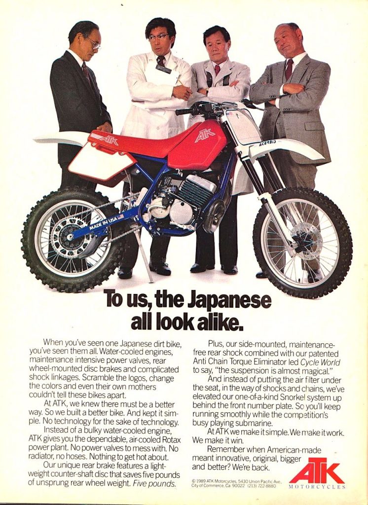 An America company, owned by an Austrian, making racist jokes about the Japanese? That’s the recipe for #1 on my list.
Blaze- If you thought the #5 ad on my list was politically incorrect, you ain’t seen nuthin yet. This one for the ATK 406 was slightly uncomfortable in 1989, but today, it is downright shocking in its calloused disregard for racial sensitivity. Even though the joke it is playing on is pretty much common knowledge to most people, putting it in a national ad seems risky. I would love to know what kind of feedback this thing got ATK in ’89. Today the Twitter-sphere would crucify them in a New York minute, but I imagine things were less uptight 20-years ago. ATK always marched to the beat of a different drummer, and this might have been taking things a bit too far.
Matthes– Maybe I’m off the mark here but I don’t find this ad that offensive. They’re clearly talking about all the Japanese dirt bikes and not Japanese people…oh wait, they actually put JAPANESE PEOPLE in the ad also. Uh, yeah. Wow. Good job ATK. How’s that countershaft rear disc brake working out for you now? Blaze- If you thought the #5 ad on my list was politically incorrect, you ain’t seen nuthin yet. This one for the ATK 406 was slightly uncomfortable in 1989, but today, it is downright shocking in its calloused disregard for racial sensitivity. Even though the joke it is playing on is pretty much common knowledge to most people, putting it in a national ad seems risky. I would love to know what kind of feedback this thing got ATK in ’89. Today the Twitter-sphere would crucify them in a New York minute, but I imagine things were less uptight 20-years ago. ATK always marched to the beat of a different drummer, and this might have been taking things a bit too far.


