Here at PulpMX, we embrace the joy of bench racing and that includes ooohing and ahhhing factory bikes of the past.
Here at PulpMX, we embrace the joy of bench racing and that includes ooohing and ahhhing factory bikes of the past.
T. Blaze– It does not matter if we are debating who is the World’s best Supercross rider, or who has the best track day food (my vote goes to the ridiculous Black Angus cheeseburgers served at Cowboy’s Stadium), we take it seriously. With that in mind, I thought it would be fun for Swizcore and I to compile a list of our picks for the best looking race team bikes of the last forty years. By that, I mean not the trickest works bikes (we already did that), but just purely the best looking. We were free to pick any bike, be it a Factory masterpiece or a privateer prize. The only requirement was that we be able to make a good case for the pick.
Swiz and I are each going to pick the five machines we believe deserve to sit atop our greatest hits list. As always, we will state our reasoning for the selection and have the opportunity to comment on the other’s picks. Just remember, if one of us leave your favorite bike off the list, its Tit’s fault.
Swiz- Let me just start by stating the obvious. Any list such as this is completely subjective because taste can not be quantified by science or mathematics. As such, what Blaze or I find awe-worthy, is sure to make someone else make a Renee Zelwegger face and close the browser windows cursing us all the way to the toilet, where they puke.
On to the countdown!
#5 Selections
 |
|
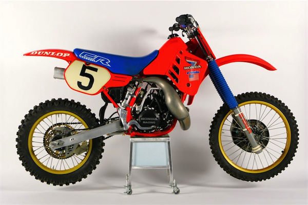
Swiz #5 Pick – ’86 Factory Honda |
Swiz- Aside from this first choice, the basement of my top 5, my selections were indeed all based upon the look. I definitely cheated at number 5 though. I’ll be the first to admit the 1986 Factory Honda is no show-stopping beauty but there’s no way I could deny that the look of this bike is what started it all for me. I was 9 years old and didn’t have a chance in hell of having a bike bought for me but when I saw this machine I was smitten and decided no matter the cost, I would ride dirt bikes. I’ll admit, my opinion was skewed by what this bike meant to me, not just it’s look but I refuse to ignore the impact it left. Number 5 with a bullet.
T. Blaze- While I chose to go the newer team graphics era bike with my choices, Swiz left himself more open to the whole range of classic machines. This, of course makes it even harder to pick just 5 bikes out of all the awesome looking bikes that have come down the pike. I kind of cheated, by basically eliminating all the older machines from my picks right off the bat. In either case, I am sure we will both get lots more hate mail from all the Maico nut jobs and dual shock lovers of the world (does breathing too much Yamalube make you bitter? Just asking…).
As to Swizzle’s pick, I would probably have gone with the ’85 RC250 or RC125 over the more mundane ’86, but it is hard to argue with this beauty. Just like Swiz I wanted this bike with every fiber of my being and had pictures of it plastered all over my bedroom throughout my junior year in High School. With RJ on board, it was the very definition of cool and THE bike to have that year. While it is not my all-time favorite, it is certainly one sweet machine
 |
|
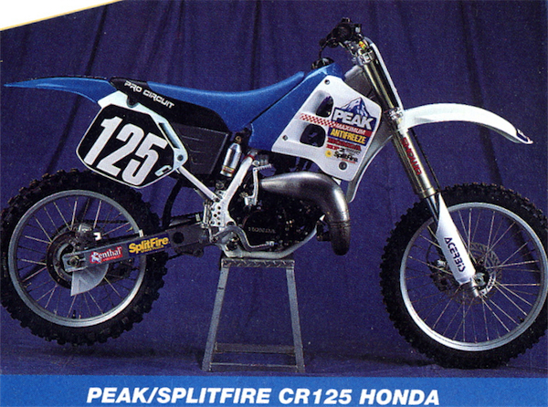
T. Blaze #5 Pick – ’91 Pro Circuit Peak Honda |
T. Blaze- With my selections, I wanted to focus on the bikes that I thought did the best job of pulling together color, graphics and styling into a perfect collaboration of awesomeness. Unlike Swiz, I wanted to stick mainly to the bikes in the post “graphics” era. Prior to 1989, most professional race bikes looked very close to the stock machines in terms of color and graphics. Even the vaunted works Honda’s of the early eighties shared the same basic look and color schemes of the mundane stock CR’s. As much as I love those bikes (and think the ’85 RC250 could win on audacious badassness alone), I wanted to stick to the post ’89 “team look” bikes for my picks.
For my first selection, I am going to go with a real groundbreaking machine in the world of Supercross satellite teams, the 1991 Peak/Splitfire Pro Circuit Honda. While there were of course, other aftermarket and privateer teams before Mitch’s squad (Team Tamm and Team Moto-X Fox for instance), his was the first one to really make a dent in the motocross mainstream. His team was professional from top to bottom and took no backseat to the other “Factory” team efforts. While it certainly did not hurt that the Peak squad had future superstars like Jeremy McGrath and Brian Swink in the stable, early on, it was the looks of the bike and team, not the riders that caused all the buzz.
The Peak/Splitfire (what ever happened to those piece of crap Splitfire plugs anyway?) Pro Circuit CR125’s looked so amazing in 1991, it was as if no one had ever thought to make a blue motorcycle before. In those days, things like a blue tank were total unobtanium and if you wanted one, you basically had to spray paint your tank blue (which is exactly what the team did). Everything from that slick two-tone seat, to that sweet Peak logo on the shroud worked in unison to make the Peak bikes look both the most unique and the most professional on the track. It was perfect marketing by Payton and really helped put Peak antifreeze on the map within the moto industry.
Some may quibble that the ’92 Peak bike was the better looking of the two years, but for me ’91 rules. I prefer the simpler two-tone blue and black seat, and that blue tank will always beat out that boring ’92 white one. Plus Swink left for Suzuki in ’92, and that majorly sucked balls, so the ’91 wins, period.
Swiz- Tony is right on the mark here. I gotta admit, top to bottom, I expected Tony and I to have vastly different lists but the fact that we are in the same wheelhouse for the most part tells me that maybe we are a pretty standard representation of fan tendency in this area. As you scroll down, you just may feel a twinge of deja vu.
#4 Selections
 |
|
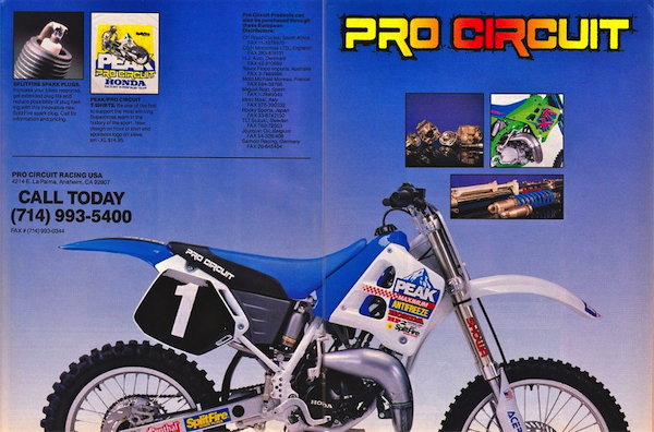
Swiz #4 Pick – ’91 Pro Circuit Peak Honda |
Swiz- When Mitch Payton put together the Peak Pro Circuit Honda team in 1991 my world was rocked. My favorite color combo was blue and white and no machine prior to this approached that color palette. Seriously though, the forward thinking involved with Mitches approach to the team model in 1991 was matched by the look he presented his team with. A blue and white Honda in a sport where sponsor decals had always been considered “graphic customization”? THis was the machine which started everything and it looks just as great today as it did back then. Imagine a 2013 Honda done up in this look. Drooool.
T. Blaze- I always knew that Swiz was a smart guy, and his agreement with me on the ’91 Peak Honda only confirms it. Groundbreaking? Check. Iconic? You bet. Badass? The baddest. If the sign if a great design is its enduring appeal, then the ’91 Peak Honda’s have passed that test with flying colors.
 |
|
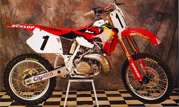
T. Blaze #4 Pick – ’95 Factory Honda |
T. Blaze- If I were giving out an award for most improved, this bike would win it hands down. Honda has always been a very conservative company when it comes to the looks of their Factory race bikes. Most years, their works bike looks very similar to the production machines and usually only vary by a subtle logo or two. In 1995 though, even Honda knew they had a problem. The stock red and purple CR looked like someone had skinned Barney, and was no machine to stick the reigning Supercross champ on.
Thankfully, someone at Honda’s race shop came to his or her senses and drop kicked the stock CR’s ridiculous appearance. Instead, they came up with this iconic piece of motocross glory, the 1995 Factory Honda CR250R. Gone were the stock bikes comical purple seat and shrouds, replaced with serious red and black affairs. At the season opener, the side panels were also red, but Honda returned to the stock white plates by round two. To me, this bike and the very similar ’96 model (the ’96 has a white rear fender and a slightly tighter stripe pattern on the tank) represent the absolute height of Honda’s powers. With MC and Steve Lamson at the controls, they dominated all three titles and looked fantastic doing it. They were the absolute kings of cool, and these bikes were the baddest in the land.
Swiz- I got no beef with T. Blaze here. My buddy, some fo you may be more familiar with Matthes’ pet name for him, “Janky Jeff”, recently built a late model CR250 replica of this bike and it was gorgeous. It was one of the early looks that sported the graphics moving from the shroud all the way to the seat and that did a lot for machines not utilizing gas tank-enveloping shrouds which made this much simpler. Ahhh, the simple days of dialing collect.
#3 Selections
 |
|
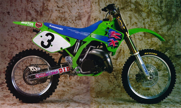
Swiz #3 Pick – ’92 Factory Kawasaki |
Swiz- The first machine to utilize gas tank enveloping shrouds AND graphics which swathed all the way back to the seat. This bike was the catalyst for the modern look of motorcycles in my opinion. It was not a progression of the 1991 KX, it was a leap frog. They went from ridiculous bolt on top shock mounts and a gas tank which peaked out from the back side of the shrouds to this. And it made a huge visual difference. Don’t let my love of this look be confused with my love for the bike year. I had a ’92 KX125 and it was a useless turd of a machine… but it was a damn pretty turd.
T. Blaze- Remember everything I just said about Swizzle’s excellent taste? Forget about it. Now, I know Swiz has a thing for ’92 Kawasaki’s like I do for ’90 Honda’s so I suppose I should cut him some slack, but in this case I just can’t do it. I mean seriously, the freaking ’92 SR250? For starters, it looks exactly like the ugly stock 92 KX, with its funky graphics that sweep back into the seat. At least this one is from the start of the season, by mid-year Kawasaki was plastering tiny sponsor logo’s all over the shroud graphics that made the bike look busy and ugly. At least they ditched the cheesy blue anodized forks on the works bike. Of all the ‘90’s Kawasaki’s, this one is my least favorite, but hey its Swiz’s pick, so I’ll shut up now.
 |
|
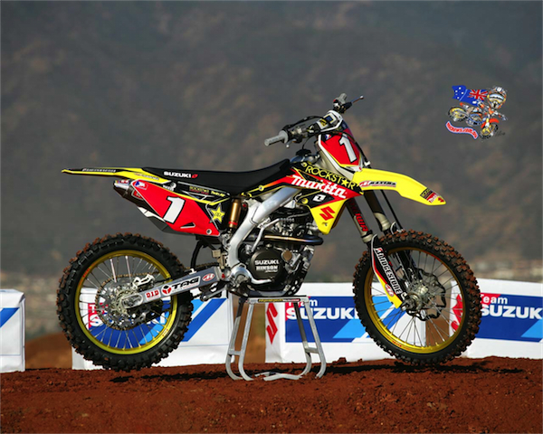
T. Blaze #3 Pick – ’08 Factory Suzuki |
T. Blaze- Suzuki has produced some god awful looking bikes at times over the years, but this my friends is not one of them. In my opinion, Team Yellow Magic has been on a solid roll since 1999 (at least with the factory bikes, I think the stockers are usually pretty ugly). I loved the Sobe bikes, and all the Makita machines have looked top notch. Of all those bikes, however, this one from late 2008 stands alone as my favorite. Now this is actually an interesting picture, as the bike shown is Chad Reed’s, but it has 2008 graphics on it (remember Reedy raced a YZF in ’08). This was a pre season picture taken to promote the signing of the ‘08 Supercross champ, so they just stuck that big red #1 on top of DV’s ‘08 RMZ. Chad only raced at the US Open with these graphics, but damn does it look sweet (better, I think than his actual 2009 race bike). DV’s #12 RMZ admittedly looked good, but the addition of those red plates somehow transforms this into a real superstar.
Swiz- Again, a very solid choice by Mr.Blazier. The red backgrounds are kind of a cheater bonus though since red backgrounds make any bike look better. I’ll allow it though since the all black seat cover needs to be made up for. In all honesty, if this bike had the red centered seat cover like the ’09, it may be right on par with it. Love the sandblasted look of this fork tube style and yes, this bike is still the foundation for this years 2013 model. It ain’t broke, so just refine it.
#2 Selections
 |
|
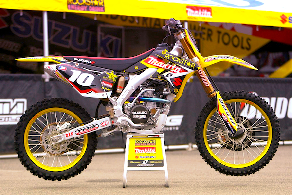
Swiz #2 Pick – ’09 Factory Suzuki |
Swiz- Much like the ’86 Factory Honda, this bike looked so damn good I made my ’08 a replica of it for a year. Blingin’ fork uppers, black lowers, Factory Yellow rims (it really is a different part number than gold), red seat spine and ohhhh that rainbow header.
T. Blaze- Here, Swizcore and I differ only slightly. I prefer the 08, and he prefers the ’09. In either case, they are gold-rimmed, black, yellow and red beauties. For my money, I prefer the less busy side plate design and cleaner shroud graphics of the ’08, but either one is a looker. I will give Swiz points for the badass red and black seat on the ’08, however. With the Dungenator and Reed at the helm, these bikes sprayed a lot of champagne in ’09 and looked great doing it. I officially endorse this pick.
 |
|
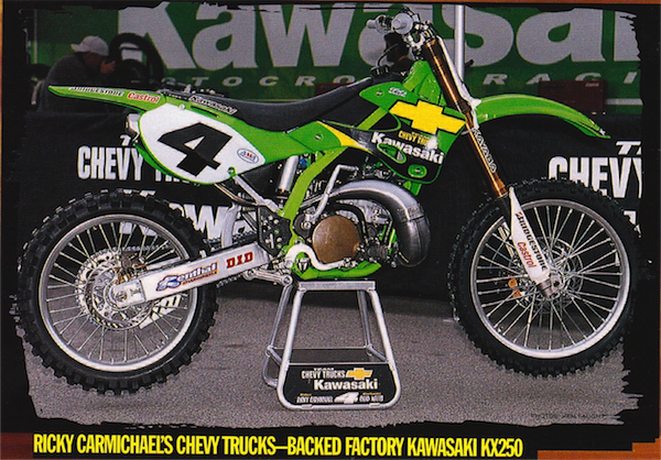
T. Blaze #2 Pick – ’01 Factory Kawasaki |
T. Blaze- I actually had a hard time picking between all of Kawasaki’s great looking late nineties race bikes, but in the end I went with RC’s awesome ’01 SR250. I absolutely loved the florescent frames and plastic Kawasaki used on these SR’s and pictures just don’t do them justice. In person, they positively glowed with color, and made the stock KX look like the Family Truckster by comparison. To me, the sign of a great graphics package is one that accentuates the strong parts of a machine’s styling, while masking its weaknesses. This one fits that bill, as it takes a bland and rather unattractive stock KX and turns it into a gorgeous race bike. I love everything about the appearance of this bike, including that sweet ginormous #4 on the plates (this was the first year that RC used this oversized number design). Even today, I think this baby looks about a hundred times better than any of the current Black Bart Monster Energy bikes.
Swiz- Ok, this is where it gets odd. Blaze categorically trounced my ’92 KX choice but he picked a green and yellow ’01 Kawi?! Don’t get me wrong, I’m from the Motor City so I love me some Chevrolet but you simply can not put yellow and green together unless you are a bag of skittles or a bullfrog.
#1 Selections
 |
|
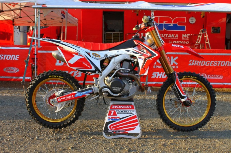
Swiz #1 Pick – ’13 Works Honda Japan |
Swiz- This bike is going to be tough to dethrone in my opinion regarless of future releases. First of all the old school ribbed seat, the red triple clamps, deep gold suspension components, black lower tubes, gold wheels, red hubs and yes red number plates with a number 1. All of this is a bonus on top of what I consider my favorite plastics body styling in motocross yet.
T. Blaze- Now, here is a pick I can truly find zero fault with. Unless you are a Honda hater, breathed in too much Yamalube, or are just plain blind, picking Akira Narita’s HRC masterpiece is a total no brainer. It easily could have taken the top spot on my list over CR22’s 2011 CRF, but in the end, I still like the old body style’s looks a tad better than the 2013’s. That opinion will probably change with time, as I get used to the new bike’s odd KTM-esque side plates (Am I the only guy that hates this stupid trend toward dinky sidepanels?), but for now, I still like the old bike better. Other than that, this bike has it all. I love the deep gold anodizing on the forks and the always cool gold rims. The graphics are basically stock ’13 with a little HRC logo, but all the other trick bits make up for the nearly stock appearance. It is another solid choice, which almost makes up for the obvious gaff of including the ’92 Kawasaki.
 |
|
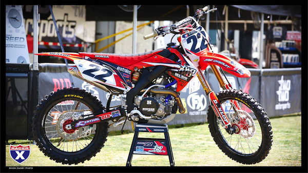
T. Blaze #1 Pick – ’11 Two Two Honda |
T. Blaze- At number one with a bullet, I have the sweetest looking machine to set wheels to dirt in the modern era, Chad Reed’s 2011 Las Vegas special CRF450R. I have loved the looks all of Reedy’s TwoTwo Honda’s, but for my money, this is by far the best. It looks more like a two-wheeled Ferrari than a dirt bike and stole the show at the season finale in 2011.
Normally, I am not a fan of too much black on a motorcycle (see any Kawasaki since Monster came on board), but in this case it absolutely works. The black rims and frame make the bright red bodywork and wheels really pop. Chad’s TwoTwo graphics look fantastic (I love all the details like the little TwoTwo logo’s built into the design. It reminds me of when AXO would emboss little AXO logos into their pants back in the day) and really work against the black accents. They also look far better against the red than they did against the white he ran earlier in the year. Factory Honda’s are always beautiful machines, but in my eyes, this baby takes the cake.
Swiz- This bike is a beauty no questioning that. black wheels, black frame, black swingarm, great graphics… it’s black and white and read all over (remember that joke from 2nd grade?). This may have actually made my number one too if it weren’t for the 2013 Honda but even if I hadn’t chosen the Narita Honda, I would have chose the Factory 2013 Honda over the Two Two look. The white aft shroud is an important piece in that puzzle.
