We have done Yamaha, we have done Suzuki, and now it’s time for KTM!
As in our previous lists, I am going to rank my picks for the ten best-looking KTM motocross models and give my thoughts on each. Then, Matthes is going to tell you why I am right and have such impeccable taste in motorcycles.
As before, I have considered all of KTM’s MX models going all the way back to their start in 1973 and up to the just–announced 2020 models. I have left it open to two-strokes and thumpers and tried to be fair by considering not just how they look today, but also by how they stacked up against the competition when they were new.
In general, I admit that I have a bit of a bias against most bikes of the seventies, as I feel they look crude and cobby in general. Every once in a while one will stand out enough to make my list (like a ’76 RM or ’78 CR), but in general, they are just not my cup of castor oil. If you are a bit older than me, you may feel that I have ignored some of those classics, but for me, the early KTM’s were more odd than beautiful. As always, your mileage may vary and feel free to share your thoughts on what I got right and what I got wrong in the comment section below.
If you like this sort of thing, make sure you check out our picks for the best -looking Suzukis HERE and the loveliest Yamahas HERE.
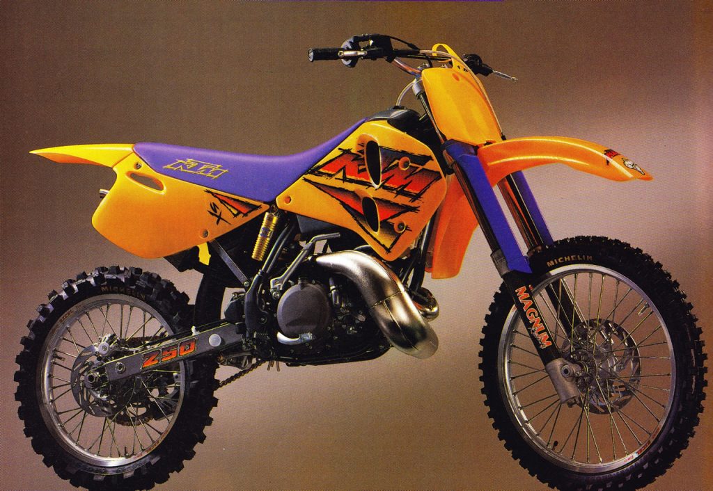
Tenth Place: 1996 KTM 250SX
Blaze: In 1996, there were not words for how much I hated this change. After the clean looking ’93-’95 models, this radical departure from white to pumpkin orange made my brain hurt. WTF where those wacky Austrians thinking?
After twenty years of orange KTMs, however, I love it. Of course, this orange and purple is a bizarre combination that only the nineties could have wrought. Again, at the time, I thought it was totally absurd, but like the ’92 RMs and ’95 CRs, this choice has grown on me. Now, I much prefer it to the far more understated 1997 version. One thing I can’t get behind is the switch to a chrome pipe from the ’95 model’s trick natural-look one, but overall this is a bolder look that works better for me as an icon of nineties moto craziness.
Matthes: Uhhh, no. It’s actually “butterscotch” as MXA liked to point out Blaze. So it doesn’t grow on you and in no way should it be on this list. Look at those upper fork tube protectors also. Good god. A plated pipe? Really? What’s wrong with you? This bike is just god-awful. I just threw up on my keyboard…
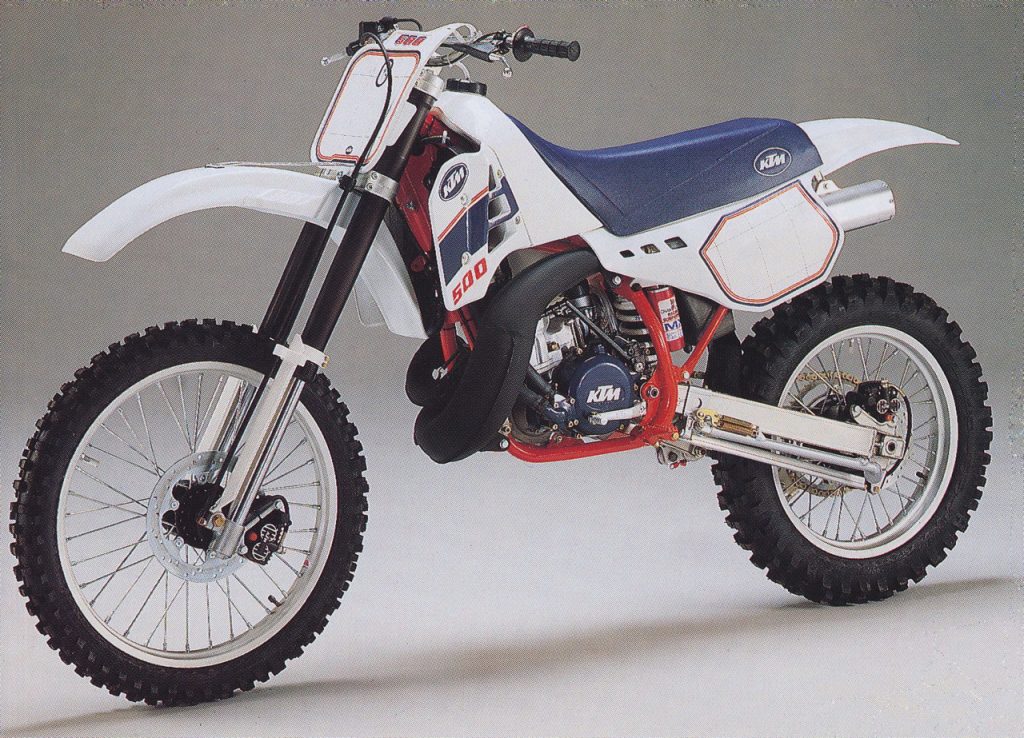
Ninth Place: 1988 KTM 500MX
Blaze: I know Matthes is a fan of some of the earlier KTMs, but this 1988 is the first one that really does it for me. The seventies models are not terrible, but neither are they beautiful, and the early-eighties versions are all saddled with odd plastic shapes and weird proportions. To my eye at least, this 1988 version is the first one that really stands out as a truly good-looking KTM. The very similar 1987 model got close, but this ’88 model has cleaner graphics and a more cohesive look that I really like.
In 1988, those 4054 White Power inverted forks were the height of trick and helped give the bike an exotic flair. I also loved that huge snaking 500 expansion chamber and the cool navy-blue engine cases. Today this bike looks pretty pedestrian, but in 1988, it was the sleekest machine in the 500 class. Classy, but not flashy, this was the high-water mark for me with eighties KTMs.
Matthes: Yes, I agree on this one Blaze. The left-hand pipe is still weird but the red and blue is a nice touch. Agreed on the 4054 forks with those sliders, always looked cool and still does. The number plate backgrounds look pretty small right?
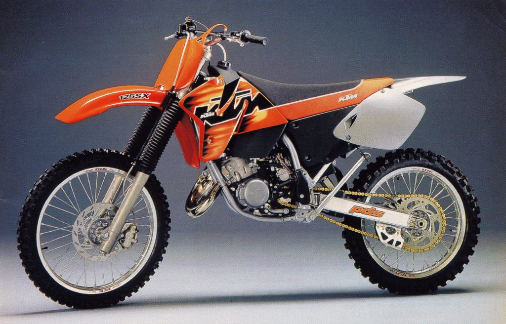 Eighth Place: 1998 KTM 125SX
Blaze: This is the first of what I would consider the “modern” KTMs and a machine that finally got them back on the right track after filing for bankruptcy in the early nineties. This is the first KTM that I ever considered owning and the first one that seemed like a legitimate contender to the Japanese.
In 1998, I loved the styling of this machine and thought it was incredibly trick. The conventional forks and “no-link” suspension were really unique and the power plant was a rocket. I thought the change to a deeper orange from the 1997’s sort of butterscotch was also a big improvement. That “Z” shroud looked cool and the graphics were fresh and understated in a way that was very welcome after half-a-decade of nineties craziness. Of course, the bike still had issues and the PDS “smart shock” turned out to be mostly a dumb one, but I loved the look then and I still dig it today.
Matthes: Yeah when this bike came out with these shrouds, things got weird. But it’s clean and flows pretty nice. Plated pipe still sucks though as do the drab black fork boots.
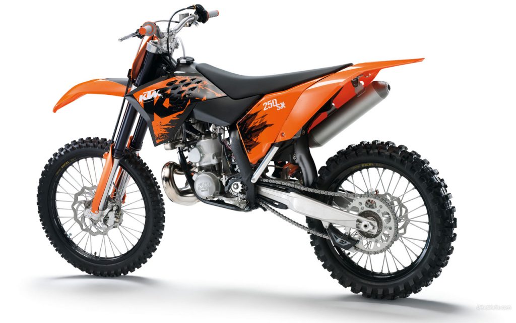
Seventh Place: 2007 KTM 250SX
Blaze: Here is another one I absolutely hated initially but really grew to appreciate over time. When I first saw this bike on the cover of Motocross Action in 2006 I though the Austrians were off of their rocker again. At the time, I had a couple of 2005 KTMs and I really loved that look (and still do as you will see) and I could not fathom why they had gone so radically different with the 2007 version.
Eventually, though, this look started to worm its way into my brain and I warmed to its inimitable charms. Sometimes, you just want to be different and these KTMs certainly were that. I have never been a huge fan of the tiny side plates and these Katooms are certainly major offenders in that regard, but they looked much better once you put a set of backgrounds on them.
Once I got over the initial shock of this bold styling departure, I actually started to really dig these KTMs. In 2008, I bought two of them, a 125 and 250 and really enjoyed them both. I can certainly understand if they are too bold for some, but I think they are cool and unique in a way you rarely see from the Japanese.
Matthes: Back in black! Blaze is right, when you put backgrounds and numbers on there, it looked better than stock. The rad shroud built into the tank is a cool look but I remember this bike looked old fast from rubbing onto the tank. I know plenty of people didn’t like the wave front rotor but I always did. In fact, I even put one on my 2002 YZ250 and thought it was the shit.
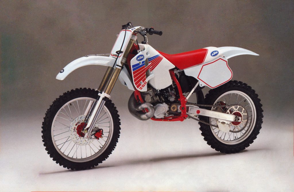
Sixth Place: 1990 KTM 250MX
Blaze: Ah 1990… the single greatest year in motocross styling history, That year, every manufacturer knocked it out of the park with awesome-looking bikes and timeless designs. Every one of them still looks great today and a few of them rank as the high-water marks for their brand’s styling to this day. If you like handsome motorcycles, it is not hard to love the 1990 season.
In the case of this KTM, this was the first year for their new “Broc Glover” replica that was supposed to woo back buyers who had been raised on Japanese machines. New bodywork made it look like a white CR and a switch to right-hand-kick finally dropped the last of its truly Euro quirks into the ash can of history. It was an all-new machine made to look, feel and perform like the best from Japan.
While it is debatable whether this new machine nailed all of its targets, it did certainly get the styling one right. The red, white and blue color scheme really popped, and the all-new bodywork was slim, trim and downright attractive. I particularly loved the graphics this year and they might be my favorite the KTM team has ever used. Overall, this is by far my favorite KTM of the nineties.
Matthes: I could do without the red hubs but yes, a good looking bike. I remember when they hired Glover there was plenty of talk about an all-new “Honda-ish” bike and they did revamp it somewhat but Glover was one and done in Europe with KTM, they had some financial issues and any talk of a new bike was done. This is cool though and a big step up…still waiting for my all-time favorite KTM to appear on this list though.
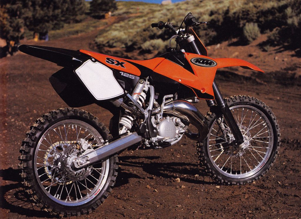
Fifth Place: 2002 KTM 125SX
Blaze: For my money, this is where the orange team really started to hit their stride. I never really liked the use of silver on the ’98-’01 KTMs and this switch to black for ’02 was an improvement in my book. The black tank, fenders, and graphics really work well with the updated “Z” shrouds and give the bike a sense of speed even when sitting still. I also really like the understated KTM graphic used here. The overall look is very minimalist and the lines of the bodywork do most of the visual work. In general, I am not a big fan of black on an MX machine, but it really works here to bring out the best of this design.
Matthes: I can’t do it. I think I said this before, but I worked at KTM in 2000 and 2001 and this bike is basically the same as those bikes. So I just don’t think it looks good, I know it so well. It’s like a stripper that you’re dating that everyone else wants to bang but you’ve seen her fart and stuff. I’m just over this bike, I knew every bolt and nut and all its flaws from working on them so much.
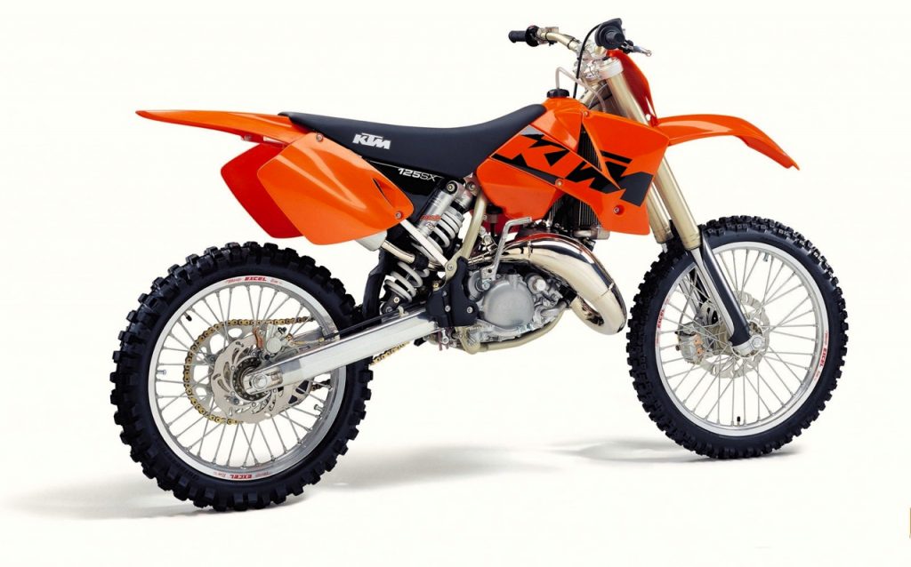
Forth Place: 2003 KTM 125SX
Blaze: As much as I liked the 2002 look, it was nothing compared to how much I loved this stellar all-orange motif for 2003. So long silver, bye-bye black, hello proper pumpkin! To me, this is how a KTM should look; lots of orange, just as the Moto Gods intended.
The new logo was not as understated as 2002, but I dug the way it inversed the colors as it transitioned from the tank to the shroud proper. I do think the new droop-nosed front fender is slightly less elegant than the ’02 version, but overall, this is the better-looking machine in my book.
Matthes: Changing the upper tubes to a “works-ish” color helped for sure and I’m with Blaze on the different color KTM. I know the PDS thing was garbage but how do we feel about the shock being so prominent on the bike? Maybe an orange spring? Frame guards are cool also.
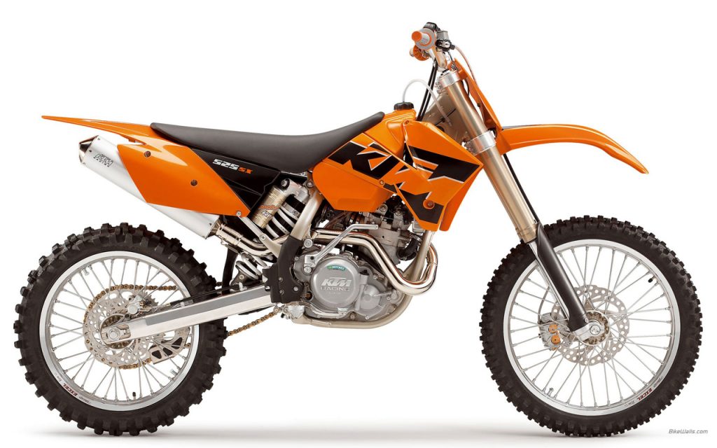
Third Place: 2005 KTM 525SX
Blaze: Here we have my favorite of the pre-Dunge KTMs, the 2005 KTM 525SX. This is another one of the bikes I actually owned and damn was she one beast of a machine. I actually had this and a 200 EXC in 2005 and loved them both. Subtle changes to the shroud design cleaned up the looks for ’05 and distinguish it from the very similar ’04. The one-piece rear section introduced in 2003 on the 250SX also gave this bike a sleeker look than the earlier versions. Of course, that came at the expense of room for numbers, but this was a veritable billboard compared to what they had in store for 2007 (what is it with the Europeans and their hatred of reasonably-sized number plates?).
While I generally prefer the cleaner looks of two-strokes to four-strokes, this 525SX and its 450cc brother are my exceptions to that rule. I always loved the looks of this RFS motor with its unique design and totally un-Japanese appearance. I also really dug the cool tank these bikes used with a hole in the side so you could reach the hot-start. Very trick! Of all the KTMs I have owned, this is the one I wish I had kept. Big, burly and beautiful, KTM killed it with this man’s machine in 2005.
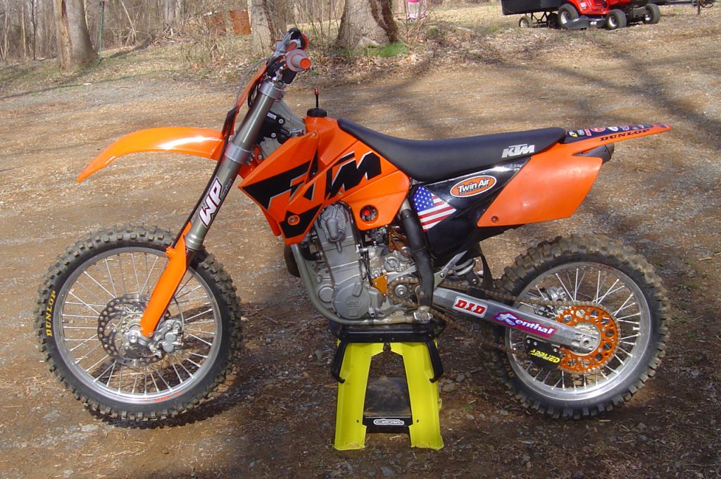
Here is my personal ‘05 525SX with the accessory 540cc kit installed. This machine was an absolute beast and I still love the looks of it. That tank was unique and reminded me of something Honda might have stuck on one of their works bikes in the eighties and the RFS motor design KTM pilfered from Husaberg gave these bikes a singular character totally unlike the Japanese of the time.
Matthes: These bikes were manly machines for sure. Tractor pulling power for days on the 520. I rode one quite a bit over the years. Still not down with the plated header pipes but overall, a good looking bike.
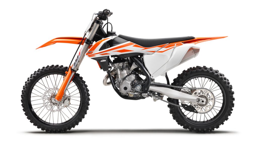
Second Place: 2017 KTM 350SX-F
Blaze: Personally, I love all of KTMs models since the new bodywork was introduced on the 2015.5 Factory Editions. The current design is just beautiful and the best-looking of all the current machines in my book. The new Suzuki RM-Zs give it a run for their money, but I still think the KTMs are king. The color, graphics, and bodywork all work together to give the bike a sensation of speed and aggression. In picking one over another, it really comes down to some minor nits like the color of the frame or rear fenders. For my money, all of them are drop-dead gorgeous and worthy of a spot on my list.
In the end, I went with this 2017 for second on the basis of my affection for the white shrouds this year. I bought a new 250SX-F in 2016 and always thought this white looked a little better than the orange on mine. I also preferred the orange rear fender on the 2017 to the white version on my 2016. Both are great, but the ’17 just pops a bit more to me.
Matthes: Good looking bike, needs to say “KTM” on it though right? I don’t get that part of it. It’s definitely a look that if you were MXA in the nineties and you had to illustrate a “bike of the future,” it would look something like this yeah?
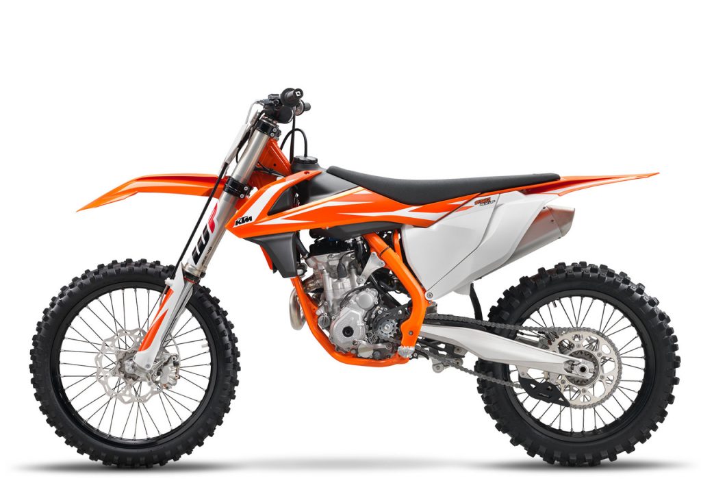 First Place (Blaze) 2018 KTM 250SX-F
Blaze: In first, I have the very similar, but slightly more beautiful to me 2018 KTM 250SX-F. Yes, the yearly shroud roulette meant this one gets a switch back to orange, but it also gets that awesome orange frame like the works versions. This alone was enough to push this 2018 over the top for me. The orange frame really brightens the overall look and brings together the orange plastic nicely as well. Plus, this ’18 keeps my beloved orange rear fender as well. Unless you hate pumpkins or are still holding a grudge about that whole World War I business, I just can’t see how you can’t love this Austrian design.
Matthes: Yes, orange frames are much better on KTMs, I think we can all agree on that. Can’t really get with the groove on the side panel though. Good looking bike for sure, but where in the hell are the 1985 models Blaze? They HAD to be on this list in my opinion. You blew it Blaze. Post a photo up here and let the public decide!
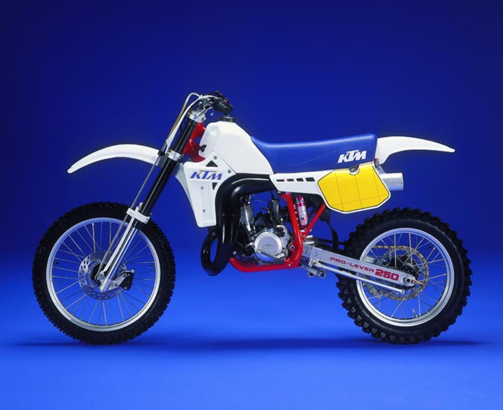 First Place (Matthes): 1985 KTM 250MX
Blaze: OK, so here is Matthes’ pick for the top KTM. I knew he loved this dang thing and I thought long and hard about whether I could see my way to putting it on the list, but in the end, I just could not do it. Yes, it is classier and more understated than any of the butterscotch Katooms, and it does have a set of very trick 4054 USD forks (in 1985!), but that bodywork just never did it for me. I can certainly see a case for replacing my number ten with this Heinz Kinigadner replica, but NUMBER ONE? That, I am not so sure about.
For your daily dose of old school moto goodness, make sure to follow me on Instagram and Twitter @tonyblazier
For questions or comments, feel free to drop me a line anytime at TheMotocrossVault@Gmail.com
