The nineties were a great time for motocross and a great time for motocross advertising. The magazines were still king and multi-page ads were the norm, not the exception. With colorful bikes in the showrooms and huge personalities on the track, this era stands out as one of the most entertaining and interesting in the sport’s history.
During this era, no manufacturer was as bold and creative in their advertising as Yamaha. From Damon Bradshaw in a bald cap to Jeremy McGrath as an Austin Powers-style spy, Yamaha ran the gamut of inspired and eye-catching ideas in the nineties. While not all of them were going to be a Cleo award winner, almost every one was memorable and effective at catching the consumer’s attention in a crowded motocross landscape.
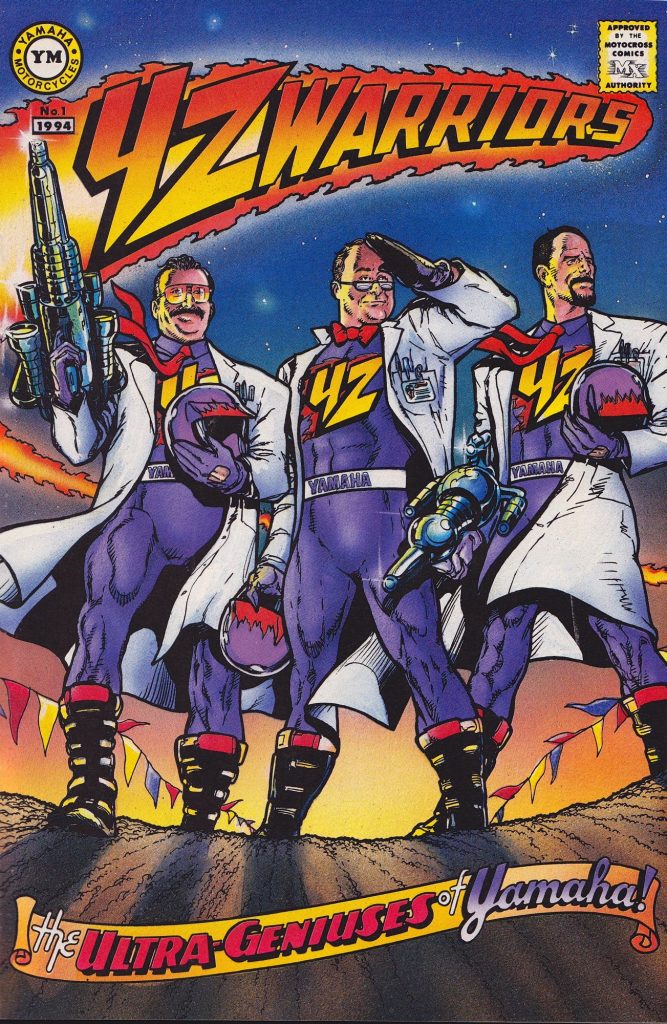
In 1995, Yamaha took this creativity to the limit with one of their most unique ad pitches of the decade. At the time, the full-size YZs were in the last year of their current cycle and due for a major refresh in ’96. The 1995 bikes were actually quite good, but externally they looked to be largely a Bold New Graphics update. At least those graphics actually lived up to the BNG moniker for once, featuring a crazy assortment of gold, red and lavender accents against a backdrop of flames and lightening bolts. Subtle, the nineties were not.

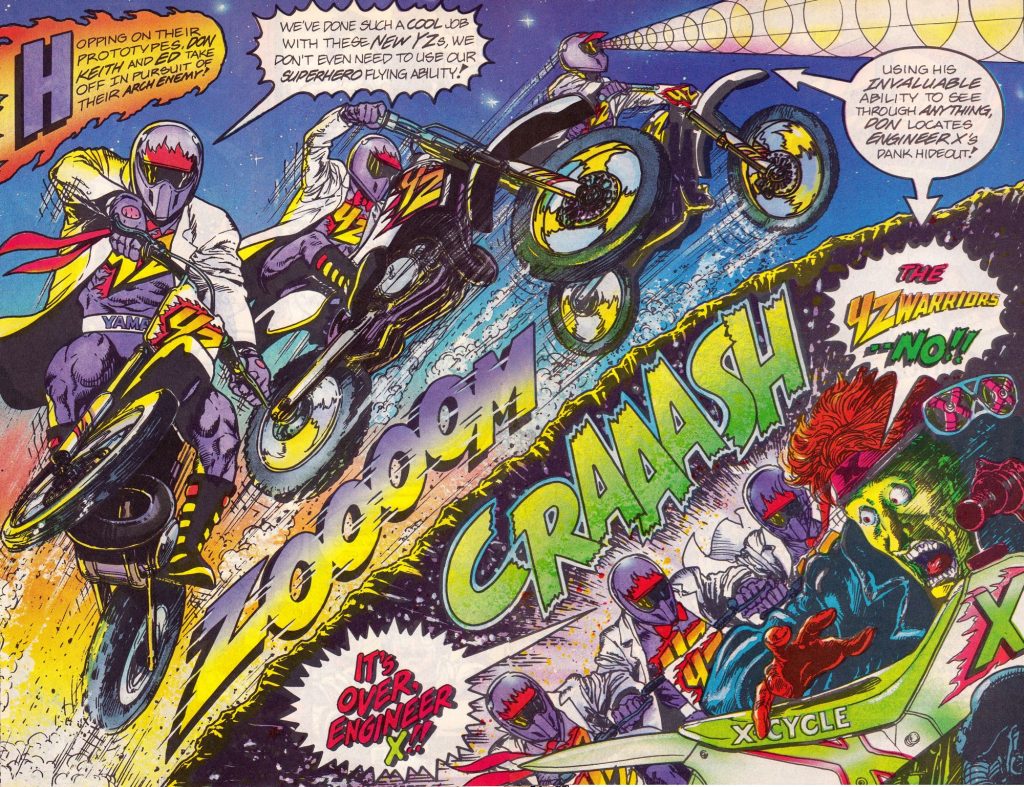
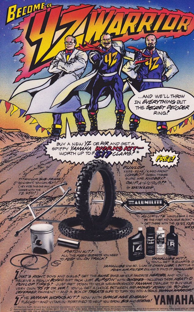
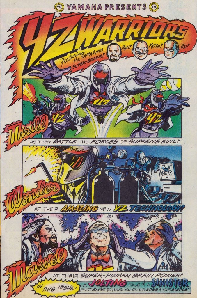
In order to sell this kaleidoscope of nineties awesome, Yamaha chose to use, wait for it…a comic book. Yes, a comic book. That bastion of pre-pubescent teens everywhere. Even more bizarrely, the ad team chose to leave out all of Yamaha’s star riders and instead focus on a trio of team personnel as the stars of the ad. While this might seem a bit odd in hindsight, there were probably good reasons for the decision. In 1994, Yamaha had built its ads around Damon Bradshaw and Jeff Emig, only to have Damon retire at the end of the ’93 season (remember, the ads are shot months well in advance). During the ’94 season, the team had an equally high-profile parting with Damon’s replacement, Mike Craig. With Emig’s contract up at the end of the ’95 season, perhaps the team thought it might be safer to rely on long-time employees like Keith McCarty, Ed Scheidler, and Don Dudek to be the faces of the ad. After all, the three Yamaha stalwarts had also appeared in the ’93 and ’94 version as well alongside their star riders.
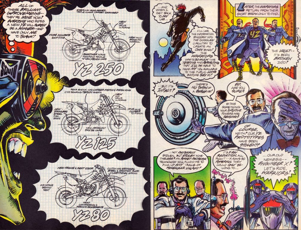
As to the ad itself, it is hard to dock it for its creativity and memorability. It certainly stood out and that is probably the number one goal of any print ad. Personally, I have my doubts about its effectiveness at selling YZ250s to 25-year-olds, but I guess it probably sucked in a few YZ80 candidates. The story is pretty silly of course, but the art style was true to the genre and nicely done. I also liked the Motocross Hall of Justice panel at the end with Jody, Ron Lawson and Wolfman Webb sitting in judgement. Overall, it was really inventive and very clever, but maybe just a bit too goofy for me at the time. In fairness, I did actually buy a 1995 YZ250, so may be the joke was on me after all. Either way, this 1995 Yamaha ad stands as a great example of the free-wheeling spirit of this era in moto.
