
For this edition of Classic Ink, we are going to take a look back at the 1990 KTM lineup
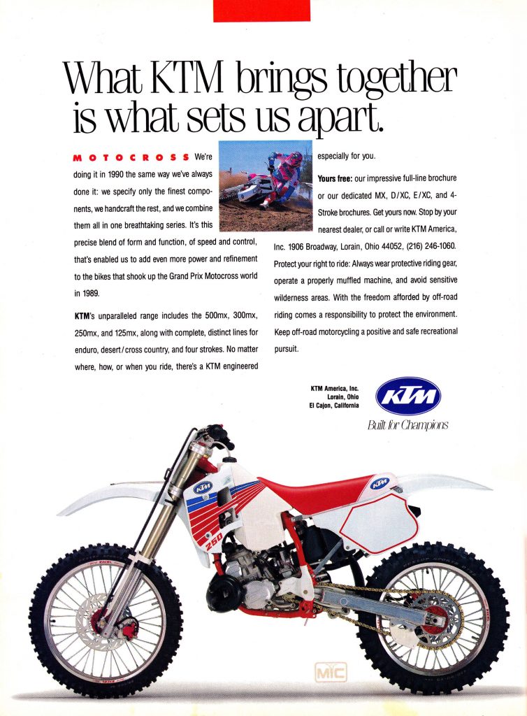 The all-new 1990 “Broc Glover Replica” 250 MX was derided by some as a Honda clone, but it proved that KTM was serious about competing with the Japanese for the US motocross market. Photo Credit: KTM
In the 1980s, KTM was more of a curiosity than a contender to many US riders including myself. I never saw anyone riding them and I can’t recall ever actually seeing one at the track here on the East coast. Occasionally they showed up in magazine tests and the odd shootout, but for the most part, they were treated like a red-headed stepchild by the US motocross press.
At the time, KTM’s US success was centered around the off-road market where the Austrian machines had enjoyed a strong following since the days they were known at Pentons. Here, they were seen as the hard-core alternatives to the fun and not-so-serious Japanese. While their success in Europe and America’s woods showed that KTM had the know-how to build competitive machines, their adherence to European-focused bike setup and old-world ergonomics left many American riders unimpressed.
Knowing how lucrative and important the US motocross market was, KTM set about a plan to revamp their lineup and make it more attractive to a generation of riders raised on the Japanese brands. The new machine would eschew classic European quirks like the left-hand kickstarter and feature ergonomics and styling that more closely resembled their competition from the Far East.
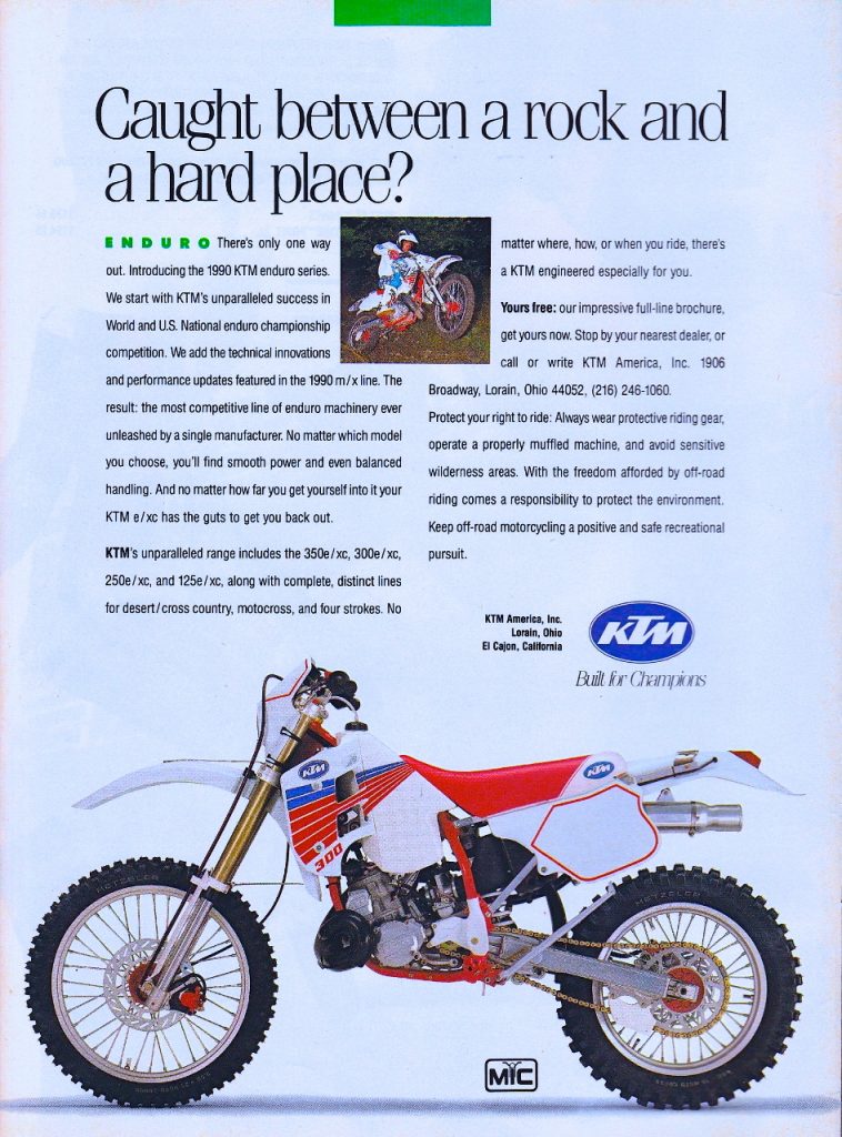 While the motocross version failed to capture KTM a huge portion of the MX market, the off-road variants of the new 250 continued to dominate the off-road standings. Photo Credit KTM
In 1988, just as KTM was launching its plan to revamp its image, the career of an American motocross icon was coming to an end. After more than a decade on the circuit and six AMA National Motocross titles, Yamaha’s Broc Glover found himself without a ride at the end of the 1988 season. While this was a surprising and disappointing end to Broc’s relationship with Yamaha, it opened the door for KTM to add a little star power to its US reinvention plan.
With Broc now a free agent, KTM reached out to him about helping them to develop an all-new machine aimed at the American market. The plan was to use the 1989 Grand Prix races as a shake-down of the new design and have the new machine ready for the 1990 season. With Broc on board, KTM’s new machine was assured to garner far more coverage in the American press and hopefully attract a few more buyers that would not have previously considered the Austrian machines.
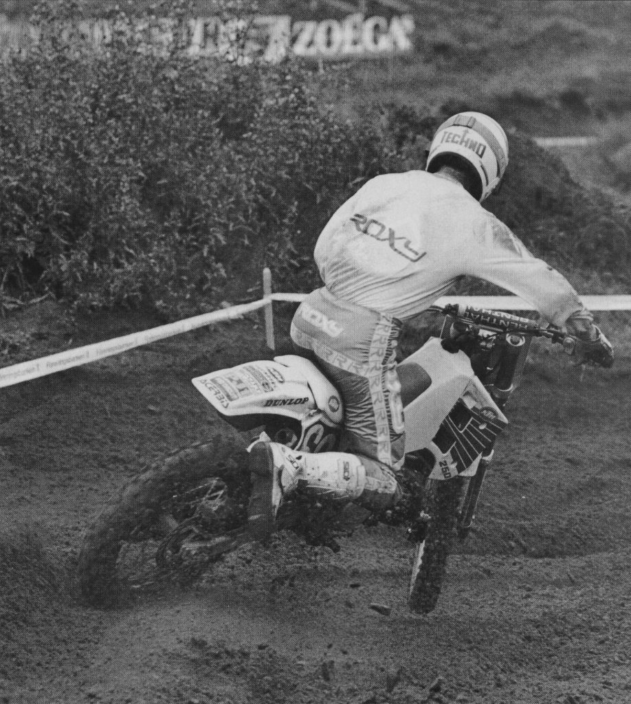 While Broc’s 1989 Grand Prix season was mostly about shaking down the all-new machine he was able to capture a win at Belgium to cap off one of the most storied careers in motocross history. Photo Credit: Per Karlsson
While Broc’s season abroad was only moderately successful on the track, it did accomplish the goal of garnering a great deal of press for KTM. All the major US off-road magazines covered his racing exploits and the development of the all-new machine. At the time, many compared his bike’s appearance to a white Honda and the resemblance was certainly not coincidental. By the time the production machine made its appearance for the 1990 model year, there was a good deal of anticipation for KTM’s new baby.
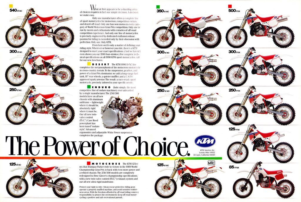 KTM’s lineup for 1990 was an interesting mix of old and new that benefited greatly from some very attractive styling updates. Photo Credit KTM
The production bike featured all-new bodywork and a much cleaner look than previous KTM models. A “low boy” pipe and low-slung tank contributed to the Honda-esque appearance, and most magazine’s tests complemented the KTM on its clean and purposeful appearance. I loved the looks of the new red, white, and blue graphics which really popped against the white Acerbis bodywork. For my money, it was the first KTM model that had ever even offered the slightest visual appeal and I still love its looks even thirty years later.
Despite their outstanding aesthetics and the new “Broc Glover Replica” 250/300, the 1990 KTMs would not be enough to turn around the brand’s struggles in America. Within two years, KTM would file for bankruptcy protection and undergo a major corporate restructuring. The KTM that would emerge would be a leaner and more purposeful operation and eventually become one of the most successful off-road brands in the world. While the Broc Glover hiring and release of the new generation of machines certainly pointed to a renewed interest in the US market, it would take several more decades for KTM to truly break through into the US moto mainstream.