For this edition of Classic Ink, we are going to take a look back at an ad for Kawasaki’s high-flying 1993 KX250.
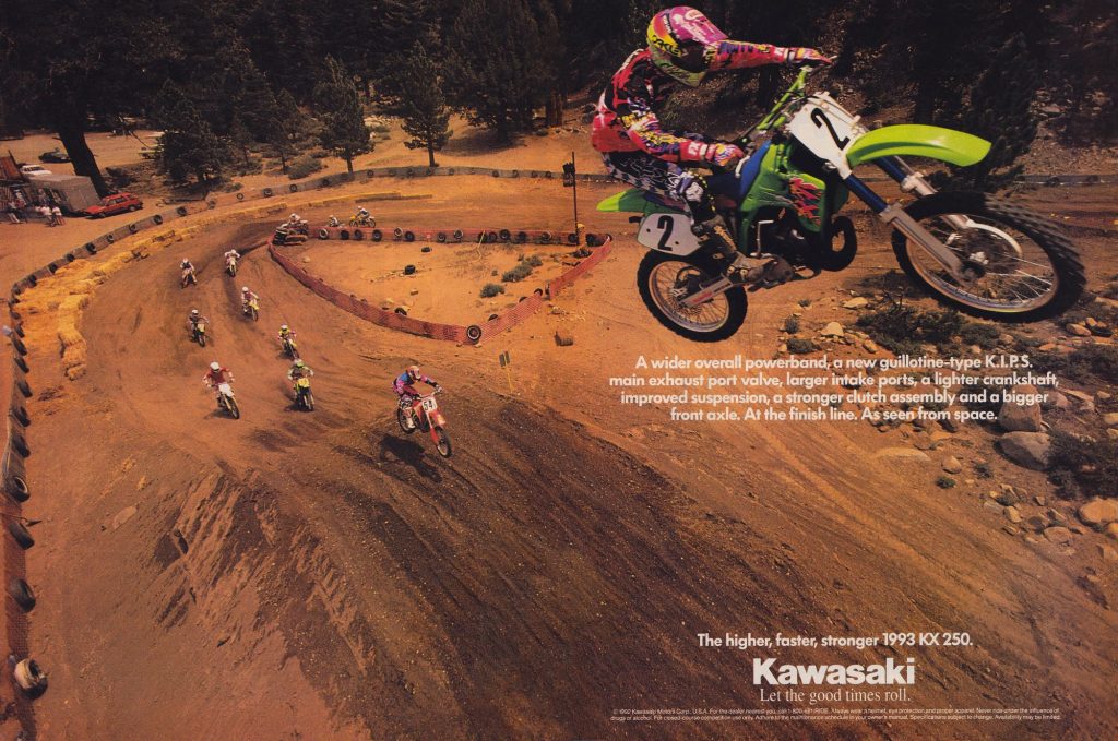
In 1993, Jeff “Chicken” Matiasevich flew the coup to Suzuki but left Kawasaki with one of the most memorable ads of the era. Photo Credit: Kawasaki
In the early 1990s, motocross was on a neon-induced high. The gear, the bikes, the riders, and even the ads were all larger than life and absolutely popping with color. On the bike side, the first machine to make this jump to outlandishness had been normally conservative Kawasaki. In 1990, they had shed their dowdy image with the introduction of their ground-breaking new perimeter-framed KX250 and KX125. With their Ninja-inspired frames, cartoon graphics, and Buck Rogers bodywork, the new KXs kicked off an era where purple and pink would become colors du jour in the halls of Japanese industrial design.
In 1993, Kawasaki kicked it up to eleven with their most bold styling package to date. Mechanically, the ’93 KX250 was not much different from the all-new ’92. None of the bodywork was new but the styling was substantially updated with a redesigned graphics package that made the conservative ’92 look like your father’s Oldsmobile. The redesigned ’93 KX was not as outright crazy as the absurdly colorful 1992 RMs had been, but for many riders it was a love-it or hate-it change.
For me personally, I loved the new look with its huge Kawasaki logo on the seat and Wile E. Coyote shroud graphics. I had not been a big fan of the 1992 look and at the time I thought this ’93 change was one for the better. The blue anodized forks really popped with the more colorful graphics and helped put the KX in contention for the best-looking machine of 1993.
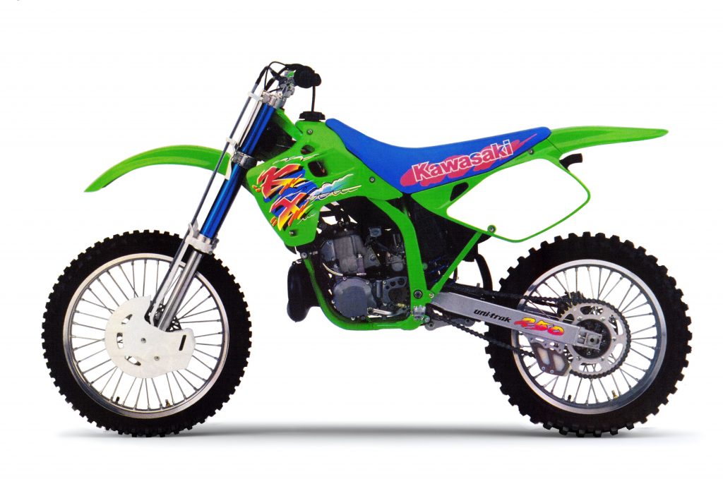 Wile E. Coyote: Bold New Graphics gave the KX a fresh appearance in 1993. Photo Credit: Kawasaki
In order to promote this new bolder look, Kawasaki enlisted their boldest rider (who ironically was moving to Suzuki for 1993); Jeff “Chicken” Matiasevich. In the ad, Chicken is utterly launching the new KX into orbit as if they had added a rocket booster instead of just a new KIPS valve for 1993. When I first saw this ad, my jaw literally dropped to the page. While Jeff was certainly more than capable of executing a moon-shot like this, I have always assumed this photo was some sort of pre-photoshop trickery. I remember having this debate with buddies back then who swore he was legit launching the bike this high. Just looking at the takeoff to this jump it seems implausible to me he could get this high, but of course, I didn’t really know any more than they did. Either way, the ad certainly had the desired effect of generating a ton of buzz for a bike that was essentially a mild refresh with some Bold New Graphics. As soon as this ad hit the mags it was torn out and plastered on bedroom walls, lockers, and workshops all across the country. At the time, I was in school and working part-time at the drive-thru at a bank. Both myself and the other teller were huge MX fans and we plastered this ad on the wall in my little remote teller booth and I can’t tell you how many people asked me about this picture. Something about it captured the attention of even non moto-lovers and the first question was always “is it real?”
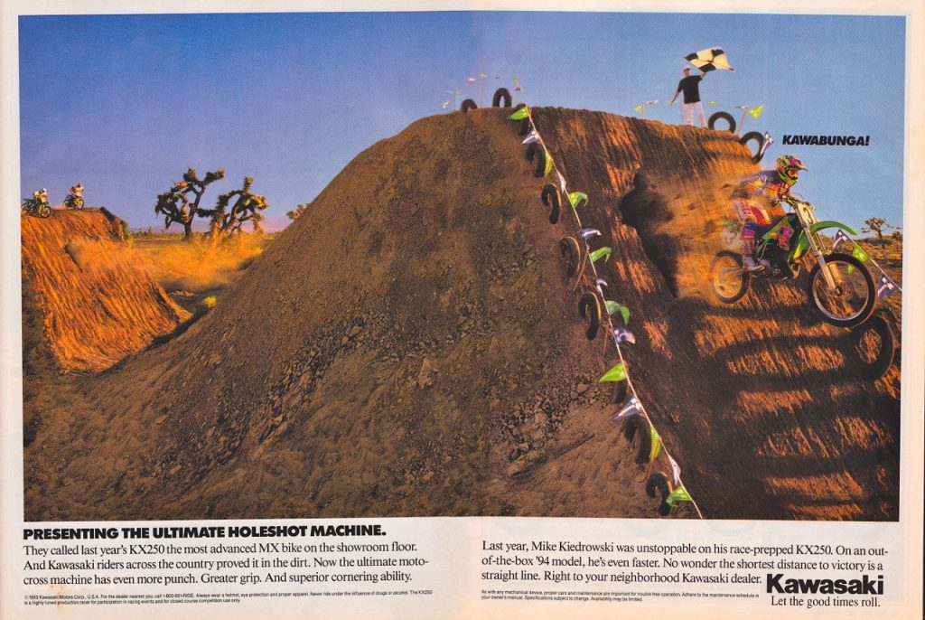
In 1994, Kawasaki tried to one-up themselves but this version missed the mark for me. By blowing straight past possible believability into a cartoon caricature it never connected with me they way the Chicken version did in 1993.
Today, I still can’t answer that question for certain, but regardless, it remains one of the most memorable and iconic ads of the 1990s. That ’93 KX250 was a sweet machine (rocket motor, Cadillac suspension and school bus steering) and I am sure this great ad helped Kawi move a few more KXs in ’93. In 1994, Kawasaki tried to one-up this ad with a ridiculous and eminently less-interesting version staring Mike Kiedrowski that I would rank as one of the brand’s worst. Sometimes, you just catch lightning in a bottle and that is what Kawasaki’s Don Draper did in ’93. Who said Chickens can’t fly?

