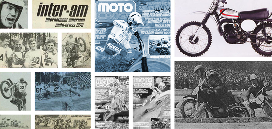
Tony Blazier’s back with a personal opinion on what he thinks are the best looking bikes ever. And I chime in as usual.
The Best Looking Bikes in History
By Tony Blazier & Steve Matthes
Motorcycle aesthetics are one of those things that true enthusiasts always feel passionately about. We all have our favorites, and if asked, are always happy to expound upon their virtues. As with most things, opinions can often vary wildly. One person may love a bike’s avant-garde styling, while another may find it over-the-top and ridiculous. When it comes to things like taste, one thing is for certain, you are never going to have a lack of opinions.
When I sat down to do my list of the best looking bikes ever, I went as far back as the early seventies and right up to today in considering my choices. You may notice that my choices are somewhat skewed towards bike from the mid-eighties and up. To be honest, I did not get interested in motorcycles until around 1980 and bikes from the seventies, while interesting, have always seemed a bit too crude for my taste. I’m sure someone a few years older than me would come up with a different list, but that is the beauty of something like this, there is no right answer.
Here without further adieu, are my top ten coolest looking motocross bikes ever with Matthes adding his own two cents in on my selections. (Matthes note- I would’ve put the ’87 YZ80 in here because when I was 13, that thing was awesome looking and as I state, the ’93 RM’s are cool looking. So is the ’85 KTM 125- loved the looks of that bike but this is Tony’s list- not mine. Although let me give an honorable mention with a photo of said KTM)
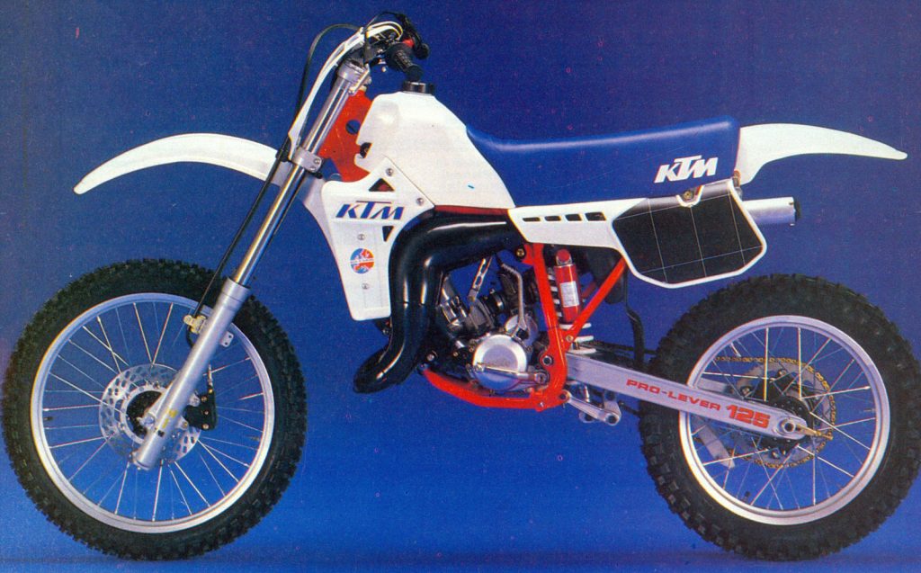
| In ’85 this thing was badass, front disc brake, upside-down forks (which the other OEM’s didn’t get until four years later!) and lots of horsepower…this bike was so cool back in the day. Also, I believe the KTM logo was actually plastic glued onto the shrouds. Plus, extra points for the kickstarter on the left side! |
#10 1988 Yamaha YZ250
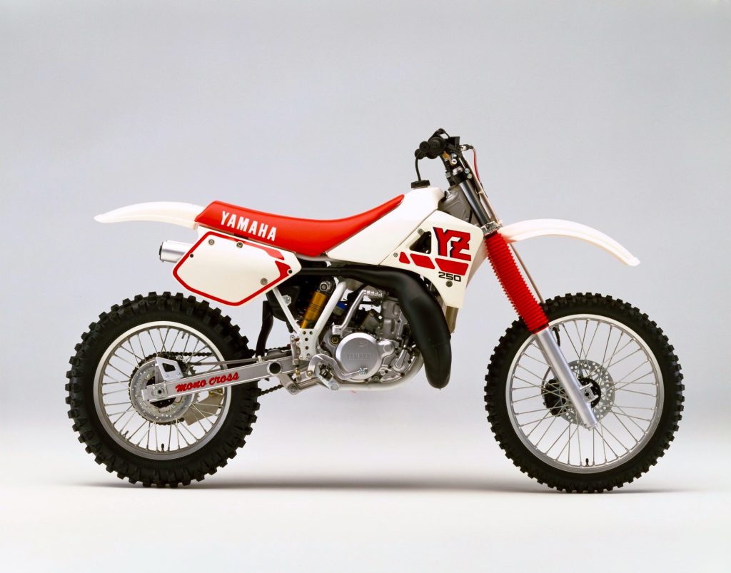
| The new YZM replica YZ250 was one cool looking machine in 1988. After nearly a decade of sub-par bikes, the ’88 YZ was a real breath of fresh air for the Yamaha faithful. |
Blazier- In 1987, Yamaha came out with one of the coolest works bikes of all time, the exotic YZM500. The YZM was incredibly advanced for its time, with an all-aluminum chassis and super trick monocoque airbox and subframe. For 1988, Yamaha looked to capitalize on the buzz generated by the YZM with the introduction of an all-new YZM inspired YZ250. The new YZ featured sleek, works look alike bodywork to go with its greatly improved performance.
While ‘87 YZ was a decent bike, it was no world beater in the looks department. The new ’88 YZ250, on the other hand, was a real knockout. The bike captured a lot of the flavor of the YZM with its new bodywork and even had a little works Honda thrown in for good measure with its cool asymmetrical radiator shroud design. Yamaha has changed their corporate colors several times, but this sweet red and white color combo with the satin silver engine is my still my favorite. I even love the retro flavor of those bright red fork boots. In a decade that was pretty tough for Yamaha, the ’88 YZ250 was definitely a high point.
Matthes: Blaze did a good job in selecting this machine although if it’s me- I put the ’89 model with upside down forks in instead of the 88 despite the ’88 having nicer shroud graphics. I just like the look of the USD forks. But either way, if this bike or the ’89 hadn’t been somewhere on the list, I’d probably drive down to D.C myself and kick his ass. The works YZM that Blaze was talking about was pretty amazing but in talking to mechanics who worked on it and riders who rode it, it wasn’t that great of a bike. Still, it looked about 80 million times better than any Yamaha that came before it. My brother had one of these bikes and although it is a great looking bike, like all Yamaha’s- it didn’t age well. The tank turned yellow, the fork boots got old and the shroud stickers disappeared if you sneezed on them. Still, new this thing (and the ’89) was badass.
#9 2005-2012 Yamaha YZ250
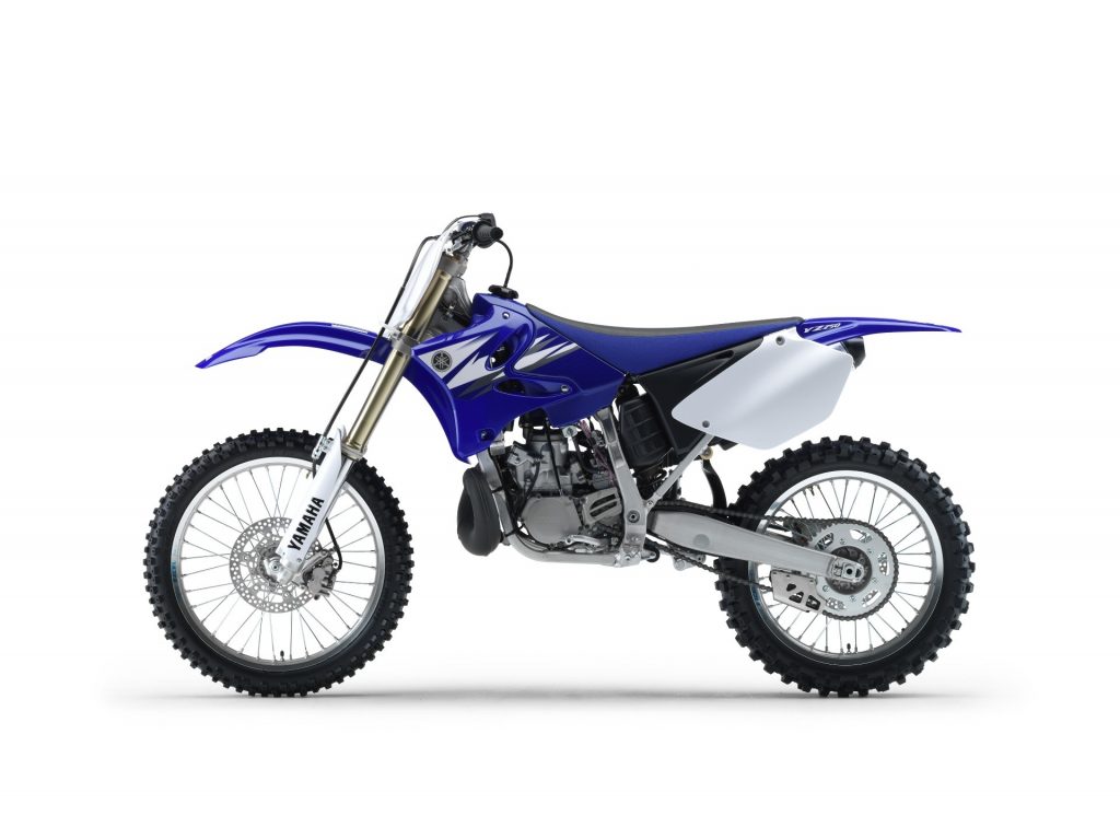
This old girl just keeps trucking along. One of the few Japanese two-strokes still in production, the YZ250 could probably use a refresh at this point, but I still think it looks better than anything Yamaha has built since 2006. It is a classic design that has held up well and still looks great a decade after its debut. Considering Yamaha’s current taste (or lack thereof) in styling I consider it a blessing they have left the good old YZ250 alone.
Blazier- I know some people probably think this bike’s styling is getting a little dated at this point, but I think it still looks great. In fact, I think it still looks a thousand times better than its current YZF stablemates. In truth, this bodywork does not really look all that different from the first blue YZs back in 1996, but it was a handsome bike then and still is today. The sharp lines of the tank and shrouds look modern without going into overkill (unlike the current YZ250F) and the side plates actually hold numbers (what a novel concept). Another cool feature on these YZs is their unique aluminum frame. Its interesting design and its unusual appearance add a little visual flair to an otherwise conventional design. To me, this is one of those cool, iconic motorcycle designs that will withstand the test of time.
Matthes- I worked on this bike at Yamaha for two years and know this bike inside and out. For example, did you know that the rubber plugs underneath the tank actually come from a street bike model? What about the fact that you had to make sure that you changed the aluminum cable holder on the side of the frame more than you would think you would have to because they got a sharp edge in them with wear and it would cut into our works clutch and throttle cables? See? It’s impossible for me to just look at this bike objectively. It’s like looking at a supermodel and then actually marrying her. It’s when you’re married that you realize she leaves the door open when she poops, she belches a lot and doesn’t shave her legs for weeks. Things just get a little different when you’re on the inside. There’s nothing on these bikes that I haven’t worked on, inspected week in and week out and lived to get frustrated by the little things.
Anyway, the early aluminum frames from Japan were painted blue so they didn’t stand out at Glen Helen and I liked that look, the actual production look with the hollowed out cups in the frame- eh- not so much. They collected dirt in there and you couldn’t scotch-brite inside of them that well which was off-putting when compared to the parts you could scotch-brite. The tolerance in the upper shock mount for our factory shocks was such that if you didn’t use some force and have it lined up just right, the freshly-greased collar would be tumbled into the dirt. Oh, and then there are the rubber tank mounts that wouldn’t stay where they were supposed to and when you zip-tied them to stay put, the zip-ty would cut through the rubber… see there I go. I better just stop.
#8 2011 KTM 350 SX-F
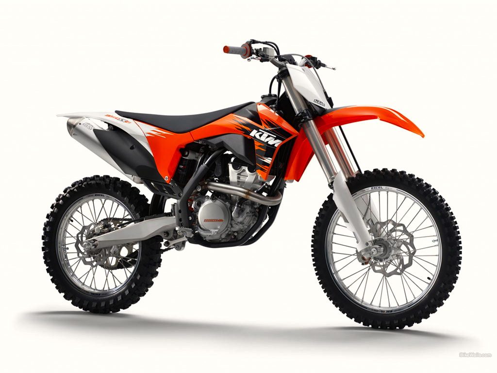
For nearly three decades KTM has been synonymous with weird. They have always marched to the beat of a different drummer and often, that march was out of step with the American market. All that changed in 2010 with KTM’s new line of machines. Gone were the non-existent number plates and oddball looks (What is it with the Euros and dinky side plates anyway? Is there a huge tax on numbers over there or something?). In their place were thoroughly modern machines with attractive lines, usable side plates (hallelujah!) and rear linkages (double hallelujah!). These new KTM’s are the first ones in quite a while that you don’t have to buy in spite of their looks.
Blazier- After years of producing shall we say “interestingly” styled bikes, I think KTM has really hit a home run with their current line of machines. To me, there is a real fine line with KTM’s choice of sharp lines and hard creases. Some bikes, like these KTMs, pull it off, while others like the aforementioned YZFs take the theme a step too far. I’m not 100% sold on the strange rear fender/side panel cladding KTM uses on these new models (and Honda is copying on the new 2013 CRF), but they are a quantum leap forward from the weird-looking pseudo side plates that were on the ‘07-‘09 models. KTM’s have always been a bit different, but these current ones can finally stand up to the world’s best in terms of performance and styling.
Matthes: I don’t think this bike is making my list but I would 100% include it if it looked like the bikes the factory teams raced. An orange frame and all the cool little goodies make it one of the best looking bikes in the pits. As this bike sits though, it’s all right. Not ugly by any means but not the bell of the ball if you get my drift. What’s with the wrap-around fork guards? And the two-toned side panels are fugly to say the least. Bonus points for the shrouds and the front disc shape though. An orange frame would go very far- just sayin’.
#7 2001-2008 RM125/RM250
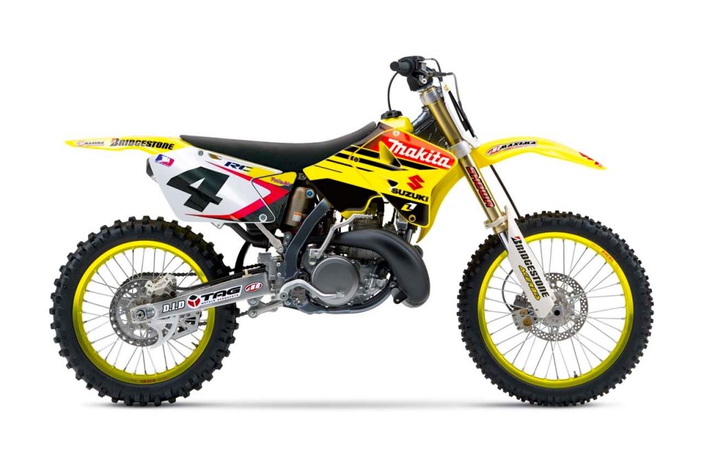 Although the RM250 has surely had a lot of ups and downs in its thirty-year run, it went out with a bang with this final incarnation. These were great machines in every way, with class-leading performance to match their aggressive looks. Any RM from 2000 to 2008 is a good looking machine, but this ’06 RC replica is my favorite by far. BRAAPPPPP!!!!
Blazier- When this body style debuted on the 2001 RMs, it was quite a departure in styling from the 2000 model. The new angular look and florescent yellow plastic shouted “NEW” in no uncertain terms. Over the course of its seven-year run, the color of the yellow got toned down a bit, and the number plates switched from yellow to white, but it never lost the appeal of its edgy modern styling. Eventually, the RM250 became a casualty of the switch to four-strokes and never got the benefit of a more modern alloy chassis. Even so, it remains one of the best bikes of its era and one of the coolest looking Suzuki’s ever.
Matthes: Years ago Suzuki did a re-design of their two-stroke bikes and as we liked to call them, they were Yamuki’s because Suzuki took what might have been the best bike back then, the YZ250, and just copied it the best they could. Right down to the bore and stroke and power-valve system I believe. And the looks department as well because this is just a Yamaha in some different colors. Nothing wrong with it, I like it, but c’mon- it’s the same bike! Bonus points for the gold rims and I’ve always liked the red color scheme with yellow but that’s just me.
#6 2009-2012 CRF450R
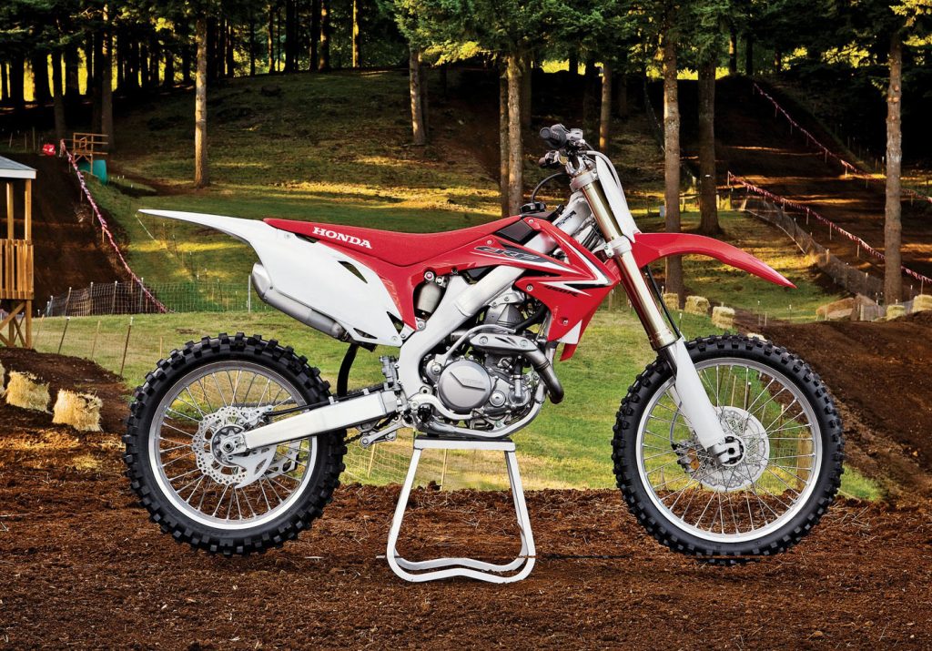
I have loved the looks of every Honda CR since they went to the aluminum frame. Sometimes their appearance proved to be better than their performance, but they always looked the part. This current CRF is a case in point. In stock condition, it is a rather confused machine, with a short a powerband and unbalanced chassis. In the looks department though, it is a superstar.
Blazier- For my money, this is by far the best-looking stock bike currently in production. I just love the CRF’s clean lines and sleek design. It looks lighter and faster than the competition just sitting still. The flowing design of the bodywork is both uncluttered and modern, making the bike look much more compact than previous CRF’s. The alloy frame becomes more svelte with each redesign and adds to the bikes ultra-modern appearance. As a race machine, this bike has certainly been a bit of a mixed bag, never quite equaling the model it replaced. As a styling exercise, however, it has been a rousing success. Honda has produced some really great looking bikes over the years, and this current CRF is definitely one of their best.
Matthes: I think Blaze has too broad of a stroke here, the ’09 was a little different than the ’12 no? I don’t know, I’m too lazy to work the Google right now but I will say that Big Red has always had it going on with nice looking bikes. And this is no different and it’s funny how on point Honda has been for so long because their 2013 bike is pretty different from this bike and it’s STILL awesome looking in my opinion. I haven’t owned a Honda dirt bike since 1992 (Kawasaki 450’s, Yamaha 450’s and Yamaha YZ250s) but I always think they’re great. And Honda being Honda, they didn’t just make the side panel black on the lower half ala KTM. I remember when I was at Yamaha and we had the ’03 450 make-over where the made the bike smaller, slimmer and sexier. And it was pretty cool looking bike until a Honda CRF450 rolled up next to it and immediately the steel-framed, bigger gas tanked, heavy machine’s roots started showing.
#5 1988 Honda CR250R
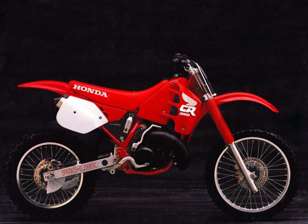 Here is another bike that was a revolution when it debuted. The radical “low boy” look was like nothing ever seen on a production machine up to that time. I was not a huge fan of the blood red look when it first came out back in ’88, but now I think it really adds to the appearance of the bike. It also did not hurt to have the Ricky Johnson killing everyone on it every weekend.
Blazier- In 1988, Honda took a major gamble by redesigning their universally-loved CR250R. Honda basically threw out everything from the ’87 and started from scratch with an all-new machine. The chassis was redesigned with a Supercross-inspired rear suspension and a radically lowered center of gravity. The new “low-boy” bodywork and exhaust routing made the bike feel lighter and much easier to move around on. In 1988, this bike was at the cutting edge. Unfortunately, it also happened to not work very well. The new motor was a major step backward from the ’87, with a slow-to-build and lethargic delivery. In addition, the new “Delta Link” shock beat riders to death and the Showa cartridge forks went from magic in ’87, to gruesome in ’88. The thing was, if you could get past the mellow motor and crummy suspension, you would realize the 1988 CR250R was one bitchin machine.
This baby just sweat trickness back in ’88. The new monochromatic color scheme was super cool and harkening back to the fire engine red Elsinore works bikes of the late seventies. That low-boy pipe looked sooooo trick, wrapped around the engine like a coiled snake. Then you had that badass dropped gas tank that looked like something off one of Honda’s RC works bikes from the early eighties. The ’88 CR just screamed performance from every angle. This bike was the Ferrari Testarossa of the motocross world, excellent on a poster, but difficult to live with in the real world.
Even with all its faults, the ’88 CR was a huge sales success; do in no small part to its incredible curb appeal. They say the first bite is with the eye, and on that account, this baby sure tasted sweet.
Matthes: I remember the mass hysteria at the track when this bike got introduced. It was on the same level as New Coke because Honda ditching it’s familiar orange-ish red was a big deal. The color wasn’t the only thing as the low-boy pipe was also pretty awesome and incredible all at the same time. Honda switched between “CR” being on the seat or shrouds while “Honda” occupied the other space for a number of years. In ’87 it was opposite and then in ’89 they went back to the way it had been. Yes, this was a bitching looking bike, no doubt but not nicer than the Yamaha in my opinion. I remember a clueless friend named Dave I had growing up who came to me in about August of ’88 freaking out about a local pro’s bike who had this super-cool custom pipe from Pro Circuit that was all low and everything. The bikes had been out for eight months but Dave just happened to notice it on this day. This man is now a police officer people. Just a little tid-bit about some of our law enforcement people out there.
#4 1987 Honda CR250R
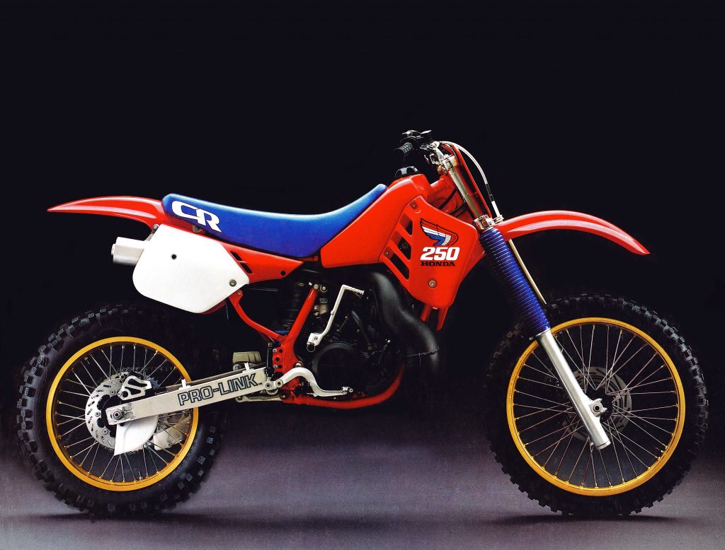
Coolest color combo ever-coolest Honda wing design ever- coolest CR logo ever- and GOLD RIMS people! This was one bad Mama Jama.
Blazier- In many ways, the eighties were the decade of Honda. While things started out a bit rough at the very beginning, by ’83, they were on the way to becoming the dominant brand in motocross. Iconic machines like the ’83 CR480R and ’86 CR250R laid waste to competition in the showrooms and on the track. By 1986, if you were not riding red, you were playing catch up.
In ’83 Honda dropped the blood red color they had used since the mid-seventies for a new more orange shade of red. This combined with their new blue seat really made for a bright, colorful machine. When you combined the new color scheme with Honda’s modern, smooth and well-designed bodywork you had a machine that made everything else look like a half-hearted design.
This design theme culminated with the bike you see here, the 1987 Honda CR250R. I love absolutely everything about the looks of this bike. This orange/red color is still my favorite Honda color and it just looks fantastic against the bright blue of the seat and fork boots. The classic red, white and blue Honda wing is iconic in its own right and perfectly suits the rest of the machine. Topping off the appearance are those super cool gold rims.
I was really torn as to whether to put this in my top three. It really is one of my favorite machines ever and maybe the best motorcycle Honda has ever produced. In the end, I decided it was just a tick behind the slightly more modern competition and placed it just off the podium. In truth, it is splitting hairs at this point and you could make a case that any of the machines in my top five deserve to be number one.
Matthes: Yup, this one is also another beauty. Here’s the thing about bikes with fork boots though. They always looked way tricker when you either put them on or took them off. Taking the boots off this bike made it look factory-ish. The first year of the rear disc brakes for Honda and gold rims, yes, please. Surprising that at the time, these bikes were hailed as slim and beautiful handling but when you sit on one now, you really are surprised at how fat they were. Drawbacks to these bikes were the magnesium side covers would corrode badly and on the 125, the pipe melted more than a few tanks back in the day.
The Top Three
1990 was an incredible year for motocross bikes. In my opinion there has never been another year like it in terms of motorcycle styling. The top three machines on my list all came from this year and honestly every 250 that year was a great looking machine. The Honda, Suzuki and Kawasaki were, in my opinion, the best ever for their particular brands. The Yamaha was only slightly modified from the #10 bike on my list, but it was a good looking machine. Even KTM, a perpetual tail-ender in the looks sweepstakes, produced a great looking bike in 1990. In short, there was not a stinker in the bunch, perhaps the only time in motocross history that can be said. Even more significantly, this was the end of the era of sanity and taste in motorcycle design for some years to come. This was the magic year before the train jumped the rails and the manufacturers started styling their bikes for half-blind five-year-olds. After reaching its pinnacle in’90, styling would descend into crazy graffiti and absurd color combos through the majority of the decade.
Here are the best of the best.
#3 1990 Honda CR250R
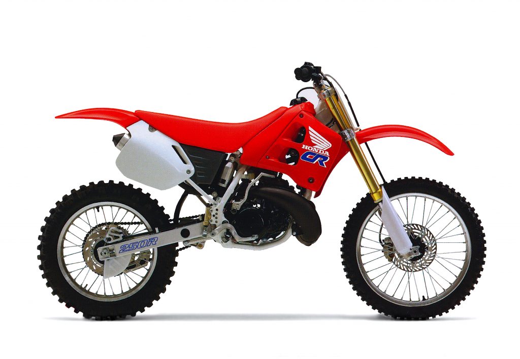
I have been lucky enough to actually own five of the bikes on my list, while I liked them all, this one remains my all-time favorite. The sweet color scheme and clean looks make this one of the best looking bikes from any era.
Blazier- In the number three spot, we have the 1990 Honda CR250R. The CR received a major overhaul for ’90 with all-new bodywork and a return to my beloved orange mist color from the previous year’s blood red. In addition to the new plastic, the CR received a bright white frame and clean understated graphics to complement the new color.
I think this bike looks just as good today as it did twenty years ago. The bodywork is extremely clean and businesslike in design. It lets you know with one look that it is a serious race machine and is devoid of any extraneous touches. The monochromatic orange color really looks fantastic against the contrasting white frame and black engine. In addition to the cool bodywork, the ’90 Honda wing graphic is one of my all-time favorite designs. It does a great job of brightening up the bike without being cartoony or overdone. Honda really hit a home run with the ’90 CR and it remains my all-time favorite red machine.
Matthes: Not sure I agree with this one here. I owed one of these bikes and they’re ok looking but better than an ’87? No way. The white frame was a big departure for Honda and it made the bike look old fast. But then again, this isn’t a contest about how the bike looks with time on it. It’s brand new out of the crate looks right? Yeah, I don’t know- it was back to Honda orange-red for ’90 and I just don’t think the white frame looks that good. An all right looking machine but in my opinion, it doesn’t deserve to be this high.
But the 500 from 1990 gets bonus points for having the stickers embossed inside the shrouds so that it never wore off. For some reason, the 500 was the only model Honda did this on despite probably selling less of that model than any other.
#2 1990 Suzuki RM250
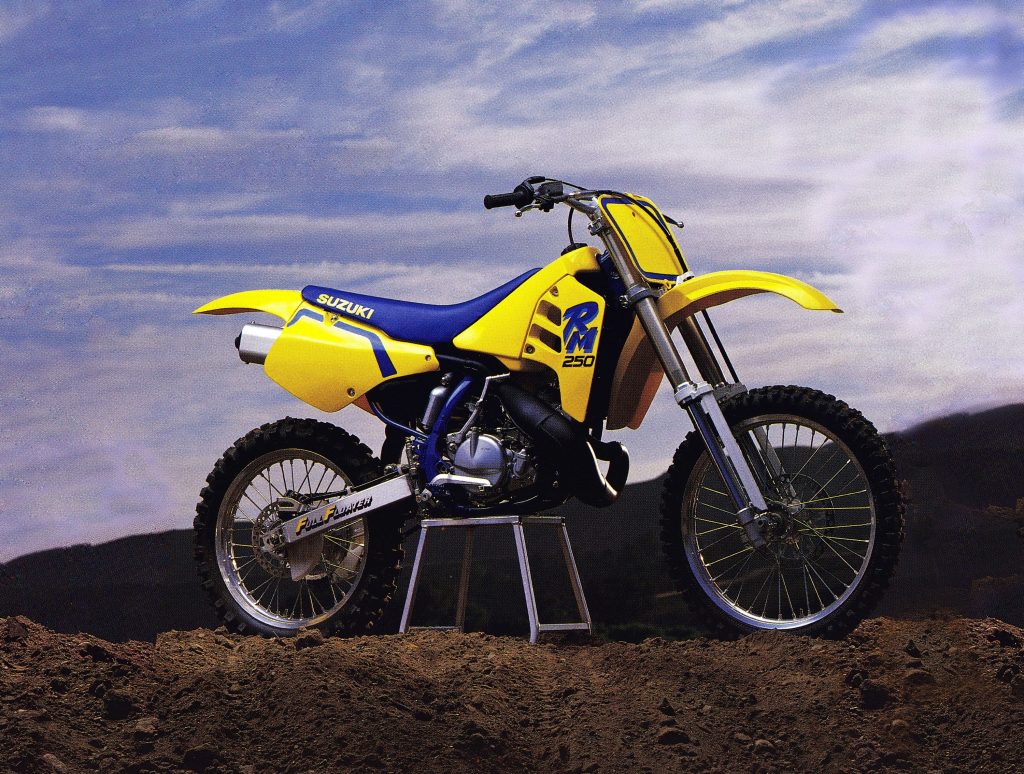 Suzuki has owned the dubious distinction of producing some of the ugliest machines ever built. Thankfully even a blind squirrel finds a nut every now and again and in ’89 Suzuki stumbled upon this beauty. The ’89-’90 RM’s are so clean and attractive in appearance that they make you wonder how the same company could have produced the ungodly hideous ’92 RMs.
Blazier- At number two we have without a doubt the best looking RM ever produced, the 1990 RM250. In 1989 Suzuki completely threw out the baby with the bathwater and introduced a radically new RM. The new RMs shared nothing with their predecessors and finally signaled Suzuki was snapping out of the doldrums that had made them the last of the Big Four through much of the eighties. The new case-reed RMs did away with the old model’s ridiculous Platypus fenders and ill-fitting bodywork. Overnight, Suzuki transformed the RM from an ugly duckling to a beautiful swan.
The classic yellow and blue color combo has always looked good, but on the ’89-’90 RMs it really looked fantastic. The difference between these RMs and their predecessor was so startling it was almost as if they were built by different companies. I love everything about the way these machines look. All the plastic is well designed, modern and clean in appearance. The graphics on the ’90 model, in particular, are the best ones Suzuki ever put on any of their bikes (this is the main reason I prefer ’90 model over the nearly identical ’89 version). This was definitely Suzuki’s high water mark for styling. In ’91 they went back to their old ways and came out with a bike that looked like someone barfed on it. Still, for one year, Suzuki made the second coolest looking bike in motocross and in the crazy awesome year of 1990 that was not half bad.
Matthes: Again, not an ugly bike but no way should this thing be this high. If you want to talk about a Suzuki RM250, put the one-piece shrouded bike of 1993 this high. I do like the upside down forks on the bike and I always way preferred the front-only sliders of this bike over the full protection of the Honda right above this. Then again, my dad was the one paying for damaged fork legs in 1990, not me. Nice rear brake pedal Suzuki- hey the sperm whale hunting society called, they’re looking for a new spear. And I like Suzuki’s absolute lack of caring about the number plate color. “Hey, it’s wayyyy cheaper for us to just make it yellow with this small blue decal on it than to issue it with an actual real color that most everyone in the free world will use.” Except in Canada, when you were a B rider, your color was black numbers on yellow backgrounds. So anyone other than some B riders in Canada was pissed. I like it but I would’ve gone with a ’93 or maybe even an ’88 RM 250 although I think that bike still had a stinky blue motor.
#1 1990 Kawasaki KX250
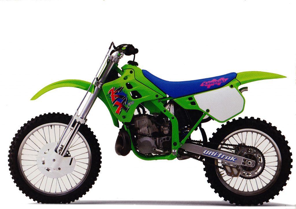 If Buck Rogers rode motocross, this would have been his ride. This baby was an eye-popper in ’89 when it was first unveiled and still looks radical today. If looks could win you races this bike would have gone undefeated.
Blazier- At number one with a bullet, we have the awesome, radical and earth-shattering 1990 Kawasaki KX250. In my thirty-plus years of following motocross, I have never been as blown away by a machine’s appearance as I was by this bike. The new KX was such a departure from the stodgy, old-school ’89 model that it looked like it was from another planet. I mean just look at that thing, it still looks crazy today!
Its look was dominated by that big, burly perimeter frame, which looked positively massive at the time. Then you had those bold graphics and bright contrasting colors that screamed: “look at me.” Add in swoopy new bodywork with a revised “low boy” layout and you had a bike that firmly put the eighties in its rearview mirror.
The success of the bold new KX probably did lead to some of the questionable aesthetic choices made by all the manufacturers in the ensuing years. There is no denying it made quite a splash in 1990 and certainly influenced styling trends going forward. Even so, its appeal and impact are hard to understate. It was one badass machine in 1990 and is my pick for the coolest looking motocross bike of all time.
Matthes: Yet another 1990 bike from Blaze! That’s three in a row if you’re counting! What happened to Tony to make 1990 so memorable? I’m guessing he got laid a lot, saw some bitching concerts and maybe he won his local Maryland district championship in 1990. Whatever it is, Blaze loved him some 1990.
But in all seriousness, I also would have put this bike up this high. It was like a spaceship when you first saw it. It blew everything else out of the water with its radical frame design and tank/shroud combination. From an ’89 125 one-radiator with a long ass shroud thing to this bike in one year was quite a remarkable achievement. Again the frame was so bitchin, the aluminum shock towers looked awesome and the fork guards, as I stated, are right up my alley. These bikes were a little chunky once you got on them and they vibrated badly but right here, in this picture, they replaced Playboy’s for me back in the day. Just an incredible looking bike indeed. I spoke with Mike Fisher, former factory Kawasaki manager and a big R&D guy for Kawi. He was instrumental in developing this machine and tells the story HERE.
