A FOP (Friend of Pulpmx) T Blazier took his time to tell us what he thinks are some of the worst ads ever.
A FOP (Friend of Pulpmx) T Blazier took his time to tell us what he thinks are some of the worst ads ever.
In case you missed TB’s Best Ads Ever, it’s HERE but you can’t put up the best without putting up the worst right? Below are some of the worst ads ever with additional commentary by Tony and myself.
Ten Ads These Companies Wish They Had Never Made
By Tony Blazier
This list was actually harder to narrow down than the best ads list was. I found that I had an easier time picking great ads than poor ones. The really great ones move you emotionally and make a lasting impression. The poor ones on the other hand rarely make any impression at all. You often just flip past them and don’t even bother to read them at all. They are quickly gone and forgotten to history. I looked at a lot of ads to come up with these ten that I thought deserved singling out. I tried to take into consideration the era in which they appeared and rate them accordingly. Here again in no particular order are the ten ads that time should have forgot.
 |
|
I will say this, I do like that litle cartoon dude on the logo. |
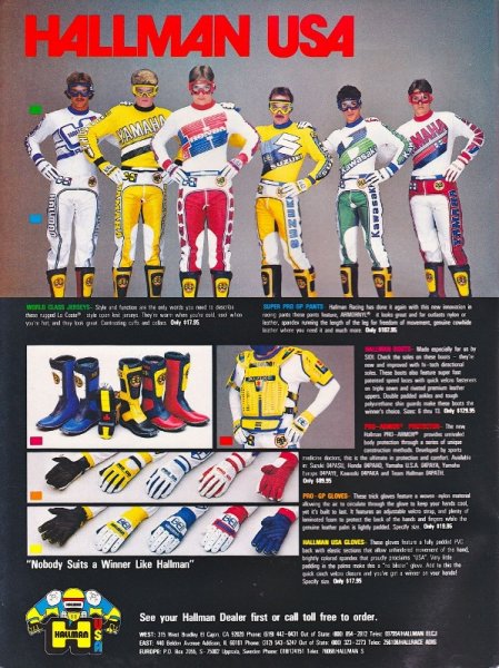
Tony- THOR today is a Motocross powerhouse – in 1983 they were anything but. Then they were then known as Hallman USA (The H in THOR stands for Hallman). Hallman’s gear through the 80’s was always just a bit off. The styling was very Euro and just a bit too different for most American tastes. This ad is a perfect example of that little bit of strangeness. The models all look more like second-rate superheroes than motocross riders. The rider in the Suzuki gear in particular is striking a pose that probably garnered more laughs than sales for Hallman. Motocross is a funny sport because it causes grown men to parade around in outfits they would normally not be caught dead in. The trick is to make your gear look cool without going too far and becoming a parody. I think this Hallman ad missed that target.
Matthes- Some VERY tight pants and jerseys going on there and I hope whomever’s idea it was to put goggles on them was fired ASAP. This stuff is butt-ugly, no way around it and it wasn’t until 1986 with Scott Burnworth did the Hallman stuff start to even look half-decent with it’s black and flo-orange look. George Holland wore it in 1987 (which I couldn’t remember in the best of story) and it was alright, very plain wrap but my brother had a set around this time and it was well made. The chest protectors? My bro had one of these as well and I imagine it’s very much what a sea turtle must feel like because that thing just clamped around you.
 |
|
Just jam this Jammin gear in the toliet. |
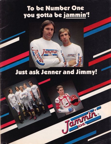
Tony- If you are like me, you probably do not even remember Jammin’ USA. I assume the name came from “Jammin” Jimmy Wienert who was a major motocross star throughout the 70’s. A couple of things stand out in this ad. For starters, what is with the look on Jimmy Wienert’s face? He looks unhappy and maybe even a bit perplexed. This is an interesting choice considering that Jimmy Wienert was always known as a really fun loving, life of the party kind of guy. In fact this may be the only picture I have ever seen of the guy without a smile on his face. The whole tone of this ad is puzzling actually. Not a single person looks like they are happy to be wearing the stuff. Isn’t riding supposed to be fun? Just look at the guy below Jimmy holding the helmet. He looks like his girlfriend just dumped him or his dog died. Then we have the rather inexplicable presence of Olympic Gold Medal winner Bruce Jenner (that is Kim Kardashian’s step dad to those of you under 30). I know that he rode bikes and filled in for Ponch on CHIPS a couple of times but he is hardly core Moto. I suppose any celebrity is a good celebrity was the thinking here. On top of all this you have the lackluster product; which if you judge it by the ad only comes in one boring color scheme. Jammin USA did not last very long and with ads like this it is no wonder.
Matthes- Yeah, uh nice ad and nice gear. It’s amazing to me that the stuff didn’t sell. So much well-done marketing in this ad and on the gear itself. Bruce Jenner was a decathalon athlete and I don’t know how anyone could think his presence in the ad would actually help out. Bad, just bad. Oh my eyes!
 |
|
This stuff is not rad, it’s just bad. |
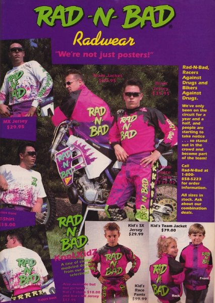
Tony- Rad-N-Bad was actually a pretty cool company in the early 90’s. They marketed a very cool set of motocross trading cards called Hi-Flyers and some sweet garage material motocross posters. On top of that they actually had a small race team supporting long time privateers like Fred Andrews in the MX nationals. With so much going for it, it is something of a disappointment that their gear was so terrible. I imagine these guys had a shoestring budget but even so this gear looks like it was designed in a high school art class. If you compare this gear to the stuff companies like Fox and AXO were producing at the time you can see that Rad-N-Bad was defiantly second tier in product design. Rad-N-Bad did sell some very cool products but their riding gear left a lot to be desired.
Matthes- My buddy Dave Dye is married to Mrs Rad-N-Bad who was none other than “Factory” Phil Lawrence’s sister Shelly. How Rad-N-Bad is that? I don’t remember this ad but I do remember Rad-N-Bad. One year I showed up at Millville to watch the national and Fred Andrews was riding around with a CR500 that looked like Godzilla ate a factory that made Skittles and then threw up all over Fred’s bike. The trading cards were cool. Shelly was cool. Helping out privateers was cool. This gear however, was not cool.
 |
|
I imagine a Feroce designer meeting to be something like this “Uhhh, yeah man- put some feathers on it…that’s what we need. More feathers” |
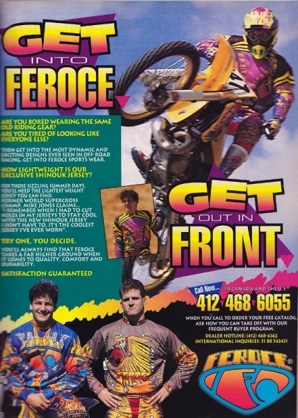
Tony- Feroce has gone down in MX history as probably the worst looking gear ever. That alone is enough to earn a place on this list. The first time I ever saw this stuff was at the 1993 High Point National. Feroce had a big display set up on vendor’s row and I had to do a double take when I saw the stuff. It just had the craziest designs I had ever seen. They had a set with a giant spider on it and one with a giant Indian Chief. Confetti and flames were the order of the day. Even in a sport that embraces crazy colorful designs Feroce was over the top. Feroce sponsored rider Mike Jones probably got the “Mad” Mike nickname by wearing this stuff. In fairness though, Feroce did have some forward thinking ideas. In an era dominated by cotton jerseys that trapped heat in like a sweatshirt; Feroce had high tech synthetic jerseys that kept the rider cool. Those same synthetic jerseys are the standard today. Feroce’s designs that seemed so crazy in 1993 don’t look nearly as bizarre when you see the outlandish designed turned out by the gear companies today. Feroce was just a bit too “out there” for most people in 1993 (Or probably 2011 for that matter).
Matthes- I suppose with a nickname like ‘Mad’ Mike Jones, one would have to be mad to wear this stuff. Or maybe the checks had enough zeros in it (who am I to bag on anyone for selling out for the money? My personal Jesus Ross “Rollerball” Pederson once wore Kings gear which wasn’t that ugly but was certainly unheard of. He told me a while ago that it may not have looked good, but it bought him a house) I’m not sure. No matter what the case was, this stuff was ugly. You can somewhat hide ugly gear with a nice ad but nope, Feroce went 0-2 in this campaign.
 |
|
I had the boots that Craig’s wearing here. They were awesome but after about two months felt like a pair of slippers. |
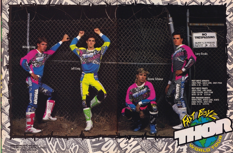
Tony- In 1988 Hallman USA changed their name to THOR. THOR was a play on the company’s original name Torsten Hallman Original Racewear. Hallman had been a bit player throughout the 80’s and I think the name change was an attempt to reboot the brand. They hired young up and coming riders like Mike Craig, Jeff Emig, Ron Tichenor and a pre “family time” Larry Brooks. Next they shed their old school Euro look in favor more colorful and bold designs. Some of the new designs, like the Typhoon line, were pretty cool. Others, like the chain link fence gear RJ wore in 1991, not so much. This THOR ad from 1990 is a good example of the latter. I was never a big fan of the Fast Boyz gear but it was by no means horrible. My main problem with this ad is that the tone and design of the ad seem all wrong. THOR it seems was going for some kind of tough guy vibe here. Like these guys are in “The Hood” or something. Jeff Emig looks like he is getting ready to pose for some beefcake poster and a Larry Brooks looks like he ready to take a nap. I just think there is a fundamental problem with trying to get guys in pink and yellow coordinated outfits to look tough. My opinion is this ad just took itself a bit too seriously. The result is an ad that just comes off as silly. Bottom line, if you can manage to make a super cool dude like Jeff Emig look stupid you are doing something wrong.
Matthes- Like Tony said, this gear isn’t that bad. I’m just amazed that they got Brooks, Craig and Emig all into a room together back then and no one beat the crap out of each other.
 |
|
Nice sword man. There’s got to be a phallic joke in here somewhere. |
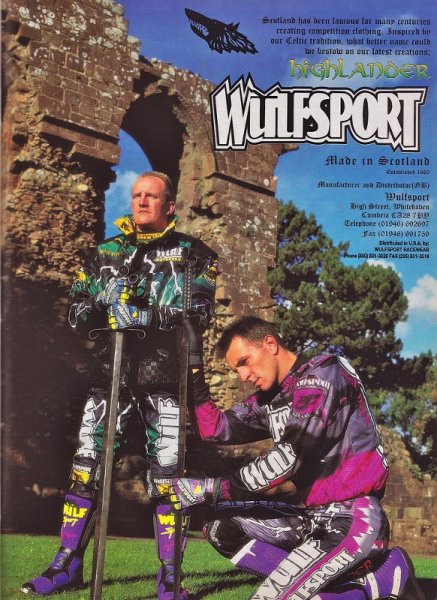
Tony- Here are a couple of dudes you would not want to try a block pass on. Apparently their pick up kit includes a Broadsword. It is probably a good thing Bradshaw and Chicken didn’t wear this stuff back in the day. Wulfsport is one of those European gear companies that stuck its toe in the water of the American market in the 90’s. Although it is still around in Europe it never caught on here in the USA. With ads like this I am not surprised. This ad is obviously a play on the Highlander movies and the gear’s Scottish heritage. The problem is I have no idea what that has to do with selling motocross gear. I don’t think Scottish knights with broadswords were the best way to advertise a brand trying to break into a new market. This Wulfsport gear itself is mid 90’s innocuous with the pinks and purples that were all the rage in 1995. Some of Wolfsport’s other gear offerings were pretty awful looking but this stuff was actually not too bad. Like so many other European gear companies I don’t think Wolfsport ever really got a handle on how to market to the American consumer. Their gear and ads were always a little too weird to catch on over on this side of the Pond.
Matthes- All I have to say about this stuff was right HERE in this faux Tell Us a Story I did that got me an email from the still active (!?!) distributor who wasn’t pumped on me.
 |
|
You have one of the greatest riders of all time in Tim Ferry wearing your gear and you don’t put him in your ad? |
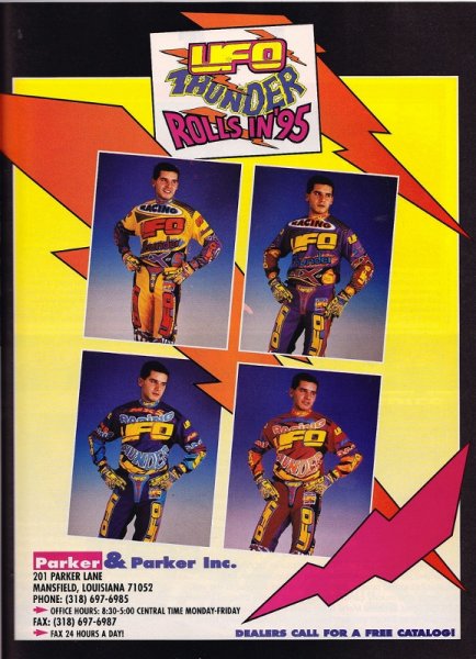
Tony- This one is tough because I know Matthes is probably going to protest. After all, his boy Timmy Ferry proudly sported this gear in 1995. Red Dog aside though, this ad is just terrible. Nothing about this ad shows any real effort to market the product well. From the hokey ad copy to the gear that really does look like something a circus clown might wear, this thing just stinks. The clashing colors and HUMONGUS logos are an assault on the senses. What is with the multi colored cod piece,by the way? These guys had the nut patch way before DMXS came up with idea. It is like UFO looked at what other gear companies were doing and decided the way to stand out was to just go bigger and louder. Italy is known for wonderful taste and fashion sense but they really missed the mark on this stuff. Even the reigning Summercross champion was not enough to save this steaming pile from the list.
Matthes- THIS WAS BEAUTIFUL GEAR AND I DON’T WANT TO HEAR ANOTHER WORD ABOUT IT!!!! If THE Tim Ferry decided to wear it, then it was awesome. End of story and I don’t even want to talk about it. The one thing that stands out for me is Ferry telling me they shipped all his gear for the whole year to him at once and his garage was overrun with UFO gear.
 |
|
Another case of some bad marketing right here folks. |
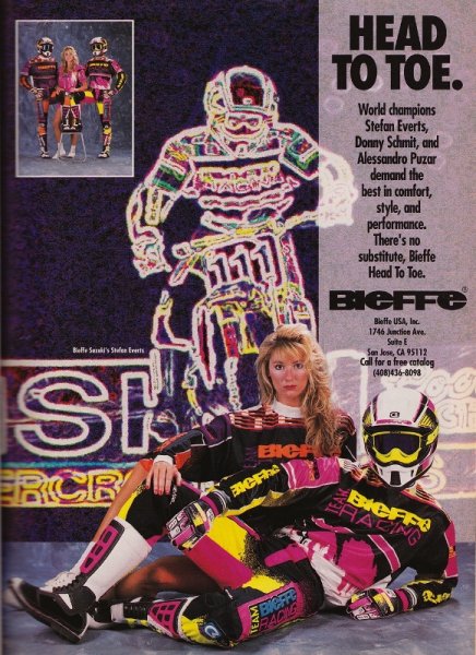
Tony- Ok, first of all I want to say upfront that unlike Kenny Watson I do not hate Europe. I have been there several times and really love visiting the place. Facts are facts though; they just do not have any taste when it comes to motocross gear. This gear, for instance , makes me think of the Mighty Morphing Power Rangers. That is not a compliment. To be honest I am not actually sure this stuff from 1992 is even the worst year for Bieffe. I think some of the stuff Albee wore later in the decade was even worse. I am a huge Albee fan and I have to admit I actually felt sorry for him wearing this awful stuff. With big star riders like Greg Albertyn, Donny Schmit and Stefan Everts riding in their stuff you would think Bieffe would have turned out some better gear. I do find it interesting that Stefan Everts is not actually shown wearing the gear in this ad. All you get is some crazy cartoon outline of him in the background. Perhaps the oddest thing about this ad is the zombie stare on the blond model’s face. I am not sure what Bieffe was going for here, but to me it comes off as a bit creepy. I think this ad is a good example of why Bieffe never really took off over here.
Matthes- You have three World Champions wearing your gear and you decide to get some dude to lay out like he’s at the beach with a chick who there’s a 98% chance dropped some E right before the shoot? Wow, that’s some bad marketing right there. I actually didn’t mind this stuff that much, yeah sure looking back on it now, it’s a little bright but all the gear stuff was back in ’92. I would just tout the fact that we actually have some great riders wearing the stuff as opposed to some chick with Warrant-video hair.
 |
|
It’s ok Broc, you can look. |
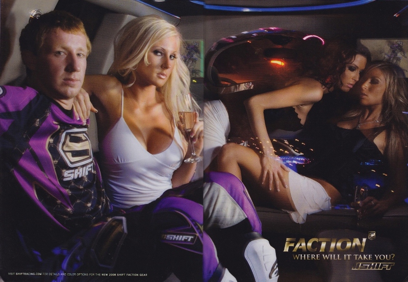
Tony- Here we have perhaps the most uncomfortable ad in motocross history. This ad is a bit of a throwback to some of the classic shift ads from the 90’s. You know, back when guys were more interested in partying at Lake Havasu than putting miles on their road bikes. Guys like Jeff Emig made those ads real classics. Broc Hepler for all his talent on a motorcycle is not Jeff Emig. Emig was a notorious partier and showman. Hepler is a quiet working class kid from Pittsburg. More Jeff Stanton than Rick Johnson, Hepler could not look more out of place in a limo full of strippers. To be honest, I am not really sure what Shift was going for with this ad. Was it supposed to be ironic? Sort of a fish out of water vibe? Or was it supposed to make Hepler look like some kind of badass pimp? Either way, I think it badly missed the mark. The end result was an ad that, while certainly memorable, was just horribly awkward.
Matthes- I remember when this ad came out and all of us in the pits just said “Huh?” and wondered if the ad designer was leaving for another company the next week and wanted to drop a stinkbomb on Shift before he walked out the door. Hepler, while a nice guy and very fast, just didn’t fit this image and there was no way you could shoehorn a round circle like Hepler into a square peg of limos and lesbians (or at least bi-sexuals and I’m not judging here). I think that blonde is Nicki Hilton but I can’t be sure.
 |
|
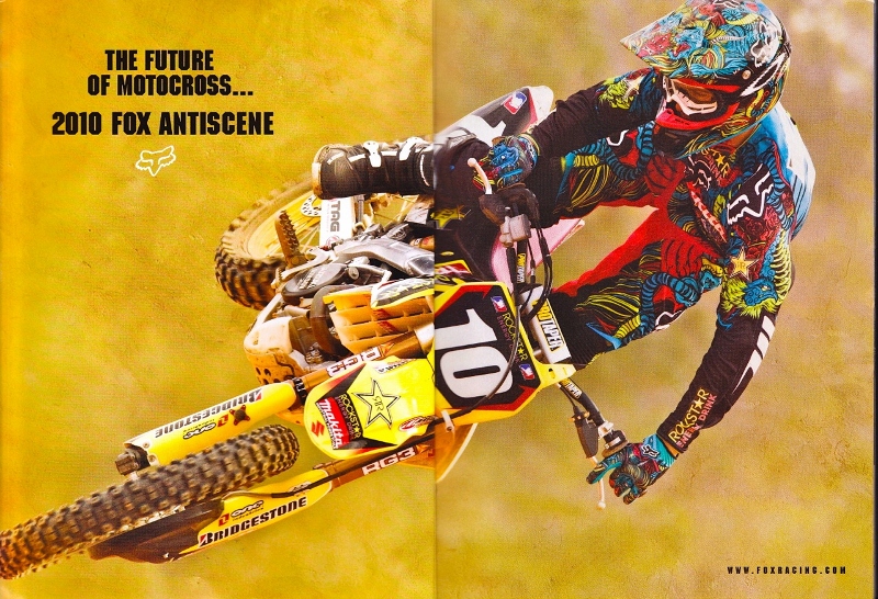
The Dunge wearing some dung. |
Tony- For the most part I have stayed away from newer gear ads in my list. I think it is better if you have a few years of perspective before you pronounce judgment on something like style or taste. History will decide if something was a brilliant idea or a misguided failure. I’m sure the dude in the 70’s with bell-bottom slacks and three-foot wide collars thought they were pretty rad at the time. All this leads me to my decision to put this particular gear on the list. This Fox stuff from 2010 is just the worst offender in an epidemic that hit our sport in the later part of the last decade. For some reason, all the gear companies went on some Technicolor bender. A race seemed to break out to see who could come out with the most garish, ridiculous clown suit known to man. Fox was certainly not alone in this pursuit. Companies like No Fear, Fly Racing and O’Neal, all joined in the fun. I know I am probably showing my age here, but holly crap I would not want to be caught dead in any of this stuff. This Fox gear looks like someone crossed a Spiro-graph with Light Bright. It has every geometric shape and neon color known to man all crammed together in one neat package. When I saw Dungy and Hill in this stuff I wanted to puke. I am sure a lot of people will disagree with me on this one but it is my list, so there.
Matthes- All I know is I made fun of this gear a bunch when I was at Transworld Motocross and Fox threatened to pull their ads according to my boss. Like Tony said, I don’t know what they were thinking with this stuff and even worse, they dressed their riders in it every week to try and disgust us even more. If I wanted to see this kind of stuff, I’ll just look into a fish tank.
