To quote the immortal words of the great Fernando Lamas, “it is better to look good, than to feel good”.
To quote the immortal words of the great Fernando Lamas, “it is better to look good, than to feel good”.
Such is the way in life; appearance is everything. It does not matter if it is blind date, or a new car, the first bite is with the eyes, and those first impressions are lasting ones.
In the world of motocross, that beauty (or lack there of) is a large key to success. We are a very style conscious sport and spend countless thousands annually to tart up our rides and deck ourselves out in brightly colored outfits that would make a clown blush. At the professional level, big-buck teams hire professional designers to come up with bold and attractive graphic designs to capture the imagination of the public and press. Their sponsors want eyeballs, and having a winning look helps attract interest and (hopefully) make a positive and lasting impression for the guys footing the bill.
Sometimes, these styling exercises produce marketing gold (see Peak Pro Circuit Honda), other times… not so much (Jägermeister KTM anyone?). In either case, they are always memorable.
In our last installment, Swizcore and I broke down our five picks for the best looking of these team look designs. Not everyone agreed with us (as was expected), but it made for some spirited bench racing none the less. This time, we are going to select our Hall of Shame inductees. Once again, we each get to select five bikes that we deem worthy of this dubious distinction. Each of us will make our case for the pick and be allowed to comment on the other’s selection. We are limiting our choices to bikes from 89 and newer, so please no requests for the Hodaka Road Toad. Here are our picks for the ugliest race team bikes of all time.
 |
|
Swiz #5 Pick- MC 02 Bud Light KTM |
Swiz- I have a real issue with graphic solution which just look and feel like the entire concept and development process for the visaul look ends with “lets slap the logo on there as big as we can and call it good”. Not only did the ’02 MC Bud Light KTM look just like that, it looks like they actually cut up a 24pack and pasted the cardboar right on the side of the tank and shroud. Add a lavender-esque silver-gray hodge podge, orange and black color scheme and it spells vomit to this guy. About the only thing going for this bikes visual appearance is, it has MC’s trademark “2” and the rear of the bike looks pretty darn good. Cut the head of this Medusa pelase.
T. Blaze- Well, I’m going to have to disagree with Swizcore on this pick. I know a lot of people don’t care for this body style, but I actually quite like it. I had a KTM 200 and a 525SX with this bodywork and still love the looks of those bikes. I will say that I never liked the silver bodywork KTM ran in the early 2000’s (the all-orange look is way better), but the overall bodywork is solid.
As for the graphics, I do think it is a bit trailer trashy (no offense to my trailer dwelling friends) to plaster Bud Light decals all over you bike, but they don’t look too horrible. It is true, that they looked way better on his Yamaha’s (although Yamaha corporate did not think so) and I do think it was bad taste for the King of SX to be promoting beer (Lake Havasu aside). Overall, it was no looker, but far from the ugliest thing to come out of Austria.
 |
|
T.Blaze #5 Pick- ’04 Pro Circuit Kawasaki |
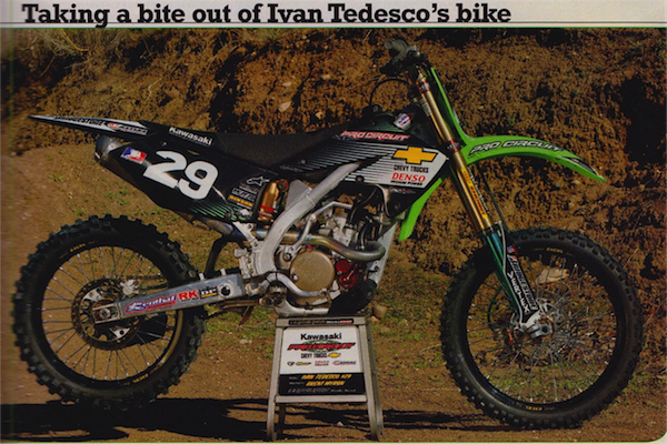
T.Blaze- In fifth, I have a pick that I know a lot of you are not going to agree with, the 2004 Pro Circuit Kawasaki KX250F. I often see this bike and it’s very similar 2003 counterpart listed on message boards as people’s favorites, but I just don’t get it. All that God awful flat black plastic makes this thing look like it escaped from Desert Storm to me. It’s like Mitch ran out of design budget for ’04 and went the JC Whitney route by just painting the whole damn thing black (apparently they could not afford plate backgrounds either).
It was not like the ‘04 Kawasaki was any looker to begin with either. That 1st gen KXF was an ungainly thing and going all Predator did it no favors. How about those graphics, too? I loved the big Chevy logo on the Factory Kawasaki’s, but somehow it looks like an afterthought here. The black on silver color has no pop and the whole thing is just a mess. I had buddies who showed up at the track on beaters that looked like this in the early eighties and we made fun of them. Now, I would never have the balls to make fun of Mitch Payton, so let’s just say he could have done better and leave it at that.
Swiz- I am not on the train with Tony on this selection. I honestly think this bike looks pretty damn good. The only thing that sticks out to me is, the venition-blind graphic look on the shrouds HAS TO BE on the same angle as the same effect which is on the number plate. A simple though glaring oversight or poor decision.
 |
|
Swiz #4 Pick- ’98 Factory Honda |
Swiz- I’m usually a fan of simple graphics which expand and unite multiple body parts but the execution of the Honda wing on this machine is ugly. Honestly, I think it’s the disgusting frame on the ’98 Honda which really makes any graphic decision slapped on this bike a failure which could otherwise work ok. The terrible number plate shape does nothign to help this bike either.
T. Blaze- Now this is more like it. Here we have a real rarity, a truly awful looking Factory Honda. I have no idea what Honda was thinking with this graphical mess but man they missed the target. I really loved the look of the ’97 Honda’s, but they ruined it with this odd ’98 package. When Honda first came out with the alloy frame, it was all the rage to cover up the spars with decals that flowed into the seat (I have to admit I did the same thing to my ’99 CR to my continuing embarrassment). This of course, seemed like a cool idea, but it ruined the sweet lines of the stock CR (and what is with that funky CR font anyway?). Definitely not one of Honda’s proudest moments.
 |
|
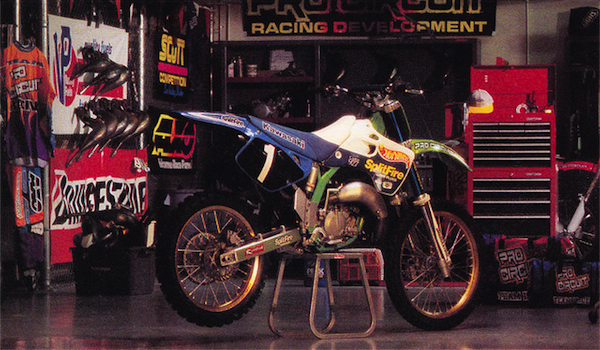
T.Blaze #4 Pick- ’93 Splitfire Hotwheels Kawasaki |
T.Blaze- After the unquestioned awesomeness of the ’91-’92 Peak Honda’s, the utter awfulness of the ’93 Pro Circuit Kawasaki’s was quite a shock. For Mitch, the shock was Honda pulling their support for his program (Has there ever been a bigger blunder in the history of the sport?), for us, it was the terrible look of the new Splitfire KX’s. Gone was the gorgeous deep blue and white color scheme, replaced with a horrendous combination of green, purple, white and baby blue (?!?). While the Hot Wheels logo looks pretty cool, the rest of the bike is just a hot mess.
In truth, I’m still pissed that Jimmy Gaddis somehow stole the ’93 125 SX title away from Factory Phil on this ugly thing, so that may be coloring my opinion. In either case, unless you work for Mattel, I can’t see what anyone would like about this design (Swiz probably likes the blue anodized forks. but that is another argument). It is just one big crap sandwich from start to finish and good for fourth on my list.
Swiz- If Tony weren’t such an awesome guy with all he does for moto-fans and PulpMX I may just drive to his car dealership and kick him in the gonads for putting this bike on his list. This bike very nearly made my top 5 list. I absolutely loved the ’93 Splitffire Hot Wheel’s Kawi’s. The blue rear end was a far better look than the Tuf Racing Red Roof Inn Kawi’s of the same year which used black rear plastic. I still love this look. Great flowing lines, good color palette and yes the blue and white probably lends itself to my decision.
 |
|
Swiz #3 Pick- ’95 Factory KTM |
Swiz- Ugh. The shroud on this bike is just ridiculous. It’s pretty much the ridiculous shroud of a 1999 RM if it were to enclose the hwole tank. Bad idea. Purple, white and orange? I can’t look at this anymore.
T. Blaze- OK, I don’t really dislike the looks of this bike. It is no showstopper, but it is hardly awful. In fact, compared to the bike that replaced it, this baby might as well be Kate Upton (Fun fact- KTM actually used the exact same ugly graphics for the race team in ’94 and ’95). All that Purple is a bit much, but it was the nineties and Barney was King. My only real fault with these bikes is the fact the KTM decided in their infinite wisdom to turn the K around backwards on the left side of the bike. This meant they did get to keep the lines symmetrical on both sides of the bike, but it also may have contributed to an increase in dyslexia in the home schooled set around ’94 or so. Ugly? Yes. Top five worthy? Hmmm…not so sure.
 |
|
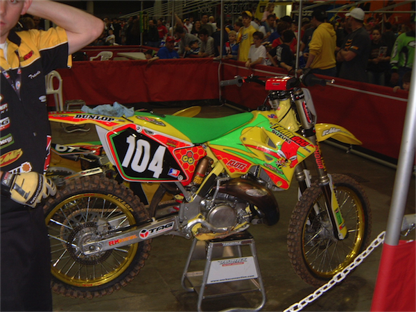
T.Blaze #3 Pick- ’03 Team ECC Suzuki |
T.Blaze- Sweet Jesus, what the heck were they thinking with this thing? I remember when I took this picture in Atlanta in ’03, thinking that someone had eaten too many hash-brownies. To be fair, I know this is another bike that some people think actually looked badass. To me though, it is a perfect example of color gone bad.
This bike is the exact opposite of the Navy Seal ’04 Pro Circuit bikes and just screams LOOK AT ME! Every pore of this bike is bursting with neon color. While it certainly made an impression, I think it was way over the top (Did you know Steve Lamson actually rode for this team in ’03? I actually don’t remember him doing anything all year). Maybe if they had gone with a graphite frame or something else to help tone things down, it could have been saved. As it was, however, it remained one of the all-time retina burners of motocross. My eyes…my eyes!
Swiz- Orange. Yellow. Lime green? Just No. Get that lime green outta there and there could be some potential.
 |
|
Swiz #2 Pick- ’94 Factory Yamaha |
Swiz- Everything about this bike’s look is awful. Every single piece of plastic is an ugly shape with no flow and the “regioning” of the graphics only underlines the lack of unity in this look. The colors don’t even bother me all that much, it’s just the panel shapes and a graphic solution which looks unresolved. Look at the up sweep of the front of the seat to the tank! This was ’94 not ’86!
T. Blaze- Now, here is where things get sticky for me. This is actually a solid pick by Swiz. In ’94, I thought this thing was WAY over done and just ridiculous. It was a kaleidoscope of color and was quite frankly a hodgepodge of design details. You know what though? Twenty years later now, I actually like it. I have no idea why, but I actually like this massive train wreck of purple and yellow lightning bolts. In truth, I am probably ruining all my credibility with this admission, but just like George Washington, I cannot tell a lie and I like it. I like it a thousand times better than the ’95 blue factory bikes that everyone else seems to prefer and way better than the subtler ’93 Factory YZ. Crazy I know, but there it is.
 |
|
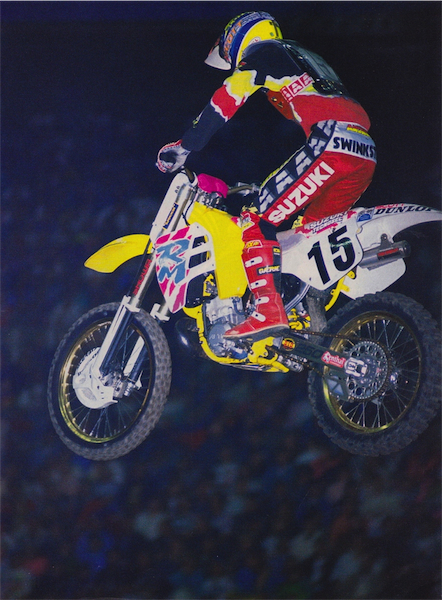
T.Blaze #2 Pick- ’92 Factory Suzuki |
T.Blaze- What can I say, that has not already been said about this iconic bit of motocross glory? The 1992 Suzuki RM250 remains to this day, the single most infamous styling exercise ever. It was a so over the top, that I doubt it will ever be matched.
One look at the factory version and it is pretty clear Suzuki knew they had gone too far, that purple and yellow seat did not match the rest of the decals for God’s sake! That seat had to go, so they could replace it with this…huh…pink and white one! Yeah Suzuki, good call there.
The interesting thing is, Suzuki did realize just how fugly this thing was, and by midway through the ’92 SX season, had ditched the white rear fender and pink seat in favor of solid yellow for both. With the solid yellow seat and fender, the RM looked a thousand times better and was no longer a styling abomination. If only they had done that at round one, it might have missed out on being number two in the bike team Hall of Shame.
Swiz- I’m on-board with Tony here as you’ll soon see.
 |
|
Swiz #1 Pick- ’92 Factory Suzuki |
Swiz- Is this a motocross bike or a two-wheeled chaufeur vehicle for urban Safari? Seriously it looks like it’s camouflaged for your family reunion when a food fight breaks out and the ketchup, hotdogs and mustard starts flying. Do Ireally need to argua a case here? It’s absurd!
T. Blaze- No Hall of Shame list would be complete without this beauty, and for once, Swiz and I agree. This thing was funky in ’92 and twenty one years have done nothing to mellow that opinion. The sad part is, there is a pretty bike lurking under all those Liberace decals. Japan has cranked out some weirdo looking machines at times, but this one takes the cake.
 |
|
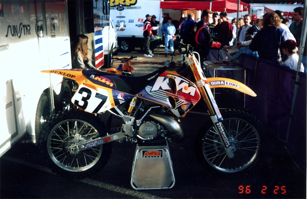
T.Blaze #1 Pick- ’96 Factory KTM |
T.Blaze- In first place, we have one truly hideous machine, the 1996 Factory KTM 250SX. This was the first year for KTM’s odd switch to butterscotch for its plastic (Butterscotch candy=good Butterscotch motorcycle=BAD). The stock bike was bad enough (with the pink and purple ’95 decals used again over the new butterscotch color), but this thing was truly gag worthy.
In ’96, I could not believe KTM was ditching their classy white color plastic for this bizarre Werther’s Original shade. I mean seriously, who thought this was a good idea? There may be a color in the palate that looks good next to this, but purple and red are not it. At least they did not stick the big K on backwards like they did in ’94, so that is something. My buddy had a 360 SX like this and it was a horrible bike, so maybe the awful appearance was fitting. It truly is amazing how far KTM has come.
Swiz- This bike honestly doesn’t bother me a whole lot. The cartoonish “KTM” is a little silly but the real crime here is the application of the numbers on that side plate. Who murdered them?

