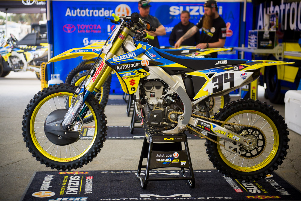
Matthes- Not a fan of the number font at all but this is an improvement from other JGR looks. They got so many sponsors going on that it’s tough to nail a great look. This is close though.
Keefer- I think this year’s Suzuki is better looking stock and JGR did a nice job adding some blue accents to tie in here. Oh and I like Yellow rims.

Matthes- Speaking of sponsors, this is the other way. Where you don’t have many! Reed should run the Bobcat from Ricky Bobby with “Me” on his bike. I like the look of this Husky (notice he doesn’t have the RS Edition machine) although the blue on the PC muffler should be a different color.
Keefer- I am usually not a fan of white bikes, but Chad’s bike is clean and to me the second best looking bike in the pits. The color of the KYB fork legs really set this bike off for me.
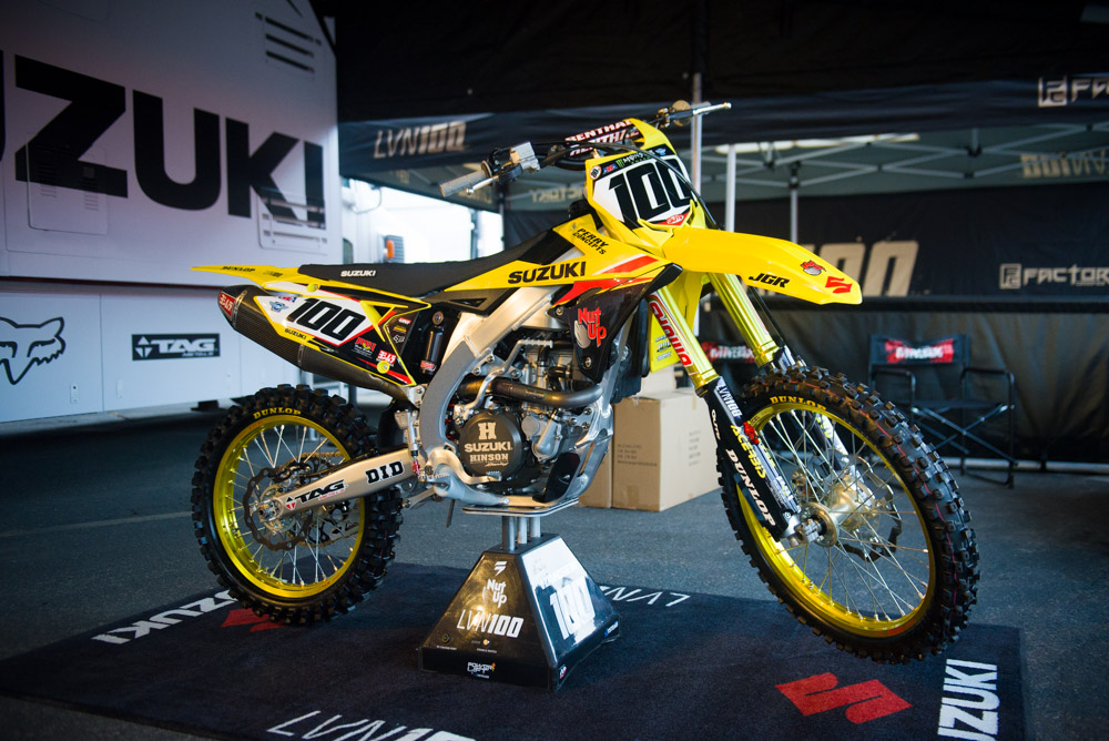
Matthes- Yup, what he said. As a member of #RMArmy, I must say I approve of this look.
Keefer- Are they Gold or Yellow wheels JT? Either way I like Hanny’s stuff almost always. I especially like the font of the numbers.

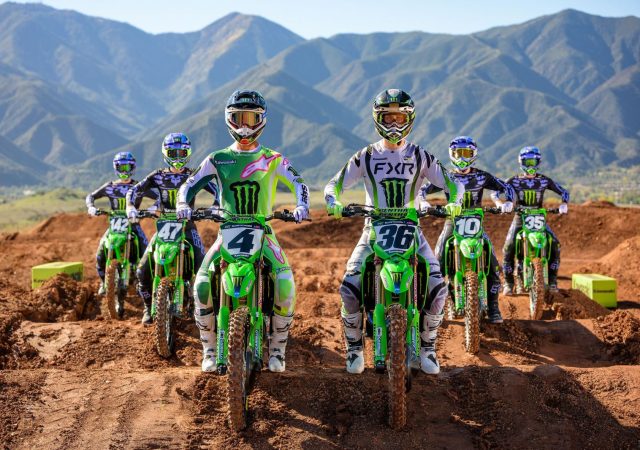
Matthes- Hard to tell from one year to the next but in 2018, Kawasaki added more black this year so I was saying “Black bandit” to the Kawi guys and they liked it. It’s a good looking bike, not my favorite, not the worse.
Keefer- I don’t like the lines going across the bottom of the shroud area. If that was all green I think it would pop more and be more clean looking. I do like the rim tape on the outside of the wheels.

Matthes- Struggling with the side panel bro.
Keefer- I am all in! I like it! Split side panel and all.

Matthes- I don’t see a mud flap here. Am I drunk?
Keefer- Again, don’t like the lines going across the shroud area.

Matthes- I like it. The color of the blue is cool also…it’s mid-80’s Honda blue but still, a strong look. The muffler is sure “out there” on KTM’s huh?
Keefer- I think the TLD KTM’s are the best looking 250F’s in the paddock. My favorite color is orange and it pops well! If only the shroud had a brighter blue to match the seat better, it would be the best looking bike in the pits.

Matthes- Didn’t they have blue last year? I can’t tell what’s different there. God I’m getting old.
Keefer- Bring back the orange rear fender! I give it a 8 though.
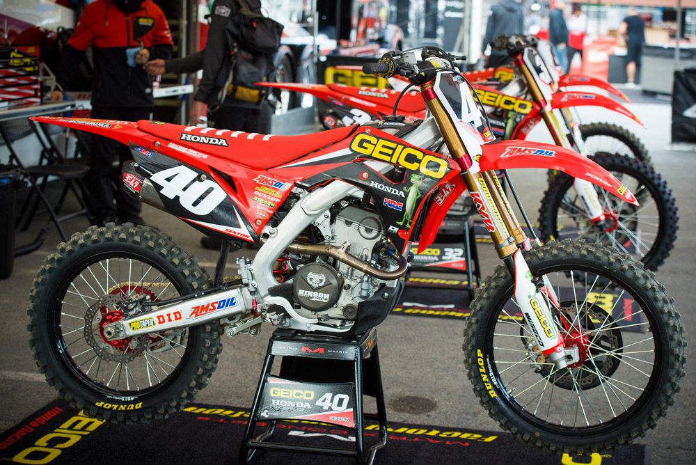
Matthes- GEICO added the red seat last year and yeah, it’s a good look for sure. The new shrouds on the 250 allow for GEICO to look better than in years past and it’s exactly what Honda should’ve done with the stock “CRF” on the production bikes but instead it looks like it was put on by a homeless drunk person.
Keefer- The Geico bikes are the type of machines that look so much better in person. Red is much more vibrant and much like my colleagues here I like the red seat with white ribs.
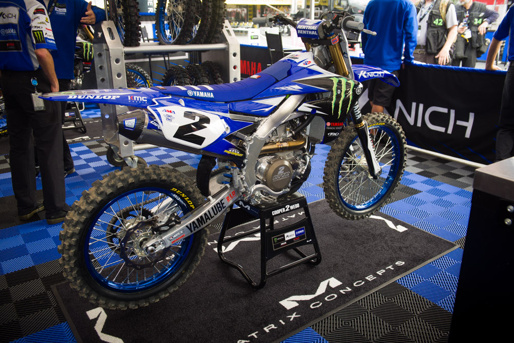
Matthes- Don’t like the blue rims but still, everything else on this is strong. Somehow it looks skinnier than other Yamaha’s right?
Keefer- Favorite look in the pits! So clean even with the “M” claw on the shroud. I love blue rims and like they split the ribs on the seat cover with blue and white. I only wish they would of matched the fuel tank portion of the seat better. It is two shades of blue, but I assume the fuel area of the cover is a stock cover not a Factory Effex version.

Matthes- Nope, sorry. And unless Yoshimura sunk a bunch of money into the team, that Yosh writing on panel has gotta go.
Keefer- Don’t like the black seat. Never have, never will. Needs a blue and red seat cover and we could be in business.

Matthes- I don’t know what’s different but I can’t get around the “CRF”.
Keefer- So fresh and so clean! The CRF across the shroud has grown on me over the past year, so it doesn’t bother me. I do wish they would make that bottom part of the shroud that is back, red however.

Matthes- The white rad hoses are a nice touch. A clean look overall.
Keefer- Sexy! I love the Lightspeed carbon touches on this bike along with a mostly blue look.

Matthes- Yeah, sure- whatever. It’s not great, it’s not hideous.
Keefer- It’s clean. It’s not something I would want to run out and purchase.

Matthes- Should be “I Say Nope Corp” because I don’t like it.
Keefer- Nah. Weird orange on the shroud and a black seat. I am out.

Matthes- Yeah, red on orange is tough and all the logos are part of the deal with a privately owned team. I do like the number font though.
Keefer- Again, loving the orange, but I am looking for an orange seat cover with white ribs.

Matthes- I don’t know man, you just can’t go wrong with the yellow and blue (as JT said) and the old school Suzuki “S” is awesome. Strong debut look for HEP.
Keefer- Not hating on this at all. Looks good, but I would of tried staying away from the JGR look. Still good looking though.
