A little while back, Matthes and I shared our thoughts on the ten best-looking Suzuki motocross models of all time. As per usual, I put forth my picks and Matthes proceeded to inform me that I was either 1 – blind, 2- high, or 3 – both. If you would like to see why I am right and he is wrong about, you can read about our Suzuki picks HERE.
Because we had so much fun last time, we are back again to regale you with our thoughts on the ten best-looking Yamaha motocross models of all time. As with our previous installments, I am going to give you my choices from ten-to-one and Matthes is going to chime in with his thoughts on exactly how my taste in motocross bikes got so damn insightful.
For this list, I considered all of Yamaha’s motocross machines from 1970 through 2019 and included both the two-strokes and thumpers. I have tried to take into account both how the machine’s appearance rated against its contemporaries and how I feel the bike has withstood the test of time. Some designs that I loved way back when just look silly today, and some that I thought were a misstep when they were introduced have really grown on me with time. In both cases, these are of course just my opinions, so feel free to let me know if you agree or disagree in the comments section below.
Here, without further ado, are my picks for the ten best-looking Yamaha motocross machines of all time.
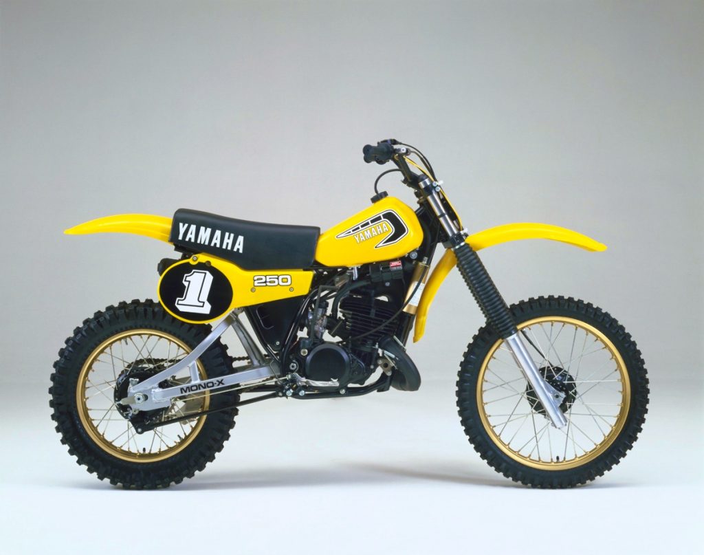 #10 1981 Yamaha YZ250
Blaze: I know Matthes will probably hate this pick, but no Yamaha list would ever be complete in my book without some kind of nod to the original yellow and black Monoshock models. When I was ten years old, this bike was motocross to me. I really did not know a lot about the sport at that point, but my neighbor had a YZ125 (’77 model I think) and Bob Hannah rode one, so that was all that mattered.
Even today, these original Mono’s hold a special place in my heart. That beefy alloy swingarm, big number one, and bumble bee color combo are iconic to one of Yamaha’s greatest eras. While none of the bikes of the late seventies and early eighties have the sleek lines of a modern machine, they do offer a raw beauty of their own. Their motors are right there for all to see and the graphics of the time were simple and unfussy. They are clean, purposeful and all-business in a way that a modern machine can’t duplicate.
For my money, the ‘81 YZs were the pinnacle in appearance for the original Monoshock design. The bodywork on them is far cleaner than earlier models and the graphics are simple and classic. This bike kept the overall look of the ’80 model but added gold anodonizing for the rims and DeCarbon shock reservoir. That alone was enough to put it over the top compared to ’80 and cemented it into the number ten spot on my list.
Matthes: I struggle with the old bikes and declaring them great looking. But I understand where someone who was in their formative years when the bike came out can deem one of these bikes as great looking. Here’s the thing I can’t get over when it comes to these bikes…the lack of a safety seat up the tank. It’s hack. Also, the mono-shock looks like it got bent. I don’t know man, not for me. NEXT.
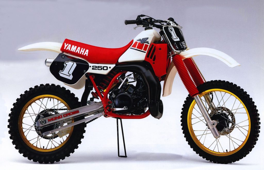 #9 1985 Yamaha YZ250
Blaze: In the number nine position I have a bike that I had the pleasure (sort of) of owning back in the day, the 1985 YZ250. In the US, these were the first models to get the long-envied international red-and-white colors (you always want what you can’t have) and the last to feature the iconic (but slightly cheesy) number ones on the plates. As I said, I had this bike and it was a mixed bag of a rocket motor (no joke, this was one of the fastest 250s I have ever owned) clanky chassis (Dirt Bike described its handling as a school bus with four flat tires) and marshmallow suspension (the forks bottomed out on a gum wrapper and the shock was a catapult of Medieval proportions). In the whoops, this beast was a Yama-hopping handful but damn was she fast and damn was she pretty.
In 1984, I loved the looks of the very similar yellow versions as well, but in the end, this red and white got the nod. I prefer these graphics to 1984 and I think the gold accents pop more here than against the yellow. That gold shock reservoir made its pedestrian-performing KYB damper look like an exotic Öhlins unit and those deep gold rims are still my favorite shade to find their way to a production machine. As I said, this was bike was a pretty mixed bag of performance, but I still love the way it looks.
Matthes: Yeah, you see Blaze we never got the yellow Yamahas in Canada so the red and white bikes were just our standard look. And by the way, MUCH better than the yellow. My dad was a Yamaha guy and my brother had this bike and the terrible 125 from this year. Yamaha won all three titles in MX in 1978 or something and they kept putting the number ones on the plates until 1986. Like, seriously guys? And eff me man, getting that black sticker off the plates was a process. I’m sure as I scroll down I’ll find the 1986 models on here because those actually looked pretty good unlike this bike which is pretty fugly. Blaze, put this ‘85 up against an ’85 Honda or Kawi and you’ll see that for its time, it was ugly.
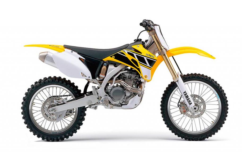 #8 2006 Yamaha YZ450F 50th Anniversary Special Edition
Blaze: While I did not have this 2006, I did have the very similar 2009 version and I really loved it. The motor was not super-fast, but it was easy to ride, handled well, and had phenomenal suspension. With the stock plastic and graphics, it was no great looker, but throw on this retro Hannah-era plastic and graphics and you had a real winner.
Yamaha tried this trick again in 2016 for their 60th anniversary, but it did not work nearly as well as this 2006 edition. Something about all that edgy new-age styling and bodywork just don’t work as well with this retro theme in my opinion. Here, Yamaha really nailed the flavor of the seventies YZs without looking old fashioned. I loved this in 2006 and still love it today.
Matthes: This is a great looking bike…WHEN IT’S BLUE. What’s with the yellow? Again, we never saw yellow Yamahas up in Canada so I don’t cling to the color like some sort of girl that got her heart broken by the captain of the football team like Blaze seems to. I had a 2006 YZ450F and enjoyed it very much but again, WHEN IT WAS BLUE.
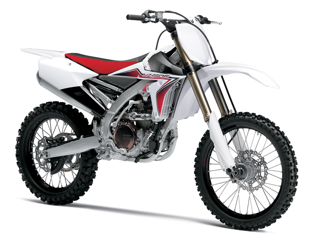 #7 2015 Yamaha YZ450F
Blaze: In general, I have hated the looks of all the YZF models since 2010. Ever since the move to the backward motor, the YZFs have featured weird lines and peculiar styling touches that either you liked, or you didn’t. In the case of this YZF, however, I actually think they got it pretty right. Even though it has the same Bizarro bodywork as all of the other YZFs from 2014 on, this 2015’s combination of plastic, colors, and graphics work in a way the others do not to my eye.
This white plastic does a good job of lightening the YZ’s chunky looks and minimizing the bodywork’s “unique” character. It still has that odd subframe and peculiar side panel treatment, but at least it no longer stands out like a reject from a Michael Bay Transformers movie. I really like this throwback red seat and graphics treatment too. This color combo always looked great and these graphics do a good job of actually working with the YZ’s unorthodox lines. In the end, I would not call any of these backward YZFs beautiful, but I do appreciate the audacity and artistry in their innovative designs.
Matthes: Yeah, I’m with Blaze in that the backwards motor bikes took a step backwards in looks, especially early on. The 2019 that’s in my garage is better than these ones but it’s still not going to win any beauty contests IMO. I guess the white plastic does make this bike a bit better but so far, this list is garbage.
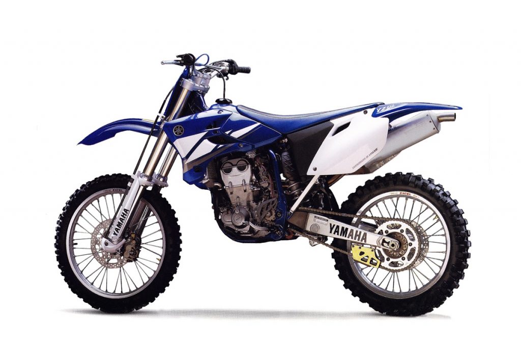 #6 2005 Yamaha YZ450F
Blaze: If we were giving out awards for the gnarliest bike on this list, this monster would surely get it. My best friend had one of these four-speed rocketships and it was so much scarier to ride than my CRF450R. I have had several 500 two-strokes over the years as well, and this thing could have given a run to any of them; it was that beastly.
Strained shoulder sockets aside, however, this was one really fine-looking motorcycle. This second generation of the YZF four-stroke was far sleeker-looking than the original and up-to-date with the YZ two-strokes of the time. The strobe graphics this year perfectly go with the lines of the tanks and shroud and give the bike the appearance of motion when standing still. I also prefer the svelt blue steel frame on these to the slightly odd-looking XR650R-style ones Yamaha introduced on the next generation YZF.
The silencer is a bit huge and the side panels are slightly oversized as well, but overall this is my favorite look of the Yamaha thumpers.
Matthes: A huge step up for Yamaha from the 2002 models for sure. I started at Yamaha working on this model and I can’t look at it and not think of the hundreds of thousands of hours I put in working on this bike and the ’04 and ’05 models that were basically the same. The muffler doesn’t look good at all. It needed to be replaced before you even roll this thing out the door of the dealership.
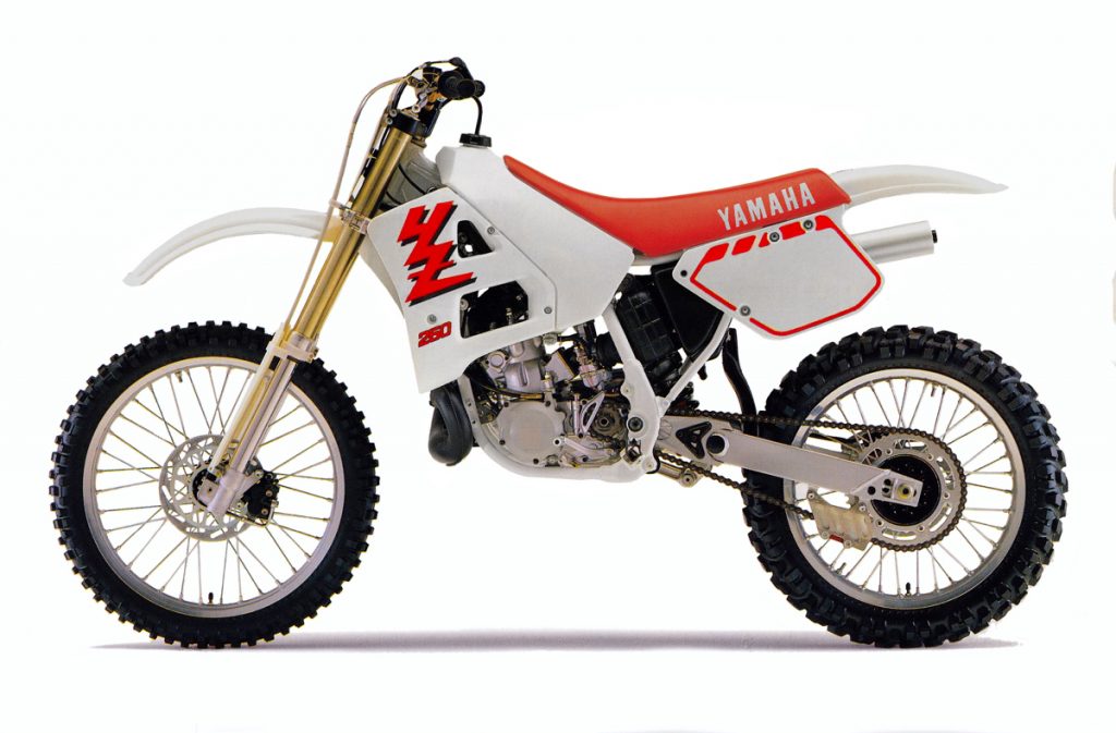 #5 1989 Yamaha YZ250
Blaze: In 1988, Yamaha introduced an all-new YZ250 that featured sleek lines inspired by their YZM500 works racer. The bodywork was thoroughly modern and incorporated a cool asymmetrical radiator design reminiscent of Honda’s ultra-bucks RC500 racers. The bike was a huge step forward in appearance and brought the slightly stodgy Why-Zed up to speed with the sexy ’88 Honda in the styling wars.
For 1989, Yamaha took it another step forward by adding a set of trick upside-down forks, a factory-like nineteen-inch rear wheel and a set of my all-time favorite YZ graphics. For me, these subtle changes added up to a machine that pegged the trick-o-meter to Eleven. The USD forks made it seem far newer than the fork-booted ’88 model and the new graphics were bolder and far more stylish than the year before.
Today, the front and rear fenders look a bit dated and the minimalist fork sliders seem like an afterthought, but in ’89, neither of these were an issue. Back then, this Bradshaw-mobile was one sweet-looking machine and capable of holding its own against the drop-dead gorgeous offerings from Honda and Suzuki. Even though I have rated a few machines above this eighties icon, there is little doubt this was one fine-looking Yamaha
Matthes: Yup, I agree with everything Blaze said here. The ’88 250 (which I have one in my garage) were a giant step forward in coolness for Yamaha and the ‘89s were better than that. Graphics were cool as were the forks. They also ditched the one piece side panel/airbox cover in ’89 which was also a better look. The ’88 that I have is pretty hack in that department because you can’t get a stock one anymore and have to use this janky brand that looks like poop. I will say that Blaze took the good side of this bike because the pipe side, when compared to the Hondas, isn’t the most attractive.
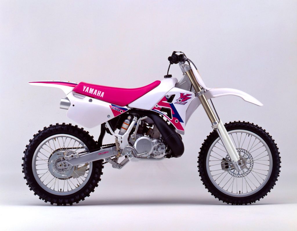 #4 1992 Yamaha YZ250
Blaze: Here is another bike that I rode a ton back in the day and I really loved. The same buddy that had the YZ450F in the early 2000s had this YZ250 in the early 1990s and I got to spend quite a bit of time on it. Back then, I was riding Hondas and it was always cool to switch back and forth and feel the differences in the brands and how they built their motorcycles. It was not quite as fast as my CR250R, but it was better suspended and WAY more stable at speed. The ergonomics were much different too, with a more “sit in” feel than the CR and an odd bulge in the side plate to clear the rear silencer.
On the appearance side of things, I really loved this bike in 1992 and I still love it today. In 1990, Yamaha dropped the asymmetrical radiator shrouds and went with a more conventional look, then in 1991 they added an updated rear section with flowing lines and a handy set of grab handles (Jody rejoice!). At first, I was not on board with the switch to pink (“Magenta” in Yamaha parlance) from red in 1991, but by the time this Bradshaw wagon rolled off the assembly line a year later I was all-in.
For 1992 Yamaha added an updated front fender and number plate design that better matched the rear bodywork. In 1991, it had been an odd combination of old and new, with a streamlined rear section and an anachronistic front end from 1983. This change really helped bring the new look together. Some people at the time compared the bike’s appearance to that of a Y-Zinger mini bike, but I really dug it. Interestingly, this front plate was actually only a one-year design, as Yamaha revamped it a year later in ’93 to offer more space for the numbers. While more practical, I still prefer this original ’92 design to any of the later iterations.
Today, I’m sure a lot of people are probably not on-board with a pink motorcycle, but you have to consider its appearance in the context of its times. In 1992, Hondas were their own shade of neon pink (“Nuclear Red” in Honda parlance), KTMs were a whacky mint green (I would love to know who thought that was a great idea), and Suzukis were…unique in a way that made the YZs look subtle. If only it had come with Bradshaw’s badass factory Yamaha graphics, I would have rated it number one, but as is, it rates the number four position on my list.
Matthes: There is a 100% chance Yamaha added those handles on the back because of Jody. Heck, they probably won the shootout this year because of that. Yeah, the color’s not great but the factory team’s bikes looked better than this stock one. They’ve grown on me now a lot more than when they were introduced if I’m being honest. The link on the bottom definitely ran too low also. I liked the rear fender, side panel intergration on this bike.
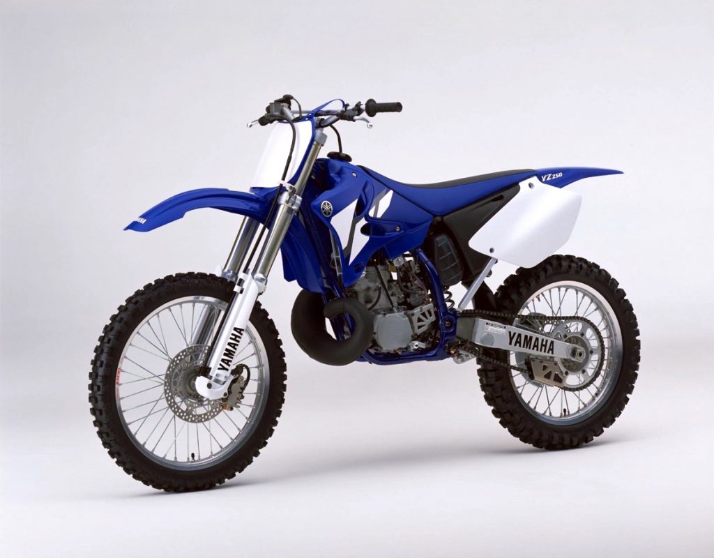 #3 2002 Yamaha YZ250
Blaze: In 2002, Yamaha revamped their YZ lineup with a redesign that kept the overall feel of the outgoing models, but sharpened the edges and updated the looks. The new models were clearly still YZs, but the new bodywork refined that signature look with subtly updated fenders, redesigned shrouds and sleek new side plates. The new side panels were much larger than before and featured a clean look that integrated nicely with the redesigned airbox. As a person who hated the white airboxes used in 2001 and 2002 (whatever happened to cooling the intake charge?), this was a welcome change.
To say this redesign was a success would have to be a massive understatement. The new bodywork really freshened the YZ’s appearance and gave it a modern look that still looks great today. Even though Yamaha updated things again in 2015, I still prefer this ‘02 bodywork to anything they have done since. The 2015-and-up plastic is more in line with the new YZF aesthetic, but to my eye, that is not an improvement. Sometimes, you just hit it out of the park on the first try, and that is just what Yamaha did in 2002.
Matthes: Nick Wey’s top privateer choice machine! Yeah, good look for this bike and I always thought the front brake line holder (although no one raced with that length of a line) cover was pretty cool. The blue was really beautiful in all of these years and Yamaha went with the less is more philosophy and that’s a good thing. I had one of these things also that I bought from DGY but I covered it in Moto XXX graphics because I was a bad ass.
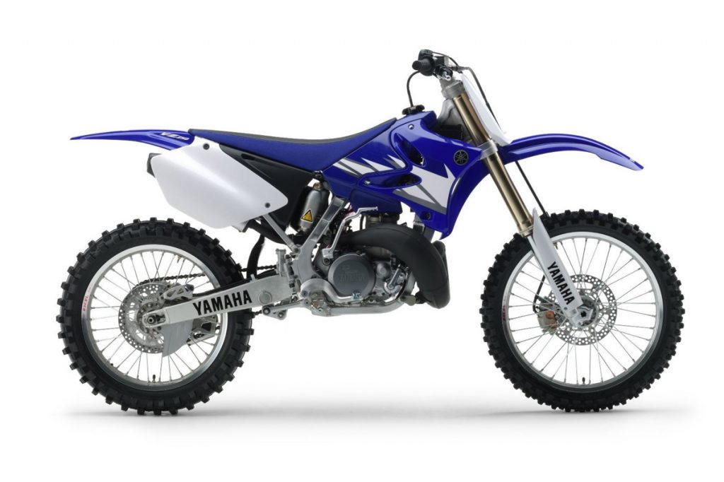 #2 2005 Yamaha YZ250
Blaze: In the second place, I have another awesome machine that I had the pleasure of owning, the 2005 Yamaha YZ250. This was the first year for the new aluminum frame and the last year before Yamaha introduced their award-winning SSS forks. The bodywork here is identical to 2002, but that new alloy frame is just a work of art. I know that many people (including all of the Team Yamaha riders) preferred the steel chassis, but I loved the looks of this unique frame design. Instead of hiding the hollowed-out sections of the frame on the backside of the rails, Yamaha chose to display them front and center. The fact that this was not a perimeter design also made it stand out in a sea of Honda clones.
In the end, I chose this 2005 over the many similar alloy-framed YZs that followed because I think this is the best version of the strobe graphic that Yamaha ever used. The 2006 version was close, but after that, things got progressively worse as Yamaha struggled to keep things fresh on a bike that was no longer receiving updates. None of the later YZ graphics are ugly, but neither are they as clean and understated as this perfect 2005 design.
Simple, beautiful, and utterly without pretension, the 2005 Yamaha YZ250 ranks as second on my list of Yamaha’s best-looking motocross machines.
Matthes: Yeah, the addition of the aluminum frame was a step up in looks although not a step up in how the bike worked. The honey-combs inside the frame were a bitch to keep clean though. Putting Yamaha on the forks and on the swingarm is a bit much yeah?
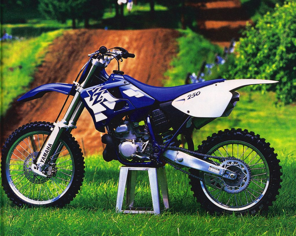 #1 1997 Yamaha YZ250
Blaze: At number one with a bullet, I have Yamaha’s 1997 YZ250. This bike was all-new in 1996 and a radical departure from the outgoing model. I actually had a 1995 YZ250 and was initially not a fan of this move to blue, but time proved me wrong on this. In 1996, both the front and rear fenders were white and the “YZ” graphics were very loud and not to my liking. In hindsight, it was more tasteful than the garish lavender and lightening bolts of my ’95, but it took me time to come to this conclusion.
In 1997, Yamaha ditched the white front fender and switched the frame from white to blue (both excellent moves in my opinion). They also added a set of factory-replica strobe graphics that were 130% less garish than ’96. All these changes really pulled together the new design and improved the machine’s looks tenfold.
The new strobe graphics were a play on Yamaha’s iconic stripe design from the seventies and a great addition to the looks of the machines. Over the next twenty year, it would be incorporated to a greater or lesser degree in all of Yamaha’s OEM YZ and YZF graphics. Even today, you can see an homage to this 1997 design on the shroud of every blue Yamaha motocross machine.
In addition to being a trendsetter for every YZ to come for the next twenty years, this ’97 bears the honor of being the last one to feature the original dark navy-blue color scheme introduced on the 1995 factory Yamaha racers. In 1998, they lightened the blue quite a bit, but I still have a soft spot for this original dark navy-blue version. Even though it showed ugly white creases after the first tip over, I prefer this look to the later, lighter blues.
In the end, I picked this YZ for the win based on its sweet graphics (iconic), unique color (good luck finding this stuff now), smaller side plates (less practical, but better-looking than the ’02 versions), and 1992-style front fender (still my favorite). I do think the 2002-2014 tank/shroud design is a little more attractive, but the rest of this bike’s virtues overcome that slight deficiency and make it my pick for the best-looking Yamaha motocrosser of all time.
Matthes: No, sorry Blaze. It’s too dark of a blue, although you’re right about the switch in 1996 – that was pretty nutty for the company. I don’t like this list, you don’t have the 1986 models on here with the lowered tank and they were awesome looking. The 1987s with white shrouds should’ve been on this list also. This ’97 can’t be number one. The ’02 is better. The ’89 is better. I don’t know, I may have to fire you.
