We got a lot of entries for the Kawasaki/Pulpmx Show, some good, some horrifically bad but in a way, they were all pretty good. Swizzle, Pookie & I break it down.
We got a lot of entries for the Kawasaki/Pulpmx Show, some good, some horrifically bad but in a way, they were all pretty good. Swizzle, Pookie & I break it down.
|
|
|
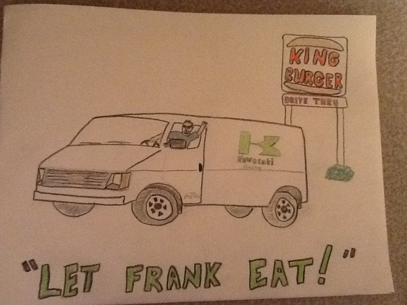
Swizzle- Obviously being my favorite story ever told on the show, I love this design. Matthes- So simple yet so complex. James Lissimore really thought this was the best one. And he wasn’t joking, he said it made him laugh every single time. Pookie-Classic. Pulp fans are the best, I still hate this story. And I did NOT bang the guy in the van. |
 |
|
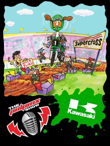
Swizzle- Great creativity and skill here. Matthes- My early favorite for the win, obviously I love the Basset Hounds racing supercross. I wish it happened in real life. Pookie- This was my pick for the winner. Love the “More Pookie” sign. Obviously. |
 |
|
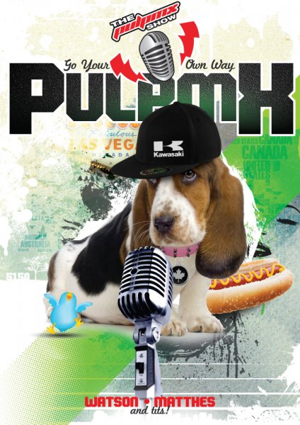
Swizzle- Another solid entry. Matthes- This was my winner for a long time but I couldn’t get anyone to put it in their top three. I love it and it’s super creative. The little details in it are wild. Pookie- I want a basset hound puppy! This was Steve’s brother’s pick for the winner. |
 |
|
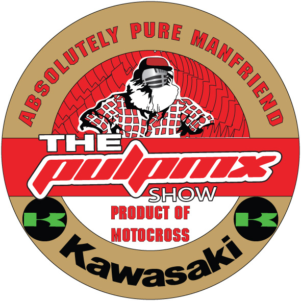
Matthes- I just thought this was a pretty cool logo. Pookie- We liked this one because we thought it would look good as a real tshirt. |
 |
|
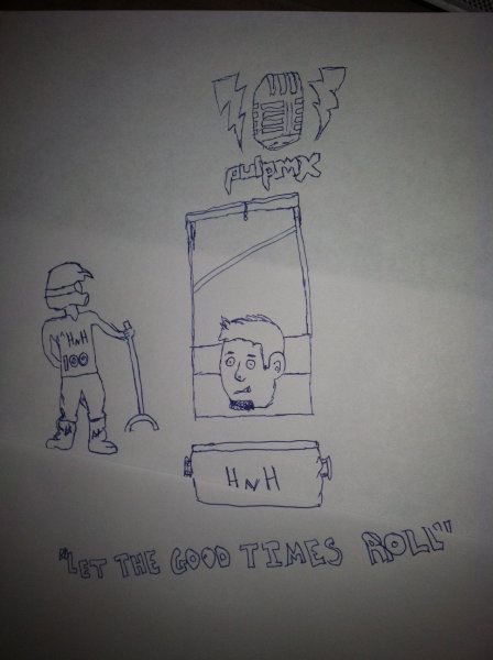
Swizzle- What this “designer” lacks in skill he more than makes up for in concept and details. Spend about 30 seconds looking over all of the elements and you’ll see a Forest Gump style genius in there. Matthes- Even better than this picture was the explanation that “Hanny” is chopping off my head and my head would roll into a wrapped H&H cooler. The artist went on to say that if we couldn’t make it “Hanny” for legal reasons, we could change it. Pookie- This one definitely made us LOL as they say. |
 |
|
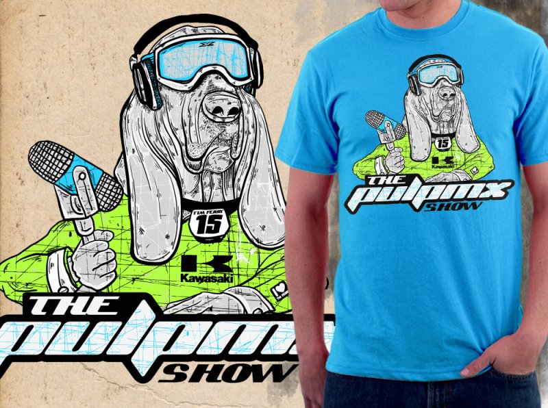
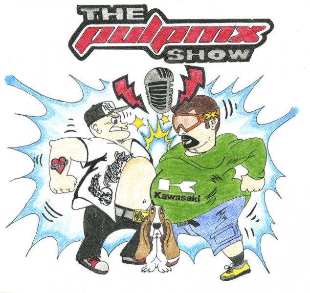
Swizzle- Homeboy took the liberty of changing a font in the show logo which was grounds for disqualification(–just kidding). This submission reminds me of that poster of the dogs playing poker; solid artistry but just awkward to look at on your wall or a shirt. Matthes- I don’t know man, I guess I like dogs because this was solid. I also liked the random dude wearing the shirt mock-up also. Gives you context. Pookie- This was Steve’s brother’s other pick for the win. Bassets rule, this one looks like Hanky. |
 |
|
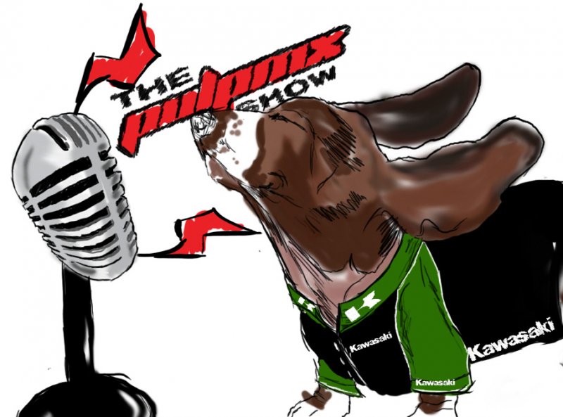
Swizzle- Love it, like the Memorex commercial with the dude in the shirt getting his hair blown back. Matthes- Brilliant in its lack of artistry, it reminded me exactly of what Swizzle said. Pookie- I liked this one too but I thought it needed a little something more. |
 |
|
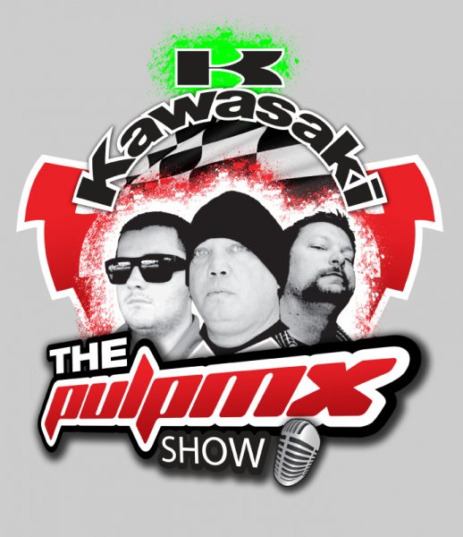
Swizzle- It’s like the OCC version of the PulpMX Show. Matthes- Kenny looks like he’s stoned in this shot. Pookie- I liked all of the submissions that had pictures of the guys on it. But Steve should have been in the middle, obviously. |
 |
|
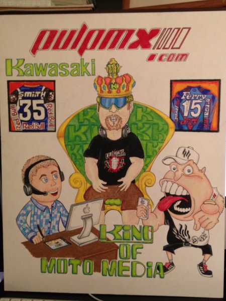
Swizzle- GREAT caricature work here. Matthes- Again, another great drawing. We have some talented listeners, no doubt about it. Watson was not happy with this one, said it just didn’t look like him.He also didn’t like me sitting “above” him in any way, shape, or form. Pookie- This was my friend Susan’s pick for the win. I love the detail and the fact that it was drawn by hand. I’m going to hang the original in the studio to make Kenny happy. |
 |
|
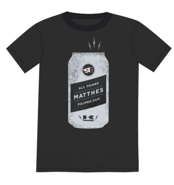
Swizzle- Solid Retro-style MATTHES shirt. Matthes- This one had no chance to win because it’s just got my name on it and the show is so much more than me. Had it had some Watson (or even Tits) on the can, it would have been higher up in the que. Still, love the idea of the show in a can and the simplicity of it. Pookie- Cool colors on this one, Raider nation would be proud. |
 |
|
Swizzle- I really liked this design. Matthes- The Bassett hound and me wearing X Brand goggles just complete the look. Pookie- How can people be such good drawers, dang?!
|
 |
|
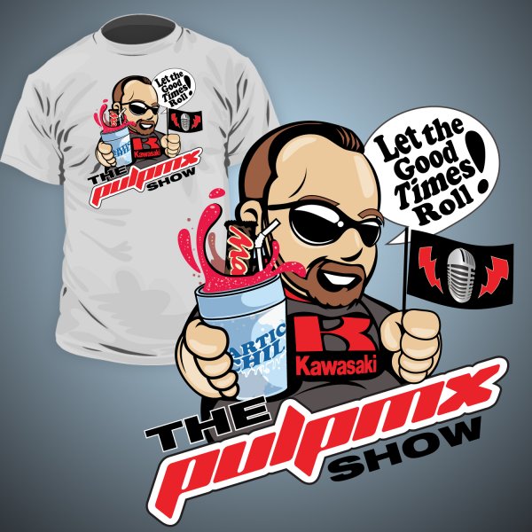
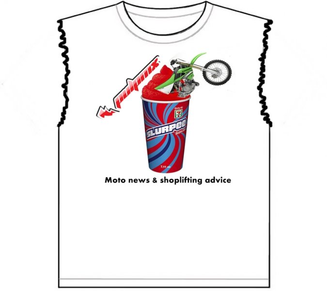
Swizzle- This was my choice for number one. It’s bridging the gap between t-shirt, poster and art. It’s got all the criteria as well as recent content mixed in. Love it. Matthes- This one was good but again, after listening to Watson tell us which ones he liked and which ones he didn’t- I didn’t want the winner to just feature me. That seemed to irk Watson and I don’t want to upset him. I couldn’t do it. Pookie didn’t like the receding hairline either because I don’t really have one. Pookie- Ya, Stevie is much hotter than this cartoon. But the candy bar inside the slurpee is genius. Great detail. |
 |
|
Swizzle- Funny, would have been funnier if it said “OLD” moto news. Matthes- Liked this one- funny how a little story at the end of a show about me stealing chocolate bars would result in three shirts made with that on it. Pookie- This one was special because it had no sleeves. Well played. |
 |
|
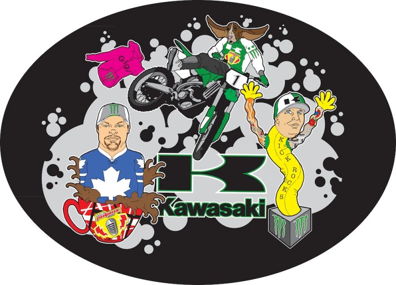
Swizzle- LOVE the GiGi sweatshirt, the KDub jack-in-the-box creeps me the eff out! Matthes- I’m with Swizzle- this one creeps me out. Too much information in here. The EVH coffee cup was a nice touch. Watson looks like something out of creepshow. Pookie- I really liked this one too. Great details and the Gigi sweatshirt…there are no words. |
 |
|
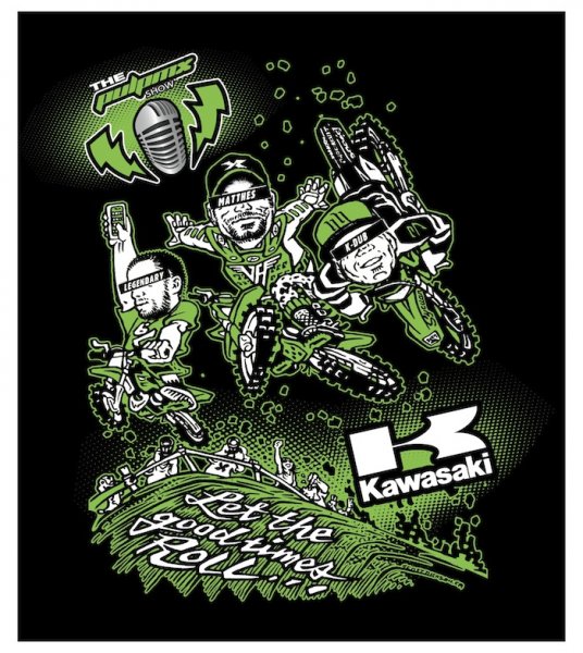
Swizzle- This dude has serious skill. If we printed this, he’d come after us for royalties in a few years when he’s a famous graphic artist. Matthes- This was well-done and pretty sharp with all the details. I wasn’t a fan of the black bars across our eyes but me doing a no-hander with a VH logo on is sweet. Pookie- This one was another on the top of my list. Again, I liked the ones with images of the guys on it. Tits with his phone is hilarious. |
 |
|
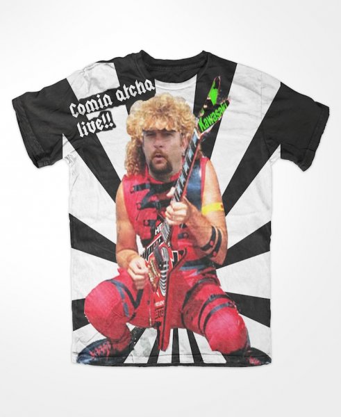
Swizzle- Creepy as HELL but super funny. I need one of these for the annual white-trash-bash around here. Matthes- WOW. That’s all- just a wow. Pookie- Now Steve finally knows what he would look like with “Sammy hair”. |
