Photos by James Lissimore
Photos by James Lissimore
 |
|
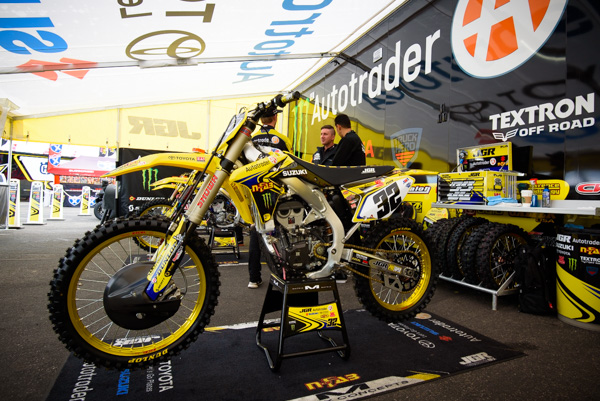
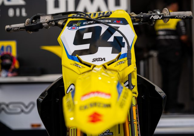
Matthes: I like the Suzuki’s overall look for many bikes in the pits but just like when they were on Yamaha’s, the JGR bike is too busy with sponsors IMO. Yeah, yeah they pay the team and JGR is probably killing it but for this column’s purpose, I don’t care. Number font is a bit weird also right JT? Phil’s bike had black forks on for some reason and I don’t like that either. Makes a bike look heavy. JT: While it may not be my favorite look of 2017, I do think it is much better than what I saw at Lille in November. More sponsors=more stickers so this is a tough nut to crack. I am with you on the font but I like that the riders have their own unique look. This font just happens to not be my cup of tea. |
 |
|
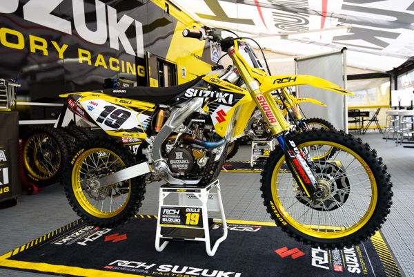
Matthes: Now THIS, I like! Switch out the fork color on JGR’s bike and we might have the best looking bike in the pits. Well, maybe add a touch of blue but the old school “S” and blank swingarm is cool. I bet the RCH guys would love a bike with sponsors like JGR on it but because they don’t have that, I like their bike! What about gold rims on a Suzuki JT?
JT: I must admit that less is more when it comes to this look. It’s probably tough on the budget and I am sure they would trade their look for more money, BUT, their bikes do look great. I agree, the gold forks are awesome and I love the blue tubes and how it matches the header pipe coloration. |
 |
|
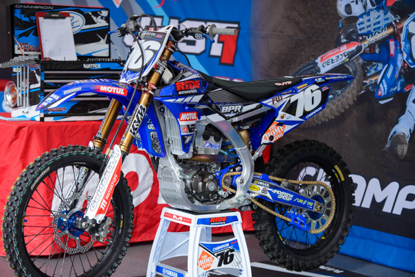
Matthes: Barn Pros needs to drop that blue rear chain guide they got going on in the back. I’m not a fan of the way Yamaha’s look in general so they’re in tough for me to be pumped on this look. I’m ok with blue hubs and black rims though. JT: I think there’s a bit too much going on here. With the orange of the Home Depot, maybe they could have made that the theme? Adding the red on top of the blue, then having to spike the orange? It just gets a bit messy for my taste.The graphics aren’t too bad, I would just like to see the colors carry one theme. |
 |
|
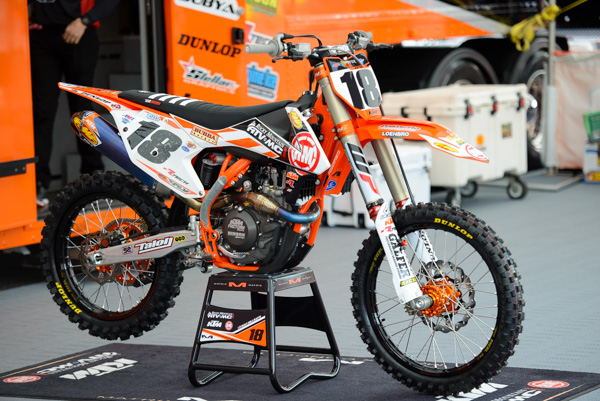
Matthes: New team sponsor for the ex-BTO Sports guys and they do a nice job with locating the RM ATV/MC logo although the way BTO logo was it fit so nice on the shroud there. I like the color of the WP forks and contrasting grip tape is sweet. I do like the look of a colored frame on KTM’s/Husky’s. What about an orange seat? Wouldn’t that be sweet JT? JT: This bike underwent some heavy improvements after the MEC. I really like the use of the horizontal area near the fuel tank. Great sponsorship love there. The FMF can stickers look great and I love the orange/black consistency throughout. I am biased but I have hated my own bikes’ look in the past so I have more insight than most for this team. NO, I DO NOT THINK THE ORANGE SEAT WOULD LOOK GOOD. |
 |
|
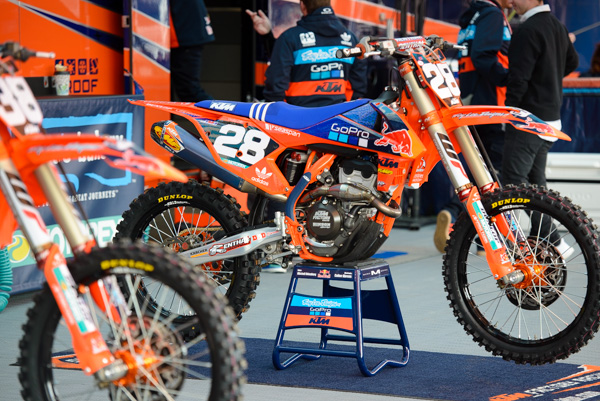
Matthes: Yeah, the TLD guys kill it. It’s as good as it can look with having sponsor logos on it. The Adidas stripes on the seat are a nice touch. It’s rare to see a team bike have silver rims nowadays. JT: I am a huge fan of orange and blue so of course I love this. I would like the blue’s to match a bit more in their tone but otherwise, they nailed it. I am confused, Matthes… Did you think these bikes have silver rims or were you more commenting on bikes nowadays in general? Matthes: No these are not silver. My eyes are fine…I was just commenting that a huge contratian move now would be to leave silver rims on your race bike.
|
 |
|
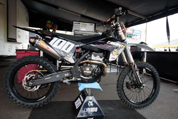
Matthes: No, no, no, no. Hanny was going for the Road Warrior look here with his Husky. And it didn’t work. NASA can probably see his numbers from space. Not good. JT: I am on the other side with this. I happen to like it. He matched his gear and bike really nicely. He stood out on the track and while his riding may not have been what he wanted, his look was clean. The matte swingarm is badass. |
 |
|
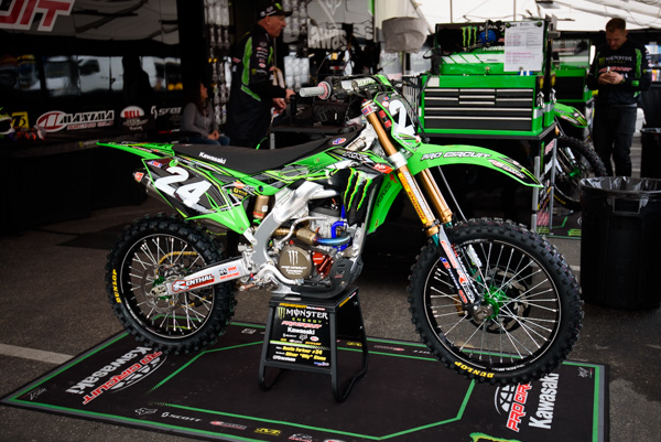
Matthes: New Kawi 250F means a new look for Pro Circuit. And they did a nice job with what has to be kind of traditional for them with Monster on-board. Black and green is a strong motif. Is it just me or is the Monster claw bigger than it’s ever been before? JT: I like the look overall. I am not a big fan of the blue, black, red, green, yellow, etc though. The bike is very exotic looking and I like exotic. Or is that erotic? Whatever, both is fine. |
 |
|
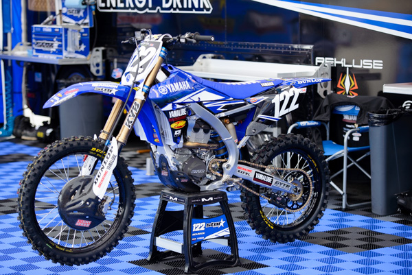
Matthes: Star bikes don’t look a whole lot different from last years and I don’t know what it is but I like bikes that have disc covers on them. It’s like it hides something mysterious or something. Carbon makes the cover even sicker. JT: Very clean. I don’t love the POW! of the FMF sticker on the shroud so much simply because it stands out too much. That’s great for FMF of course but throws off the feng shui of the bike. Can’t believe I just said that. |
 |
|
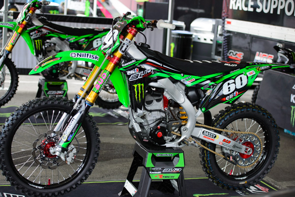
Matthes: The BUD Racing bikes brought back the flo-green from back in the day! Red hubs? Are we ok with red hubs JT? JT: Flo-green is always good. The red hubs actually work here because they stuck with the red hits throughout. The only thing I don’t like are the fork stickers. Wow those stickers are bad. It literally makes me think that the suspension doesn’t work well because the stickers are so bad. That’s not fair to BUD Racing but it’s just what pops into my head. |
 |
|
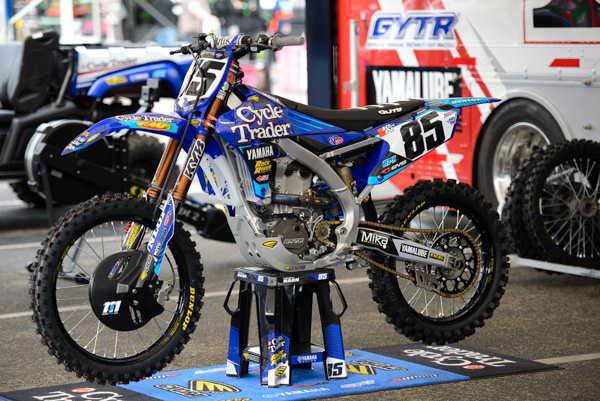
Matthes: Thanks to Lissimore for shooting Tommy Hahn’s bike for me by the way. Anyways, yeah not a fan of Yamaha’s and that way they look but I do like the old school dark gold on the KYB forks. That’s the OG fork cover and still the best IMO. JT: Overall, I like this bike. Using the ice blue hits was a nice touch. I don’t love the number plate font or look too much but the graphics are clean and professional. Cycle Trader can be read clearly and it still looks cool… that’s tough to do. |
 |
|
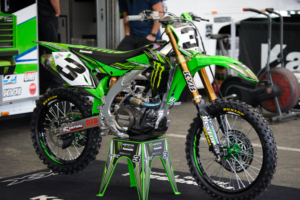
Matthes: The Kawi 450’s look pretty good this year, not a lot different from last year’s. Just some more weirdo lines and stuff about the numberplate to me. Green stickers on the rims are a nice touch…it’s like saying ‘Hey, we’re black rims but wait…maybe not!” JT: I am a huge fan of this look. The bike just screams MEAN MOFO. I like the consistency of green, black, and gold without overdoing it. This is one awesome looking bike. |
 |
|
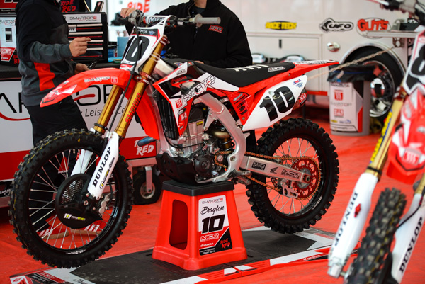
Matthes: A big improvement over their last few years, the MCR guys went with a colored sprocket and I like that. I’m not mad at this bike at all. Number font fine also. JT: The bike is simplistic in its look which isn’t a bad thing. I don’t love it but I don’t hate it. Something about the number plates need a bit more IMO but I can live with this look. |
 |
|
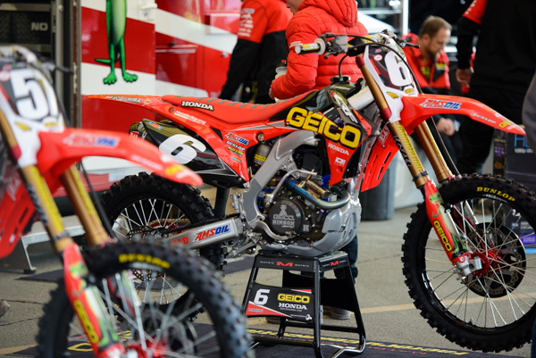
Matthes: I think the only thing the GEICO guys did was put a red seat on their bike but I like it! Oh hi there black rims! GEICO, like BTO last year, just fits on that space on the shroud perfect. Single digits are always cool cause you can make them bigger. JT: Either this bike or Eli’s bike get my vote as best in show. Having a single digit definitely helps but the contrast of bright color (red or green) on the black is just hard for me to overlook. The red seat really makes this bike pop and most importantly, they matched the red tone. That’s crucial. Kudos, boys. |


