It is often said that beauty is in the eye of the beholder, and that is certainly true in the world of motocross. Over time, my taste in motorcycle styling has changed quite a bit. Bikes that I thought looked awful years ago I often find myself admiring now, and some models I thought were badass when new, have worn out their welcome with me like a set of dirty riding socks I forgot were in my gear bag. Taste is a fickle thing and one man’s treasure is often another man’s turkey.
With that in mind, I am back once again with another one of my tasteful, tactful and 100% accurate top ten lists. For this one, I am going to proclaim my picks for the ten best-looking Kawasaki motocross machines of all time. As with my previous lists, I am going to make my selections and Matthes is going to chime in with his own nuggets of wisdom. As always, your mileage may vary so feel free to leave a comment or suggestion for any machines I might have missed in the comment section below.
If you enjoy this and would like to read more, you find my picks for the Top Ten Hondas HERE, Top Ten Suzukis HERE, Top Ten KTMs HERE, and Top Ten Yamahas HERE.
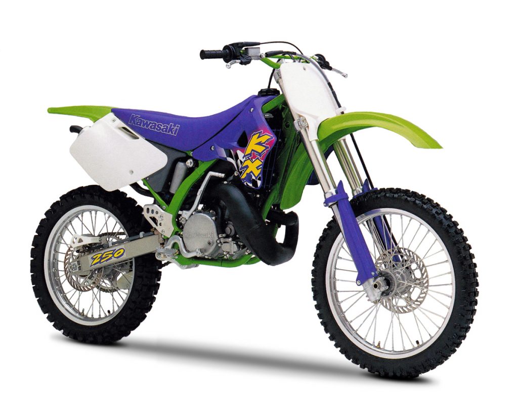 Blaze’s Tenth Place: 1996 Kawasaki KX250
Blaze: Here is another one of those bikes I absolutely hated when it came out but I have softened on with time. I actually really love the bodywork on the 1994-1998 KXs, but all the purple they plastered on it in 1996 just made me go WTF? Of course, this was a symptom of the time, with everyone going purple crazy in the mid-nineties as if they had all joined a cult and gotten ahold of some bad grape Cool-Aid. At the time, I was utterly baffled by this purple obsession and have to admit, I am still a bit perplexed by the fact that all the Big Five decided to go this direction like a bunch of lemmings off a styling cliff. In general, I am fine with a bit of purple to accent things, but Kawasaki really doubled-down on the Barney look in ’96.
That said, however, I kind of dig it now. Is it crazy? Yes, but in a kitschy nineties sort of way. The purple shrouds don’t look that bad and I actually like the graphics. I also much prefer this purple seat to the awful green ones on the 1998 KXs. I still think that purple is best used in moderation (those fork guards are maybe a bit much), but this bodywork is solid and I appreciate this now more than I did when it was new.
Matthes: Ok, generally speaking the Kawasakis looked pretty awesome from 1990 on. The perimeter frame allowed them to do some cool things with the shrouds and panels, etc but they’re also a bit generic over the years with not a lot separating them. I have a feeling I’m gonna get mad at Blaze over this list though. I’ll start with this one because yeah, too much purple barney colors for anyone to really like this model all that much. CERTAINLY shouldn’t be on a top ten list. Kawasaki putting green bars on the bikes for years was close to Yamaha doing the #1’s as something that should never happen.
 Blaze’s Ninth Place: 1985 Kawasaki KX500
Blaze: When I was young, I was never a very big fan of Kawasakis. Growing up in the late seventies and early eighties I just thought they looked odd. They had that weird number plate on the rear fender, looked about six feet tall and were covered in a garish combination of lime green and gold. While in general I love gold accents, Kawasaki went plumb gold crazy on these machines and dipped all manner of parts in bling like some kind of King Midas wannabe. Gold rims? Good. Gold painted swingarms? Well…let’s just say it was the eighties and leave it at that.
Thankfully, this Goldfinger fascination was rather fleeting and eventually, Kawasaki began un-weirding their bikes. First up was an all-new KX60 and KX80 for 1983. Both of these machines featured clean styling, proper number plates, great performance and a complete absence of goofiness. Next up was the all-new 1984 KX125. This machine kept the unique mono radiator of the ’82-’83 one-two-fives but added slick styling that mimicked the look of their class-leading minis. This bike propelled Jeff Ward to the 125 National title and stood out as being about 130% better looking than the KX250 and KX500 which were still saddled with outdated styling and a giant ice cream scoop for a rear fender.
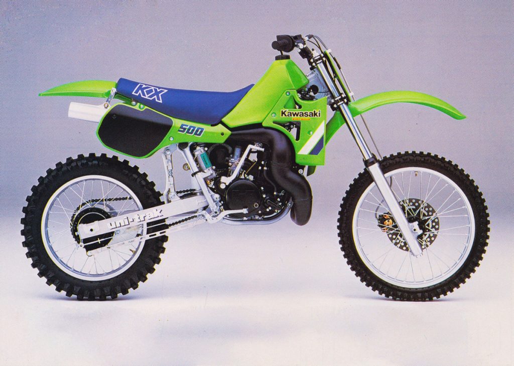
For 1985, Kawasaki finally brought their deuce-and-a-half and Open machines up to speed with lovely new bodywork. Of the two, I prefer this beast, the mighty Kawasaki KX500-D1. All-new from the ground up, the KX500 featured a cleaned-up version of the ’84 KX125’s styling that was both beautiful and purposeful. Dubbed a “Works Replica,” this truly was the first Kawasaki that I thought actually looked great. Even today, this bike’s lines look clean and modern and the monster pipe snaking around the bodywork is just badass. This bike has none of the weird angles, oddball pieces and ungainly proportions of the earlier KXs. Just clean styling, understated graphics, and a massive motor that screams business. For my money, eighties KXs do not get any better than this.
Matthes: The ’85 models were a step up in coolness factor for Kawasaki but why, why, why would Blaze pick the 500 to put in this list? The pipe looks like some sore of slithering anaconda! Pick the 250! And truthfully, pick the ’86 model as the “KX” on the seat looked, to me, a tad better. Also I would put the ’85 KX125 on this list but from the radiator side, not tank side. Good-looking bike right there!
 Blaze’s Eighth Place: 1992 Kawasaki KX125
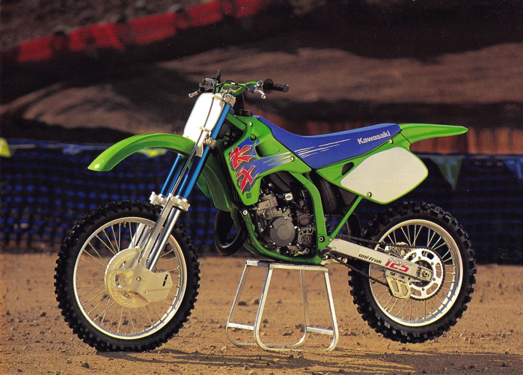
Blaze: I know Swizcore is going to hate me for putting these blue forks so low on the list, but I have to admit they never did anything for me back in the day. I liked them better than the garish red versions on the 1990 Yamahas, but that is not saying much. I would have much preferred an understated silver or gold, but it was the nineties after all.
(Swizcore note: Yes, this bike should be 3rd at the lowest! Grrrrr)
As to the rest of the styling, I actually did not care much for it back in 1992 but it has grown on me since. The bodywork is nicely styled and the graphics are attractive and understated in a way that would be unheard-of a year later. When the 1993 KXs debuted with their crazy colors and Wile E. Coyote graphics, I much preferred the bold new look to this classier ’92 scheme, but I think that time has proven this to be the better choice. Today, those blue forks actually look cool and the understated styling has a timeless quality the cartoony ones will never capture. I still don’t love this bodywork as much as some of the others, but it is undoubtedly an attractive machine.
Matthes: This look has definitely grown on me over the years. At the time I thought the red forked Yamahas and blue forked Kawasakis looked like poop. I like the little continuation from graphics to seat, that’s cool. I like the front disc guard that came stock also. Ever see a ’93 on Craigslist after the sun has been beating down on the blue forks for 30 years though? It’s not pretty.
 Blaze’s Seventh Place: 1997 Kawasaki KX250
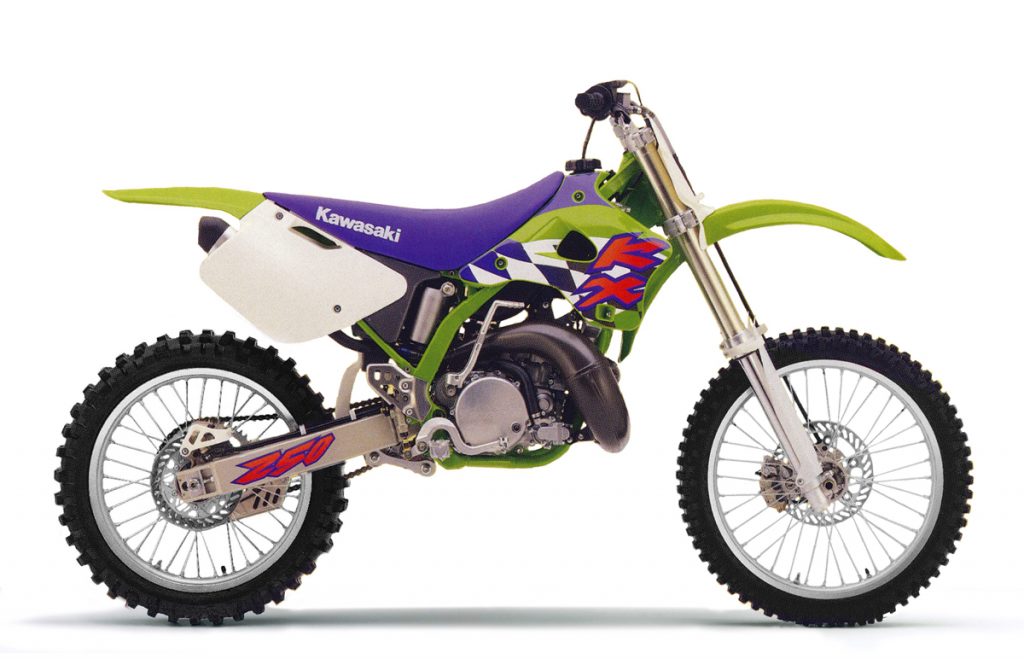
Blaze: After the purple haze of 1996, this more tasteful 1997 version was a welcome change in my eyes. Clearly, there was still a BOGO sale on at Sherman Williams in the purple aisle in ’97, but at least they restrained themselves from sticking it on everything. Personally, I really love these graphics with the big KX logo and checkered flag of ’95-’96 against the green shroud. The move back to white for the fork guards also gets a big “thumbs up” from me. The purple seat looks good and I prefer this “Kawasaki” logo to the barely-there outline they used in 1996. Overall a great-looking machine and worthy of the seventh spot on my list.
Matthes: Yes, good-looking bike here with just enough purple to be “ok”…Kawasakis should always be blue with green though…for the record. It’s weird because this was the first year that the race team used that flo green on the frame and plastics (Blaze: 1996 actually) so you don’t really think about what the stocker looks like you know? Checkered flag graphic? Uhhhh, ok- I guess.
 Blaze’s Sixth Place: 1994 Kawasaki KX250
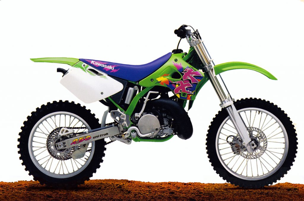
Blaze: There are no words for how much I wanted this bike in 1994. I loved the new look for 1994 and after riding one at a demo day, I was totally hooked. It was not as fast as my CR250R, but good lord that suspension! I could not believe how much better it worked than the stuff on my CR. It literally felt like riding on a magic carpet compared to my jackhammering Honda. At the time, I could not afford a new machine, but sweet Jiminy Christmas did I want it.
Maybe that plays a small role in why I rate this first version slightly higher than its similar brothers. In 1995, I moved over to Yamaha, then Suzuki, and eventually back to Honda, never really catching the Kawasaki bug again as I had in 1994. Perhaps for that reason alone, this 1994 version ranks as my pick for the best of this generation of Kwackers.
Matthes: I owned one of these and all I can think of when I see it is the stripped out bolts, loose footpeg springs, broken plastic, cracked frames that seemingly happened every time you rode it. They did work well though but cost a ton in repairs. It did look better than the ’97 and ’96 though. I always thought that little aluminum guard they put on the frame to protect the rear master cylinder was cool by the way.
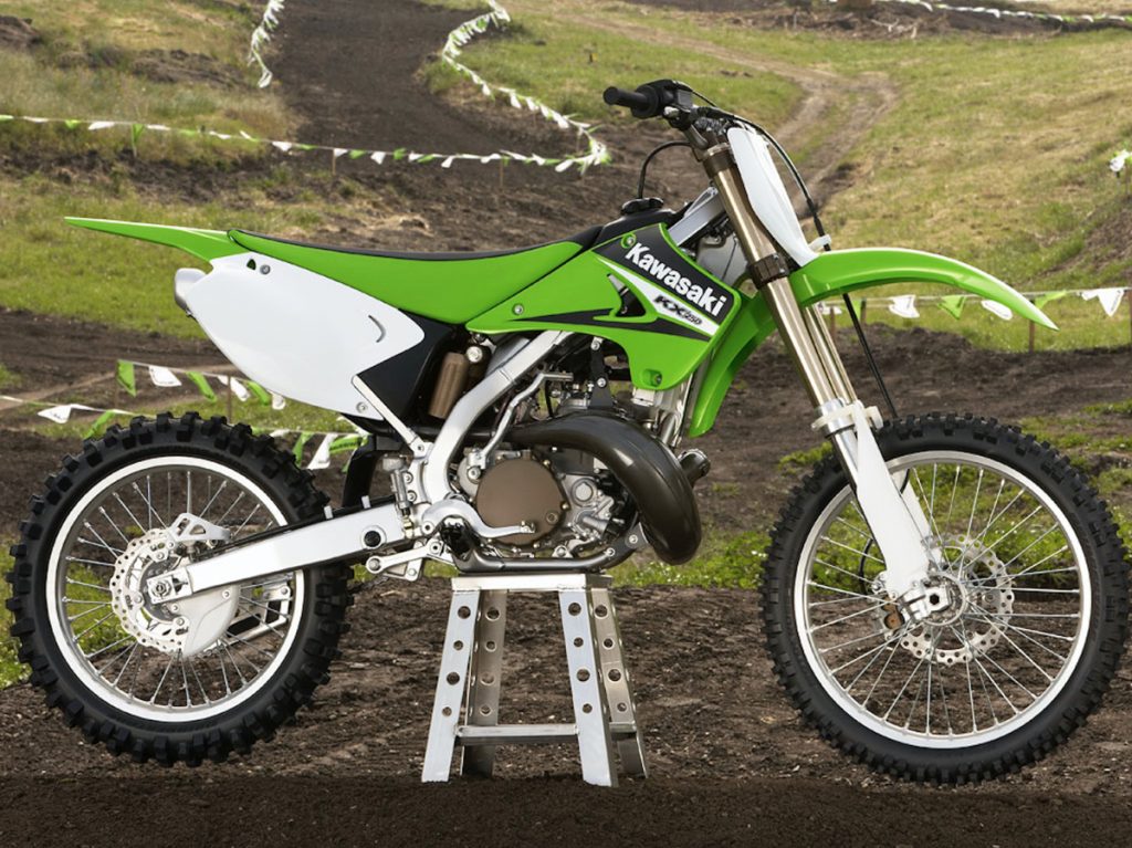 Blaze’s Fifth Place: 2006 Kawasaki KX250
Blaze: This 2006 250 was actually the first KX I had owned since my 1987 KX125 back in the eighties. I never loved or obsessed over it like I had that ‘94, but the price was right, and I wanted another two-stroke, so I snatched it up. The bike itself was a bit of a mixed bag with handling that was quirky (get a link), a motor that pinged like a Cummins diesel (always run a bit of race gas), and a garbage clutch (I put on a Magura juice clutch), but damn was she a rocket.
In the looks department, I think this bike was actually pretty sweet. I really liked the understated 2005 factory replica graphics Kawasaki used in ‘06 and the green bodywork was clean and good-looking overall. I did not love the green seat (I replaced mine with a black one like Bubba had), the side panel shape was a bit peculiar, and the rear fender seemed to point skyward like it was a bit too happy to see me, but overall this was a good-looking machine. With a different link to level the bike and a black seat, it was downright pretty.
Of course, it also did not hurt that this was one of the last of its breed as well. If Kawasaki had come out with a badass alloy-framed KX250 in 2007 we might not even remember these models, but the fact that they killed them off a year later means this last-generation of KX two-strokes will always hold a special place in the hearts of many, including me.
Matthes: I enjoy the mag color of the hubs, clutch cover, and clamps of this model, that’s always a good look. I didn’t like when Kawasaki went to the grey colored frame though, it was too generic and mixed in with the motor to pop. I’m a traditionalist in that way, like frames should be green you know?
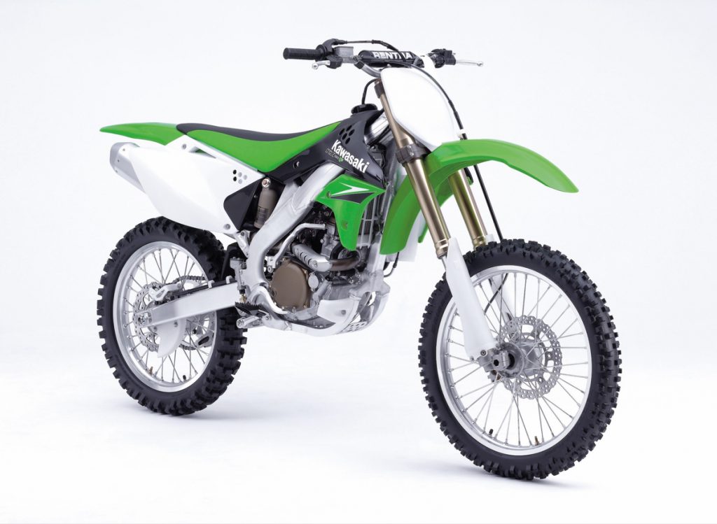
Blaze’s Fourth Place: 2006 Kawasaki KX250F
Blaze: In fourth place, we have the first thumper on my list, the 2006 Kawasaki KX250F. This was the first year for alloy frames on the KXs and a major upgrade after their rocky first outing partnered with Suzuki. The first-generation KX250F had been a rather unattractive bike, saddled with mediocre performance and a myriad of reliability issues. It was a big hit in the marketplace, but not a particularly satisfying pairing for Kawasaki or Suzuki.
For the second generation of their super-thumper, Kawasaki decided to keep everything in-house. The new 250F (and 450F) adopted a very Honda-esque aluminum frame and sexy new bodywork to go with a redesigned engine. The result was a great bike and one of the best-looking Kawasaki machines ever.
Interestingly, I think the green on the seat works way better here than it did on the two-strokes. Maybe it is the black on the shrouds that break things up? Clearly, the graphics and overall look were designed for the new four-strokes instead of the older two-strokes, so that makes sense. I love this new bodywork and prefer it to anything Kawasaki bolted on their thumpers up until 2016. It is handsome, clean and even looks pretty good with the black accents I normally don’t favor. That deep brown coating for the motor covers, shock, and triple clamps still looks great and gives the bike a little faux-works swag. Overall a really great-looking bike and one of my favorite Kawasaki four-strokes.
Matthes: Yeah I remember thinking that Kawasaki did a good job with this, the first “real” four-stroke that they came out with. The “factory” holes in the side panels to get air through was cool.
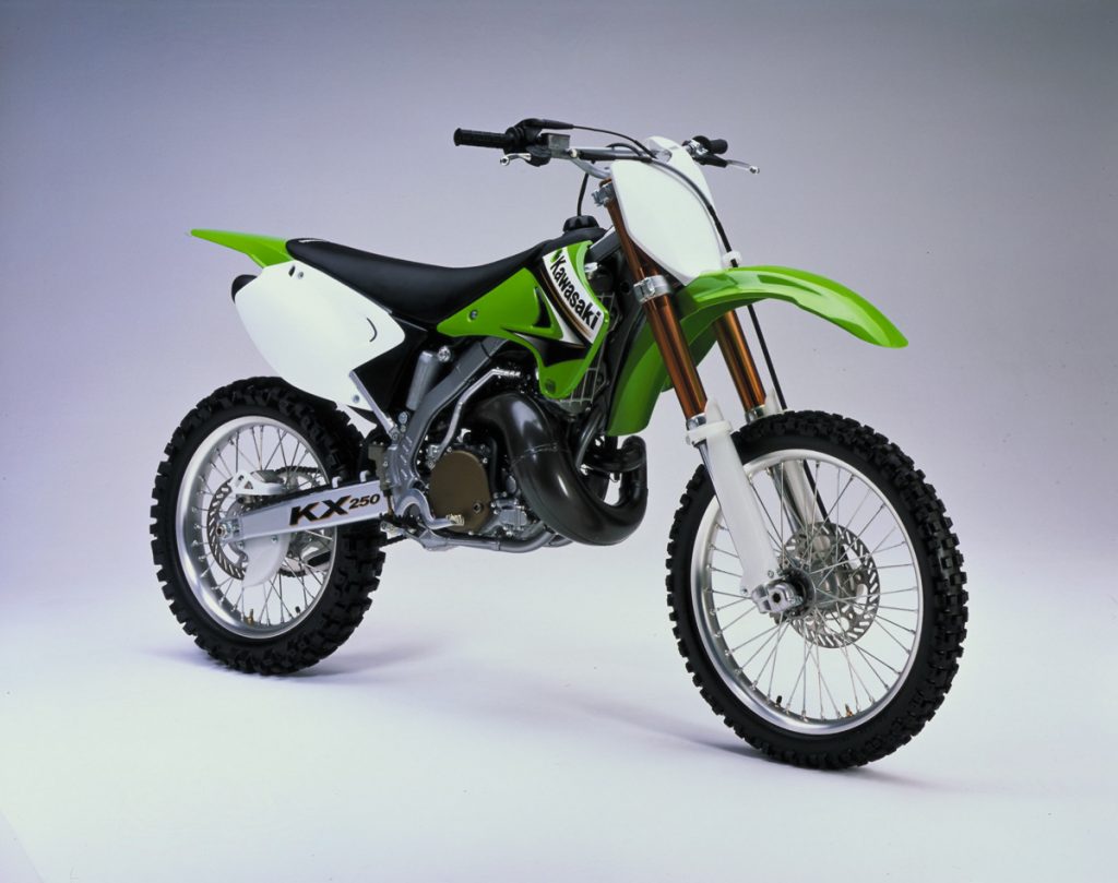
Blaze’s Third Place: 2003 Kawasaki KX250
Blaze: In third place, I have Kawasaki’s all-new for 2003 KX250. This was the first year for the design that would carry the KX250 through its eventual retirement in 2007, and for my money at least, they nailed it this first time out. The actual bike was fairly lackluster in 2003, but they got it right on the styling end at least. That works-like deep bronze color Kawasaki used on the forks this year really made it stand out from the bikes that came before and after and gives the bike an exotic flair. The graphics even have matching bronze accents and are by far my favorite of the 2000s KXs. If only the shock and clamps had featured the 2006’s Cerakote look it would have been perfect. Heck, even the seat is the proper black this year. Great…Looking…Bike.
Matthes: At some point every manufacture has their moment when they fall in love with black. This was Kawasaki’s moment. The fork color, as Blaze says, is cool and this is definitely in the “less is more” design department. Still don’t like that frame color though.
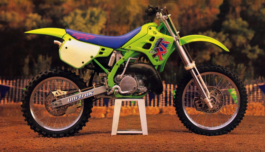
Blaze’s Second Place: 1990 Kawasaki KX250
Blaze: Wow, this one was a hard choice that I thought about for a long time. I was sooooo close to rating this bike number one, but I just could not pull the trigger. I loved this design in 1990 and still do today, but it has aged a bit. Those fenders seem really wide when you look at them now and the steel frame appears a little industrial compared to the slick alloy ones that are de rigueur these days. I don’t want to fault it for being built in 1990, but it is hard to rate it above the downright sexiness of the machine I have at number one.
At the time of its introduction this 1990 KX design was utterly mind-blowing and an unimaginable departure from the stodgy and slightly cobby bikes Kawasaki had been cranking out the previous few years. It was a bold, colorful, and visionary design that influenced motocross aesthetics for many years to come. Bright colors, cartoony graphics and yes, even perimeter frames would all become mainstream in the nineties – much of that due to the influences of this machine. It is a great design that has certainly withstood the test of time, but one that has been supplanted at the top of my list.
Matthes: This is it. THE best looking Kawasaki ever and it’s not up for debate. It needs to be one up on this list. When this came out it was amazing, people lost their shit for this bike. It was SO different from every other bike out there due to their perimeter frame design and I love this particular years aluminum shock towers (that they ditched after one year cause they cracked). There is no look for fork guards that are cooler than these (although they’re not protective enough) and look at that little tip of the silencer poking through that is just screaming “FACTORY”!!! Here we have it folks, THE number one Kawasaki look of all time. I should fire Blaze for not having it there.
Swizcore: C’mon Steve, just putting this up against the 1992 it comes up short in a few glaringly obvious ways. The clunky radiator shroud seam at the gas tank as opposed to the fully enveloped 1992 setup. The graphics which span from the shroud to the seat with pulls the look even further along. The sloping cockpit as opposed to the flatter 1992 seat to tank junction. The 1992 just looks eons more progressive and modern than this Chicken-weapon.
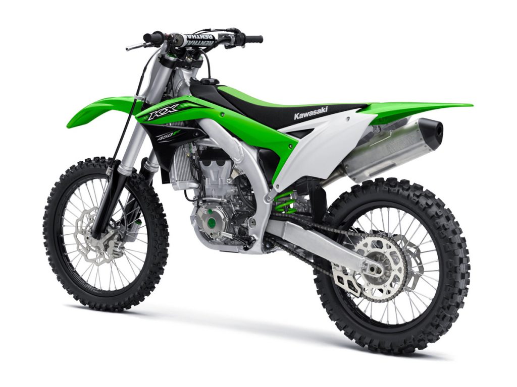 Blaze’s First Place: 2016 Kawasaki KX450F
Blaze: Ok, ok, in the past I have said that four-strokes are really not my thing in the looks department and that is certainly still true. All of my other lists and this one as well are populated mostly by two-stroke machines. I think that huge motor and great honking muffler detract quite a bit from what would otherwise be a lovely design. Four-strokes just look heavy, even if these days they often aren’t.
With is this design, however, I can throw 80% of that out the window. Yes, the motor is still big (but handsomely decked out with a little bling) and the muffler looks like it belongs on a Buick (I’m thinking a ’63 Electra), but the rest of this design is absolute aces. I absolutely love the look of the new for ’16 bodywork. The fenders, shrouds, plates, and graphics are all really nicely done and work well together. That green element that runs along the frame spars from the shrouds to the side plates is really unique and does a great job of tying together the whole design. This side plate design is easily one of my favorites Kawasaki has ever used as well. It is very stylish and modern looking, without being too busy or overdone (I’m lookin’ at you Husqvarna). Plus, numbers actually fit on them!
Regardless of how many strokes it has, this is a damn fine-looking motorcycle. It actually reminds me a bit of a green Honda and I mean that as a compliment. It looks fast standing still and is about as sexy as something the color of a frog can be. True, it does lack the nostalgia and cultural cachet of the 1990 KX, but it is sleek and racy in a way the old bikes just can’t match. In the end, that was enough for me to put this mean green machine over the top.
Matthes: They did a great job with this, looks amazing and so much better than any other Kawasaki thumper. Nice two-toned use of black and dropping the “F” from the four strokes is a nice move although somewhat weird. It’s great for sure but it just CAN’T be above the 1990 model. It just can’t. And WTF is the 1985 KX125 Blaze??? I can’t deal with this guy.

