As we celebrate O’Neal’s fiftieth year in motocross, Matthes, Doug Dubach and I are back with another look at the gear that has made O’Neal a staple of tracks around the country over the last five decades. For this installment, I have combed through my thousands of magazines to find all of O’Neal’s classic motocross ads from the 1990s. Easily my favorite era for moto, the nineties were awash in colorful gear and even more colorful personalities.
During this era, gear became ever more sophisticated and even more vibrant. New print techniques introduced a kaleidoscope of eye-catching colors and innovative materials and designs that brought with it improvements in durability and comfort that every rider could appreciate. While some products like kidney belts and over-the-jersey chest protectors began to fade, other innovations like baggy pants and synthetic jerseys burst onto the scene. Overall, it was an era of bold choices, constant innovation, and great change.
As in our previous entry that covered O’Neal’s origins, this one is going to look back at the brand through the ads that they produced. For this second O’Neal installment, we are going to go through O’Neal’s motocross gear ads from the nineties year-by-year. Along the way, I am going to be adding my thoughts to each, with Matthes and The Doctor chiming in where they feel necessary.
If you would like to read our previous entry that covered O’Neal from its origins through the 1980s, you can find it HERE.
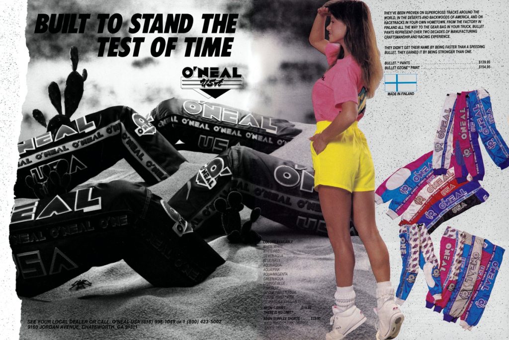 Photo Credit: O’Neal
Blaze: Unfortunately for people with good taste everywhere, the questionable Bullet Ozone pants were back for 1990.
Matthes: Yeah, I like these except for the O’zone font. Solid two-tone colors with a cool logo- what’s not to like? Nice yellow shorts chick.
The Doctor: I can confirm, the O’Neal gear has always been very durable!
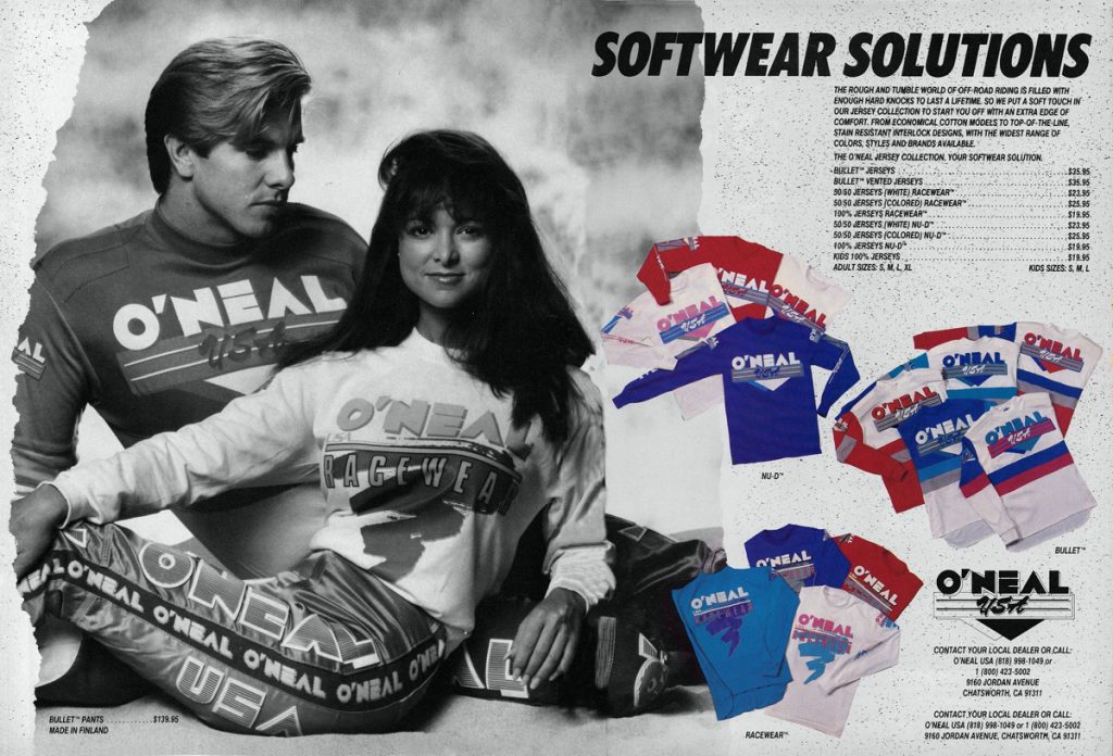 Photo Credit: O’Neal USA
Blaze: Even though they were getting a bit old by 1990, the original Bullet look was still a classy option for those who found the crazy new Fox and JT designs too outlandish.
Matthes: Yeah it was for sure still old school at this point and O’Neal has always been popular for the vet guys over the years. Look at their signings of Larocco and Ferry as well, that was done for specific reasons. That guy is looking at the girl really creepy-like by the way.
The Doctor: They did run long in the tooth with this stuff. The jerseys on the right side of the ad were like sweatshirts…not the best for the East coast in summer!
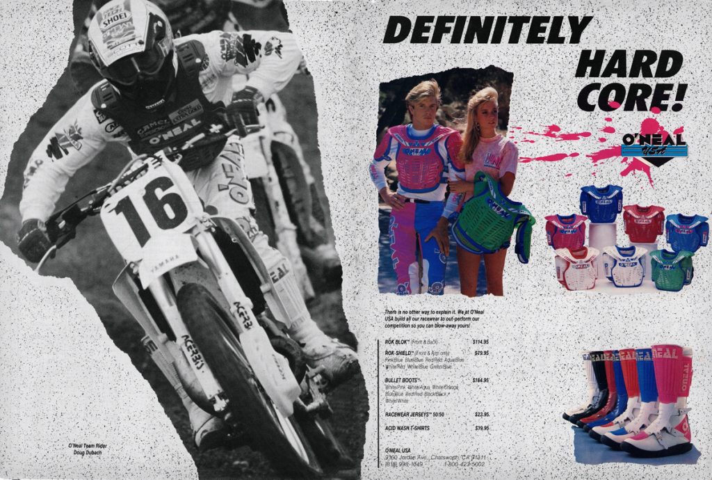 Photo Credit: O’Neal USA
Blaze: The Rok Blok was still no beauty queen but the addition of bold pink and blue colorways really perked up its looks for 1990. The pink treatment helped freshen up the original Bullet Boots quite a bit as well IMO.
Matthes: I think Jim just took that MXA cover photo of the Doctor for this ad.
The Doctor: I really liked this set up, clean and simple! I love this photo (Hangtown leading the O’show) I’m pretty sure I holeshot both motos that day and led the first one for a very long time. I’m also pretty sure Matthes is right and this was an MXA cover.
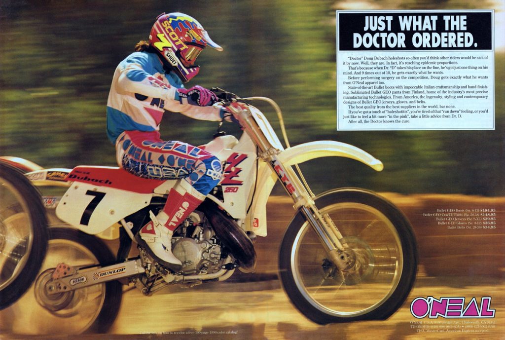 Photo Credit: O’Neal USA
Blaze: Updates for the fall included a new Bullet Geo Jersey, redesigned Bullet Geo Boots and a “crackle” option for the Bullet pants. As the Doctor demonstrates, this was a really strong look in 1990.
Matthes: Yeah, I like it! A bit like the Glover/JT look in 1988 for sure but that doesn’t mean it’s not good. Doug always had cool helmets also.
The Doctor: I loved this gear, however, the color of our bikes didn’t match it all that well (they did a weird powder pink on the factory bikes in 1990). This was a bad year for me, I was riddled with injuries.
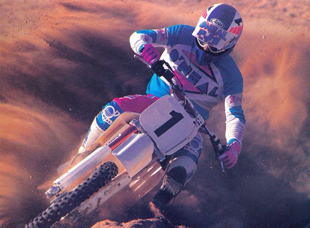 Photo Credit: O’Neal USA
Blaze: Ultracross champ Jim Holley was still hauling ass and still looking good in O’Neal in 1990.
Matthes: Ahhh, the giant O’Neal logo on the visor lives on! Man those red forks were hideous for the 1990 YZ’s. Holley needed the bigger font on his numbers.
The Doctor: This is a cool shot of Jimmy, he was a bad dude…in many ways 😉
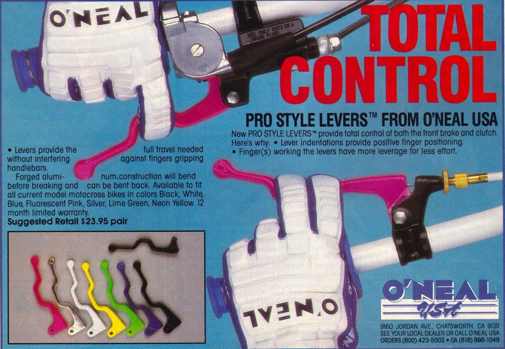 Photo Credit: O’Neal USA
Blaze: While not gear specifically, I think it is worth mentioning this little blip on the moto landscape that O’Neal introduced in 1990. These Pro Style Levers came in cool colors and seemed like a good idea. They supposedly offered increased control and no worrying about crunching your fingers. Of course, I had to get a set and of course, they were weird to use and less practical than one would think. I never really came to grips with their odd feel and ditched them in short order.
Matthes: No thanks. I’m out.
The Doctor: I tried these as well and was not a fan.
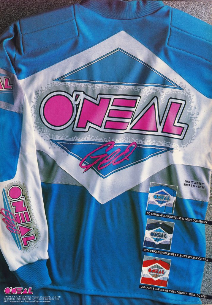 Photo Credit: O’Neal USA
Blaze: The Bullet Geo jerseys received some minor cosmetic updates for 1991 that I don’t think were really much of an improvement. Those shoulder pads might have been practical, but they always make me think of the funky Yoko gear Tallon Vohland wore around this time that I would not want to have been caught dead in.
Matthes: Yeah, true Blaze- Yoko lives on!
The Doctor: My memory of this jersey was that it was hot to wear, even at a SX. It felt like a sweatshirt. I always went back to the 100% cotton jersey.
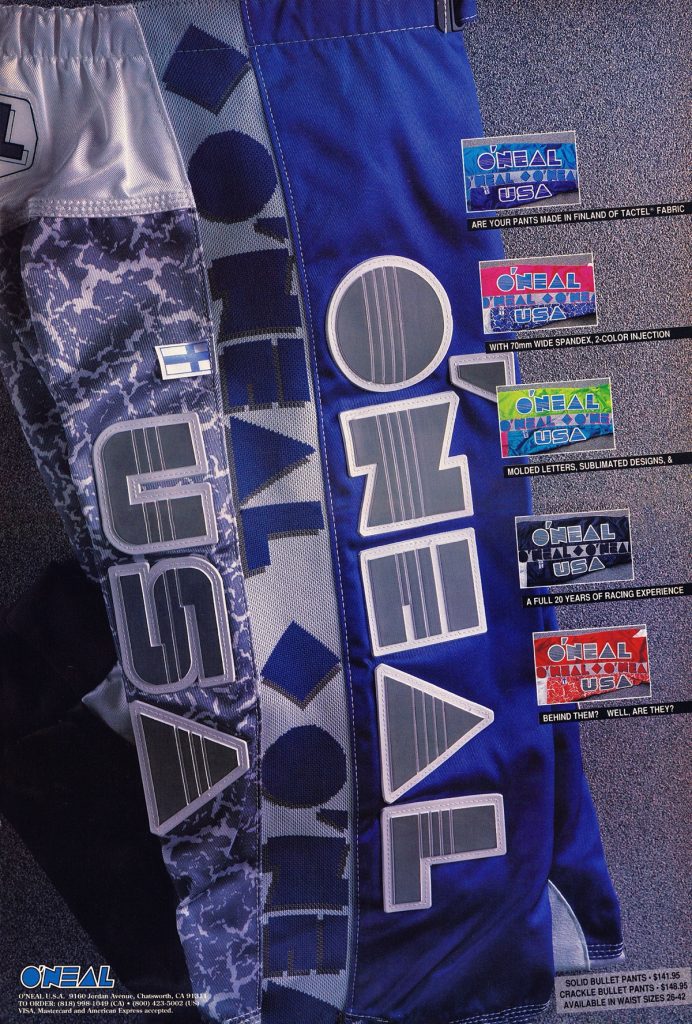 Photo Credit: O’Neal USA
Blaze: I like all of these, but the Pink/Blue and Green/Blue colorways are the picks of the litter.
Matthes: Very blocky looking. I like it though.
The Doctor: The Pink/Blue were cool!!!!
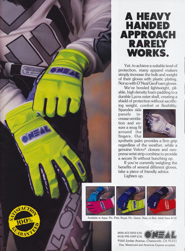 Photo Credit: O’Neal USA
Blaze: O’Neal was certainly all-in with this foam look for a few years in the late eighties and early nineties. Like I said in part one, I’m sure they were practical, but man were they ugly.
Matthes: I do not remember these and have never seen them in person.
The Doctor: These took a while to break in, they were very stiff at first. Good protection for Binghamton though.
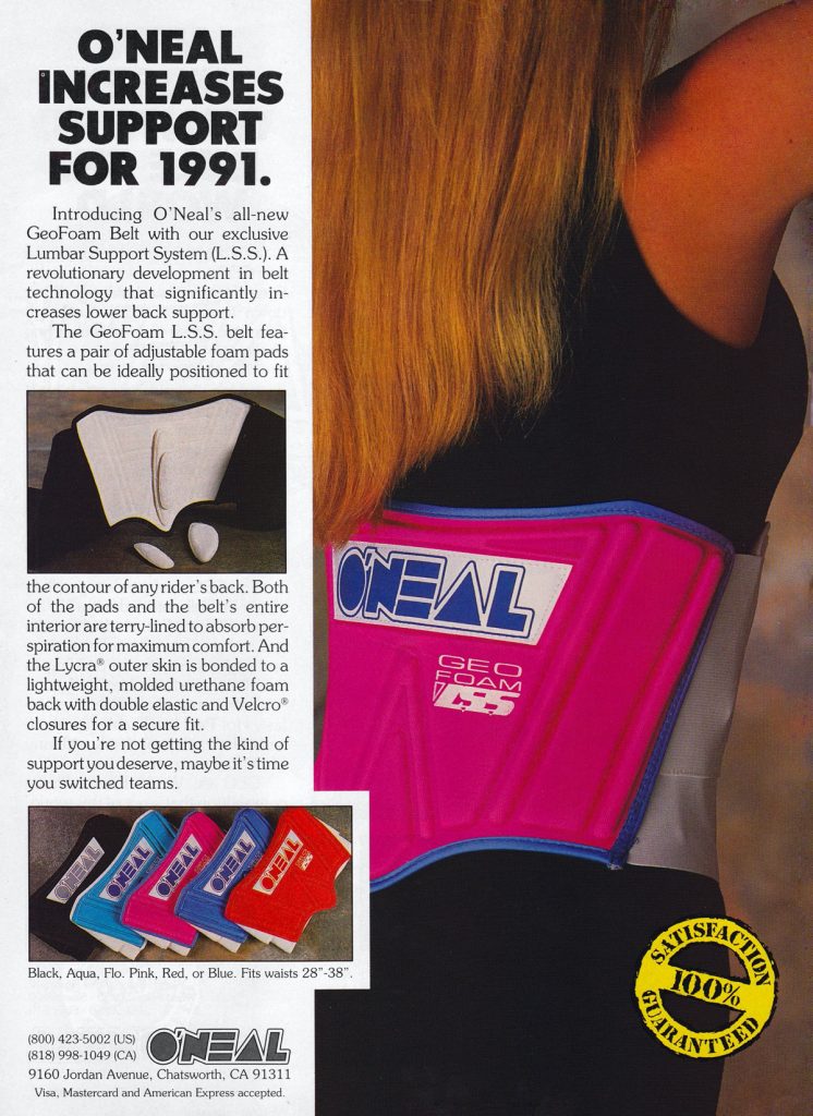 Photo Credit: O’Neal USA
Blaze: I think kidney belts had already begun their slow tumble towards irrelevance by 1991 but O’Neal was there with the all-new Geo-Foam belt that perfectly matched their oven mitt gloves.
Matthes: Did Jim get a deal on some bulk Geo-Foam or something?
The Doctor: I was a holdout kidney belt guy, however I liked their smaller lighter one.
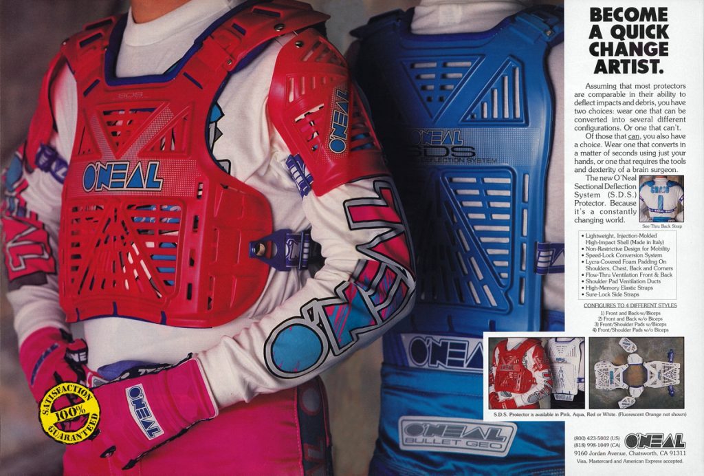 Photo Credit: O’Neal USA
Blaze: The all-new S.D.S (Sectional Deflection System) chest protector continued O’Neal’s run of uninspired deflector designs. Sort of an AXO Pentagon knock-off, I don’t think this one had Pete Fox or Jim Hale shaking in their motocross boots.
Matthes: Nope, well said Blaze. Although this is better than the Rok Blok thing it still wasn’t much for inspiring a good look. Did they just make them in red, white and blue? Weird.
The Doctor: I wore this as a chest only piece, light weight and offered good protection.
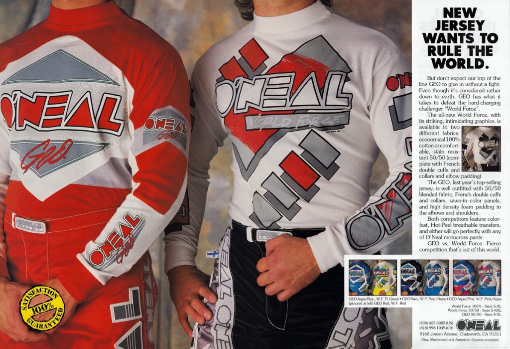 Photo Credit: O’Neal USA
Blaze: The new World Force jerseys were decent but those new IFS pants with the wrap-around logos and weird diamond-plate pattern are a hard pass in my book.
Matthes: God that turtle neck collar thing looks rather choking huh?
The Doctor: C’mon Tony…I rocked the diamond plate stuff!!!
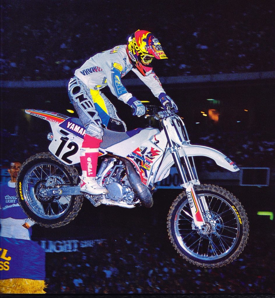 Photo Credit: Jeff Ames
Blaze: During the early nineties several of the gear brands tried this unique wrap-around logo look. While I can certainly see the appeal of those huge logos from an advertising perspective, I cannot get on board with their appearance. Plus, what the hell was it with that diamond plate background? How did they come up with that one? Maybe Jim O’Neal felt Pete Fox had cornered the market on crazy designs so they just copied the pattern off of Steve Butler’s toolbox? Weird, just weird…
Matthes: I’m with you on the diamond plate Blaze but other than that, I like the look of these pants. I remember coming close to wearing all O’Neal this year because of this design. It was pretty unique and cool looking which is something you can’t always say about O’Neal back then.
The Doctor: This is a great photo!!! It goes to prove that you can have 15 different colors going and still pull it off.
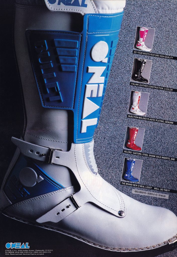 Photo Credit: O’Neal USA
Blaze: I’m not sure how different the new Bullet Geo boots were from the outgoing models, but they sure looked a lot better.
Matthes: Yeah, I mean what’s really different here from the late 80’s boot other than BNG?
The Doctor: I think they had a stiffer sole from what I remember. It helped a lot in SX.
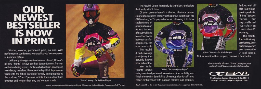 Photo Credit: O’Neal USA
Blaze: Gel printing was all the rage in the early nineties and O’Neal was ready in 1992 with some sweet new all-over printed jerseys to fill the demand. Like all the other gel prints, these looked amazing but were probably hotter than a Louisiana swamp in August.
Matthes: Yeah, AXO was all over this and O’Neal was a bit late to the party but still a good look I think.
The Doctor: They had some cool colors…but yes, these were very hot even in SX.
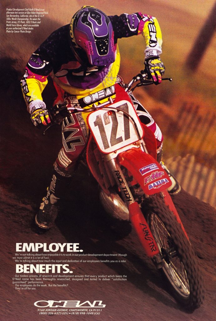 Photo Credit: O’Neal USA
Blaze: Keith O’Neal sighting! I always thought it was kind of odd for Jim to throw his son in all of these ads instead of Mike Craig, Jim Holley or Doug Dubach. No disrespect to Keith, but let’s be real – he was no Stingray, Hollywood, or Doctor. Regardless of who was modeling it, this was some good-looking gear. In this colorway, even the whack IFS pants look pretty decent.
Matthes: The pants aren’t whack Blaze! This is a good look!
The Doctor: You have to throw a bone to the your own flesh and blood!
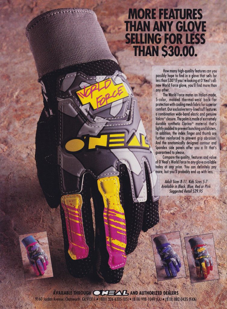 Photo Credit: O’Neal USA
Blaze: Holly frijoles Batman! A new set of O’Neal gloves I actually like. Other than the weird diamond plate making its way here too, this is a pretty good-looking glove. I imagine these gloves were about 87.5% cooler than the old O’Neal oven mitts.
The Doctor: Yes, these were a great glove. The only thing that I would do is cut the cuff so it wasn’t so tight on my wrist.
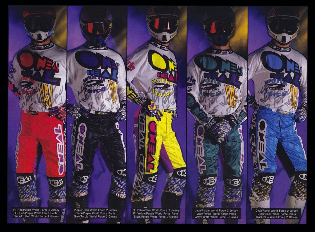 Photo Credit: O’Neal USA
Blaze: LOVE, LOVE, LOVE the new World Force pants and jerseys for 1993. That pinstripe is a clear rip-off of AXO’s older 125ST pants but who cares? It looked great in 1991 and it still looks great here. If O’Neal updated the materials and re-introduced this design today these would sell out in a matter of hours. Stamp it!
Matthes: It’s just too many memories of Mike Craig for me but ok.
The Doctor: Yes, for sure…I really liked this stuff when it was released. I think I still have an aqua jersey fresh in a bag!!!
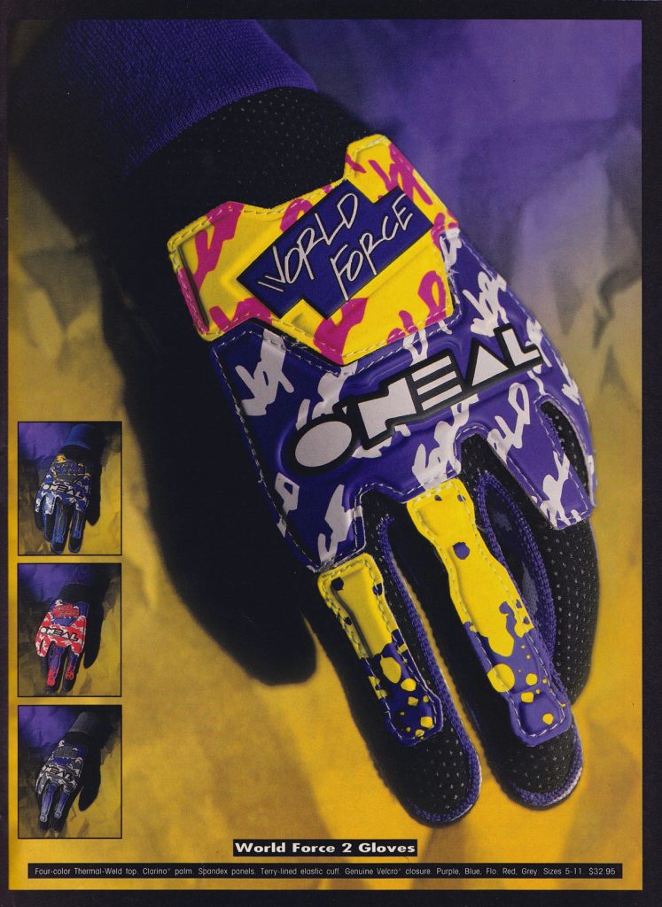 Photo Credit: O’Neal USA
Blaze: For 1993 they dumped the diamond plate (can’t imagine why) and punched up the colors. I’ll take two to go, please.
Matthes: Remember when you washed all these old gloves and they just ended up all crusty and in a ball?
The Doctor: Again, this was a big improvement over the oven mitts.
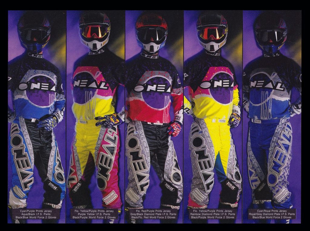 Photo Credit: O’Neal USA
Blaze: IFS pants and Print jerseys were back for 1993 with two nice colorways and three goofy diamond plates. Even if you like the diamond plate look, it’s hard not to admit that the middle one should have been a Flo-red and purple combo instead of this black and silver. Those logos must have weighed twenty pounds…
Matthes: BLAZE…THESE WERE THE SHIT.
The Doctor: These were heavy pants…and Damon would ask if he could wipe his feet on mine like a doormat.
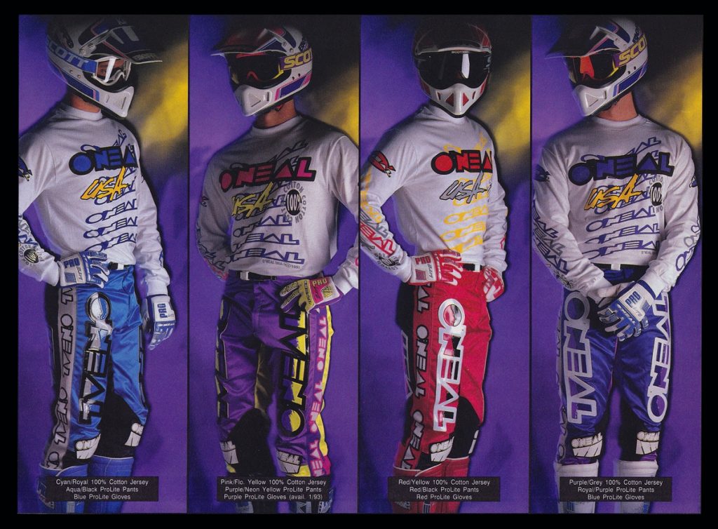 Photo Credit: O’Neal USA
Blaze: For those on a budget, O’Neal offered these lower-cost Pro-Lite pants and Cotton jerseys for 1993. I know people love synthetics, but I miss a nice cotton jersey.
Matthes: You and nobody else bro.
The Doctor: These jerseys did not absorb sweat AT ALL!
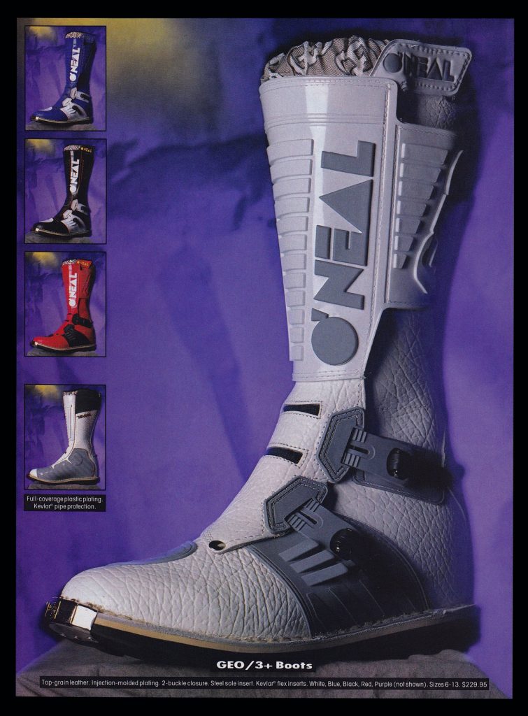 Photo Credit: O’Neal USA
Blaze: A new Geo 3 added an understated look and a lot of texture to the leather for 1993.
Matthes: We also got some new buckles! Changing things up.
The Doctor: This new leather didn’t last as long as the previous stuff.
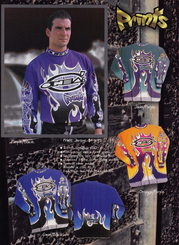 Photo Credit: O’Neal USA
Blaze: In 1994, O’Neal added one of my favorite designs of the nineties to the stable. That Orange/Purple Prints jersey positively glowed with color and looked amazing when paired with the matching pants.
Matthes: I’ll never be onboard with MX companies not putting riders or riding shots in their ads. Why hire some models to stand there looking all goofy? Dirt bike people want to see other dirt bike people.
The Doctor: I think of Mike Craig when I see this stuff. He looked soo good on his Factory Yamaha in this stuff!!!!!
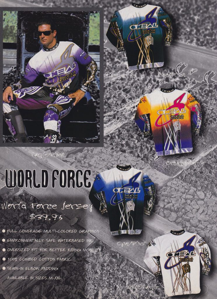 Photo Credit: O’Neal USA
Blaze: I loved these new World Force jerseys as well, particularly my favorite Orange/Purple colorway.
Matthes: Not on-board with this look.
The Doctor: I wore this stuff to my first Vet title about 100 years ago☺
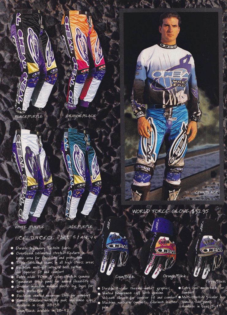 Photo Credit: O’Neal USA
Blaze: The redesigned World Force pants looked good as well, although I think that huge new logo might have been a bit much.
Matthes: Agreed with that, man that’s a huge circle.
The Doctor: I liked this stuff, but yes, the big Logo was heavy and stiff.
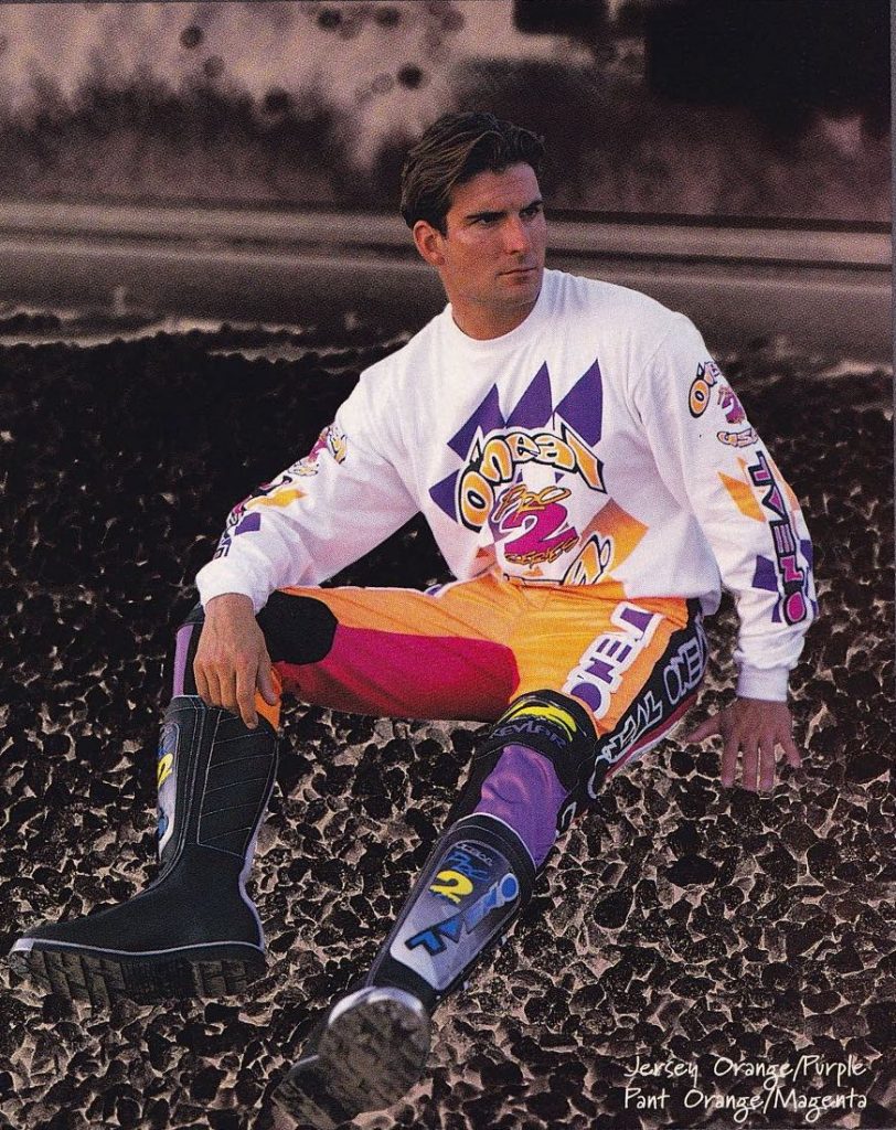 Photo Credit: O’Neal USA
Blaze: Even though they were not the flagship, I actually think I prefer the more understated looks of these lower-priced Pro 2 pants over the World Force ones in 1994.
Matthes: I do not ever remember seeing this ad.
The Doctor: I liked these because they were light weight and still looked good!
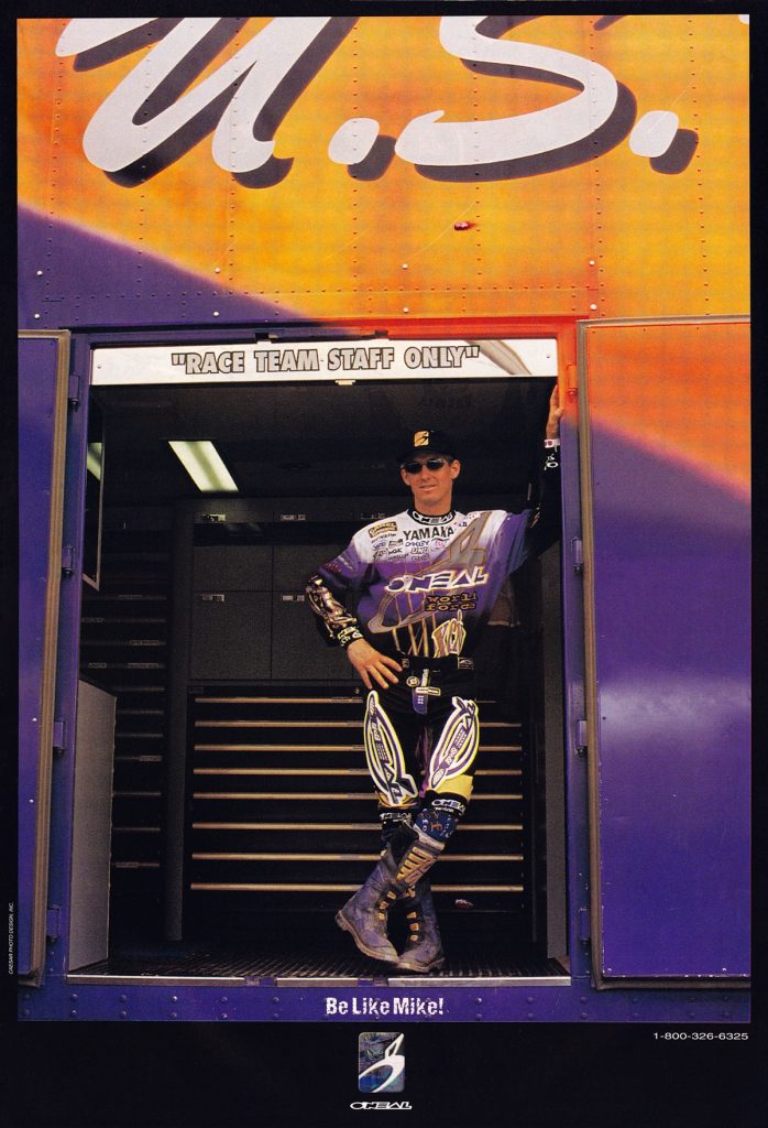 Photo Credit: O’Neal USA
Blaze: Having Mike Craig in the Factory Yamaha truck and in O’Neal gear was a big deal for the brand in 1994.
Matthes: Yes it was but it didn’t end well. The ad tagline “Be like Mike” was fake news, nobody wanted to be like Mike Craig.
The Doctor: Sting Ray looking good!!!!!!!
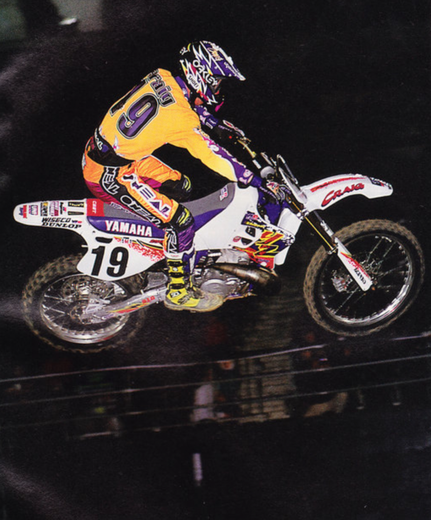 Photo Credit: Motocross Action
Blaze: Even though the honeymoon did not last long, Craig did deliver O’Neal a Supercross victory at Tampa in 1994.
Matthes: Lost in all of the Craig stories is that he did win a premier class race. Which is, like, way legit. I don’t think I’ve ever seen the actual race though.
The Doctor: He was jumping that entire set of whoops that night.
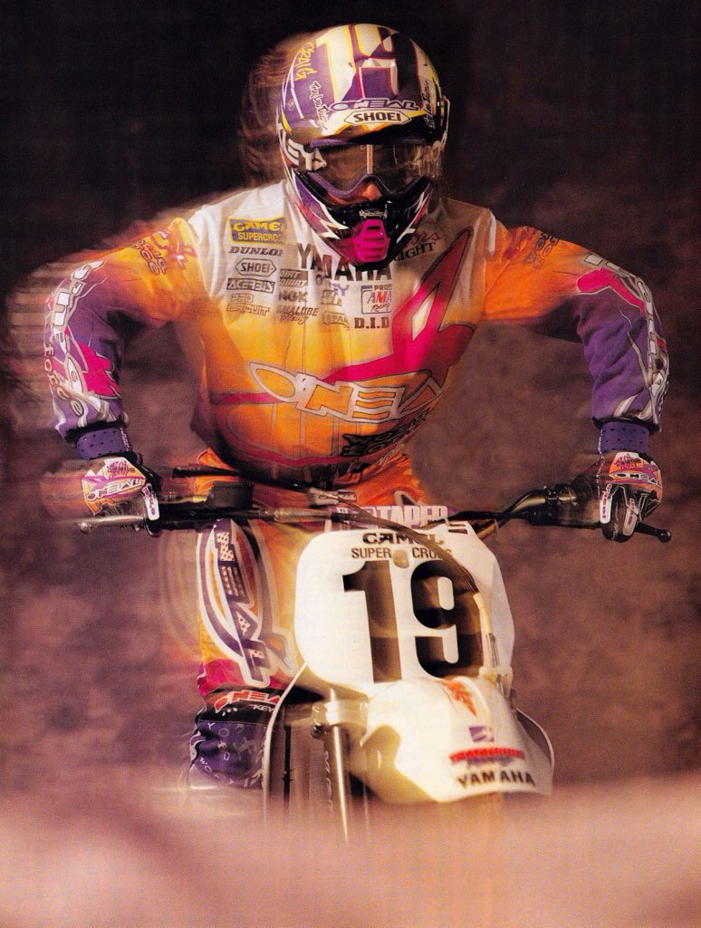 Photo Credit: O’Neal USA
Blaze: Man I loved this gear.
Matthes: Rolling the dice with Mike Craig as your number one guy to drive sales is like blindfolding yourself and walking out onto the 91 freeway. It might be ok for a bit but in the end, it’s not going to end well.
The Doctor: Looking good!!!!!!!!
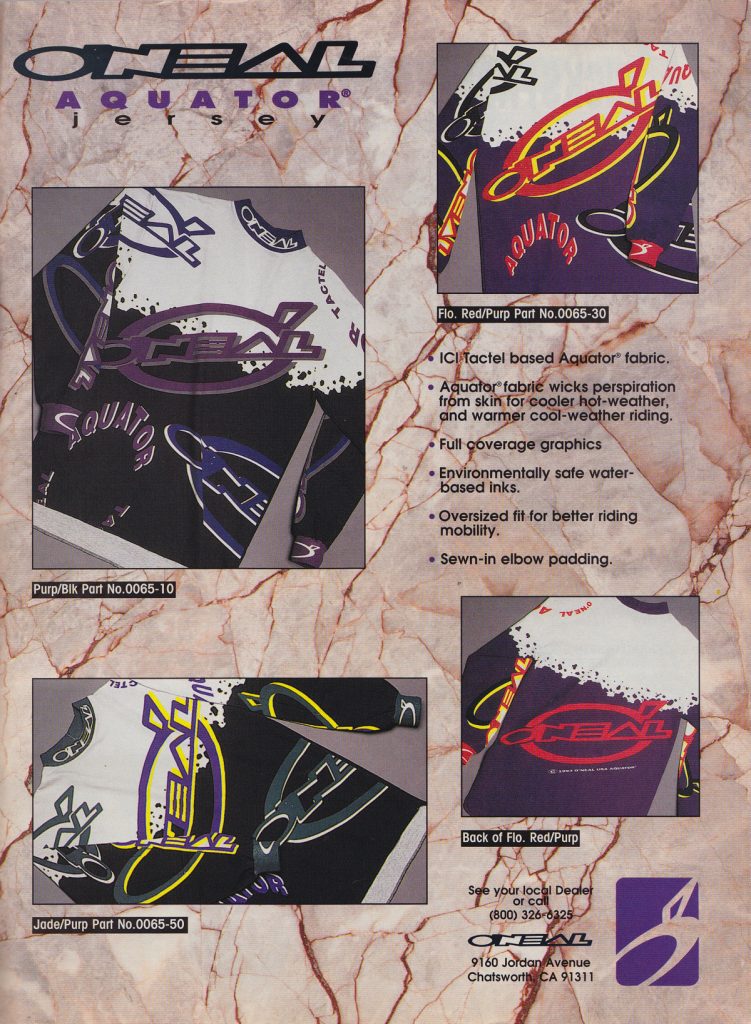 Photo Credit: O’Neal USA
Blaze: If you did not want to sweat your balls off O’Neal offered this Aquator jersey with improved sweat-wicking performance. It is interesting that AXO offered a version of this back in 1992 and O’Neal is even calling it the same thing here. I had the AXO version of these and while it was way better than a Gel Print jersey, it was nowhere near as free-flowing as a modern synthetic is today.
The Doctor: There was some great options throughout this line up, all the combos looked good.
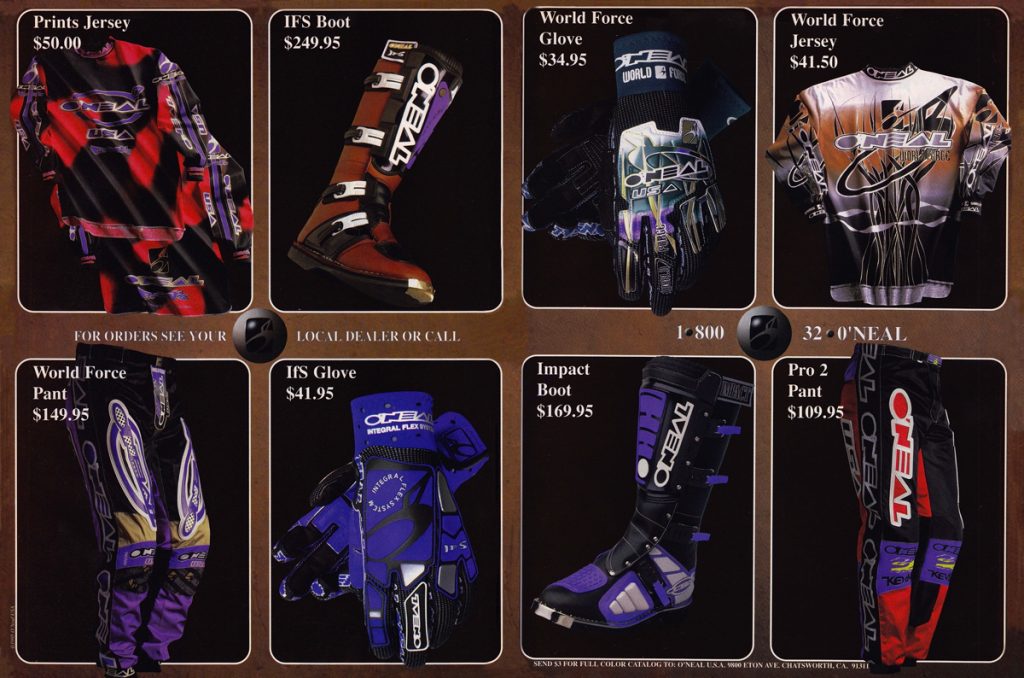 Photo Credit: O’Neal USA
Blaze: For 1995, O’Neal added a new IFS boot to the lineup and a revision to the Prints design that I did not particularly care for.
Matthes: It’s like for the entire 90s O’Neal is one year behind Fox and AXO. Fox introduced the earth tone colors in ’93 or ’94 so by ’95, O’Neal was onboard.
The Doctor: I think that one had some funky texture like they turned the leather inside out?
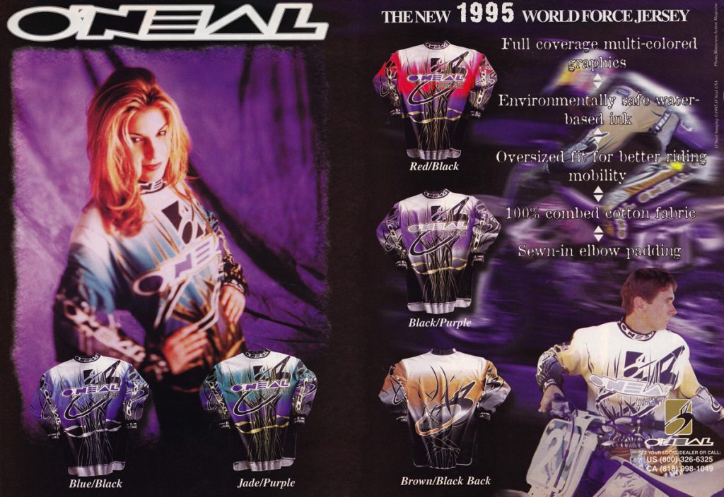 Photo Credit: O’Neal USA
Blaze: Factory Suzuki’s Craig Decker was the flashy new hire in the O’Neal stable for 1995. While these ’95 World Force jerseys are very similar to the ’94 versions, I do prefer the subtly-updated graphics and I really love the new Gold/Black colorway.
The Doctor: I favored the Jade/purple set up.
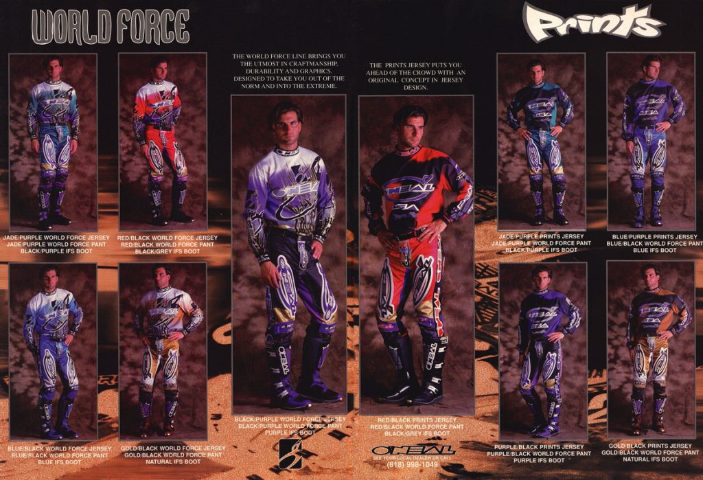 Photo Credit: O’Neal USA
Blaze: As I said, I don’t love these ’95 Prints designs, but those World Force combos in Gold/Black and Red/Black are fire.
Matthes: Yeah they do look good Blaze, I’ll give you that.
The Doctor: This stuff looked good for sure.
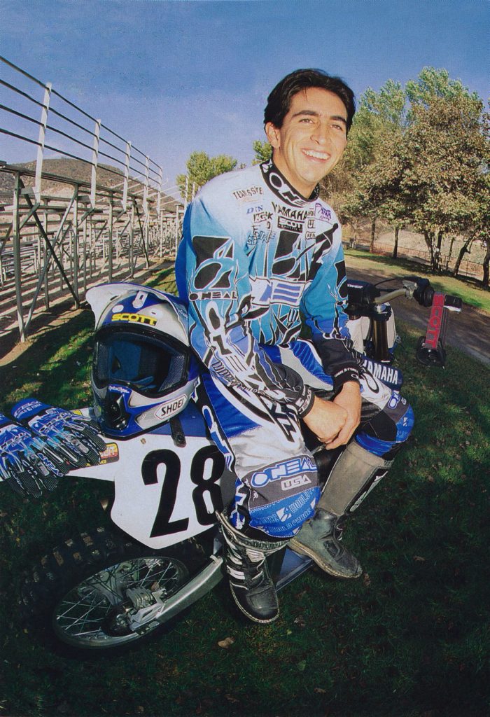 Photo Credit: Motocross Journal
Blaze: This was some good-looking gear.
Matthes: The Doctor was into a semi-retirement stage at this point but he’d show up at nationals and run inside the top ten all day long.
The Doctor: Good looking young man there…
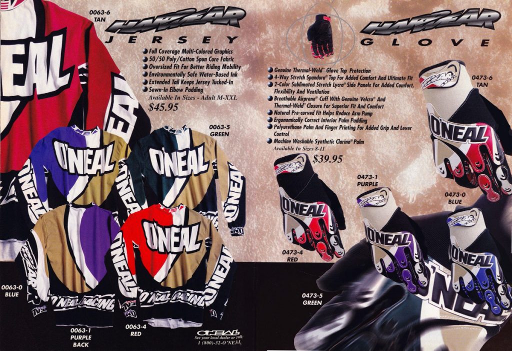 Photo Credit: O’Neal USA
Blaze: In 1996 O’Neal started a trend with their jersey designs by going BIG with all of their logos. While I don’t really love these new Hardwear jerseys, I do dig the move to earth tones and cleaner overall designs.
Matthes: This was Larocco stuff, I don’t care that he didn’t wear O’Neal in 1996, this made me think of the Rock.
The Doctor: I wasn’t a big fan of this stuff.
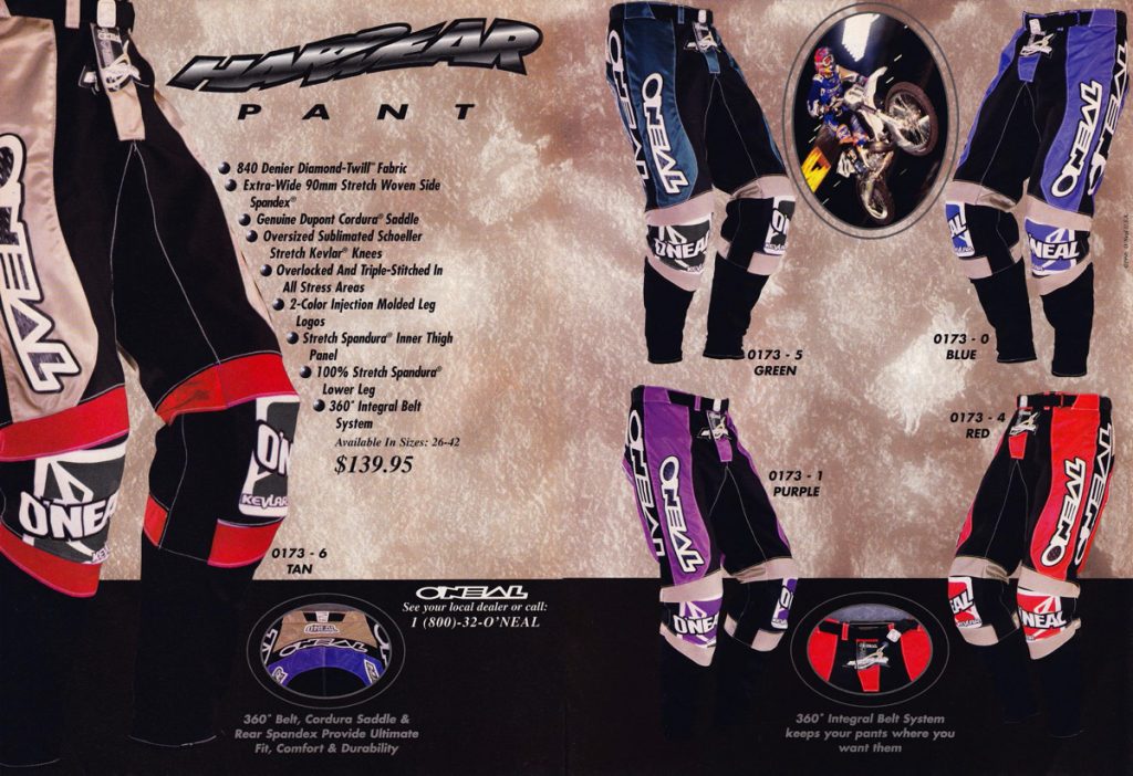 Photo Credit: O’Neal USA
Blaze: Like the jerseys, I am very blasé on the new Hardwear pants. None of them are ugly, but neither do any of them excite me as the World Force line did. I would give them all a solid “B”.
Matthes: I give them a “C.”
The Doctor: yes, just so-so for me as well.
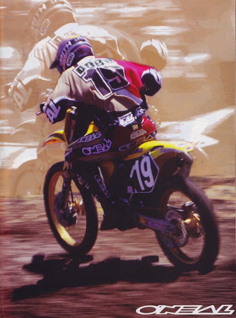 Photo Credit: O’Neal USA
Blaze: With Crag Decker sidelined with a broken back, Factory Suzuki’s (for the SX season at least) James Dobb was O’Neal’s hired gun for the ’96 season.
Matthes: Dobber won a moto at Red Bud this year then said on the podium that he had given all he could. He pulled off early into moto two so he wasn’t kidding.
The Doctor: Again, not my favorite…the gloves got better though.
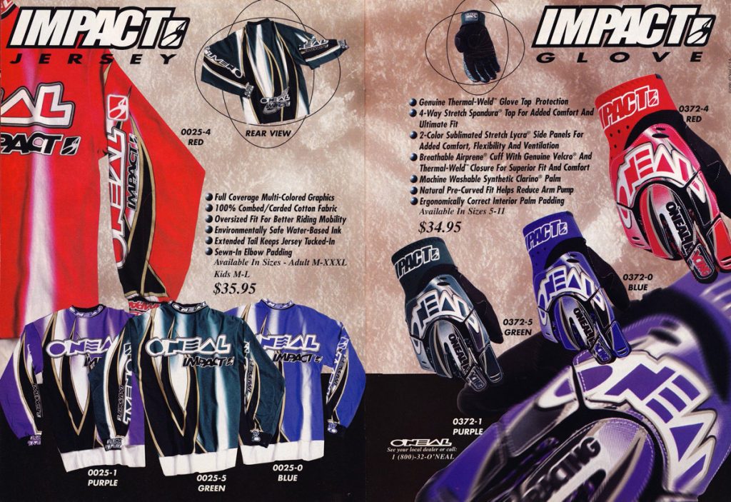 Photo Credit: O’Neal USA
Blaze: These new Impact jerseys must not have made an impact on me because I don’t even remember them.
Matthes: Yeah, I’m out.
The Doctor: I think they lost their way here for a couple years with some of this stuff…
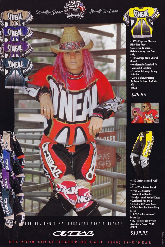 Photo Credit: O’Neal USA
Blaze: The 1997 season brought with it some all-new Hardwear gear that I liked much better than 1996. The Logo was still huge, but the designs were cleaner and more monochromatic.
Matthes: WTF with this ad though?
The Doctor: I agree, this was a nice change from the previous era. I think this was about the time Roland Hines of High Torque stopped running O’Neal ads…
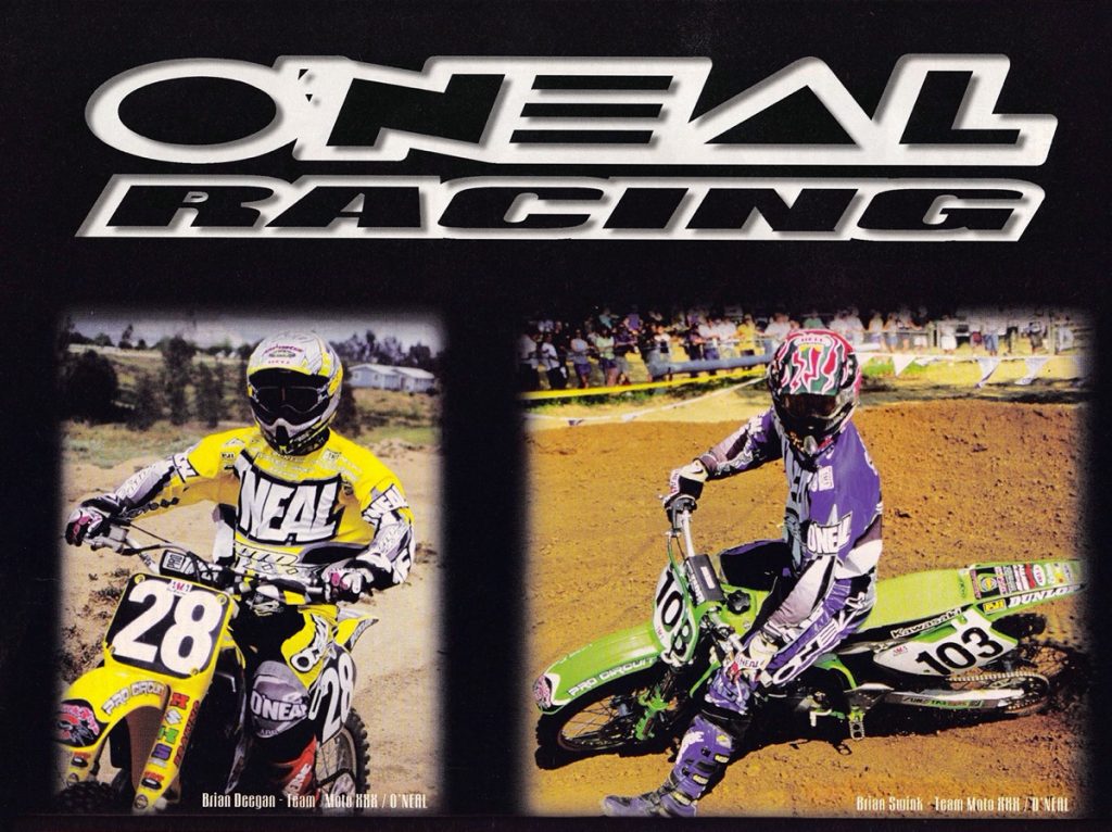 Photo Credit: O’Neal USA
Blaze: With Dobb back in Europe, Moto XXX privateers Brian Deegan and Brian Swink were O’Neal’s biggest names for 1997.
Matthes: Ahhhh, Kenny Watson hammering out the O’Neal team deal would’ve been a sight to see. I remember this ad and thinking about how bad the photos looked.
The Doctor: These we some better colors, however, it left very little room for other sponsor logos…maybe that was Jim’s master plan?
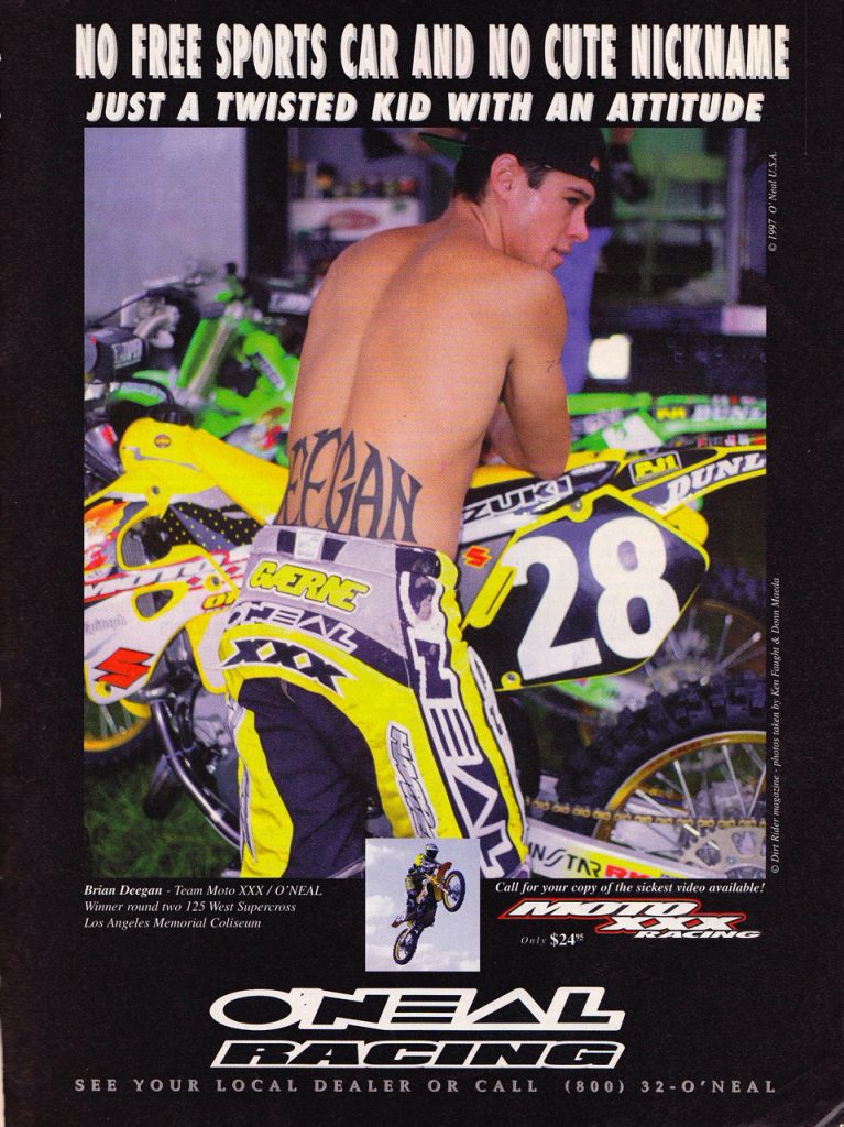 Photo Credit: O’Neal USA
Blaze: Say what you will about Deegan, he probably sold more gear for O’Neal than Dobb and Decker did combined the two years before.
Matthes: True that Blaze. Does Brian still have this tramp stamp tattoo I wonder? The bikes and gear looked good this year I think.
The Doctor: People have always been drawn to Brian and yes, he probably did bring a lot of people to the brand.
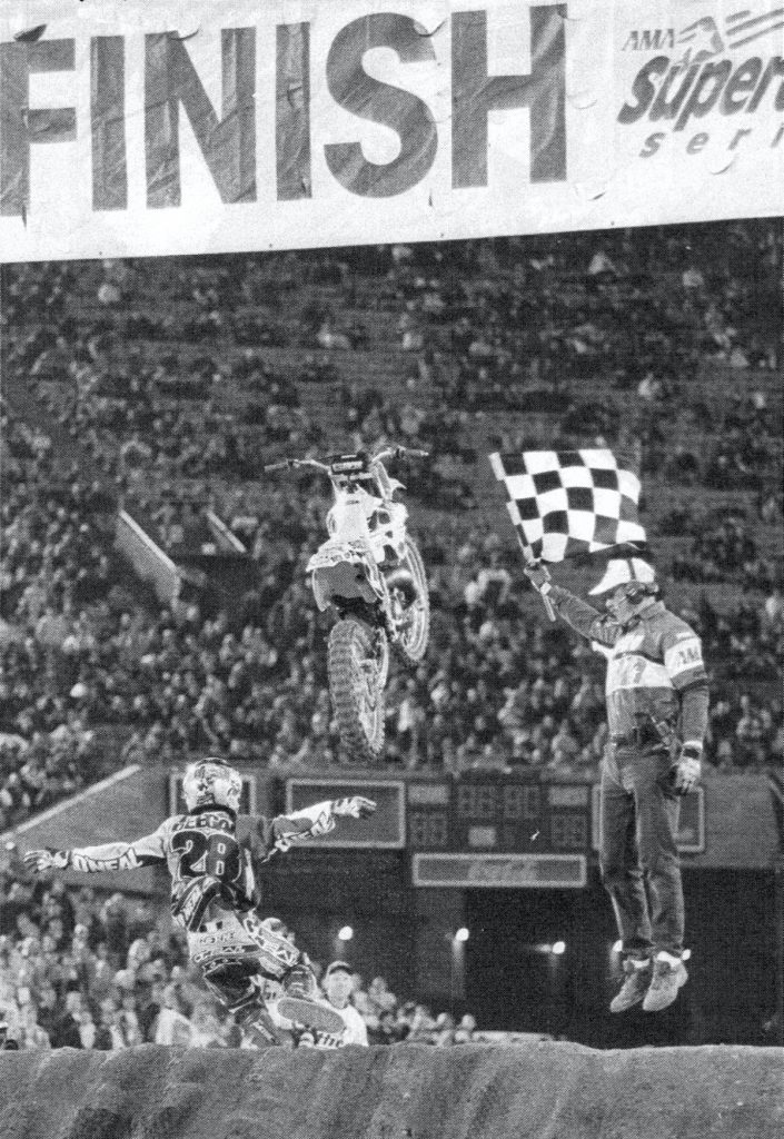 Photo Credit: O’Neal USA
Blaze: The moment that will live on in O’Neal and moto history.
Matthes: Yup, good shot and story with this.
The Doctor: It certainly left an impression on many!
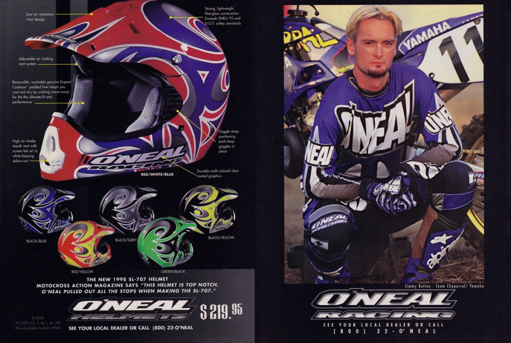 Photo Credit: O’Neal USA
Blaze: The 1998 season brought with it Jimmy Button and some pretty cheeseball-looking helmets. It was around this time that all the gear companies came in hard with their own helmet lines. I think the same company (KBC maybe?) in Asia was manufacturing them for the gear companies and basically, the only differences were their looks.
Matthes: Button was good this year, he started coming into his own and was a privateer in the 125 nationals which made all these people upset.
The Doctor: Yeah, Jim tried to get me into one of those helmets, luckily I had a long term contract with Shoei at the time.
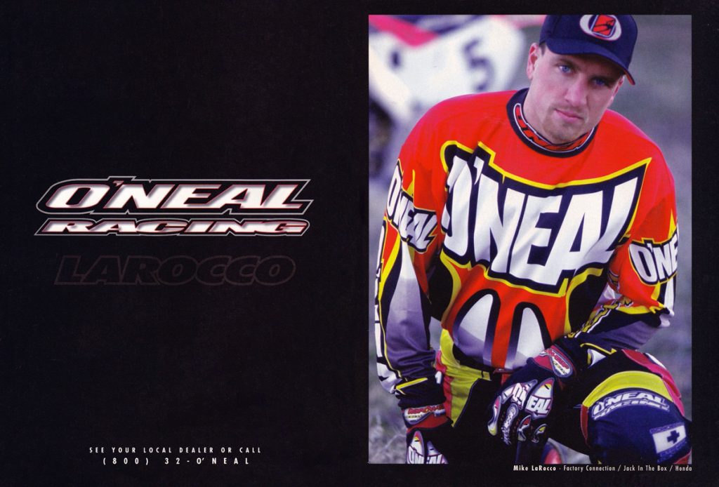 Photo Credit: O’Neal USA
Blaze: In addition to Button, O’Neal picked up “Iron” Mike LaRocco for 1998. No offense to The Doctor, Earthquake or the Stingray, but this was probably the biggest name in O’Neal since they signed André Malherbe back in 1981.
Matthes: Stop it, no it wasn’t. You gotta remember Mike was no longer a factory guy, he had a garbage 1997 season and wasn’t that big of a name at this point. He kind of rebuilt himself though after this which was a win for O’Neal and Mike.
The Doctor: He was a big name guy for sure!
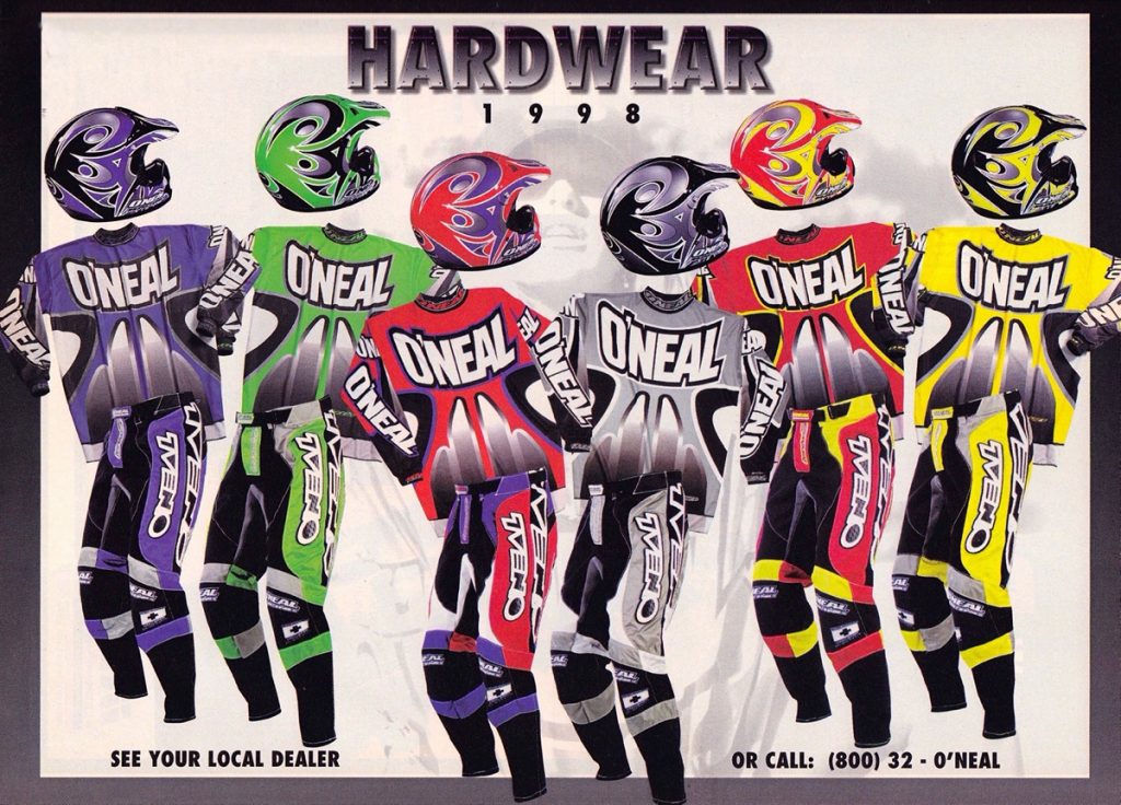 Photo Credit: O’Neal USA
Blaze: You can keep the helmets, but the rest of this Hardwear gear for 1998 is aces.
Matthes: Yeah, those helmets are NOT good. I’m down with everything else though.
The Doctor: I wore mostly the yellow and the grey that year. I have a great photo from the Four Stroke National at Glen Helen in the yellow gear.
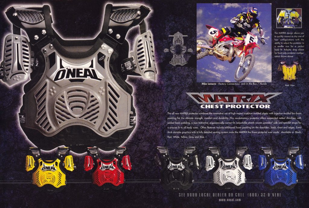 Photo Credit: O’Neal USA
Blaze: The new Matrix chest protector for 1998 finally brought features like the suspended shoulder pads that Fox and HRP had offered since the mid-eighties to O’Neal. As with most of their previous chest protector offerings, you wore this for the protection, not for the looks.
Matthes: Welcome to 1986 O’Neal!
The Doctor: I never wore this one, it was a bit bulky and I liked wearing my chest stuff inside my jersey by then.
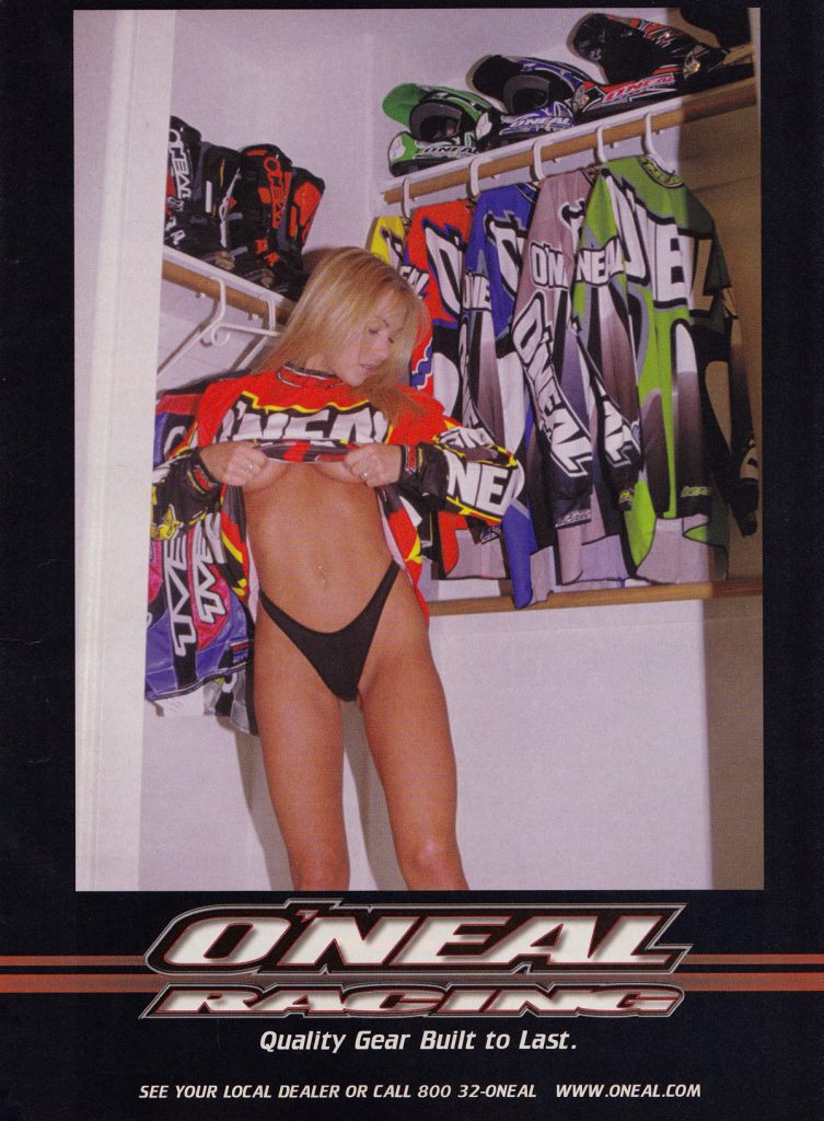 Photo Credit: O’Neal USA
Blaze: In 1998, O’Neal started the tradition of having beautiful women in bikinis model their gear. Somehow, I think this was probably Jim Holley’s idea. Regardless of who thought of it, it guaranteed two things: 1) it would not ever appear in MXA, and 2) it would make it to the bedroom wall of every adolescent male with a RacerX or MX Racer subscription in North America. Call me crazy, but that is damn fine-looking gear.
Matthes: I wonder if Hollywood was “supervisor” of all these photo shoots?
The Doctor: I think your right on the Jim Holley comment. Yes, this gear was good. I wore mostly the blue set up that year.
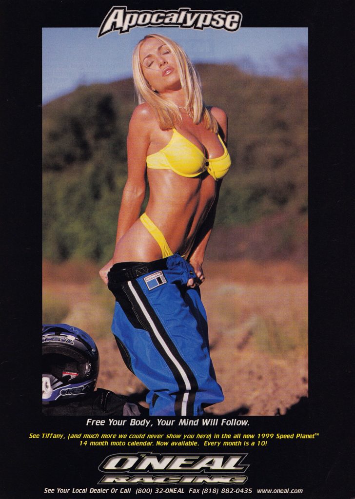 Photo Credit: O’Neal USA
Blaze: Yes, baggy gear was a thing and yes, O’Neal made it. While she certainly seems to be enjoying it, I would not have been caught dead in any of this stuff.
Matthes: O’Neal made baggy gear? Huh?
The Doctor: I never went to the dark side…
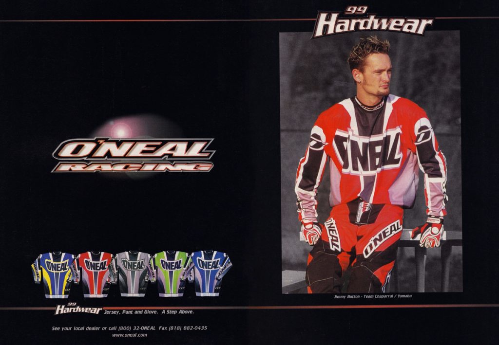 Photo Credit: O’Neal USA
Blaze: For 1999 O’Neal made some subtle changes to the Hardwear line that was not much of an improvement in my book. I do love the new Blue/Yellow combo on the far left, but for the most part, I preferred the looks of the 1998 designs.
The Doctor: Yes, I wore the blue/yellow that year. It was a really good mix of colors.
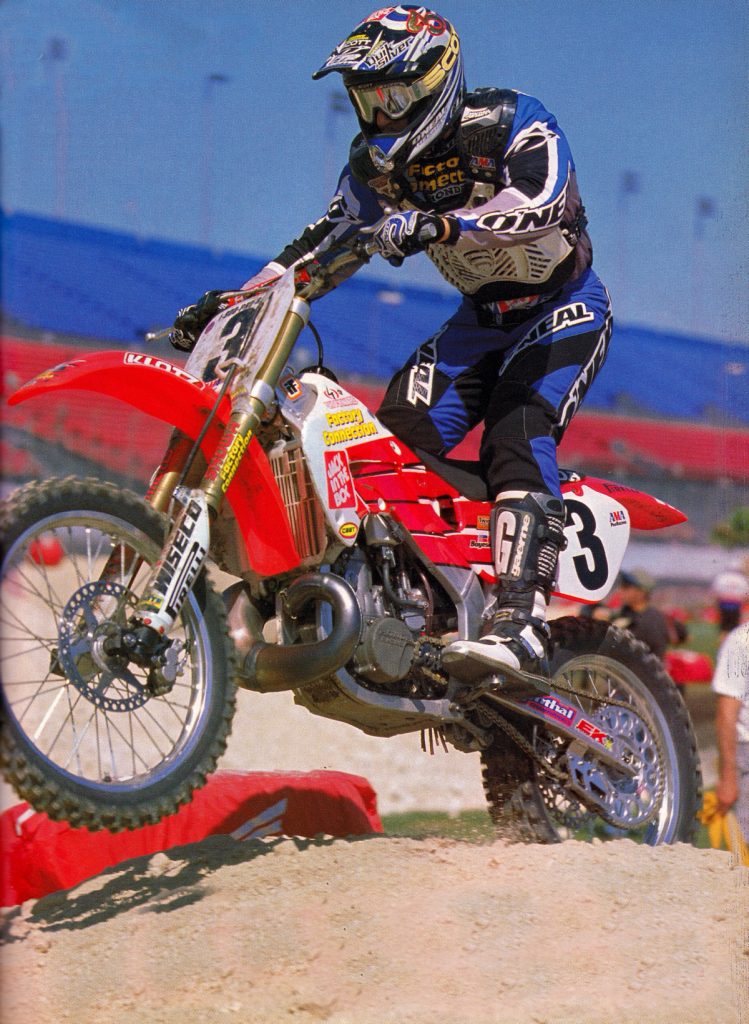 Photo Credit: Motocross Action
Blaze: This bike was pretty sweet, but overall this ‘99 Hardwear gets a solid “meh” in my book.
Matthes: Yeah, this wasn’t a strong LIT KIT by any means.
The Doctor: You have to give them credit for going smaller on the O’Neal logos. I would agree, however, that it was just average looking.
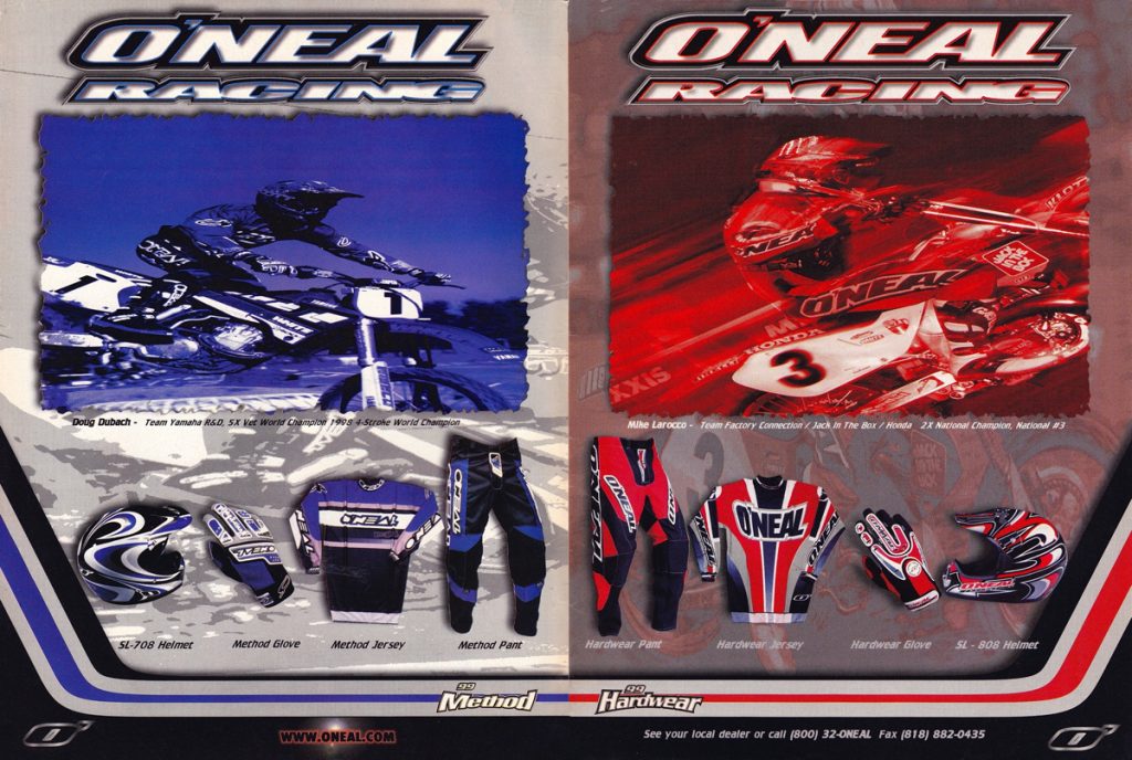 Photo Credit: O’Neal
Blaze: O’Neal also offered a Method line of gear in 1999 that was different, but not necessarily better-looking in my opinion.
Matthes: Man, O’Neal made a ton of stuff for a loooong time right? Where’s the Tim Ferry ads Blaze?
The Doctor: I never was a big fan of that line. I stuck with the Hardware stuff.
So there you have it, O’Neal, throughout the 1990s. If you enjoyed this, make sure to check out the rest of the site where we have done similar looks back at AXO Sport, JT Racing and Answer. Thanks for reading and if you would like to see a daily dose of old-school moto goodness you can check out my Twitter and Instagram – @TonyBlazier.
If you like your moto in video format, check out my YouTube channel at www.youtube.com/themotocrossvault .
