The 2016 Teams!
The 2016 Teams!
Photos by James Lissimore
 |
|
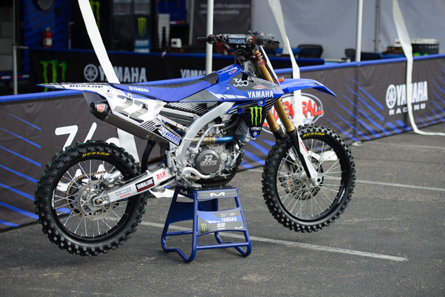
Swiz- Some things are coincidence but I can’t believe that Chad Reed’s last 3 brand changes looking stellar is one. From year-one on Two Two Honda’s, Chad’s bike “packages” have been pretty damn incredible. Now back on a Factory team, I gotta believe Chad or “his guy” from Two Two had a lot of input on this setup, too. Awesome. Matthes– I don’t know Swiz, I wouldn’t be surprised if Reedy didn’t have any input into this look. Seems like he’s out of the back-end things on this team. But whatever. It’s hard to make a Yamaha look nice in my opinion and especially from this side with that rear subframe bar there. I like this though, black rims look good with dark blue and it’s not plastered with stickers everywhere.
|
 |
|
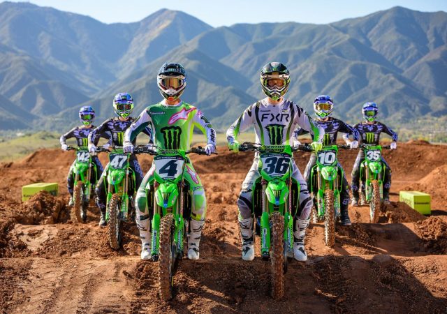
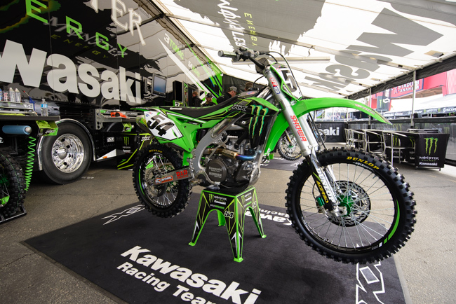
Swiz- Keefer noted this week on the PulpMX Show that his stand-out team bike, is the Kawasaki. I think they look good but a touch overly simplified in my preference. The green hubs and sprocket that Steve loves are better than the blue from recent years but not enough to get me hot n bothered. Matthes- I’ll have to fire Lissimore for not shooting this straight on but I love this look. I like the way the stock Kawi’s look with the side panels coming up to the shroud. Black wheels look great and if you’ve got to have a sort-of ugly grenn claw on your bike, then having the rest of your bike green is great. And yeah, the green hubs and green rear sprocket are sweet, don’t listen to Swiz. Drawbacks for the color of the Showa’s–not cool bro.
|
 |
|
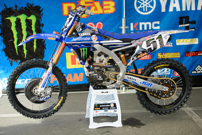
Swiz- The JGR bikes are looking really dated in 2016. The parallel-with-the-ground graphic treatment is fighting all the flowing possibilities with the geometry of these bikes and it makes me anxious….anxious to look at a better looking bike. Matthes- Never really liked the JGR bikes, they have too many logos on them. I get it, it’s the way they want to do it and have to do it but combine that mentality with the Yamaha’s built-in ugliness and you have this. Sorry bro, it’s not me- it’s you. |
 |
|
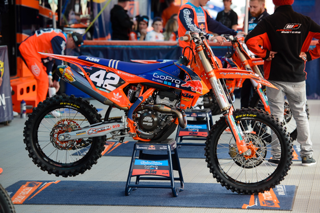
Swiz- Tory Lee aint known for his incredible design choice for no good reason. These bikes look terrific! Now if only Troy could get out his eraser and get rid of some of that honkin exhaust! Matthes- KTM’s are good looking bikes but the red bull logo doesn’t look great on orange and we have the black wheels appearing once again. The side number plates still take some time to get used to and I’m with Swiz on the muffler showing so much. Still, strong look.
|
 |
|
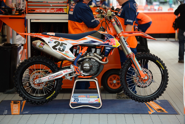
Swiz- The Factory 450 KTM’s look a little too tame without the red number plate background. My tune would change completely if this were a shot of Dungey’s bike. This is a safe-look. Too much white for me. Matthes- Yep, Swiz nails it with the word “safe”. I thought their older looks were better and does that white stripes in there supposed to sort of spell out “KTM”? I’d like to see the word “KTM” in there somewhere also besides that small one on the shroud. The Akra exhaust matching the fork color is a nice touch, unlike the TLD bikes. It’s not great, it’s not bad…it’s just eeeeh.
|
 |
|
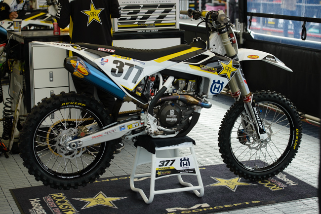
Swiz- These Rockstar Husky’s are pretty simple. Not making me feel anxious, nor are they making me sick to my stomach or wanting to buy one. The blue of the FMF can should be utlized elsewhere too… maybe the hubs? Matthes- Same bike as above but for some reason, I think it works with the white and yellow. Black wheels yet again (never realized this growing trend in the pits until now) and I like how on this bike the white side panel just flows into the white rear fender.
|
 |
|
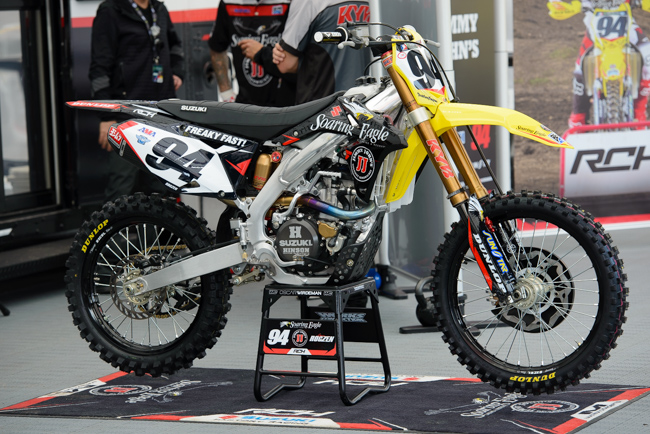
Swiz- A seri-font face suchas that used for the Soaring Eagle Casino brand logo will never look great in the sport of Motocross/Supercross… I get it though, it has to be on there in it’s proper form. Next! Matthes- Yeah, it’s eeeeh. I like some blue on my Suzuki’s and black and yellow isn’t inspiring colors and the bare swingarm is just waiting for Watson to hook it up with something. It doesn’t help the guys that the RMZ is now into it’s 74th year of basically looking the same.
|
 |
|
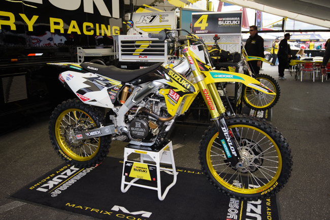
Swiz- This is my least favorite factory look in the paddock. Too busy and disjointed. Matthes-MYeah but Swiz, the gold rims bro! Something a bit different right? I like the bold Suzuki word there in the proper font as well. Just takes you back to the days of when Suzuki was Suzuki y’know? I think the fork color is a but much right?
|
 |
|
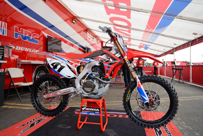
Swiz- It’s Factory Honda and Red, White and Blue done so well. Awesome! Matthes- Yeah, I like this look. Perhaps the best one in the bits with the addition of more blue this year. And Honda has an advantage like Suzuki in that they don’t have to slap on an outside sponsor logo but hey, whatever man. It’s racy, it’s got the nice fork color, I like it! Small points deducted for the black tank, I’d like to see an aluminum one there or the ti ones they’ll have on outdoors.
|
 |
|
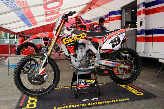
Swiz- Have these bikes changed their look in the last 4 years? I can’t tell. Dated. Matthes- Yep, time to change it up over here. The black seat is better than a red one though and I don’t have a problem with the tank with the GEICO bike like I do on the factory one.
|
 |
|
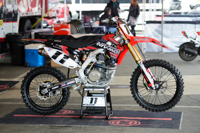
Swiz- Not a bad look but not winning any design awards either. Still really weird seeing 11 not on green but I do like the fresh hardware for Chiz. Matthes- Too much black! Take the swingarm sticker off or put on a red seat cover and now we’re talking.
|
 |
|
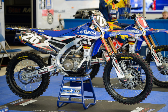
Swiz- This looks like a bike from the GP’s without all the cool titanium one-off stuff… Where’s the UFO sticker? Matthes- I like this. It’s come a long way from a few years ago. The addition of the little graphic on the side plate is a nice touch and I like the dark gold on the forks. White radiator hoses are good also. Again, tough to make the bike look bitching but Star guys did a nice job on it.
|
 |
|
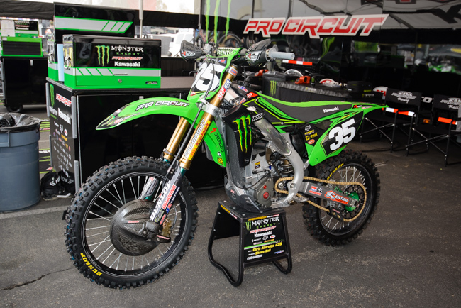
Swiz- Meh… Same thoughts as the Geico bikes. Matthes– They are what they have to be.
|
 |
|
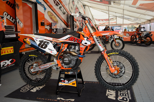
Swiz- The BTO bikes are looking a little dated too but with a Team like BTO (one that has a TON of sponsors) you gotta get all those brands in there somehow. Those silver lines on the rims got to go! Matthes- I like that the BTO logo fits nicely on the shroud and I like that the fork guard shows more orange but, yeah- I’m with Swiz.
|
 |
|
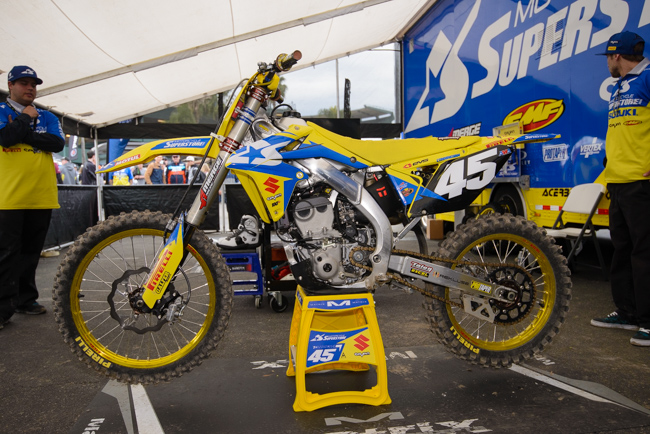
Swiz- Liss didn’t do Top Jimmy’s team a favor here, getting a shot of a dirty bike but I’ll look past that. These bikes look great! Retro blue shades on the Zook and stepping out from the standard black wheels and graphic lines which just flow so well. My last Suzuki had gold wheels too, so that says all you need to know! Matthes- I like this. Blue on Suzuki yellow is cool. Gold rims is a nice touch away from black. I like the number font and the red Suzuki “S” is retro. Nice job guys!
|
